
The complete guide to pitch deck design in 2026

TABLE OF CONTENTS

TL;DR
Pitch deck design is the visual work that makes a startup's story fast to read: one takeaway per slide, headlines that state the conclusion, large legible type, labeled charts and a consistent layout. In 2026 the most important design decision is building two versions, a send deck investors read alone in about three minutes and a shorter deck you present live.
- ✅ Design the send deck first. It is the one that gets you the meeting. DocSend data puts average seed deck review time at 3 minutes 44 seconds, with no founder in the room to explain anything.
- 🎨 Write every slide title as a conclusion. "Revenue grew 3.4x in 12 months" beats "Traction". Investors scanning at about 15 seconds a slide read titles, not paragraphs.
- 📊 Label the takeaway on every chart. A chart without a caption asks the investor to do your analysis for you.
- ⚠️ Do not apply presentation rules to the emailed deck. Guy Kawasaki's 30 point minimum and YC's "no screenshots" advice are rules for a room, not an inbox.
- ❌ Skip decoration. Animations, stock photos and five brand colors cost attention and add nothing a reader can use.
Most pitch deck design advice agrees on everything and helps with nothing. Keep it simple. One idea per slide. Use visuals. You have read those lines on every page that ranks for this topic.
The problem is that the popular rules contradict each other, and nobody says why. Y Combinator tells founders to use five to seven slides and avoid screenshots. DocSend's seed deck research recommends 19 to 20 pages and finds investors spend almost a minute on the product section. Both are right. They are describing two different decks.
This pitch deck design guide covers both, starting with the one that matters first. It is about the visual side: layout, type, color, charts, product visuals and tools. If you still need to decide what goes on each slide, start with our guide on which slides to include in an investor pitch deck, then come back here to make them readable.
What is pitch deck design (and what isn't it)?
Pitch deck design is the visual structure that helps an investor understand a startup quickly: slide layout, typography, color, charts, product imagery and consistency across the deck. Its job is comprehension, not decoration. A well designed deck lets someone who has never heard of the company grasp the business in a few minutes without help.
That definition rules out a lot of what gets called design. A custom illustration on the cover is nice. It is not what moves an investor. What moves them is whether they can find your revenue number in two seconds, and whether the chart next to it tells them what to think.
OGS Capital puts it well: in fundraising, design is how clearly the company thinks on the page. A messy deck reads as a messy plan, whether or not that is fair.
The content framework is mostly settled. Sequoia's business plan outline (purpose, problem, solution, why now, market, competition, business model, team, financials) still shapes most seed decks. Design is the part founders get to do better or worse than everyone else using the same outline.
Bottom line: pitch deck design is the work of making your argument fast to read, and every visual choice should be judged by that test.
Why do you need two versions of the same pitch deck?
You need two versions because investors meet your deck in two different situations. The send deck is read alone, on a screen, with no one to explain it, so it must be self-explanatory. The present deck is projected behind you while you talk, so it must be sparse. One design cannot do both jobs well.
Most founders build one deck and try to use it everywhere. The result is either a presented deck with paragraphs the room reads instead of listening to you, or an emailed deck of big single words that make no sense without the voiceover.
Here is how the two differ in practice:
The practical order is: build the send deck first, then create the present deck by cutting. Remove the supporting text, enlarge the key number on each slide, and move detail into your speaker notes. Going the other way (adding text to a sparse deck) almost always produces clutter.
Bottom line: design for the reader first, then cut down for the room.
How long do investors actually spend on a pitch deck?
Investors spend roughly two to four minutes on a pitch deck. DocSend found seed decks get 3 minutes 44 seconds on average, and Papermark's analysis of 3,000 decks found 3.2 minutes, with about 23 seconds on the first slide and around 15 seconds on each slide after it. Design has to work at that speed.
The numbers come from a few sources, and they line up closely:
Here is what those numbers mean for design. At 15 seconds a slide, an investor reads the title, glances at the biggest visual element and moves on. Anything below that level gets skimmed or skipped. So the title and the dominant visual on each slide have to carry the whole point by themselves.
The 58% completion figure matters too. Four in ten readers never reach your last slide, which is usually where the ask and the team live. That is a design argument for putting your strongest proof early and keeping the deck tight.
Okay, one caveat: time on deck is a correlation, not a recipe. Decks that raised got more attention, but a longer read is partly a result of investor interest, not only a cause of it. Still, a deck that is hard to scan never gets the chance to earn that extra minute.
Bottom line: design every slide to deliver its point in 15 seconds, because that is roughly all it gets.
Layout and visual hierarchy: one takeaway per slide
Every slide should answer one question and make that answer the most visible thing on the page. That sounds obvious. In practice most slides have three competing elements of equal weight, and the reader has to decide which one matters.
Here's what works:
- Conclusion titles. Replace topic labels ("Market", "Traction") with a sentence that states the finding ("A $4.2B market growing 18% a year"). The title becomes a summary of the deck when read top to bottom.
- One dominant element. A single number, chart or image should be clearly larger than everything else. If two things fight for attention, split the slide.
- A consistent grid. Keep margins, title position and logo placement identical on every slide. Readers stop noticing the layout and start noticing the content.
- Generous white space. Empty space is what makes the important thing look important. Filling every corner flattens the hierarchy.
- Left-aligned text. Centered body text is harder to scan across several lines. Save centering for single numbers or short statements.
A quick test: read only the slide titles, in order. If they tell the story of the company without the rest of the deck, your hierarchy is working. If they read like a table of contents, rewrite them.
Bottom line: if a reader has to hunt for the point of a slide, the slide is not finished.
What font size and typefaces should a pitch deck use?
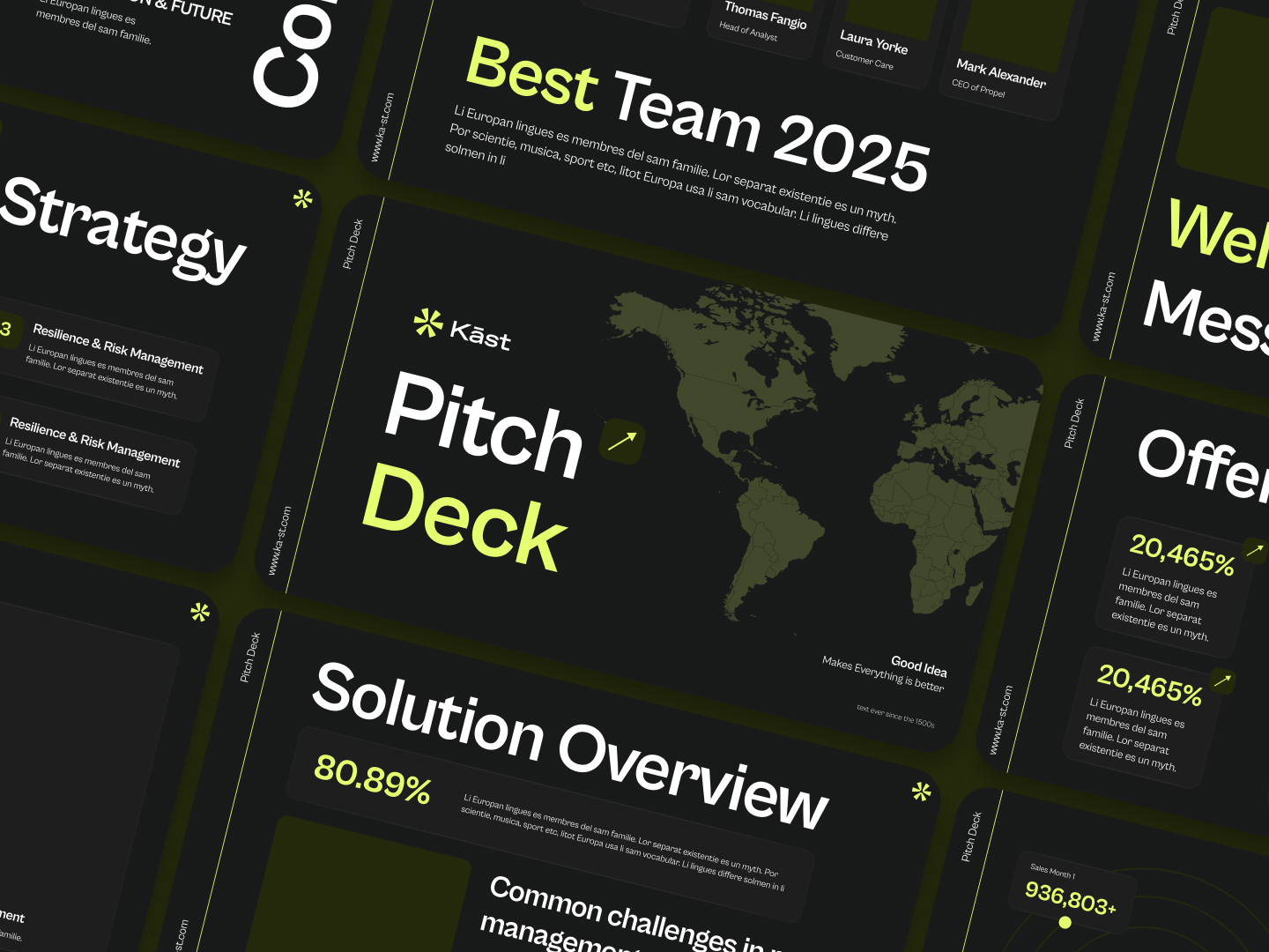
For a presented deck, use 30 point or larger for body text, following Guy Kawasaki's 10/20/30 rule. For a send deck read on a screen, 18 to 24 point body text and 32 to 44 point titles work well. Stick to one or two clean sans serif typefaces, use bold for emphasis and keep line length short.
Kawasaki's rule is ten slides, twenty minutes and no font smaller than thirty points. He also offers a formula: take the age of the oldest person in the audience and divide by two. It is a great rule for a projector at the back of a room. Apply it to a 20 slide emailed deck and you will run out of space for the detail an investor reading alone actually needs.
The principle behind it still holds for both decks: if you need small type to fit your content, you have too much content. Cut words before you shrink them.
A few typography rules that hold for both versions:
- Use one typeface family, or two at most (one for titles, one for body).
- Pick fonts with clear numerals, because your deck is full of numbers.
- Avoid thin weights. Light and hairline fonts break down on projectors and phone screens.
- Keep lines to about 8 to 12 words so the eye does not lose its place.
- Embed fonts or export to PDF so the investor sees what you designed, not a fallback font.
If you are choosing a typeface from scratch, our list of PowerPoint fonts that hold up on screen and projector is a good shortlist.
Bottom line: 30 point for the room, 18 to 24 point for the inbox, and never small type as a way to fit more in.
Color, contrast and brand consistency
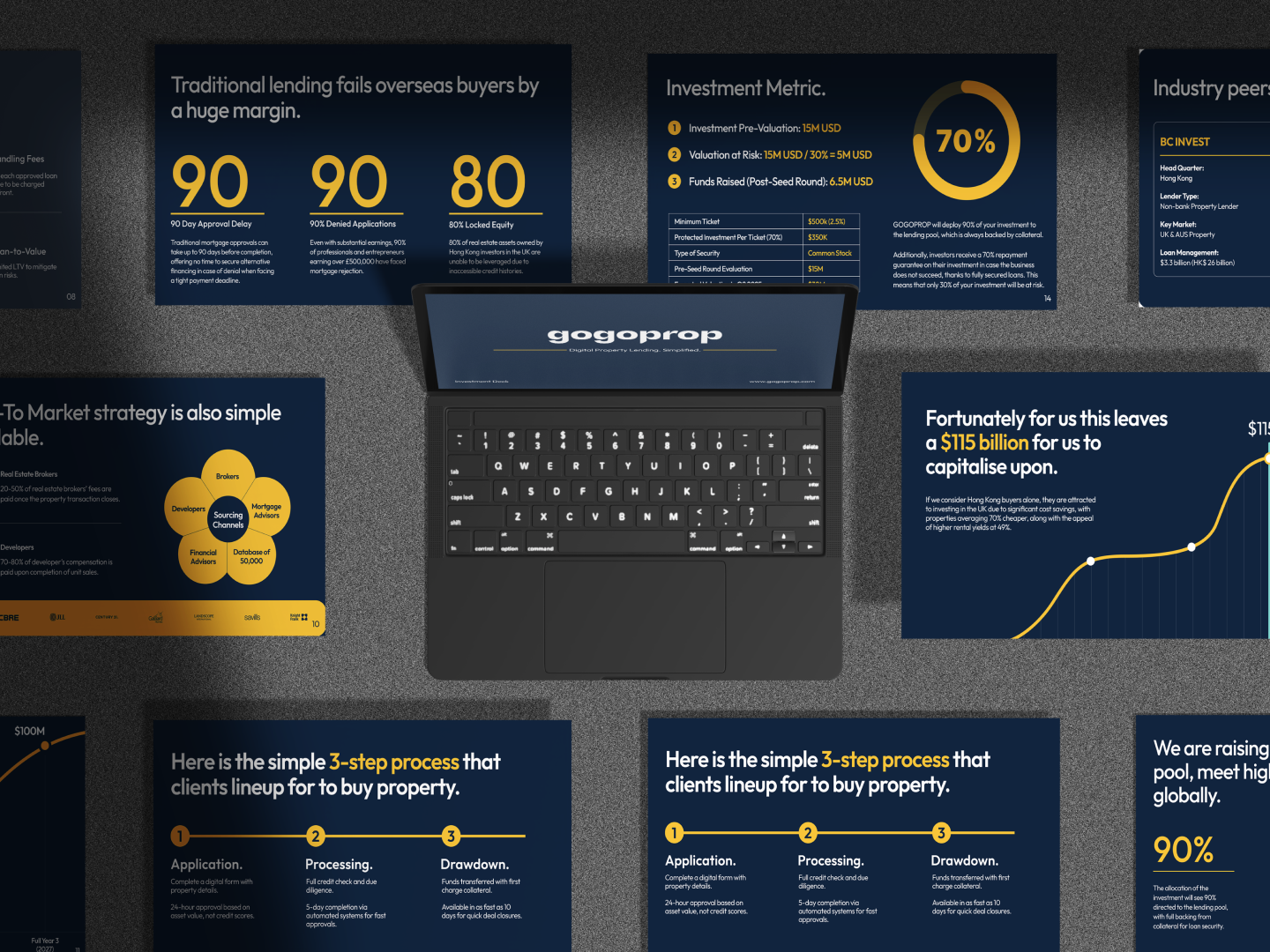
Color in a pitch deck has two jobs: make text readable and point the eye at what matters. Most decks overdo the second job and fail the first.
Start with contrast. The WCAG accessibility standard sets 4.5:1 as the minimum contrast ratio for normal text and 3:1 for large text. That is a useful floor for decks too, because investors read on laptops in bright offices, on phones in taxis and on conference room projectors that wash everything out. Light gray text on white fails all three.
Then limit the palette. A practical setup is one dark text color, one background, one brand color and one accent used only for highlights. When the accent appears only on the number that matters, the reader's eye goes straight to it. When it appears on every heading, icon and border, it means nothing.
Dark backgrounds look dramatic on a big screen. They are also harder to read in print and in bright light, and many investors still print decks or read them on white PDF viewers. If you use a dark theme for the present deck, consider a light version for the send deck.
Need a starting point? Our collection of presentation color palettes includes combinations that pass contrast checks.
Bottom line: one accent color, used only where you want the eye to land.
How should you design charts and traction slides?
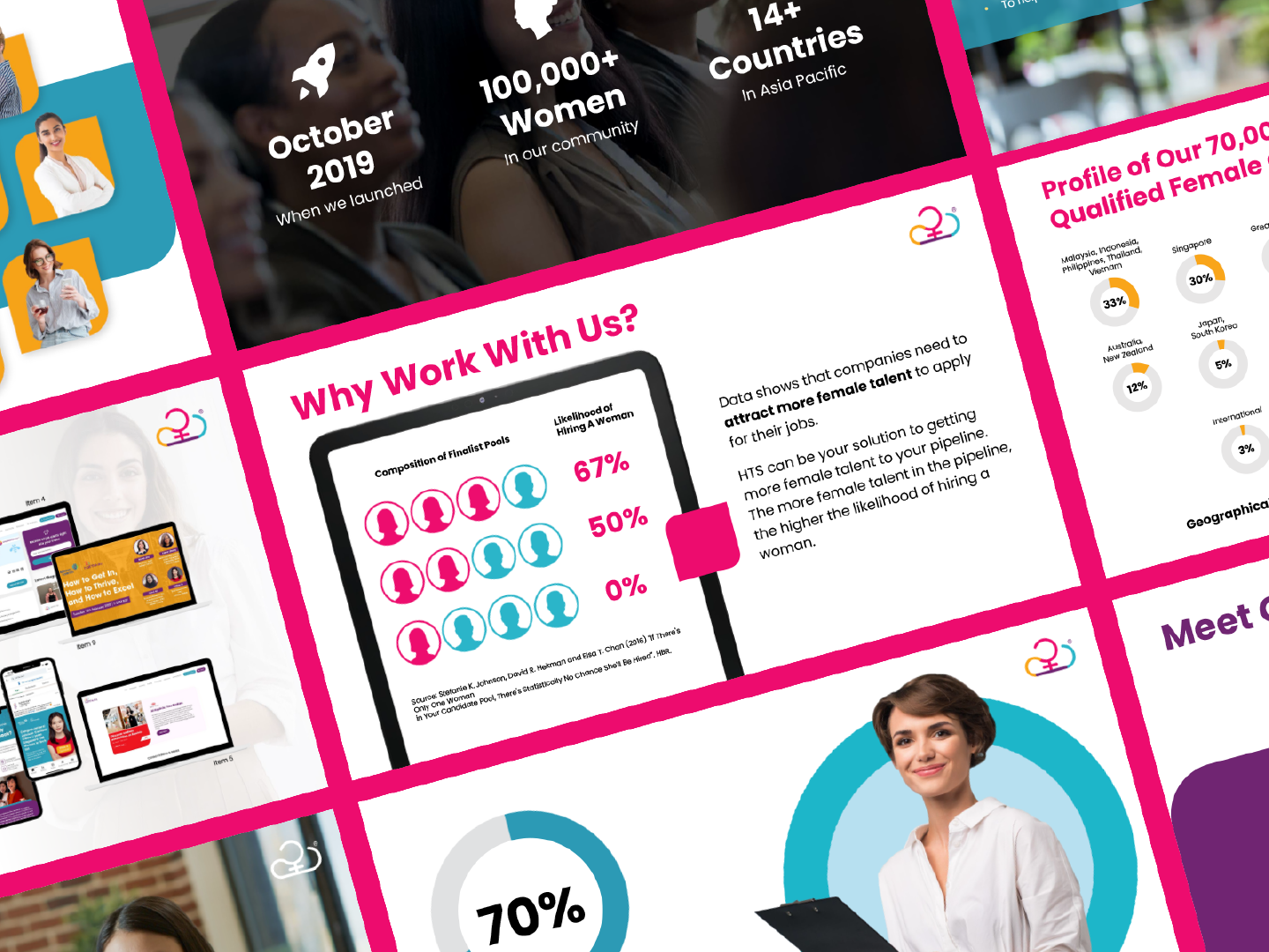
Design pitch deck charts to deliver one conclusion at a glance. Choose the simplest chart type that fits the data, remove gridlines and legends where possible, highlight the key data point in your accent color and write the takeaway directly on the slide. The investor should never have to interpret the chart themselves.
YC's Kevin Hale makes this point clearly: label the conclusion on the graph, because without the caption, the reader has to study the chart to reach it. This matters more now than when he wrote it. The DocSend seed deck study found business model slides get the most time of any section, at 64 seconds, followed by product at 59 seconds and traction at 40. Those are the slides built on numbers, and the slides where a confusing chart costs you most.
Here is one traction slide done two ways, using example figures:
The strong version works at 15 seconds and still rewards a longer look. The weak version only works if you are in the room to explain it.
A few chart rules worth keeping:
- Use line charts for growth over time and bar charts for comparisons. Avoid pie charts with more than three slices.
- Start the y axis at zero unless you say clearly that you have not. Investors notice truncated axes, and it costs trust.
- Show the unit and the time period on every chart.
- If a number is a projection, label it as one. Mixing actuals and forecasts without a visual break is a red flag.
For more on this, see our tips on presenting data clearly.
Bottom line: a chart in a pitch deck is an argument, so write the argument on the chart.
Showing your product: when screenshots work and when they don't
YC advises against screenshots, calling them illegible, complex and non-obvious. For a projected deck that is correct. A full app screenshot shrunk onto a slide is unreadable from row three.
The send deck is a different case. Investors spend close to a minute on the product section when reading alone, and "show, don't tell" is the fastest way to make a product feel real. The fix is not avoiding screenshots. It is designing them.
- Crop hard. Show the one part of the interface that proves the point, not the whole screen.
- Annotate. Add a short label or arrow that says what the reader is looking at and why it matters.
- Use a device frame sparingly. A laptop or phone mockup gives context, but only if the screen inside stays legible.
- Show a flow, not a feature list. Three cropped steps ("upload, review, approve") explain a product better than one busy dashboard.
- Use real data. Lorem ipsum and placeholder names signal a product that is not in use yet.
For the present deck, swap the screenshots for a short live demo or a single simplified flow, and keep the annotated versions in the appendix.
Bottom line: screenshots fail when they are pasted in, and work when they are designed.
Which tool should you design your pitch deck in?
Use the tool your team already knows and can edit quickly, because a pitch deck changes after almost every investor conversation. PowerPoint and Keynote give the most design control, Google Slides is best for collaboration, Figma suits teams with an in-house designer, and AI builders are useful for a first structure but rarely for the final design.
If you are torn between the two most common options, our comparison of Google Slides vs PowerPoint covers the trade-offs in detail. For newer tools like Pitch, Figma and Gamma, check export quality before you commit, because the investor will usually see a PDF, not your editor.
On AI builders, Outcrowd's advice is sensible: use AI for structure, not for thinking. An AI tool can give you a layout in minutes. It cannot tell you which of your numbers is the one an investor will care about.
Whatever you choose, share the send deck as a PDF or a tracked link (DocSend, Papermark and similar tools show which slides get read) and test it on a phone before it goes out.
Bottom line: choose the tool you can update in ten minutes after an investor call.
10 pitch deck design mistakes that cost you the second read
These are the patterns that make an investor close the tab early. Most are quick fixes.
- Topic titles instead of conclusion titles. "Market" tells the reader nothing. State the finding.
- Several ideas on one slide. If a slide needs two titles, it needs to be two slides.
- Paragraphs. DocSend's research found typical decks carry about 50 words per slide. Go well over that and you are writing a memo.
- Unlabeled charts. No takeaway, no units, no time period.
- Low contrast text. Pale gray on white, or text over a busy photo.
- Too many colors. When everything is highlighted, nothing is.
- Full-screen screenshots. Illegible at slide size. Crop and annotate.
- Stock photos of handshakes and skylines. They take space and prove nothing. Use your product, your team or your data.
- Animations and transitions in the send deck. They do not survive PDF export and add nothing when presenting either.
- Inconsistent layout. Logos jumping around, shifting margins and three font sizes for body text make the company look less organized than it is.
Run through this list before every send. It takes five minutes, and each fix makes the deck easier to read at 15 seconds a slide.
Should you design your pitch deck yourself or hire a designer?
Design it yourself if you have a clear story, a clean template and time to iterate. Hire a designer when the content is final but the deck looks inconsistent, when you are raising a priced round where polish signals maturity, or when you also need the one-pager, data room cover and website updates to match.
Remember: even the best designer cannot fix a weak story. If you do not yet know which number is your strongest proof, spend the time on content first. Design pays off once the argument is settled and the problem is making it readable.
If you outsource design, there are two models.
- Specialist pitch deck agencies charge per project, and we compared them by the real cost of a 15 slide seed deck in our guide to pitch deck design services.
- The other option is a design subscription. At ManyPixels, a daily output for presentation work is typically 4 to 5 slides, so a full redesign of a 15 to 20 slide deck takes about four to five business days on a single-output plan, and roughly half that with two daily outputs. The subscription makes more sense when the deck is one of several things you need designed during a raise, since investor updates, one-pagers and product visuals follow soon after.
If that fits, you can explore ManyPixels plans. Pricing starts at about $699 a month (check manypixels.co for current pricing).
{{PRESENTATIONS_PORTFOLIO="/dev/components"}}
Frequently asked questions
Bottom line
Good pitch deck design is not about looking impressive. It is about making your argument readable in the two to four minutes an investor actually gives it. Write conclusion titles, give every slide one dominant element, label your charts and design your screenshots.
Most of all, stop treating the send deck and the present deck as the same file. Design the one investors read alone first, because that is the one that gets you in the room.
{{PRESENTAION_BANNER="/dev/components"}}

Having lived and studied in London and Berlin, I'm back in native Serbia, working remotely and writing short stories and plays in my free time. With previous experience in the nonprofit sector, I'm currently writing about the universal language of good graphic design. I make mix CDs and my playlists are almost exclusively 1960s.

Top-quality designers
A complete creative team at your fingertips: graphic and web designers, illustrators, and more.

Lightning-fast turnaround
Get start today and receive your first update on the next business day.

All-inclusive pricing
Unlimited requests and revisions. One flat monthly fee. No surprises.

Flexible & scalable model
No contract. Scale up and down as needed. Pause or cancel at anytime.
Continue reading


.jpeg)
Explore some of our best designs
Get inspired by a curated selection of ManyPixels work. Download the portfolio to see what our team can create.








