13 Yearbook cover ideas for high school, middle school and beyond
TABLE OF CONTENTS


TL;DR
- ✅ The rule that matters most: commit to one idea (an illustration, a photo or a single word) and carry it from the front cover to the spine.
- Elementary and preschool: illustrated or student-photo covers.
- Middle school: one bold idea, like a storybook scene or a big theme word.
- High school and college: typographic or artistic covers that age well.
- ⚠️ Design the cover first: printers set its deadline before the interior pages. Supply 300 DPI images and add bleed.
A good yearbook cover does three jobs: it signals the year's theme at a glance, it appeals to students and parents alike, and it survives the trip to the printer. The covers that hold up pick one idea, whether an illustration, a photo or a single word, and commit to it from the front cover to the spine.
Yearbook staff don't have an easy job. Between chasing students who want their portrait retaken (or was that just my school?) and hitting printer deadlines, the team still has to produce a yearbook cover that a 15-year-old thinks is cool and a parent wants on the shelf for 30 years.
Here's the thing most yearbook cover ideas lists skip: the theme matters less than the restraint. The 13 covers below span preschool to university, and almost every one of them works because it does one thing well. We've grouped them into four styles, broken down the design choice behind each, and added the production details (sizes, bleed, binding, deadlines) that decide whether a great idea actually prints well.
Illustrated yearbook covers
Illustrated covers are the go-to for elementary schools and preschools, but they work at every level. An illustration lets you show a feeling or an idea that no single photo of your school can capture, and it ages better than a trendy photo filter.
1. Elementary school SDN Kampungdalem 1 Tulungagung
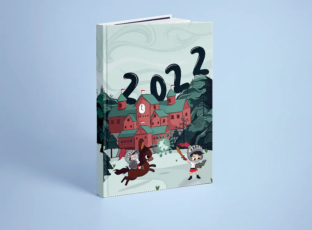
Design by S Dharmawan
These illustrations look exactly like something you’d find inside a children’s book. There aren’t too many details, especially if you explore the pages inside, which leave room for text and photos, without losing a sense of consistency.
2. School yearbook cover
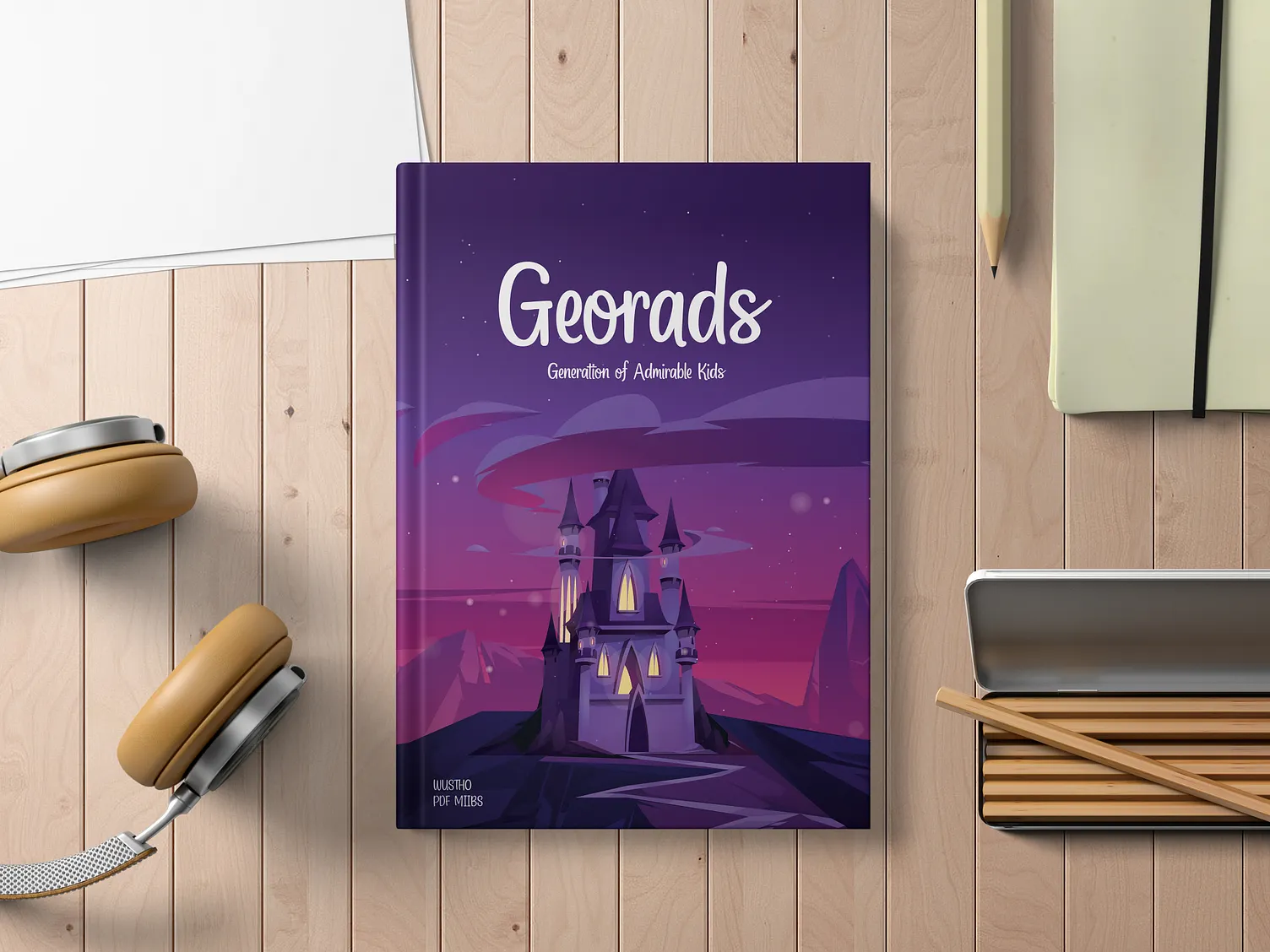
Design by Adinda Ristiani
This design looks more like a fairytale storybook cover rather than a yearbook. It would work perfectly for preschool or younger elementary school grades.
3. Greenwood Preschool
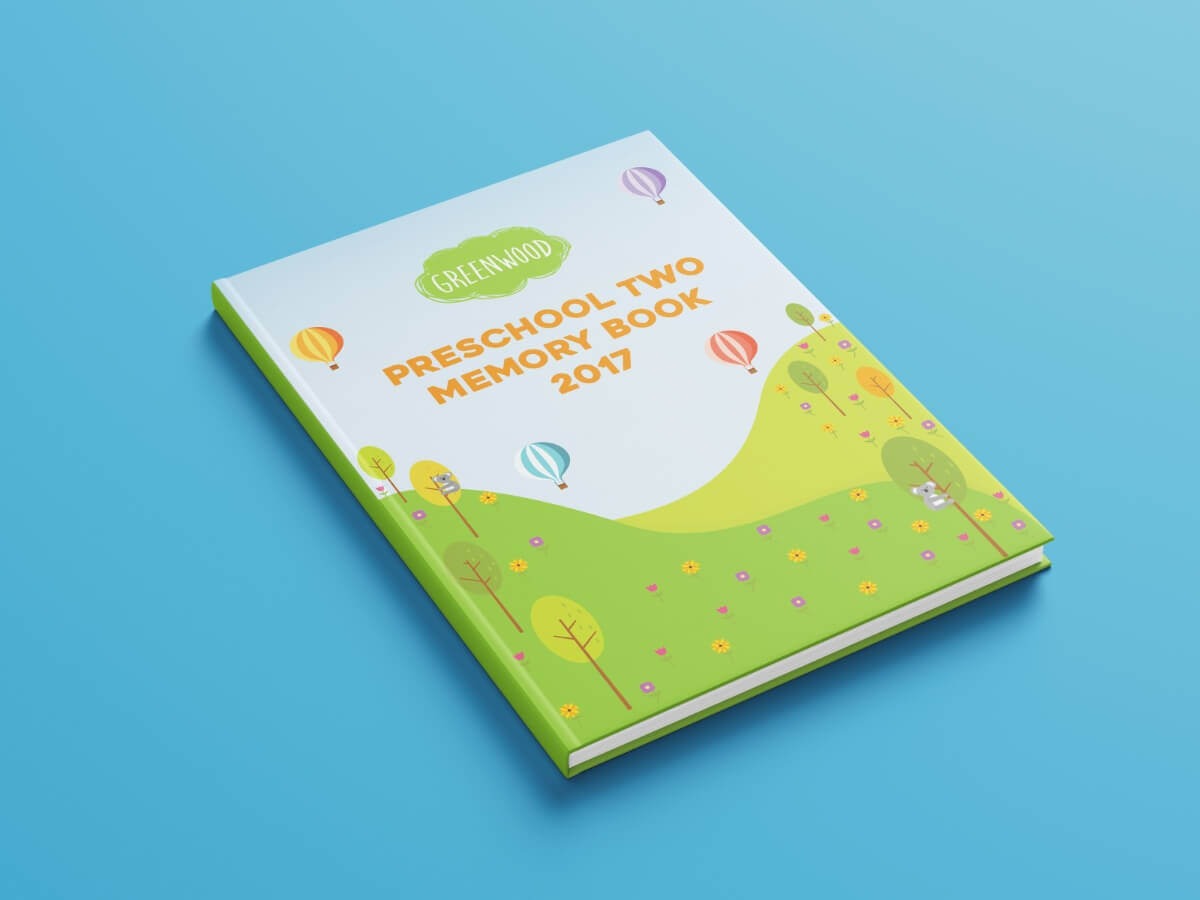
Design by Rebecca De Roxas
What I love here is how little is on the page. Designing for young kids is no excuse to ignore the basics of good layout. A handful of well-placed elements makes a more cohesive cover than a page crammed with crayons and cartoons.
💡 Illustrated covers borrow a lot from publishing. Our roundup of book cover ideas is a good place to look for illustration styles that translate to a yearbook.
Artistic yearbook covers
The goal of an artistic cover is simple: make something people would display even if it weren't a yearbook. Most students will flip back through for the photos, but a cover that works as a small piece of art earns a permanent spot on the shelf.
4. NSCAD University
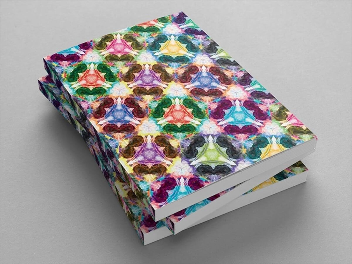
Design by Ksenia Azanova
Strictly speaking, this is the cover of NSCAD's 2015 graduation catalogue rather than a yearbook, but the idea transfers perfectly. The kaleidoscopic pattern was inspired by the lion statues outside the university building. Turning a campus landmark into a pattern honors tradition without looking like a postcard.
5. Thornhill Secondary School
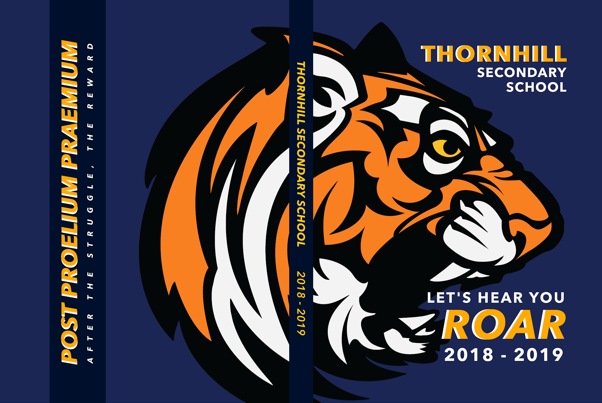
Design by Emily Louie
This 2018-19 cover was designed by the yearbook's own editor-in-chief in her final year of high school, and it went out on more than 700 copies. The year's theme was spirit, tied to a new house system, so the school tiger takes over the cover mid-roar. The mascot isn't decoration here: it is the theme, which is why the cover feels loud in the best way.
6. Newark Charter High School
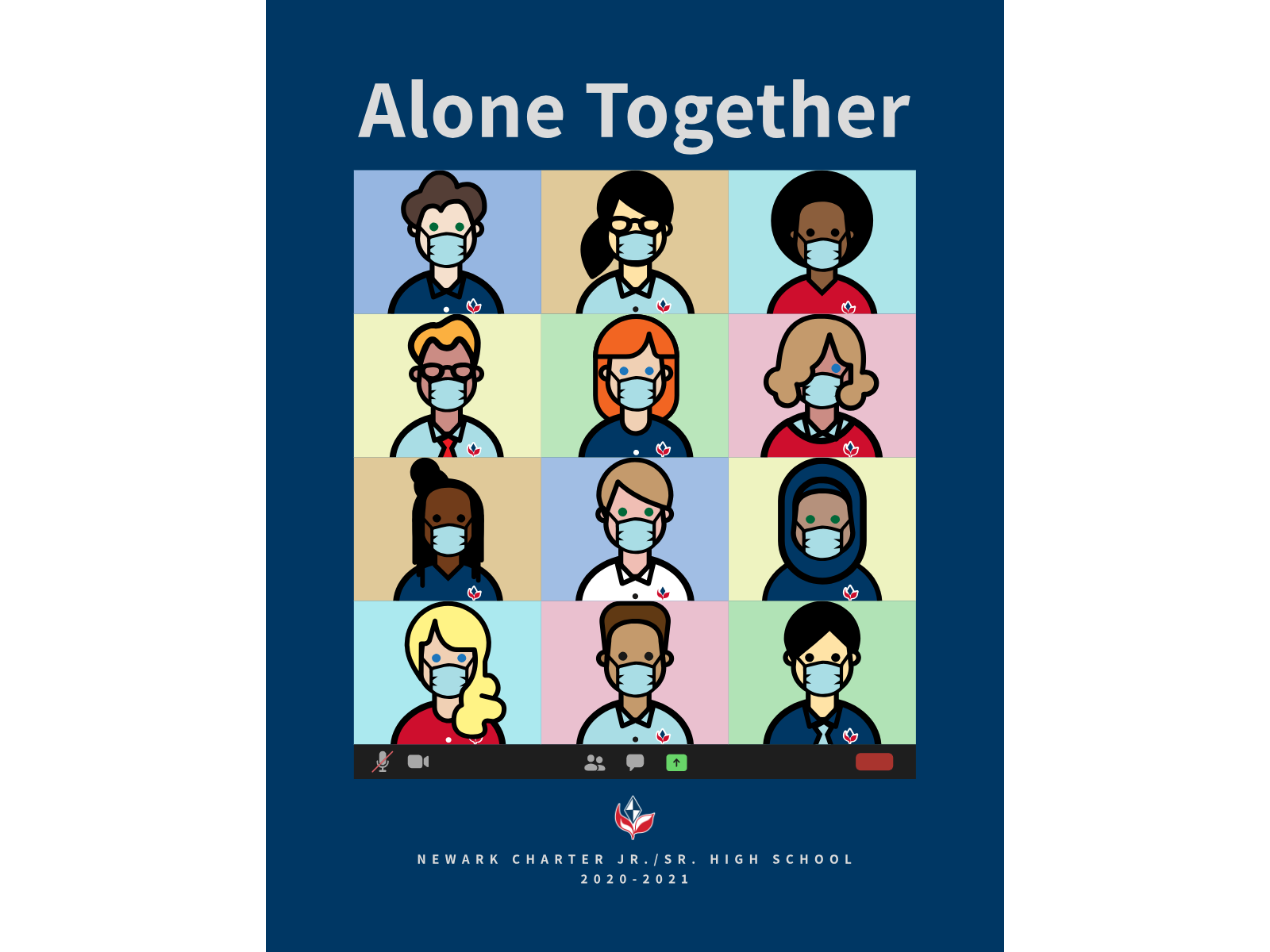
Design by Bella Riera
"Alone Together" covers the 2020-21 school year, and it doesn't pretend otherwise. A grid of illustrated students in face masks reads like a wall of video-call tiles. The cover works because it records what made that year different, which is exactly what people will want to remember in 20 years.
Photographic yearbook covers
Yearbooks are about people, so a photo cover is the most literal choice and often the most popular with students. You can feature a few faces or try to fit in as many students as possible. Either way, the challenge is keeping a busy image from turning into visual noise.
Photo covers pair especially well with magazine-style interiors, where every spread looks different. If that's the direction your team is leaning, our guide to yearbook layouts covers how to carry the cover style through the inside pages.
w to carry the cover style through the inside pages.
7. University of Oxford – Saïd Business School Yearbook Design
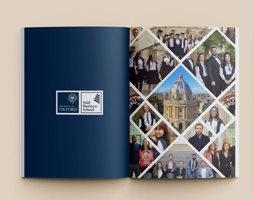
Design by Muh Rumi
University yearbooks are expected to be a little more serious, and a well-designed photo yearbook does just that. This great project shows a number of creative ways for including photos, without making the final product look cluttered or amateurish.
8. School Yearbook Design Page
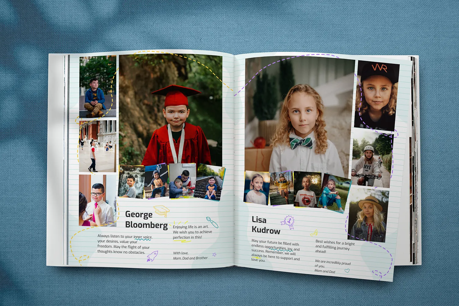
If you’re a fan of the magazine-style, this example is a great source of inspiration. The classic layout is a great choice for smaller yearbooks, as it allows you to focus lots of attention on a single subject.
Typographic yearbook covers
Typographic covers are the safest route when your team can't agree on a theme, and often the classiest. Custom lettering or one thoughtful word can say more than a collage. Go big and bold, or try a cursive or chalkboard-style script for something warmer.
Type-led covers live or die on font choice, so it's worth brushing up on typography basics before you commit to one.
9. Atlantic County Institute of Technology
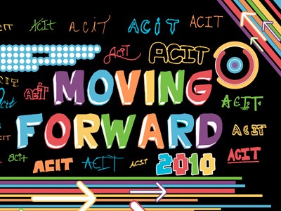
Design by Devon Hosford
For ACIT's 2010 "Moving Forward" yearbook, every graduating senior wrote the school's acronym in their own way, and those versions were embossed on the cover around the bold title. It's typography as a group project: every senior can find their own handwriting on the book.
10. University of Kentucky
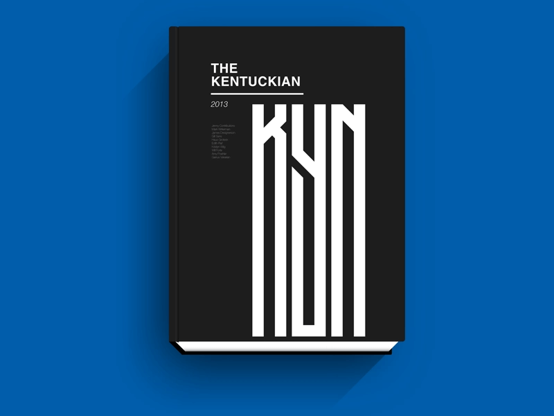
Design by Andrew Johnson
This cover for The Kentuckian, the University of Kentucky's 2013 yearbook, stacks the letters KYN into one tall, bold mark. It looks great in print, almost like an art monograph, and the designer also turned it into a flat graphic for the university's website. A clean design like this works on paper and on screen, which matters if your school also publishes a digital yearbook. It's also easy to pair with your college logo.
11. Repton School Dubai
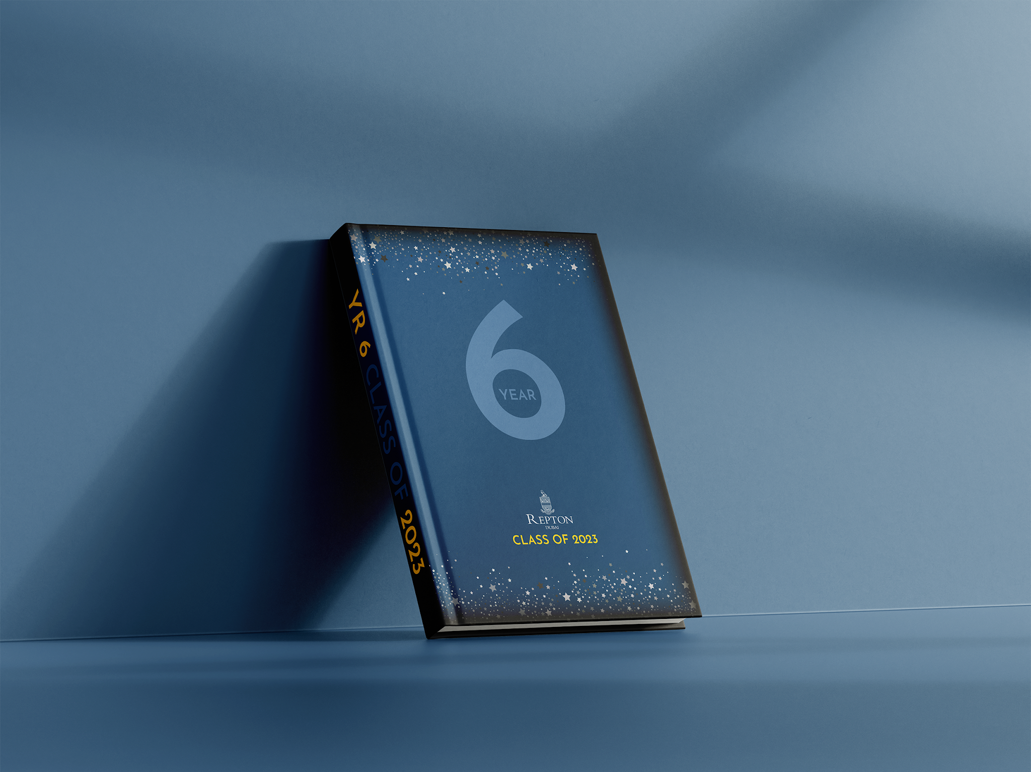
Design by Mahnoor Ali
This yearbook for Repton School Dubai's Class 6 of 2023 puts one oversized number on a dark cover and lets it do the work. For a single class or grade, that's all the identity you need. When the number is the point, make it the biggest thing on the cover.
12. Moody Bible Institute
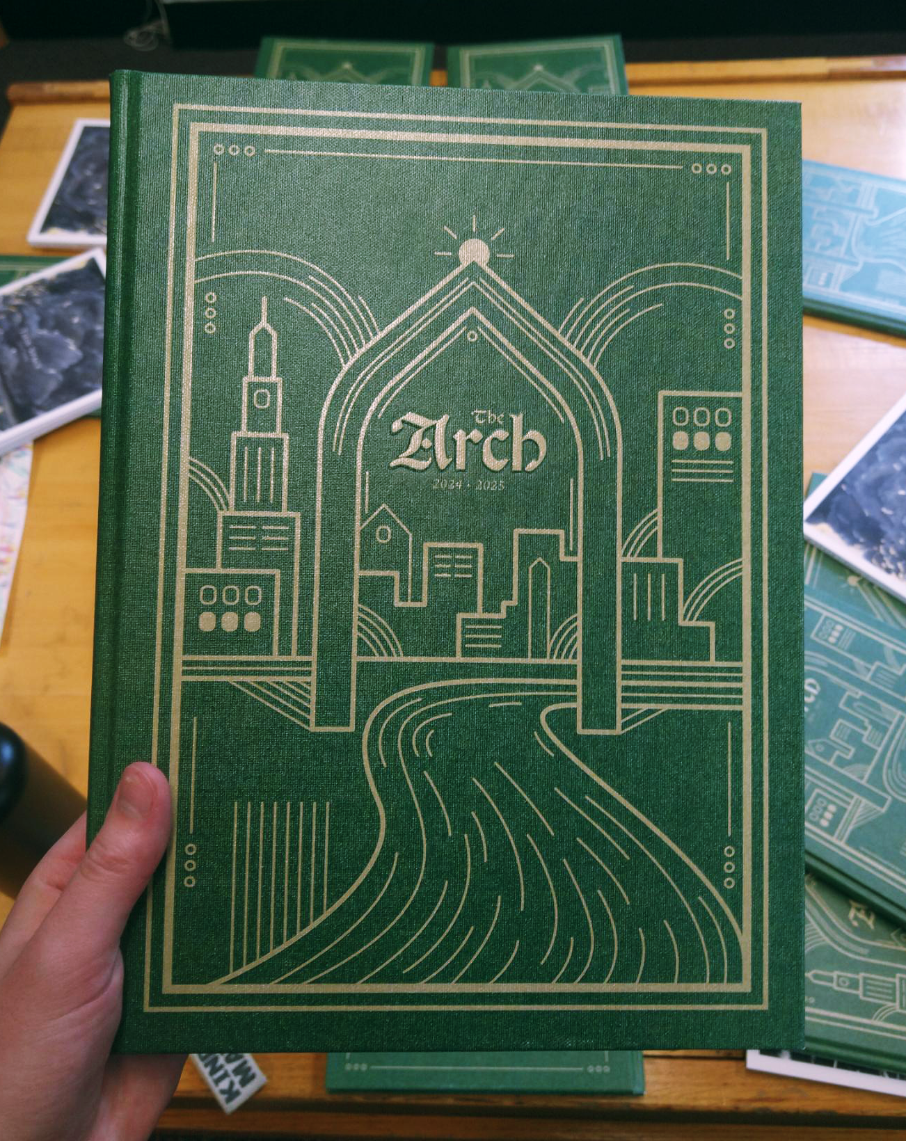
Design by Aravelle Boone
The 2025 ARCH yearbook took its theme, "Everlasting", and borrowed the look of old hymnal covers to express it, adding gold linework of Chicago architecture around the hand-lettered title. Borrowing a format your community already treasures makes a new cover feel instantly familiar.
13. Gordon College
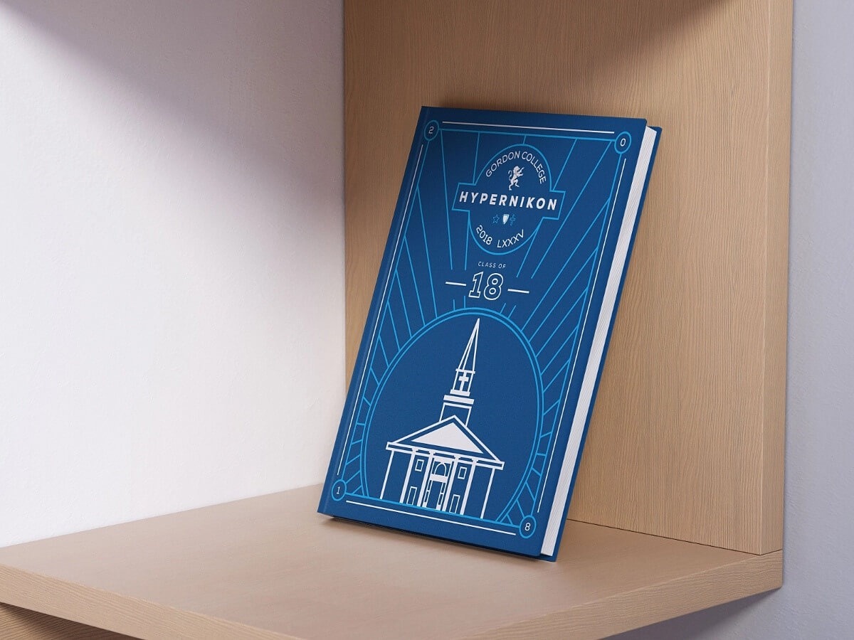
Design by Jenna Dawson Garcia
Gordon College's 2018 Hypernikon renders the A.J. Gordon chapel in clean white linework, paired with the college's new logo. Geometric linework is flexible: it can frame a title, repeat through the inside pages, or draw a recognizable building. Simplifying a campus landmark into lines makes it feel modern and familiar at once.
For more covers that do a lot with a little, see our pick of the best book covers.
Which yearbook cover style suits your school?
Elementary schools usually get the most from illustrated or photo-grid covers, middle schools from bold photography or playful themes, and high schools from typographic or artistic covers that feel grown-up. College yearbooks lean on campus landmarks and logos. Use the school level as a starting point, then let your theme decide.
- If you're designing for elementary or preschool, go illustrated or photographic. Kids want to recognize themselves or something fun. 👉 Greenwood Preschool and Fairmount School are the models.
- If you're designing for middle school, pick one bold idea students can rally around: a big photo, a playful reference, or a single theme word in large type. 👉 The Jakarta junior high cover shows how far one illustrated scene can go.
- If you're designing for high school, aim for a cover seniors won't be embarrassed by in ten years. Typographic and artistic covers age best. 👉 ACIT and Thornhill show how.
- If you're designing for a college or university, build from the campus itself: a landmark, a building, or the institution's logo.
- If your team can't agree on a theme, go typographic. ✅ It's the hardest style to get wrong.
How do you get a yearbook cover ready for print?
Confirm your book size and binding with your printer first, then design at 300 DPI with bleed past the trim line and important text kept well inside it. Hardcover designs need extra wrap around the edges, and spine width depends on page count. Most printers set the cover deadline earlier than the interior pages, so start the cover first.
This is the part most yearbook cover ideas articles skip, and it's where most cover problems actually happen. A gorgeous design with the wrong dimensions, a low-resolution photo, or text sitting too close to the edge gets sent back, or worse, printed as is.
Timing: start with the cover
Your cover usually has an earlier approval deadline than your interior pages, partly because special cover finishes like leatherette or foil need extra production time. Friesens recommends settling specs, deadlines and your theme at the start of the school year in August and September, since the theme shapes the cover, the fonts and the photography.
In practice, that means the cover should be designed in the fall, not squeezed in after the spring events. Check your printer contract for the exact date: it varies by company and by delivery date.
Yearbook cover size and bleed
Most yearbooks come in two standard sizes. Friesens offers 8.5" x 11" and 9" x 12" as its standard formats, and Walsworth lists a smaller size 7 as well. Printers often refer to these as "size 7", "size 8" and "size 9" books.
Size 7 dimensions come from Walsworth's Canva guide; custom formats from Friesens.
Bleed is the extra artwork that extends past the trim line so there are no white slivers after the book is cut. A common spec for an 8.5" x 11" book is 0.125" of bleed on every side, for a document size of 8.75" x 11.25", with important text kept at least 0.25" inside the trim. Hardcover covers need more: Studio Source notes that 0.75" of the cover edge wraps around the board and won't be visible.
⚠️ Spine width changes with page count, so don't finalize a full wraparound cover until your page count is locked.
For a broader look at trim sizes and spines across printed books, see our guide to book cover size.
Resolution: 300 DPI at final size
Yearbooks print at 300 DPI, which means a full-page photo on an 8.5" x 11" book needs to be at least 2,550 x 3,300 pixels. Studio Source's software flags images below 250 DPI at the size you've placed them. Never use screenshots or photos pulled from social media on a cover: they almost never have enough pixels. Logos should be vector files (SVG, EPS or AI) wherever possible.
Binding affects your cover layout too. On perfect-bound and hardcover books, anything placed close to the spine gets pinched, and on saddle-stitched books the staples land in the middle. Memory Book's layout guide makes the same point for photos that cross the center of a spread.
Getting help with your yearbook cover design
Most yearbook committees design the cover themselves in their printer's software or in Canva, using a yearbook cover template as a starting point. That works well when someone on the team has a good eye. When nobody does, or the volunteer designer graduated last June, outside help can save the cover.
If your school or district also needs ongoing design work (event flyers, enrollment brochures, social graphics), a design subscription like ManyPixels can cover the yearbook cover and theme graphics alongside everything else, with print-ready files and native source files you own outright. Because yearbook work is seasonal, the $10/month pause option means you aren't paying full price in the months you don't need it. 👉 Explore ManyPixels plans.
Yearbook cover FAQs
The bottom line on yearbook cover ideas
✅ The best yearbook covers commit to one idea, whether that's an illustration, a photo or a single word, and carry it from the front cover to the back. Pick the style that fits your school level, design the cover first, and lock in size, bleed and resolution with your printer before anyone opens a design tool.
{{PRINT_PORTFOLIO="/dev/components"}}
Having lived and studied in London and Berlin, I'm back in native Serbia, working remotely and writing short stories and plays in my free time. With previous experience in the nonprofit sector, I'm currently writing about the universal language of good graphic design. I make mix CDs and my playlists are almost exclusively 1960s.

Top-quality designers
A complete creative team at your fingertips: graphic and web designers, illustrators, and more.

Lightning-fast turnaround
Get start today and receive your first update on the next business day.

All-inclusive pricing
Unlimited requests and revisions. One flat monthly fee. No surprises.

Flexible & scalable model
No contract. Scale up and down as needed. Pause or cancel at anytime.
Continue reading


Explore some of our best designs
Get inspired by a curated selection of ManyPixels work. Download the portfolio to see what our team can create.