
LinkedIn banner size 2026: dimensions, safe zones and templates (updated for LinkedIn's new company page size)
TABLE OF CONTENTS

TL;DR
The LinkedIn banner size in 2026 is 1584 x 396 pixels for a personal profile and 1512 x 256 pixels for a company page. LinkedIn changed the company page size in mid-2026, so the 1128 x 191 figure many guides still print is now below LinkedIn's own minimum. Keep text out of the bottom-left corner, where your photo or logo sits.
- ✅ Personal profile banner: 1584 x 396 px (4:1), JPG or PNG, under 8MB.
- ✅ Company page cover: 1512 x 256 px, JPG or PNG, under 3MB. This is LinkedIn's new spec, checked on its help page on 8 October 2026.
- ⚠️ Safe zone: on desktop your profile photo covers roughly the first 360 px of the bottom half. A company logo covers roughly the first 290 px. We measured both on live pages.
- 🎨 Event, group and newsletter covers use different shapes: events and newsletters are 16:9, groups are 1776 x 444.
- ❌ Don't trust a template's canvas size blindly. Even Adobe Express's own FAQ still lists the old company size.
Here's the problem with most LinkedIn banner size guides right now: they were written before LinkedIn changed its company page spec. Sometime in mid-2026 LinkedIn quietly updated its Page image specifications, and the company cover is now 1512 x 256 pixels. A lot of the guides that rank for this term still say 1128 x 191.
So we did the boring part properly. We read every relevant LinkedIn help page on 8 October 2026, then measured where the profile photo and the company logo actually land on live LinkedIn pages. Every number in this guide comes from LinkedIn's current help pages or from our own measurements, not from another blog's table. Where something is a design convention rather than a LinkedIn rule, we say so.
What is the LinkedIn banner size in 2026?
The LinkedIn banner size in 2026 is 1584 x 396 pixels for personal profiles and 1512 x 256 pixels for company pages and Showcase pages. Personal banners can be up to 8MB and company covers up to 3MB, and both must be JPG or PNG. LinkedIn changed the company size in 2026; the personal size hasn't changed.
Here's every LinkedIn banner and cover size in one place, with the source for each. We checked each source on 8 October 2026.
Bottomline: if you only remember two numbers, make them 1584 x 396 for people and 1512 x 256 for companies.
Personal LinkedIn banner: 1584 x 396 and how it crops
A personal LinkedIn banner should be 1584 x 396 pixels, a 4:1 ratio, saved as a JPG or PNG under 8MB. LinkedIn's profile cover image help page calls 1584 x 396 the recommended size. Its photo upload help page confirms GIFs aren't supported.
On desktop, the banner barely gets cropped at all. When we measured a live profile on a standard laptop screen, LinkedIn showed the banner at 792 x 198 pixels, exactly half size and exactly 4:1. Nothing was trimmed.
The real problem is the profile photo. On desktop it's a circle that covers roughly x 56 to 360 and y 212 down to the bottom edge, measured in banner pixels. In plain terms, the bottom-left quarter of your banner belongs to your face, not your tagline.
Two more things LinkedIn's help page mentions that most guides skip:
- When you go live with LinkedIn Live, your banner is temporarily replaced by the live stream, and there's no opt-out.
- Some Premium plans can show a slideshow of cover images instead of a single banner.
Company page banner: why 1128 x 191 is out of date
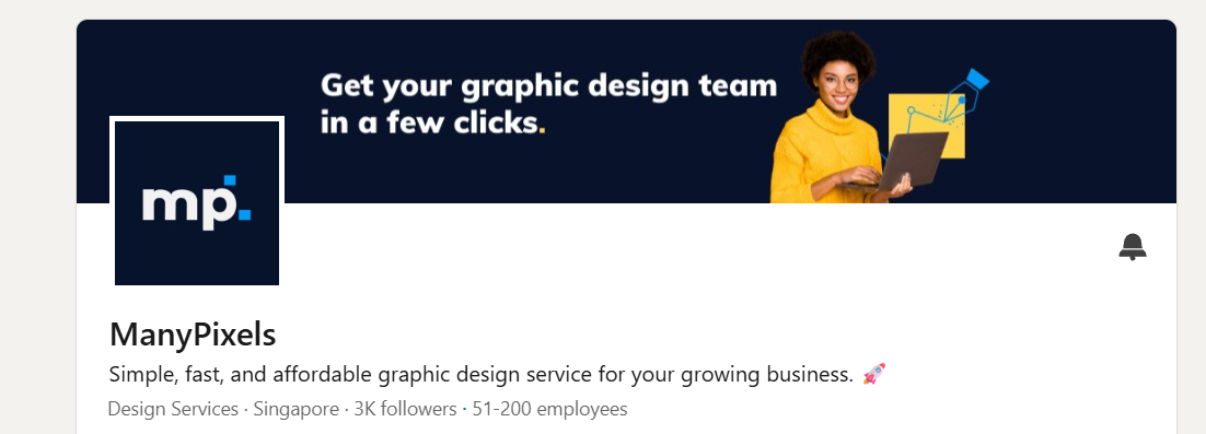
A LinkedIn company page banner should be 1512 x 256 pixels, JPG or PNG, under 3MB. LinkedIn lists 1512 x 256 as both the minimum and the recommended size, so the older 1128 x 191 figure is now too small. Showcase pages use the same 1512 x 256 cover.
We checked the Page image specifications page on 8 October 2026. It said "Last updated: 2 months ago" and listed 1512 x 256 for the Page cover image. The 1128 x 191 number still shows up in a lot of the ranking guides, and even in Adobe Express's own LinkedIn banner maker FAQ.
Here's a likely reason the old number won't die. When we inspected our own ManyPixels company page, LinkedIn was still serving the desktop cover from a file labelled 1128 x 191. That's how LinkedIn resizes the image for display, not what it asks you to upload. Upload at 1128 x 191 today and you're below LinkedIn's own minimum, so the image gets scaled up and goes soft.
On desktop our cover displayed at 804 x 134 pixels, which trims only about 2 pixels off the top and bottom. The logo square covers roughly x 45 to 286 and y 134 down to the bottom edge, in banner pixels. LinkedIn's help page adds one more warning that almost nobody repeats: keep key details away from the edges, "especially in the lower-right corner."
Where is the safe zone on a LinkedIn banner?
The safe zone on a LinkedIn banner is the area that stays visible on every screen. For a 1584 x 396 personal banner, keep text inside a box from roughly x 420 to 1424 and y 40 to 356. For a 1512 x 256 company cover, use x 340 to 1362 and y 28 to 200. Leave the bottom-left corner clear.
Be real: LinkedIn doesn't publish pixel safe zones. It only says images "might be adjusted to fit the screen." Guides that quote exact crop numbers disagree with each other because they're guessing. Here's how we built ours:
- Red zones (measured): where the profile photo or Page logo sits on desktop. We measured these on live LinkedIn pages on 8 October 2026.
- Amber edges (convention): a buffer of about 10% on each side, for screens that trim horizontally. This is a design convention, not a LinkedIn number.
- Amber lower-right (LinkedIn's warning): on company covers only, because LinkedIn's help page calls out that corner specifically.
- Green box: what's left. That's where your headline, logo and call to action go.
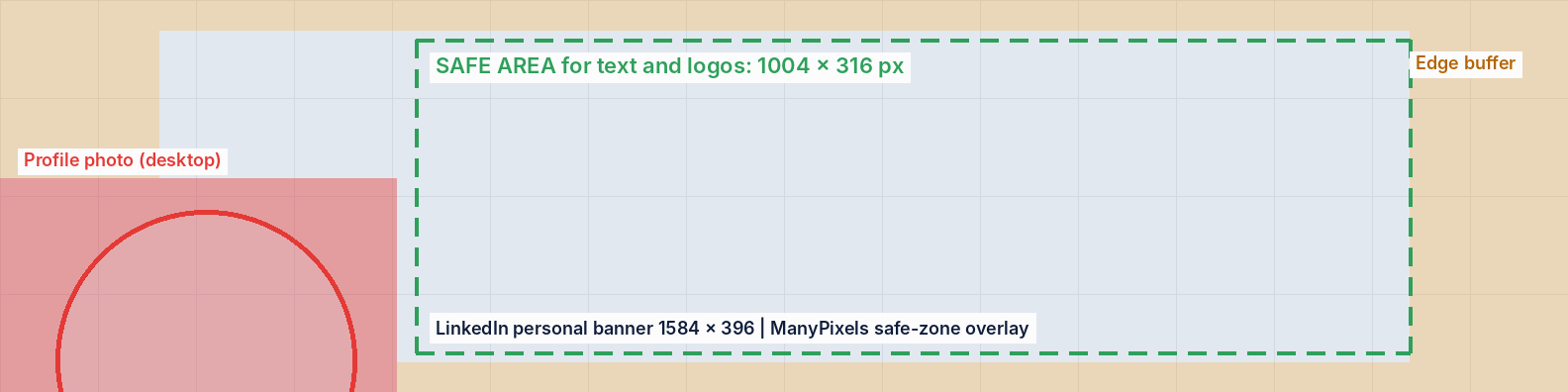
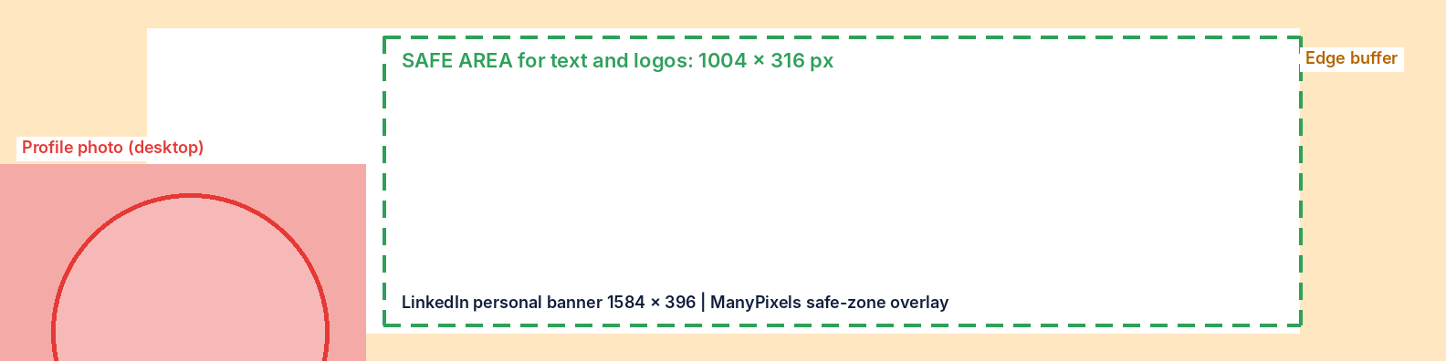
💡 Download the overlays: grab the transparent personal banner overlay and company cover overlay. Drop one on the top layer of your design in Canva, Figma or Photoshop, line it up with your canvas, and hide it before you export.
Okay, one honest caveat. We measured on desktop. LinkedIn's phone app lays the header out differently, so test on your own phone before you call it done. If your headline sits inside the green box, it will almost certainly survive.
Export settings that stop a blurry LinkedIn banner
To stop a LinkedIn banner looking blurry, export it at the exact recommended size (1584 x 396 or 1512 x 256), as a high-quality JPG in sRGB, under the file limit. LinkedIn itself recommends a high-resolution JPEG over a PNG for Page covers, and photos over logo-heavy graphics.
If a banner still looks soft, LinkedIn's own advice is counterintuitive: use a larger file, not a smaller one. Over-compressing to save kilobytes is usually what causes the fuzz. Fix the source file before you blame LinkedIn.
Event, group and newsletter covers: the ones people get wrong
LinkedIn event, group and newsletter covers don't use the banner sizes. Event covers are 16:9 (1280 x 720 recommended, 480 px wide minimum). Article and newsletter covers are 1920 x 1080, also 16:9. Group covers are 1776 x 444, a 4:1 ratio like the personal banner.
The common mistake is reusing a 1584 x 396 banner as an event cover. LinkedIn's event help page says the aspect ratio must be 16:9, so a wide strip either gets rejected or cropped to a sliver.
Newsletters have two images. The newsletter best-practices page recommends a 300 x 300 logo, plus a 1920 x 1080 cover for each edition. The article cover help page adds that covers are cropped to 16:9 and accept WEBP. GIF covers are no longer allowed.
For groups, the group cover help page gives 1776 x 444. Only the group owner can change the cover, so managers will need to ask.
Free LinkedIn banner templates (and what to check first)
The best free LinkedIn banner templates come from Canva, Adobe Express and the Figma Community. Before you design anything, check the canvas size against the current spec, because some template tools still default to the old company size.
Canva's LinkedIn banner gallery is the quickest place to start. Adobe Express is a solid alternative if you already have Adobe fonts. For full pixel control, search "LinkedIn banner" in the Figma Community.
If you want ideas rather than blank templates, we've collected 25 LinkedIn banner examples and templates by type. For the rest of your profile, the best social media design templates cover posts and carousels too.
Common LinkedIn banner mistakes
- Using 1128 x 191 for a company page. It's below LinkedIn's current 1512 x 256 minimum.
- Putting the headline bottom-left. Your photo or logo covers it on desktop.
- Ignoring the lower-right on company covers. LinkedIn's help page singles out that corner.
- Too much text. One line plus a URL or handle reads at any size. Five lines don't.
- Uploading a GIF. LinkedIn doesn't support animated banners.
- Treating the banner as decoration. It's the widest free ad slot on your profile, so use it for one clear message that fits your personal brand.
Designing covers for other platforms too? Our YouTube banner size guide and Facebook event banner size guide deal with the same cropping problems.
If you'd rather hand the whole thing off, ManyPixels designers make LinkedIn banners, post graphics and carousels on every plan, from about $699/month (check manypixels.co for current pricing). Explore ManyPixels plans.
FAQs
Bottom line
✅ Use 1584 x 396 for a personal LinkedIn banner and 1512 x 256 for a company page, and treat any guide or template still showing 1128 x 191 as out of date. Keep your message in the center-right, away from the photo or logo in the bottom-left. Then check it on your phone before you call it finished.
Got a banner that keeps cropping badly? Drop the overlay on it first. It usually shows you exactly where it's breaking.
Don't want to do it yourself? ManyPixels unlimited design subscription plans start from just $699 per month. Get all your marketing graphics under one roof, unlimited requests and revisions included.

Having lived and studied in London and Berlin, I'm back in native Serbia, working remotely and writing short stories and plays in my free time. With previous experience in the nonprofit sector, I'm currently writing about the universal language of good graphic design. I make mix CDs and my playlists are almost exclusively 1960s.

Top-quality designers
A complete creative team at your fingertips: graphic and web designers, illustrators, and more.

Lightning-fast turnaround
Get start today and receive your first update on the next business day.

All-inclusive pricing
Unlimited requests and revisions. One flat monthly fee. No surprises.

Flexible & scalable model
No contract. Scale up and down as needed. Pause or cancel at anytime.
Continue reading

.jpeg)
Explore some of our best designs
Get inspired by a curated selection of ManyPixels work. Download the portfolio to see what our team can create.








