A Beginner’s Guide to Responsive Web Design
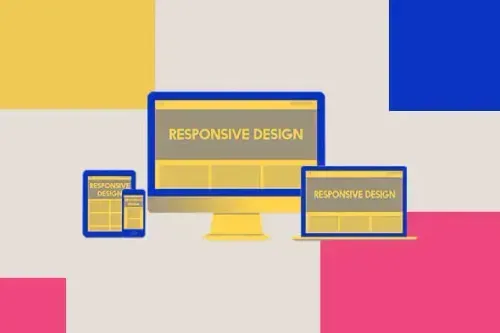
TABLE OF CONTENTS

You’ve probably heard the term responsive web design a lot. But what is responsive web design? Why is it important? How to create responsive web design - can you do it yourself, or do you need to hire a web designer? We’re here to answer your questions.
If you’re a small business owner looking to create a new website, the question “how to create responsive web design” might not be on the top of your list of priorities.
However, this is something you ought to consider as soon as you start developing your digital marketing strategy. So, let’s get right into it - what is responsive web design and why do you need it?
{{WEB_BANNER="/dev/components"}}
What is responsive web design?
Responsive web design (RWD) is an approach to web design and development created by Ethan Marcotte. Responsive web design aims to create websites that provide an optimal viewing and interaction experience across a wide range of devices and screen sizes.
With responsive design, websites are able to adapt and respond to the user's behavior and environment, whether they are accessing the site on a desktop computer, laptop, tablet, or mobile phone.

Instead of designing separate versions of a website for different devices, responsive design allows the website to dynamically adjust its layout and content based on the screen size and capabilities of the device being used.
Principles of responsive web design
So, how to create responsive web design? Here are some of the main aspects you ought to consider:
1. Fluid Grids
So how does responsive design ensure mobile-friendliness, meaning everything looks equally good in mobile as well as desktop view? The answer is fluid grids.
Traditionally, web designs were built using fixed pixel-based layouts for each type of screen. On the other hand, a fluid grid system involves dividing the web page layout into a series of columns and rows. Each element within the grid is then assigned a width and height based on the available space.
Flexible or fluid layouts, also mean that the positioning and sizing of elements are defined using relative units such as percentages or ems instead of fixed pixels. This enables the website layout to adapt based on the available screen space.
2. Media queries
Media queries allow developers to apply different styles and rules based on various device characteristics such as screen size, resolution, orientation, and even user preferences.
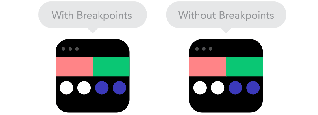
When the screen size changes, the elements within the fluid grid adjust their dimensions accordingly. The fluid grid system uses breakpoints for predefined screen widths. That way, each element can be positioned according to different breakpoints, for optimal viewing experience.
3. Images and media
The most obvious way in which responsive web design affects user experience is the presentation of images and media. Images can be scaled and optimized to ensure fast loading times and optimal visual quality.
You should use percentages rather than fixed-values in pixels for image width. With CSS frameworks you should set the maximum width property of an image to 100%, which will ensure the image doesn’t exceed the available space with smaller screens.
Another important aspect of creating responsive web images is the file size and type. If your images have a lot of details, bitmap images are a better choice (e.g. photos). If not, vector images generally scale better and often are smaller in size.
The file size depends on the type of image and website. Generally speaking, no image should exceed 500KB in size, with 1MB being the maximum.
4. Web fonts vs. system fonts
Just like images, the fonts you use on your website have to be uploaded for use. This type of font is called a web font.
Web fonts come in various file formats, such as TrueType (TTF), OpenType (OTF), and Scalable Vector Graphics (SVG). Web fonts need to be downloaded by the user's browser before they can be shown on the webpage. These fonts provide a wide range of typeface options beyond the default system.
System fonts are fonts available to common operating systems, such as Windows, macOS, iOS and Android. They offer less choice, but can increase loading speed.
So, when choosing which fonts to use to create responsive web design, consider the importance of a custom font and loading speed as the key factors.
Why is responsive web design important?
I’ve mentioned at the beginning that as soon as you consider creating a new website, you ought to consider responsive web design. Why is that?
- Over half of the world’s Internet traffic comes from mobile devices. Moreover 42% of ecommerce sales in the US came from mobile in 2022.
- Bounce rates are also dependent on responsive or mobile website design. 53% of visitors abandon websites that take longer than 3 seconds to load. Since mobile devices usually have slower processing times, responsive images can help to have the same or similar loading speed on mobile as on desktop.
- Google and other search engines also favor responsive websites. If you don’t have a responsive website, but a mobile version of your site, this creates duplicate content which Google penalizes. Backlinks also won’t work on mobile devices, if you have two separate URLs.
Finally, creating responsive web design is a way to secure yourself for the future. New types of screens are developed all the time. So, a responsive website design ensures that your pages will always appear as intended, ensuring a positive user experience.
Great examples of responsive web design
If you’re not a web designer yourself, the concept of responsive web design might not seem like much. It’s just a way to ensure websites look good on every screen type or size or browser window.
However, to illustrate just how important responsive web design is for the user experience we’ll look at a couple of examples.
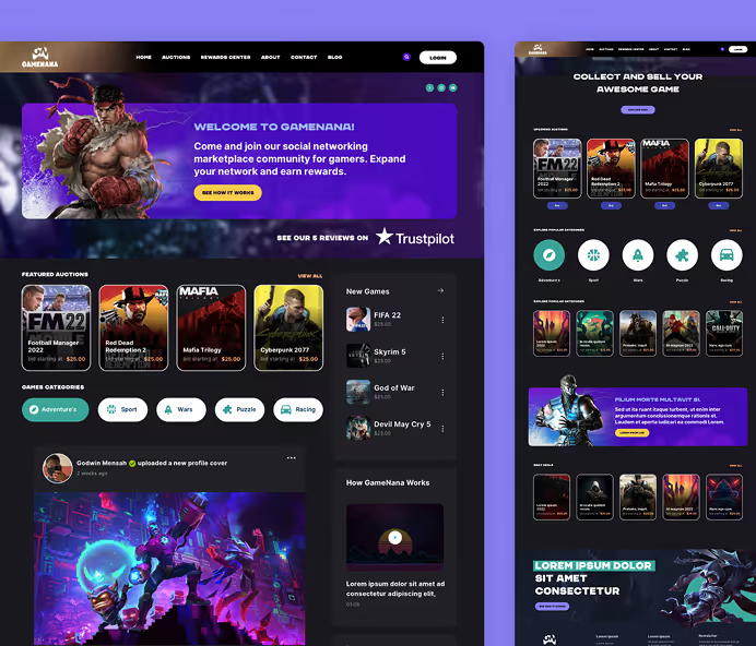
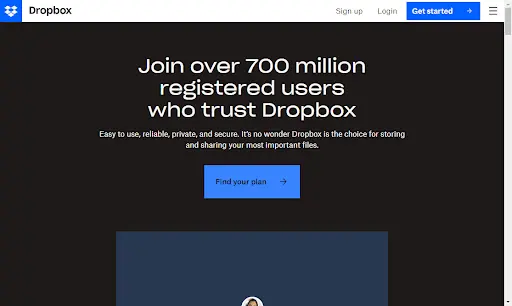
Dropbox
Dropbox has a pretty simple homepage, but you can still see the details that make this example of responsive web design effective. For example, the desktop version includes an additional CTA button for purchasing additional secured storage, which you won’t find on the mobile version.
This is important since desktops still have a higher conversion rate (although interestingly mobile devices bring more website traffic). So, in this case responsive web design helps different users achieve their goals more easily. Thrifty mobile users can sign up/log in for free, while those ready to pay for premium services can do so in one click with the desktop version.

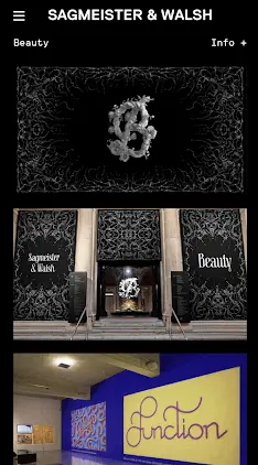
Sagmeister & Walsh - Beauty
You probably won’t find this site on many lists of the best responsive web design examples. Still, not only is it incredibly beautiful - it’s also a great example of how you can make even the most intricate design into a mobile-friendly website.
The hero section of the desktop version is a stunning 3D animation that prompts the viewer to pause and admire it before scrolling down to explore the rest of this website (it’s a creative project by a couple of the most iconic graphic designers in the world!).
The mobile version has the same animation, but it’s smaller and appears together with other sections of the website, since scrolling on mobile devices is a lot quicker.

Swiss Air
Have you ever found yourself casually looking up flight tickets, only to give up because the mobile website site too slow, or because you were unable to see crucial options or information?
This is not an issue you’ll encounter with the Swiss Air website! If you compare the mobile and desktop versions of the site, you’ll notice that all the key information and options are immediately available and accessible in both instances.


Bavet
If you’re looking for an example of a responsive site with lots of awesome animations, Bavet is a superb one.
The hero image is very successfully adapted to a smaller screen, but if you take time to look around their fun and beautifully designed website, you’ll discover lots of fun micro animations that work equally well on bigger and smaller screen sizes.
Most importantly, none of these slow down the loading speed very much, making for a pleasant user experience.

.webp)
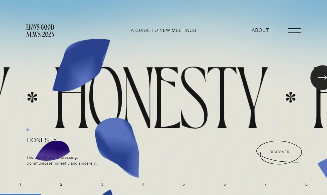
Lions Good News
It’s a bit difficult to explain why this is one of the best responsive web designs out there. Why? Because it works!
There are so many elements - different animations, fonts in different sizes, intricate illustrations, several buttons and options. And yet, everything fits just as well into a small mobile screen size as it does on a desktop.
Imagine if these petals were not scaled properly. They’d probably cover half of the screen. Or if the discover button wasn’t placed right. It would be incredibly hard to use this site.

Conclusion
We hope this answers your questions about responsive web design and its importance. Nevertheless, remember that responsive websites don’t mean good websites.
Creating a responsive web page is a way to ensure users have the same website experience, no matter which search engine, or device they use. However, the thing that creates a positive user experience in the first place is web design.
There’s a lot to learn about website design, even if you decide to use premade templates or the help of a website builder. On the other hand, if you want to leave it to the pros, be prepared to pay several thousand dollars with web design companies or freelance web designers and developers.
Luckily, there’s a budget-friendly solution to get stunning websites! Our unlimited web design service starts at just $599 per month, and allows you to make as many design requests and revisions at a flat monthly fee.
Once you have your web design in the bag, send it off to an experienced developer who can make sure your website is responsive as well!

Having lived and studied in London and Berlin, I'm back in native Serbia, working remotely and writing short stories and plays in my free time. With previous experience in the nonprofit sector, I'm currently writing about the universal language of good graphic design. I make mix CDs and my playlists are almost exclusively 1960s.

Top-quality designers
A complete creative team at your fingertips: graphic and web designers, illustrators, and more.

Lightning-fast turnaround
Get start today and receive your first update on the next business day.

All-inclusive pricing
Unlimited requests and revisions. One flat monthly fee. No surprises.

Flexible & scalable model
No contract. Scale up and down as needed. Pause or cancel at anytime.
Continue reading
.jpg)
.jpg)
.jpg)
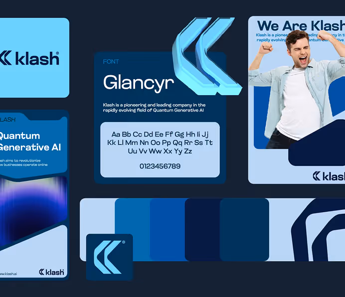
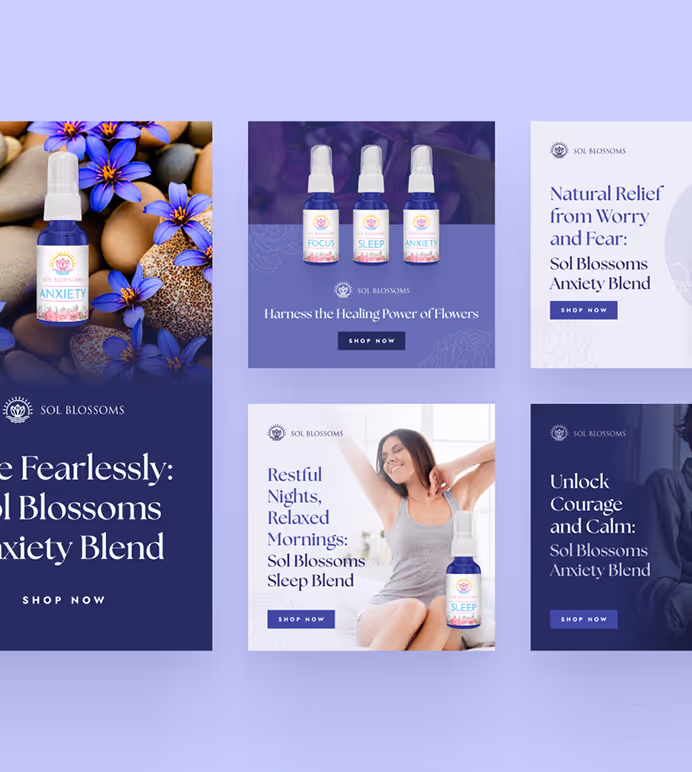
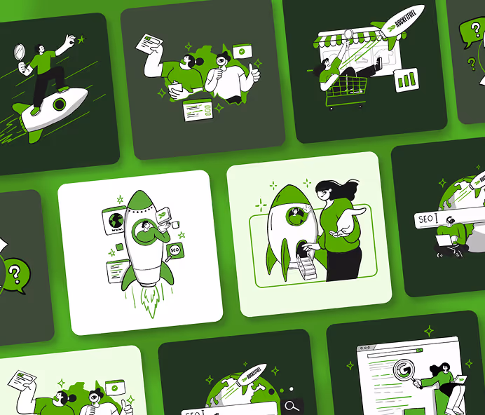
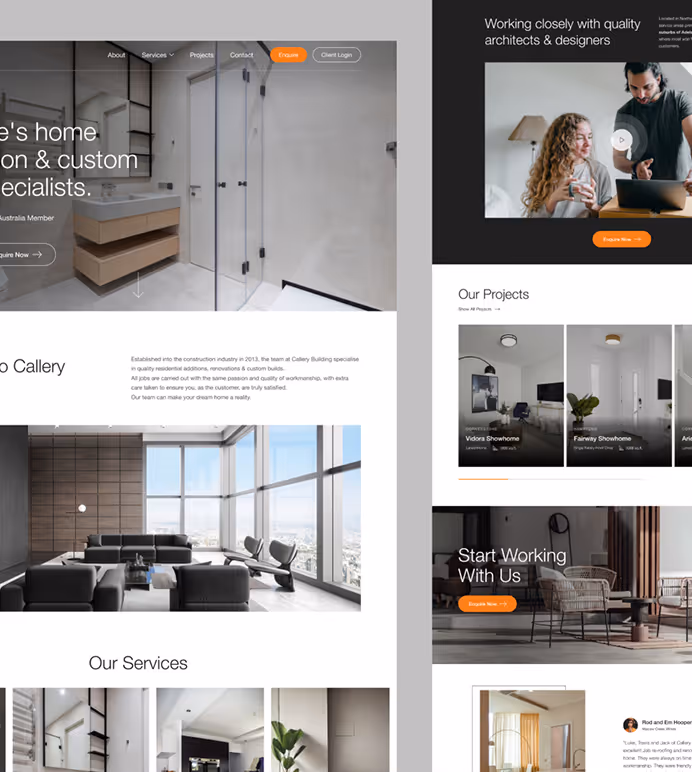
Explore some of our best designs
Get inspired by a curated selection of ManyPixels work. Download the portfolio to see what our team can create.