12 Golden Web Design Rules
TABLE OF CONTENTS

There’s no way you can create a powerful online presence without a good website. But how to create a website that both search engines and website visitors will love? Here are 12 web design rules you should follow!
Are you just dipping your toes into the world of web design? Or a designer looking for a refresher on what makes a good website?
Here are a few golden web design rules you should never break.
{{WEB_BANNER="/dev/components"}}
1. Keep it simple
We're bombarded with visuals and ads every day, which has significantly shortened our attention span. So you should use as few design elements as possible, and ensure each element serves a purpose.
Keeping options to a minimum will increase the odds of your audience revisiting and staying on your website.
This principle is also called Hick’s Law. It’s the simple idea that the more choices you present someone with, the longer it will take them to reach a decision.

Above is an example of web design kept simple. ETQ. is an Amsterdam-based shoe brand embracing all things minimalistic, valuing quality over quantity.
With minimal options in their menu bar, it’s instantly clear where you should click and why.
2. Select the right website typography
Although 94% of first impressions of a website are design-related, it’s website text that converts visitors into customers.
Choosing the right typography in web design is almost as important as the content itself. If the text is difficult to read people won’t give you their attention.
Here are some of the most important typography rules of web design to follow:
- Choose the right font size. It goes without saying that the body text font should be big enough to allow easy reading. But you should also pay attention to using the right font sizes for heading and subheadings, to ensure the page layout is sensible and aesthetically pleasing.
- Split the body text into manageable chunks. Whether it’s your home page or a blog post, you should limit the paragraph and line length to ensure the text is easy to read and skim.
- Pick website typography that suits all screen sizes. An intricate script font might look awesome on a large screen, but there’s a good chance it will be completely illegible on mobile devices.
- Consider using system fonts to increase page speed. Web fonts need to be downloaded by the user's browser before they can be displayed to the user. On the other hand, system fonts are fonts available to common operating systems (e.g. Times New Roman, Arial, Helvetica, etc.). So, if you’re worried about website speed, use system fonts instead of a custom one.
3. Apply visual hierarchy
Each visitor comes to your page with a purpose. While one visitor is looking for your location, another wants to get in on your sale. A visual hierarchy will help visitors navigate your page, guiding them through the design elements.
Visual hierarchy is the order in which a visitor processes information on a web page. You can apply visual hierarchy in numerous ways, with the most common ones being;
- Typography - Perhaps the most straightforward way to apply visual hierarchy is by making some text bigger than others and using spacing in between. Or by making some words bold, italic, or underlined.
- Color - Choose website colors based on the 60-30-10 web design rule. This means that your primary color (usually a neutral like black or white) takes up 60% of the design. A secondary color (e.g. text color) takes up 30%, while the 10% is reserved for contrast color, typically used for CTA buttons and other elements you want to draw attention.
- Repetition - Repeating a particular style suggests that content is similar or related. Think about a blog page showing all entries similarly. Each entry’s design contains a banner, a title, and a snippet of text, ensuring visitors understand these are all blog entries.
- Proximity - When placing certain elements in a group or in close proximity, most people will quickly establish them as related. This is also known as the gestalt law of proximity.
- White space - The opposite also rings true. Rather than placing elements in close proximity, adding white space will visualize that the elements differ from one another. White space is a crucial element in web design and a valuable tool in the toolbox of web designers.
- Texture and style - If you want a particular message to stand out, adding texture or a slightly different style will do the trick. This is called the Von Restorff Effect, stating that humans take note of unique things much quicker.
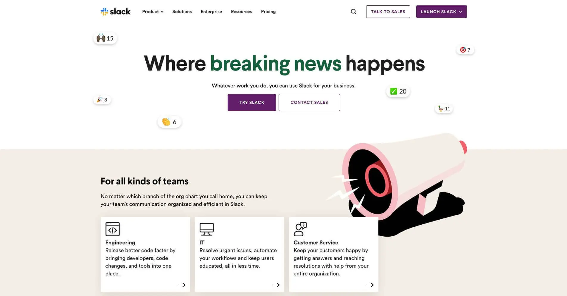
Slack’s website is a prime example of a visual hierarchy done right.
Their web designers opted for various headings to divide their content in order of importance. Slack’s call-to-action buttons have a different color, and repetition and proximity are used to explain who their service is for. White space surrounds their central message, and lastly, the text block below the main message has a slightly different style with an illustration.
4. Focus attention above fold
This is one of the most important homepage design principles. Keeping information above the fold means that all the most important elements are visible to the users without the need to scroll.
The area above the fold gets the most attention and readership. The parts available after clicking on an element are described as “after the jump.”
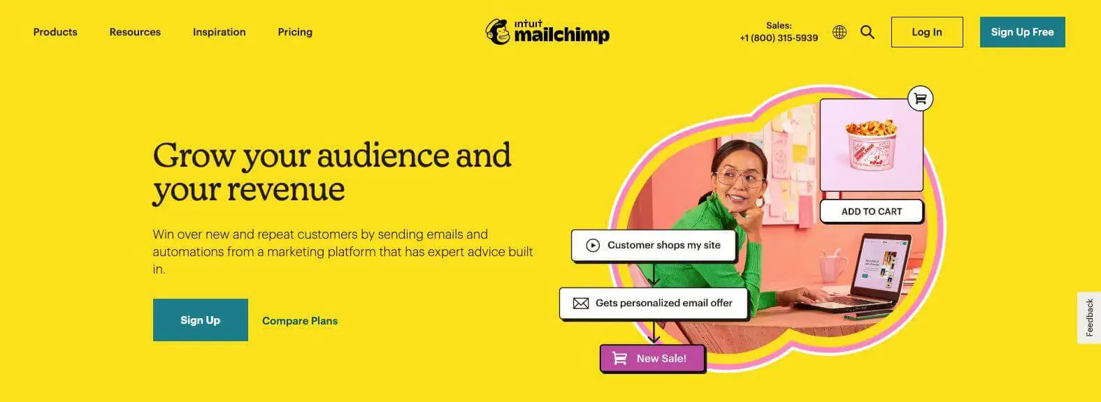
Let’s look at this MailChimp page, where you can find multiple web design rules applied. They use a high-quality graphic, legible typography and the 60:30:10 website design principle is applied for the color scheme. It's instantly clear what MailChimp is all about and where you can sign up!
5. Organize content in chunks
It’s well known that people’s attention span online is incredibly low. So, if you hope to keep users' attention long enough you’ll need to organize information into bitesize pieces.
Using boxed texts and bullet points will help make content more digestible. Some basic typography rules of web design include choosing a legible, preferably sans serif and a limited number of fonts. If you want diversity, combining different variations and sizes of the same font is a good idea.
However, grouping is also important for other elements on the page, e.g. products in your online store, images in a gallery, or testimonial quotes and pictures. Make sure that everything that’s supposed to be experienced together is placed in proximity.
6. Ensure fast loading
Nothing drives visitors away faster than a slow loading page. Moreover, 70% of consumers say page speed impacts purchase decisions.
How can you make sure your pages load quickly? Here are a few web design best practices to follow.
- Optimize images (compress files, use modern formats like WebP, set correct dimensions).
- Use a Content Delivery Network (CDN) to serve content from servers closer to users.
- Minimize HTTP requests by reducing scripts, stylesheets, and plugins.
- Enable browser caching so returning visitors don’t reload everything.
Use lazy loading for images, videos, and iframes so they load only when needed. - Minify CSS, JavaScript, and HTML to reduce file sizes.
- Implement efficient hosting with enough bandwidth and server resources.
- Enable GZIP or Brotli compression to shrink text-based resources.
- Prioritize above-the-fold content (load essential elements first).
- Regularly monitor speed with tools like Google PageSpeed Insights, GTmetrix, or Lighthouse.
7. Observe the rule of thirds
The rule of thirds in website design is borrowed from visual art and photography. It’s a layout principle that suggests dividing a page into a 3×3 grid (two horizontal and two vertical lines).
Important elements (like headlines, CTAs, or hero images) should be placed along these lines or at their intersections.
This creates visual balance, draws attention naturally, and makes the design feel more structured and aesthetically pleasing.
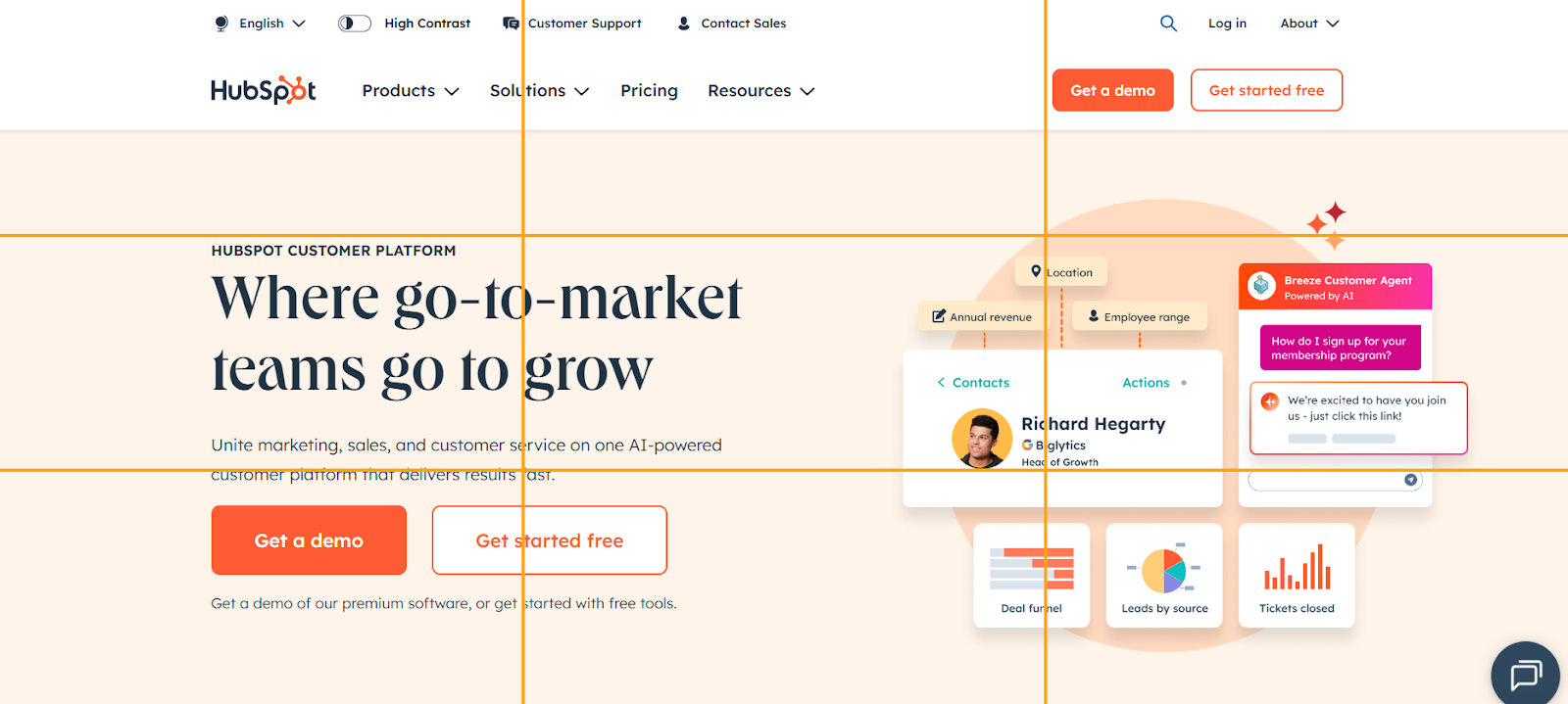
Here’s how Hubspot makes this principle work. The headline sits near the upper-left intersection, drawing immediate attention, while the two main CTAs align with the lower-left intersection, right where users look after reading.
On the right side, the hero illustration and UI mockups occupy the right-hand two-thirds, counterbalancing the text and keeping the layout open and engaging. This structure follows the natural visual flow—top-left to bottom-right—ensuring the message, visuals, and calls-to-action all stand out without clutter.
8. Apply the ‘F pattern’
Another good rule of good website design is to create an F pattern on your pages (especially landing pages).
The F-pattern in web design is a layout principle that describes how people typically scan content on a webpage. Eye-tracking studies (especially from Nielsen Norman Group) show that users don’t read word-for-word—they scan in an F-shaped pattern:
- First horizontal movement – Users start at the top left, scanning across the top line of the content (like a headline or navigation bar).
- Second horizontal movement – They move down a little and read across again, but usually for a shorter distance (like a subheading or first line of text).
- Vertical movement – Then, users scan straight down the left side, glancing at the first words of each new line or section to see if it’s worth reading.
This is a very common layout with SaaS websites, and we also use it on our own homepage. Each section (heading, subheading, CTA button) is relatively shorter, which creates a natural progression for the viewer.
9. Limit the options
We all love to have more options when ordering in a restaurant or buying in a store. But when it comes to rules of good website design, this isn’t the case.
The principle of “decision fatigue” or Hick’s law explains that with every additional choice a decision takes longer to reach. And since people generally don’t spend loads of time on a single website (just up to 3 minutes on average), time is really of the essence if you want to boost conversion rates.
Limiting choices, especially in your home or pricing pages will help users to reach decisions faster and move them through your sales funnel.
10. Be consistent
Just as it’s crucial for branding, one of the major rules of good web design is consistency. However, in web design this doesn’t just help to create a lasting brand image. Consistency is also a critical factor in creating a good user experience.
There are three major elements when it comes to consistency in web designing:
- Visual consistency - All of your design elements should have some form of consistency throughout your web design.
- Functional consistency - Makes things predictable for the user. For example, you should place menu bars in the same spot on each page.
- Internal consistency - The combination of both visual and functional consistency is called internal consistency. This has to do with uploading content to your website and adding on to your existing pages. The additions should align with the existing design's visual and functional consistency.
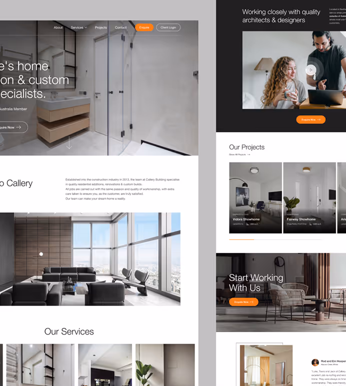
Here are two parts of the ManyPixels website. Although the pages serve different purposes, you can clearly tell the web designers applied consistency throughout the design. The menu is in the same spot, the color usage is similar, and the buttons remain in the same place.
11. Go for responsive design
Your visitors see your design on a variety of devices. In addition to devices, they use different browsers and operating systems.
Fortunately for website users, there is such a thing as responsive design. This means the web design adapts to the type of device and browser you view the page from. Try it for yourself; open a website on your desktop and drag the corners in and out to alter the size of your window. Chances are, the design will change accordingly.
Of course, the most important aspect of responsive design is that it makes websites mobile-friendly. And since 62% of the world’s internet traffic comes from mobile, this is definitely a website design rule you don’t want to ignore!
12. Put your user first
This is one of the most important rules of good web design and, incidentally, the starting point for creating a good user experience design.
A study by Amazon Web Services indicates that 88% of visitors are less likely to revisit a website after a poor experience. So you better make sure the ux design is top-notch and catered to user expectations and their needs.
Here are a few basic rules of user-friendly web design:
- Create simple navigation: Aside from using as few options as possible, utilize visual cues (e.g. icons) to help users navigate through the site quickly and easily.
- Prevent errors: Errors will happen, so you should ensure users are always aware of the issues, and how they can fix them (e.g. a 404 page, and the “return home” button).
- Give feedback: Each action a user takes should be followed by feedback. It can be a simple loading bar, or a message like “Are you sure you want to close this window without saving?” Common user behavior, such as errors, or closing windows should guide the way you create feedback.
- Make actions reversible: Another way to avoid errors are reversible actions. A back or undo buttons have become an indispensable part of digital user experience, so this is the bare minimum you should include.
Final thoughts
Now that you know about the most important rules of good web design, you might be tempted to try and create your own website using a popular website building software, or even an existing website template.
Well, don’t forget that either way, the web design process is going to take a lot of time and effort. More importantly, you might end up with a website that’s not SEO-friendly, or doesn’t fit your brand identity. So, you’ll end up hiring a website designer, and spend more time and money in the long run.
How about a simpler alternative? Discover our flat-rate website design services starting at just $599 a month! Get unlimited requests and revisions for your new website, social media graphics, landing pages and everything else in between!

Having lived and studied in London and Berlin, I'm back in native Serbia, working remotely and writing short stories and plays in my free time. With previous experience in the nonprofit sector, I'm currently writing about the universal language of good graphic design. I make mix CDs and my playlists are almost exclusively 1960s.

Top-quality designers
A complete creative team at your fingertips: graphic and web designers, illustrators, and more.

Lightning-fast turnaround
Get start today and receive your first update on the next business day.

All-inclusive pricing
Unlimited requests and revisions. One flat monthly fee. No surprises.

Flexible & scalable model
No contract. Scale up and down as needed. Pause or cancel at anytime.
Continue reading
.jpg)
.jpg)
.jpg)
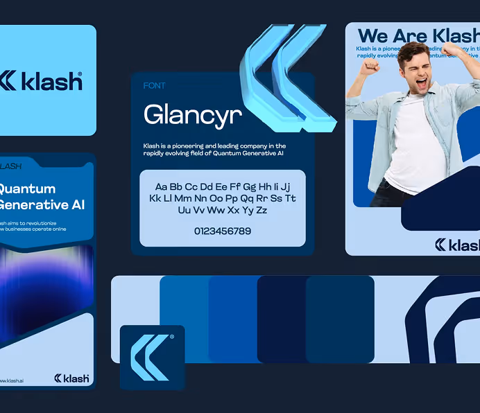
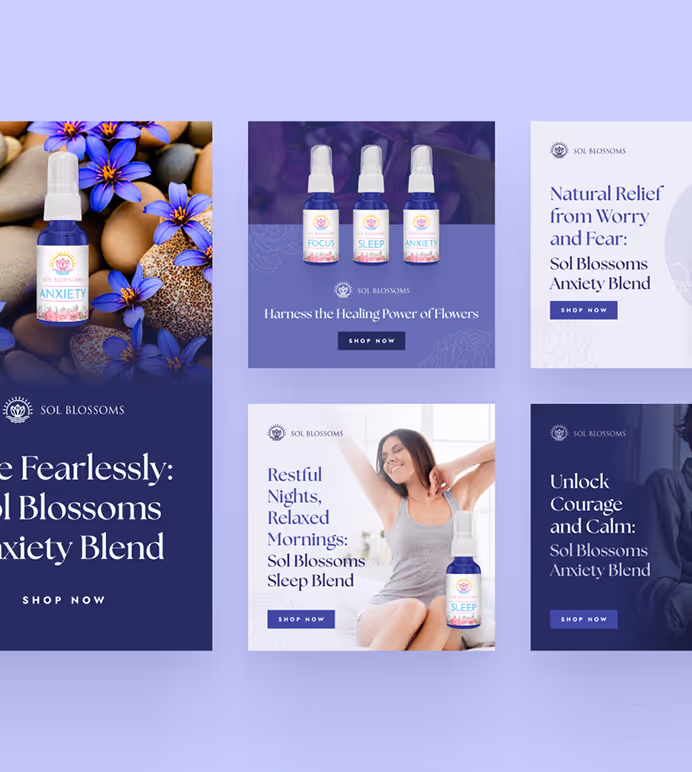
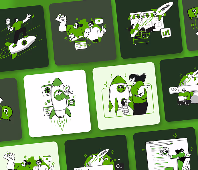
Explore some of our best designs
Get inspired by a curated selection of ManyPixels work. Download the portfolio to see what our team can create.