

Famous Luxury Brand Logos and Why They Work
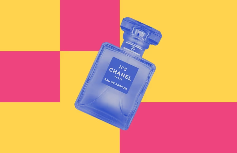
TABLE OF CONTENTS


You definitely recognize these famous logo designs from the biggest luxury brands in the world. But do you know what makes them so great and timeless?
Big fashion and beauty brands have some world-famous logos, that often reflect luxury, style and exclusivity. There are many different ways to achieve this type of look, from choosing a unique color palette, a particularly attractive symbol or even the right typography.
Today, we’re looking at logo designs from some famous brands and looking at what makes these examples so great.
{{BRAND_BANNER="/dev/components"}}
Timeless fashion logotypes
When we think of big fashion brands today, the first few that come to mind are those that have made exceptional use of typography. However, this isn’t something that came naturally. Back in the days before graphic design became relevant, luxury was associated with abundance and even excessiveness, and a simple wordmark or monogram wasn’t exactly seen as the best way to represent luxury and wealth.
But thanks to these major players from the fashion industry, we know that in order to show impeccable taste and style, sometimes all you need is your company name and a killer logo font.
1. Louis Vuitton
If a measure of success is how much your logo has been plagiarised, then Louis Vuitton probably takes the number one spot. This is one of the oldest fashion logos, created back in 1896 and created by Louis' son, Georges Vuitton. For that reason, this logo inspired many newer similar designs.
Its uniqueness lies in an innovative approach to the simple monogram: instead of placing the letters in a row (horizontal or vertical), they are interlinked. Another quirky thing about this logo design is that only one letter of the monogram is italicized, while the other isn’t. Consistency and balance are principles of good design, but sometimes great designers know how to make a logo most memorable, yet attractive, by bending these rules a bit.

2. Gucci
If you have a strong sounding name like Guccio Gucci, it only makes sense that you would want to somehow include this in your logo design. It’s very likely that this famous logo relied heavily on the famous Chanel logo, which used the alliteration in Coco Chanel’s name as its starting point.
Whether or not it’s the most original idea, the famous Gucci logo works. The simple idea of a monogram, in this case, was transformed by creating something that looks like an interesting graphic element. Moreover, a perfect sense of balance between the round letters in the wordmark portion and the stylized monogram makes this example another instance of graphic design genius.

3. Chanel
The main difference between between Guccio Gucci’s and Coco Chanel’s initials is that the latter, incidentally, has a much simpler letter in her name. Incidentally, this means that the Chanel one looks a tad simpler, which in fact fits perfectly with the famous brand image.
Throughout the years the haute couture brand became a symbol of classic, simple elegance, and this minimalist logo continues to represent the brand well. Two crescents of the letters C, and a geometric sans serif font (unlike the serif letters with different widths used by Gucci) exude an effortless sense of style, associated with the brand founder herself. Of course, a logo like this one is easily incorporated in anything from business cards to custom accessories.

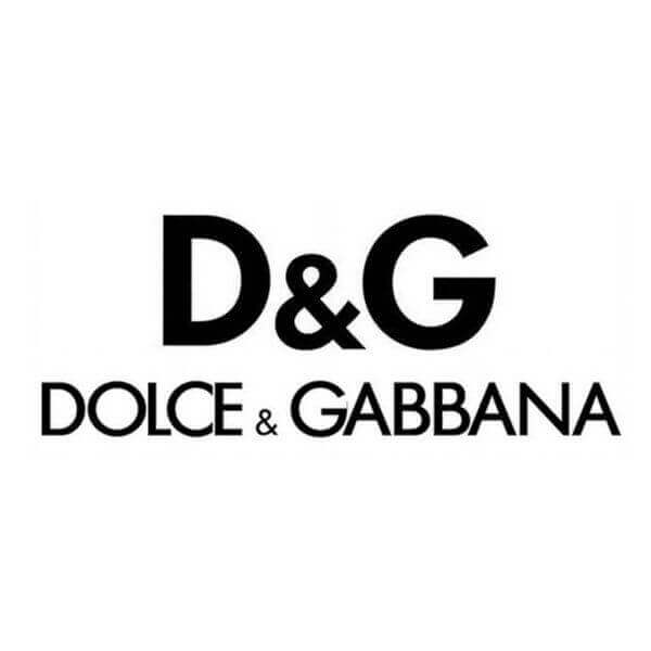
4. Dolce & Gabbana
A more contemporary logo that seems to have followed suit is Dolce & Gabbana. With so many people trying to counterfeit high-end brand logos these days, going with something simplistic is pretty clever (or at least sticking to the same simple, logo design). I suppose the reasoning is something along the lines of, “If it’s the real deal, you’ll know it, no matter what the logo on the label says”.
This famous logotype is another reminder of Antoine de Saint-Exupéry’s famous quote that “Perfection is achieved when there is nothing left to take away.” Even though the company name includes two famous designers’ last names, it’s as simple as it can be.
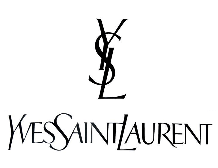
5. Yves Saint Laurent
The previous logotypes demonstrated the power of crisp, geometric lettering. But graphic designers know that there is definitely more than one way to represent a sense of effortless style.
The Yves Saint Laurent logo is one of the best examples of this, with its rule-bending use of typography. The custom lettering is a mix between serifs and sans serifs, italicized and regular lines and curves. It’s not supposed to work, but the three letters of the vertical monogram have a unique flow and fit perfectly together. The wordmark also has a unique look with letters merged together, supporting the overall sense of flow.
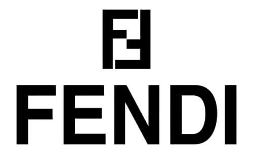
6. Fendi
You might think that this example looks similar to several brands' logos on the list, but it’s actually got a great high fashion industry story behind it. Fendi’s logo was designed by Karl Lagerfeld in 1965 when he joined the Italian fashion house. The designer wanted to highlight the brand’s innovative use of fur, so he sketched the logo with two Fs that stand for “fun fur”.
Thanks to its geometric shape, the logo lends itself well to custom patterns used in designs. Initially, it was used on lining for travel trunks and was first rendered in classic tobacco and black.
7. Prada
This next example on the wordmark portion of this list is a great reminder of the timeless saying that less indeed is more. The iconic Prada logo featured a simple emblem, with a knotted rope outline including the Italian coat of arms.
The clever and elegant logo design (evoking a sense of tradition and luxury), brought the fashion house immense brand recognition, however, the thing that always really mattered was this strong-sounding brand name. The new logo is the stripped-down version of the old design, with the company name written in the famous custom Prada typeface.

8. Burberry
Many of these brands logos have originated a long time ago, and more or less kept their look intact to this day (Prada being a good example there). But Burberry is a brand that had an almost shocking logo redesign in 2018, getting rid of the old equestrian knight and serif typeface, for a crisp, modern sans serif wordmark.
Although initially, the redesign had some clientele doubtful and disappointed, it’s an exciting refresh of the brand image. The new logo was created to appeal to a millennial audience, for the age where we are increasingly trying to look past the fashion label and give important issues like ethical production, environmental impact and transparency a platform. This is a new logo for a famous fashion brand that is prepared to stay relevant.

Luxury brand logos with unique images
An example of creative logo design often quoted from a different industry is the Starbucks mermaid. By doing something totally different than usual coffee shop branding, the brand’s unique mermaid helped create immense brand recognition and a logo mark that people love.
Here are some high-end examples that used images and a more creative approach to logo design.
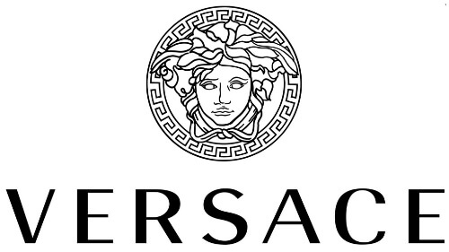
9. Versace
Gianni Versace’s fashion company is similar to the Starbucks example in the fashion industry. You might think that graceful animals like horses, deers, etc. would make appropriate symbols for a fashion brand, but Medusa?
Well, when you think about it, the idea is cool, original and powerful. Medusa is a mythical creature said to be able to turn people into stone; and since she also had the appearance of a beautiful woman, it was always hard to look away. In a later interpretation of the myth, Medusa was also able to make men fall in love with her forever.
By choosing this unique symbol, the logo perfectly encapsulates the brand promise: once you catch a glimpse of their gorgeous designs, there’s no going back.
11. Coach
The first of several examples on this list that uses equestrian symbols, Coach is a brand that certainly suits this imagery. Not only because of the company name, but also because unlike many of the examples on this list it’s not an Italian or French brand, but rather originated in New York in 1941. So it didn’t make much sense to rely on, say Roman mythology or the ostentatious aesthetic of French baroque.
The brand logo shows elegance and luxury, with a more dynamic look (the coach is on the move), but also serves to represent key values such as teamwork (the horses must work together to pull the carriage), vision and leadership (the coachman).

11. Ralph Lauren
Another American name on the list, with a logo so remarkable it became synonymous with the brand’s staple design: polo shirts. And again, the connection between the symbol of a polo player and the fashion brand is exceptional.
Just like the sport polo, Ralph Lauren designs are often casual and sporty but meant for a high-end clientele. There’s a perfect balance between the dynamic graphic element and the classy serif typeface.

Colorful luxury brand logos
Most of the logos that we have seen so far come are monotone. And it makes sense since black and white color palettes are a good way to represent style and elegance. However, that doesn’t mean that this is the only option. Here are some luxury brand logos that made excellent use of color.
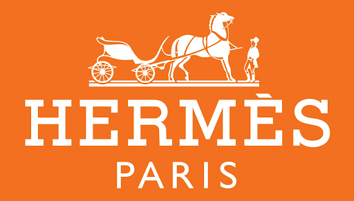
12. Hermes
Yet another equestrian logo (and brace yourselves for a few more). But what’s really exceptional about this luxury brand is its signature orange color. In logo design this color is associated with innovation, communication and optimism - none of which are traditionally immediately associated with high end fashion labels.
The logo design is a nod to the brand’s history: it started out as a luxury manufacturer of horse harnesses and bridles for the carriages of the upper classes. Together with the perfectly combined serif and sans serif lettering, the design captures a sense of opulence, which is even more striking paired with the unique, orange color. Interestingly, this fashion house’s logo design is kind of the product of fate: the staple orange was introduced after World War II, when Hermès had to drop their original cream-colored boxes for orange ones, due to supply shortages.
13. Rolex
You would think that the two colors of money (gold and green) would make for a pretty tacky logo design, but this luxury logo is here to convince you otherwise.
With a relatively simple design and toned down versions of the two colors (Metallic Sunburst and Cadmium Green), the Swiss watchmakers’ logo is still incredibly classy, whilst subtly signaling that this is an accessory not everyone can (afford) to have.

14. Ferrari
The final example on our list is a logo that definitely doesn’t follow the rules of luxury brand logo design, and yet, it’s one of the most memorable brand logos on the planet.
This logo has a rich personal history related to the company founder, Enzo Ferrari. The horse was suggested to him by Count Enrico Baracca and Countess Paolina Baracca, parents of an Italian fighter pilot killed in WWII. Ferrari decided to put the prancing horse on his cars and paint it black as a sign of mourning. The yellow background was a nod to his native city, Modena.
Over the years, the company logo was adapted slightly (the horse got less of a furious and a more joyful expression), and the traditional emblem was replaced by a simpler rectangular form. This was perhaps a necessary change in modern times, especially given the founder’s personal history, closely related to fascism. But whatever the backstory is, this is a striking example of the use of color and good graphic design. The dynamic prancing horse and the Italian flag give the logo a sense of tradition and opulence, while the vibrant color combinations suggest power and excitement.


Having lived and studied in London and Berlin, I'm back in native Serbia, working remotely and writing short stories and plays in my free time. With previous experience in the nonprofit sector, I'm currently writing about the universal language of good graphic design. I make mix CDs and my playlists are almost exclusively 1960s.

Top-quality designers
A complete creative team at your fingertips: graphic and web designers, illustrators, and more.

Lightning-fast turnaround
Get start today and receive your first update on the next business day.

All-inclusive pricing
Unlimited requests and revisions. One flat monthly fee. No surprises.

Flexible & scalable model
No contract. Scale up and down as needed. Pause or cancel at anytime.
Continue reading

Explore some of our best designs
Get inspired by a curated selection of ManyPixels work. Download the portfolio to see what our team can create.


