
12 Essential graphic design styles (+ how to use them)
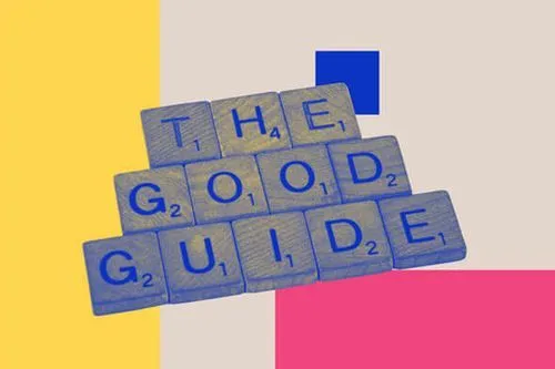
TABLE OF CONTENTS


If there is one thing we love about the creative discipline of graphic design, it’s the ever-expanding nature of it. From where we started with simple cave paintings, we can now feast our eyes on countless design styles. From geometric design to grunge, let’s take a look at the most important and commonly used graphic design styles today.
A great graphic designer has more in their toolbox than just skills and (super expensive!) design software.
Great designers also invest time researching and adapting to various graphic design styles. From minimalism to 3D illustrations, a graphic designer is spoilt for choice. However, it is not as simple as blindly picking a style that sounds like it may work. It’s important to know the characteristics of each style and what it brings to the table to decide which is the best fit for each project.
So, let’s explore different graphic design styles and their main characteristics!
{{GRAPHIC_BANNER="/dev/components"}}
Swiss style design or international typography style
Referred to as either Swiss style design or international typographic style, this design style originated in Switzerland in the 1940s. It is seen as the foundation on which many design movements grew throughout the 20th century.
This design style sprung from the Zurich School of the Arts and Krafts and the Basel School of Design.
This design style emphasizes clarity, simplicity, and objectivity. Some of its main features include grid systems, minimalism, hierarchy, and functionality. So, it’s beena major influence on some modern design fields, such as web and application design.
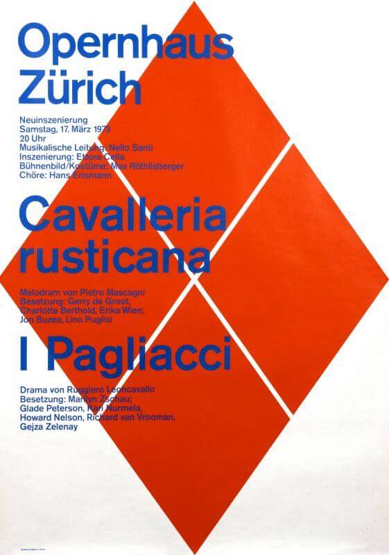
Characteristics of this particular style are:
- Clean and simple
- Asymmetrical layouts
- Legibility
- Consistent use of negative space
Art Nouveau
Many consider this the first modern design style. It’s characterized by fluid shapes, long curved lines, and use of natural imagery. It’s a very decorative style, so in graphic design it can be a perfect choice for packaging and posters.

Characteristics of this graphic design style include:
- Organic forms
- Floral motifs
- Sensual female figures
- Asymmetry
- Intricate detailing:
- Emphasis on decorative arts
Art Deco
The polar opposite of its predecessor, Art Deco uses sharp lines and geometric shapes. However, this is not a minimalistic design style. Art Deco is a great choice for brands that want to emulate a sense of luxury and prestige, and brands that wish to use dark or metallic color palettes.
It can be a great choice of style for a logo design, since these geometric shapes often scale better than abstract graphic art styles.

This style’s characteristics are:
- Geometric shapes
- Symmetry and streamlining
- Bold colors
- Sunburst and zigzag motifs
- Glamour and elegance
Retro
The retro design style is where the graphic designer uses elements or takes inspiration from a vintage design style. It’s a broad term since there are many different old styles.
However, nowadays when we mention retro graphic design we usually mean the style of the 50s and 60s (also known as New York design style).
This style is characterized by vibrant colors, playful fonts and creative use of layout and drop shadows. It’s very popular in certain industries like food and clothing. However, it’s definitely not suitable for more “serious” industries such as legal or medical.

A retro design draws inspiration from vintage design styles. These are the most common styles:
- Bauhaus
- Mid-century modern
- Pop art
- Psychedelic design
- Memphis style
- Grunge
Three-dimensional
Three-dimensional design, or 3D in short, is one of the more modern styles. It’s widely used in the digital world for landing page design or web design, for example. Lastly, product design and 3D printing are the perfect match, increasing the popularity of 3D design even further.
Adding movement or animation to 3D design elements is a great way to achieve a modern vibe. This can be a great addition to tutorial videos or attention-grabbing ads.

Characteristics of the three-dimensional design style are:
- Life-like shapes
- Natural lighting effects
- An illusion of bigger depth and volume
Abstract
Like abstract fine art, abstract graphic design style is subjective and can be experienced differently. This design approach is definitely not for everyone. Sti,, when done well, it can produce a powerful response with the right target audience
For example, an abstract visual element like the one below can be a great way to make UI design more striking and portray your company as cutting-edge.

Characteristics of abstract design are:
- Subjective
- Nonsensical or a mix between identifiable and non-identifiable elements
- Unconventional
Minimalism
Minimalism is often used in corporate design, advertising, and packaging design. If you’re striving for simplicity and want a clear and concise brand message sent to consumers, minimalism is the way to go.
Using basic shapes, simple sans serif typography or minimal colors will help you build a strong brand identity, whatever the design project.
Additionally, it can help people understand your purpose better. There aren’t any elements distracting the viewer from the ultimate message your design conveys.
Characteristics of minimalism design are:
- A clean design without the use of many different elements
- Minimal use of different colors
- Simple yet enticing typography
- Use of white space
Maximalism
There are two sides to each coin. So, instead of minimalism design you can take your project in another direction. Loads of design elements, bright and bold color schemes, and unconventional typography are all characteristics of maximalist design.
There are many different graphic design styles that fall under this umbrella term. One of the most important ones is certainly psychedelic design, which emerged in the 1960s and 70s, but is still popular today.
This is definitely one graphic design trend to look out for. Minimalism has reigned supreme for years. However, younger generations are adopting less polished, more creative aesthetics, so you’ll see this design style used in anything from typography to websites!
Photorealism
Did you have to check twice to see whether a design is a photo or not? That’s photorealism for you.
Photorealism is a very commonly used style in architecture and interior design, or other disciplines where it’s important to show how something looks in the real world. Creating photorealistic illustrations used to be a pretty difficult task. However, modern design software makes this a lot easier. There are even some advanced AI generator tools that can create decent realistic illustrations.
Additionally, photorealism is often used in mockups and advertisements.

Characteristics of photorealism are:
- Remarkable detail
- Truthful resemblance to the actual image or inspiration
- Hyper-realistic
- Natural shapes, forms, and colors
Flat design
On the opposite spectrum of 3D design, there is flat design. As the name suggests, it is two-dimensional and therefore more simplistic than 3D. There is no need for a natural lighting effect or creating the illusion of depth in a flat design, making it a monochromatic style.
Flat graphic design design is often used in web design and digital marketing. It’s a style that has become increasingly popular for digital illustrations, especially in corporate design. These types of illustrations give you the option to add a bit of fun to your otherwise very formal website or socials.
If that sounds like something your company could use, then maybe it’s time to check out ManyPixels’ gallery of free resources. You’ll find a bunch of royalty-free flat graphic design style illustrations to spruce up your content with.

Characteristics of flat design are:
- Bright colors
- Quick visual perception
- Two dimensional
- Simplicity of shapes and elements
- Clear and strict visual hierarchy
Geometric
One of the evergreen design styles is geometric design. Let’s first answer the question: What does geometric design mean? Geometric design is a style that is based on sharp geometric shapes, accentuated lines and edges, and a balance between abstract and realism.
This style is a great duo prospect since geometric graphic design often overlaps with minimalism design and typography. Did you know there’s a whole subcategory of geometric typefaces?
Now that you’ve got the answer to what does geometric design mean let’s look into this popular style a little bit more. The history of geometric design is an interesting one since it can be traced back as far as Mayan temples and ancient pyramids. Back then, it was often used for decorative purposes, displaying geometric pattern design.
Different shapes and patterns are used to zhoosh up certain building elements. This is still a trendy design style, although now applied in a much broader sense. From digital backgrounds to product packaging, in our opinion, a good graphic designer should know how to design geometric patterns.
If we’ve just spiked your curiosity to learn how to design geometric patterns, then luckily, many modern graphic design tools will do the dirty work for you. The Fibonacci Sequence is a good first step if you want to go old school. Additionally, it never hurts to study a bit of Escher while reminiscing about your high school math classes.
From a striking tattoo design to seamless geometric patterns, geometric design is a widely applicable style and a great match to many other design styles.

Characteristics of geometric design are:
- Repetitive usage of shapes and lines
- Cohesive
- Often abstract
Grunge
Let’s talk about the rebellious graphic design style of the group: grunge. Grunge is a counter-movement, standing up against the design principles. In with the gritty and rough, out with the conventional and strict!
If you think of the punk and gothic movements, you’ll get somewhat of an idea of this graphic design theme. Grunge takes its name and style from the subculture emerging in the 90s. Think distressed textures layered on top of each other, with uneven edges and a rough finish.

Characteristics of the grunge style are:
- Rough finishes
- Goes against the principles of design
- Layered textures
- A bit chaotic (but in a good way)
This is by no means a complete list of every style out there, but in our opinion, these are the most commonly used styles today. We hope this has helped you distinguish different graphic design styles and sparked some inspiration into using one or two for your next project.

Journalist turned content writer. Based in North Macedonia, aiming to be a digital nomad. Always loved to write, and found my perfect job writing about graphic design, art and creativity. A self-proclaimed film connoisseur, cook and nerd in disguise.

Top-quality designers
A complete creative team at your fingertips: graphic and web designers, illustrators, and more.

Lightning-fast turnaround
Get start today and receive your first update on the next business day.

All-inclusive pricing
Unlimited requests and revisions. One flat monthly fee. No surprises.

Flexible & scalable model
No contract. Scale up and down as needed. Pause or cancel at anytime.
Continue reading


Explore some of our best designs
Get inspired by a curated selection of ManyPixels work. Download the portfolio to see what our team can create.


