
The ultimate infographic design guide
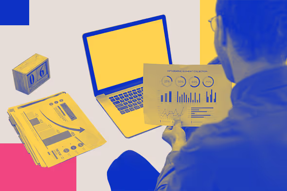
TABLE OF CONTENTS


Learn how to design an infographic, what types of infographics there are, and where you can use them to up your marketing game!
Sharing knowledge can be quite a task in a world of instant information. People’s online attention span is just 8 seconds. So, educating audiences about your service, product, or anything else requires some creativity. That’s where effective infographics can help.
Infographics are visual representations of information, data, or knowledge. Their purpose is to present information in a clear and concise way. They’re one of the hottest design trends right now and for a few very good reasons. Infographics:
- can increase the traffic on your website by up to 12%;.
- are liked and shared more than any other type of content on social media.
- are 30 times more likely to be read entirely compared to blog posts or news articles.
So, can a simple pie chart be considered an infographic? Not really. Charts and graphs are merely methods of presenting information, while an infographic usually contains several such methods (including text, icons, tables, etc.).
{{INFOGRAPHICS_PORTFOLIO="/dev/components"}}
How to design infographics in 4 steps
Designing infographics isn't terribly complicated, but it's advisable to follow these steps in order. Since infographics pack a lot of information in a single design, these steps will help you stay on the right track.
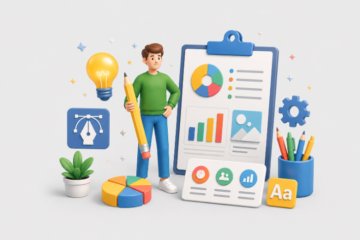
Compiling data
Since some form of data is the core subject of infographics, this is where you want to start. Consider who the infographic is for and why they need it. This will help you select the most relevant or useful data.
Say you're creating an infographic on social media trends. Including the number of people that use a specific social channel might feel organic, but is it really useful? It might be better to present specific changes over time, such as how many people are migrating from one platform to another. This will help marketers use your infographic to better plan and structure their strategies.
Writing the copy
An infographic designer, like most others, will hate significant changes in the copy during the design stage. It might seem like just a couple of extra sentences to you, but to a designer, it might mean having to change the whole layout.
Try to finalize the copy before submitting it for design. Make sure it's proofread and, of course, fact-check everything twice. The most stunning infographic design still can't make up for false information.
Choosing the graphics
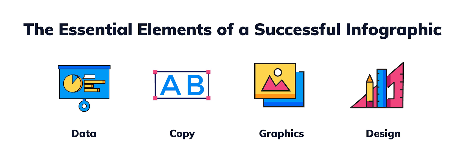
Remember that an infographic is not just a graphic. It's a bunch of graphical elements, such as images, charts, graphs, illustrations, and icons, all rolled up into one coherent design.
You can see how poor planning can easily make an infographic design a total mess. So, before you start putting it together, ensure your graphics can work together.
Are you going to use a uniform way of presenting or spice things up with various forms of data visualization? There's no right or wrong here; it all depends on what audience the infographic is designed for and the type of data you want to present.
Creating the design
Designing infographics always starts with layout. If the layout doesn't work to convey information in the intended order, the infographic won't be successful.
Try a few different variations before you settle on something. List infographics don't always have to be vertical, and how-to infographics can work just as well in a horizontal layout! Be creative, but never at the expense of readability.
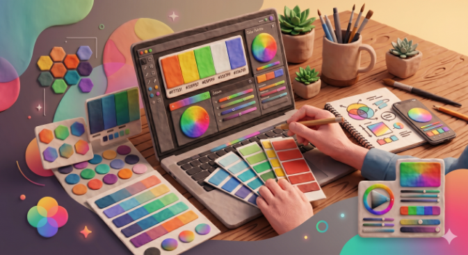
Once the layout is nailed down, it's time to choose the right color palette, fonts, charts, and all other design elements. Luckily, this will be relatively easy if you've followed all the previous steps. Choosing the right style will be much easier if you know what information you want to convey and to whom.
Types of infographics
There are many types of infographics, so let’s present a few of the most common ones.
Statistical infographics
Few people nowadays have the patience to read through detailed reports and studies.That’s where statistical infographics come in. They’re a fantastic way to highlight the most relevant statistics and bring a subject closer to the reader. Still, if you’re an infographic designer, be careful not to overload statistical infographics with data.
Here’s a great example of infographic design from our own portfolio. Domuso’s yearly review focuses on four core statistics. The infographic design makes it both informative and convincing (it suggests a considerable spike in the growth of company operations).
Our infographic designer also added a map instead of yet another statistic. Sure, it would have been much easier to include yet another number. This way, there’s more visual balance, the infographic design doesn’t look repetitive, and the map conveys the relevant data perfectly (the company’s presence across different states).

Process infographics
These visuals help break down complex processes and procedures into smaller steps.
Although the actual infographic design can be very simple, it’s always an effective tactic to make a particular topic or process more understandable. Here’s another example from our portfolio.
Even today, when both have reached new heights, many people still confuse marketing and advertising. Using layout and color, this simple infographic perfectly represents how far-reaching and over-encompassing marketing is compared to advertising.

Timeline infographics
Although there are similarities between these and process infographics, the primary purpose of timelines is to highlight a change (or process) over time.
You’ll often see these in history textbooks and corporate end-of-the-year reviews. However, timeline infographics can be a fun addition to your content marketing efforts.
Sometimes, you need to give a bit of background for the topic you’re about to discuss. And, surprise, surprise, most people will skim-read that part. So, to help them understand how this topic has evolved, you might want to utilize a simple timeline.
Here are a few of them we’ve used when writing about the history of marketing. And although they’re simple, they still contain vital pieces of information.


How-to infographics
A crucial aspect to consider with how-to infographics is the layout. The catch is organizing information into groups so viewers can follow the process seamlessly. Here’s our own infographic showing the key steps for developing a SaaS business.

You may notice that process and how-to infographics are quite similar. Indeed, the terms are sometimes used interchangeably. The difference usually comes down to content.
Process infographics are used to explain processes that don’t require any conscious involvement from a person (such as physiological, financial, or technical processes). How-to infographics, on the other hand, are always related to the steps a reader can take to achieve a certain goal.
Flowcharts
Flowchart infographics are meant to help readers make a decision. For that reason, flowcharts are often used in web design. It’s also a great idea to make them interactive and get users to engage with your content.
The most fundamental concern with flowchart design is a clear and straightforward layout. Using design elements, such as colors and arrows, can help you ensure that users move through the flowchart in the intended direction.
Here’s a very simple flowchart we’ve created to help readers decide on the best design outsourcing option. The infographic designer used the size of the letters and colors to ensure consistency and a logical progression

Comparison infographics
What's a great way to beat your competition? Show that you have a better offer!
Comparison infographics are one of the most effective ways to do this. If done well, they can truly be the connection between you and your next client!
They often look like something we'd call a "table." However, remember that infographics usually contain other forms of visual information representation, such as icons, graphs, etc.
Comparison infographics are also used to help differentiate between two similar or easily confused terms, such as UX and UI design. Our designer's infographic contains all the vital aspects of UX and UI design. However, it also manages to convey the idea that UX and UI are intrinsically linked.

List infographics
The purpose of list infographics, as the name suggests, is to list several pieces of information related to the same topic.
These offer a lot of creative freedom to an infographic designer, as the amount of information and text you need to include can vary greatly. Here's an example from one of our designers dealing with healthy eating habits.
The design is playful and casual, and the addition of illustrations and highlights on the subheadlines make it reader-friendly.

Informational infographics
Wait a minute, aren't all infographics supposed to be informative? Of course. But this particular type of infographic is used to provide the most relevant information on a topic or often answer a single question such as "what is."
These are probably the most commonly used in blog and content creation. As was already mentioned, few people have the patience to read through an entire article these days. An infographic can help summarize the key points or convey the most critical information.
Since search engines like Google also rank images, a skilled infographic designer can help you boost your SEO tremendously, as people might end up on your blog after seeing a helpful graphic like this one.

Map and location infographics
We've already covered how infographics deal with the subject of time. But they can also be used to present spatial information.
The best advice to remember with map infographics is that less is more. Since they inevitably present at least two sets of information (location and something else), they can quickly become overwhelming.
How about an example? This is an infographic we've created to show the different hourly rates of graphic designers across the world.

Dos & don’ts of infographic design
Now that you know the basics of how to design infographics, here’s a handy list of actionable dos and dont’s that you can come back to.
Do: use up to three colors
A great infographic packs a lot of information in a relatively simple format. So, you need to ensure the design doesn’t look overbearing or confuse viewers.
A skilled infographic designer can sometimes bend this rule. However, if you’re creating visuals yourself, it’s best to stick to a maximum of three colors. This way you’ll ensure the design looks consistent and professional.
Don’t: use excessive text
The point of data visualization is to present information visually. So, if you feel you need to explain something in greater detail, there’s a good chance your infographic isn’t going to impress your target audience.
Do: highlight the most important information
A creative infographic can offer lots of knowledge, but the main hook should be obvious. It can be the most important or interesting piece of information, and it should immediately draw attention, whether through use of color, fonts, or proportion (it’s usually the biggest design element).
Don’t: stick to basic graphics and charts
If a client wanted a pie chart, they could have easily made one themselves. Remember that storytelling is another key aspect of effective infographics.
Use visual elements like illustrations and clever layout to capture viewers’ attention and build a lasting impression. Don’t forget that the style and content of your infographics should reflect your brand, and make potential clients want to connect and engage with you.
Where are infographics used?
Now that you know what types there are and how to design infographics let’s see some of the most common uses for this type of visual.
Content marketing
According to Hubspot's research, Infographics are the 4th most used type of content marketing. Why? Well, they bring a lot of informational value in a condensed format.
Long gone are the days when all you had to do to rank high in search engines was to stuff your content with keywords. Search engine algorithms these days are much more sophisticated, so high-quality, informative content is where it's all at.
Unfortunately, Google and other search engines still don't fully grasp just how short our attention span is. So, you may write thousands of words of quality content and still get no visitors to your website simply because the long-form content may put many people off.
However, if you've done the research, you should consider transforming your content into an infographic. You can include it in your blog post or make it a downloadable lead magnet.
Website design
Not many people will consider infographic designs a priority when developing their website. However, great infographic designcan truly transform your user experience and improve your website tremendously.
Remember that infographics are engaging: people are 30 times more likely to read them in their entirety than a blog post. Since you want website visitors to engage with your content rather than quickly bounce back, website infographics can help you reduce bounce rates and increase your session time. This positively impacts your search engine ranking, bringing more visitors to your site - and the circle continues.
There are many fantastic ways to include infographic designs in your website. Here are a few ideas:
- Reports: Achieved excellent results? Share them in a visually engaging way to help build a sense of transparency and trustworthiness.
- Surveys: If you want to position yourself as an industry leader, conducting research and surveys is a clever idea. You can create an abridged version of your infographic design to put on your website and require visitors to share their email addresses for the entire piece.
- Tutorials: If you don't have the resources to create a how-to video, an infographic is definitely the next best thing. Help website visitors understand your product or service better with a helpful how-to infographic they'll see as soon as they land on your site.
Social media
If you've been thinking about how to design an infographic, you may not be ideal for social media. Social media posts and stories usually have a limited amount of text on them and have to comply with strict size guidelines.
Well, that's where a creative infographic designer can help.
One of the best examples to learn from is Spotify. Their most famous campaign, called "Year in Music" (or "Wrapped" formerly), is a data-driven campaign that had users engaging with and sharing their insights across the board.
The secret? Stellar design.
You probably wouldn't care about your own, or anyone else's, listening habits that much if the data wasn't presented in a fun and unique way. Spotify launched many creative templates for stories and posts that users loved sharing.

Presentations
Did you know that over 90 % of presenters feel more confident when presenting with a well-designed slide deck?
We are visual beings, much more so in this day and age. A presenter or lecturer can be charming and engaging. But if the delivery isn’t accompanied by memorable visual aids, there’s little hope people will remember much more.
One study suggests that people remember 65% of the information they hear when it’s paired with visuals, compared to only 10% they retained when they only had the audio input.
Where can I get stellar infographics?
Now that you know how to design an infographic and where you can use it, it's time to pose one essential question: do you actually need to create infographics yourself?
Of course, it’s easy to pick an infographic template from an infographic maker like Canva or Visme. Still, remember that your data is as unique as your business (remember Spotify!).
So the best way to get your infographic designs is to leave them to a professional. These days it's pretty easy to hire a skilled freelance infographic designer. The price is usually more than affordable, with numerous candidates to choose from. However, working with freelancers can quickly become time-consuming and expensive if you want to make infographics a more consistent part of your marketing strategy.
Instead, you should choose a design service created for long-term collaboration. Unlimited design services, such as ours at ManyPixels, offers unlimited design requests and revisions at a flat monthly fee.

Having lived and studied in London and Berlin, I'm back in native Serbia, working remotely and writing short stories and plays in my free time. With previous experience in the nonprofit sector, I'm currently writing about the universal language of good graphic design. I make mix CDs and my playlists are almost exclusively 1960s.

Top-quality designers
A complete creative team at your fingertips: graphic and web designers, illustrators, and more.

Lightning-fast turnaround
Get start today and receive your first update on the next business day.

All-inclusive pricing
Unlimited requests and revisions. One flat monthly fee. No surprises.

Flexible & scalable model
No contract. Scale up and down as needed. Pause or cancel at anytime.
Continue reading

Explore some of our best designs
Get inspired by a curated selection of ManyPixels work. Download the portfolio to see what our team can create.


