


10 Icon Styles That Have Changed the Face of Design
Are you a beginner in the world of illustration? Or looking to get some illustration work, but don’t know what you want? This list of the most vital styles of illustration is a good place to start.

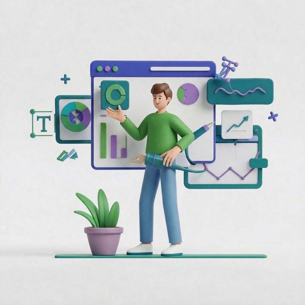
.svg)


Icons have become a big part of our daily lives; we all understand icons' visual interpretation no matter what language we speak. This article focuses on introducing and explaining the most important icon styles.
As the world gets busier, our attention span gets shorter. That is why we are so easily sidetracked nowadays. A case study shows that the average attention span of a human being has dropped from 12 seconds to 8 seconds from 2000 until 2013.
Icons are lifesavers for effective digital design. They give quick prompts and instructions that everyone can understand. We all know that a house represents the home screen, and a magnifying glass icon is a quick way to find the search option.
Whether you need to find the restroom at the airport, the right app icon in the crowded Google store, or some particular information on the product page, icons are here to make things clearer and speed up the process.
10 Icon design styles you should know
A style is a form of expression based on the developers' perception, and the end result is their vision transformed into an icon graphic design.
Designers strive to develop their unique signature style by infusing different visual elements based on methods and techniques they acquired over a long process of researching and improving. The tricky part is that individual styles in the designer world can be easily imitated.
However, this visual alternation of someone's previous work brought us all the different styles that we will discuss today.
{{ICONS_PORTFOLIO="/dev/components"}}
1. Pictograms - pixel art icons
This is the most popular type of icon and the first-ever icon style created on the Xerox Star 8010, the first personal computer. The computer technology was so slow that designers had to cope with monochromatic displays. The image below shows you the Xerox Star 8010 icons displayed on the desktop.

The mission was to create different icons by arranging a specific number of black pixels over a square grid until the symbol took the desired shape. This style uses hard, thick, black lines for the outlines and softer, thinner lines for the inner composing sections.
The style is impressive since it hasn't changed a lot until today. It still maintains popularity since the retro look is back for good. The main point of pixel art is not about how many details can fit into a small space; it's more about creating an eye-catching design using minimal visual elements.
In the world of pictograms, a simple airplane silhouette is more than enough to represent an airport. Nowadays we can also see color icons in the pixel art style.

2. Ideograms - isometric icons
This icon type was introduced with the Atari 520ST computer and the TOS (The Operating System). Before this innovation, the icons were two-dimensional, but this operating system allowed designers to interpret the illusion of depth and dimensions using the third axis.

This wasn't some radical change; this was a simple visual evolution since they were still pixel-based. This style evolved and now uses colors and shapes to make vivid three-dimensional objects.
This style might seem straightforward, but it isn't easy to learn, considering that your starting point is a rotating cube. Isometric icon design is still in use today, but it has significantly evolved as you can see from the image below.

3. Skeuomorphic icons
A few years after the launching of the Atari 520ST, a new breakthrough occurred in the form of Steve Jobs's NeXT workstation computer that brought a lot of innovations into the designing world, beginning with skeuomorphic icon design.
The new icon style mimicked the real-world counterparts; the thick, chunky outlines were replaced by thin lines and shading paired with the highly detailed illustrations. Surprisingly all that still fitted inside the same small space.

Today skeuomorphism became more of an art form than a simple icon designing style. These icons feature life-like textures, highlights, and shadows, and they truly are a piece of art. This style became even more popular with the launching of Apple's iPhone.

4. Outline and filled icons
This icon style evolved from the original pixel art style. It separates the objects composing sections with thick and hard lines, but instead of using the individual squares, the designer uses the strokes technique. Creating outline icons is more about using different shapes and paths instead of individual pixels and sharp rectangular shapes.

The only difference between the outline and filled line icon design is that filled icons incorporate the colors inside the basic outline design.
The outline and filled icons can portray powerful imagery using simple shapes, outlines, and colors. Creating a complete set of icons in this style is fairly easy. That is why this style is still among the most popular ones today.

5. Glyph icons
The glyph is a visual style, where the icons are precisely shaped monochromatic objects that can incorporate empty spaces to separate different composing fractions. The glyph icon represents an idea, but it never incorporates standard icon visual elements like texturing, shading, and highlighting.

This style is extremely simple, yet effective. These small size icons allow designers to define the object using a minimalist approach and still achieve effective results. Glyph icons are an excellent choice for representing common items in tab bars, sidebars, navigation bars, and toolbars.
6. Flat icons
Flat design style icons promote a simplified interface while focusing on a powerful visual impact, using colors and geometric shapes. This design was created as a response to Apple's skeuomorphic icon design with the launching of the new operating system, Windows 8.
Flat illustrations and icons are minimalistic. The primary goal of this style is to illustrate objects with only bare essentials and remove all the unnecessary details. This method uses no 3D elements, no shadows, no gradients, or any other techniques that allow designers to achieve the 3D effect.

The idea is to make them easy to understand and use. Most operating systems nowadays redesigned their 3D icon sets into flat icons.
Flat design style icons are a beautiful way to convey a message focusing only on simple visual presentation. However, the flat design did evolve a bit in the past few years and introduced subtle shading to refresh and boost the design. This style is now called "almost flat," and is currently trending.
7. Material icons
Google is responsible for creating this icon design style. In 2014 they decided to create their own visual language, which they named Material Design.
They needed a change since the flat design was too flat and straightforward for their taste, but on the other hand, skeuomorphism had too much going on. So Google placed itself somewhere in the middle with their new design trend.

They brought back the highlights and shadows (but subtly) and developed a visual layout to seem like the objects were stacked over one another.
There are approximately 1500 icons divided into several categories such as - action, alert, av, communication, content, and more. The icons mentioned above are available in 5 themes: outlined, filled, rounded, sharp, and two-tone.
This icon design is used as a signature look for Google's website and apps. Still, there are plenty of cases where material design icons are used outside Google's platforms.
8. Dimensional icons
This design style focuses on adding dimension and depth to the icon from a horizontal viewpoint by presenting the front and one of the object's sides. This works well with rectangular shapes. In the case of the curved and circular object, designers only use the front side to create a contrast with the colored background.

This design is all about understanding the basics of perspective to correctly define and position the details needed from the front and side sections. Designers use shading, textures, and gradients to achieve the real-life 3D effect while creating these types of icons.
They are great for designing social media icons. Just take a quick look at how realistic this interpretation of the YouTube icon is.

9. Hand-drawn icons
Hand-drawn icons are rarely used since they feature a playful look that is not popular enough yet. This style allows creators to develop a unique icons by using hand-drawn lines that have friendlier and warmer layouts and look more humane instead of computerized.

This style is a bit hard to handle since not all designers are used to drawing and shading. But the good part is that this style is hard to interpret. Hence, most hand-drawn icon designs are unique, giving the creators a lot of credit for creativity and originality.
10. Animated icons
Motion graphics are very popular in UX design nowadays, and icons are no exception. Animated icons are the future of interaction, and these icons enhance the engagement between the user and the interface.
At first glance, this icon may look like a simple flat icon, but when you hover over the icon, you bring it to life, and in that state, the icon displays valuable data in no more than a few seconds. Animated icons use simple or complex motion based on the level of intensity that the designer had in mind.
Wrap Up
Designing icons may look like a fun and easy task, but it is more than setting up simple graphics and labeling it as an icon for an app, for example. Icons can be an integral part of a good user experience, and make your marketing graphics more effective.
To stay in the know, check out our articles on icon design and this list of current icon design style trends. Also, be sure to visit our icons gallery, with thousands of cool free icons you can use for all your projects: from web design and social media to presentations!

Privileged to be raised in the most beautiful city in the world, Novi Sad. Studied biology and ecology at the University of Novi Sad. A creative soul, travel enthusiast, passionate writer, and crazy dog lover. Proud mama of (for now :) ) one stubborn English Bulldog.
A design solution you will love
Fast & Reliable
Fixed Monthly Rate
Flexible & Scalable
Pro Designers


