

14 Cool & Creative Cryptocurrency & Blockchain Logos

TABLE OF CONTENTS


Need great logo ideas for your startup? Here are some of the best blockchain logos; from creative concepts to the real examples of cryptocurrency market leaders.
As a very modern industry, blockchain technology can present logo designers with challenges: how to best represent something quite complex and techy so that most people who use these technologies can understand?
Well, there are different ways to do that, and of course, the logo design will always depend on the type of work your company does: whether it deals with cryptocurrency or healthcare. We tried to cover a range of different examples with these 14 blockchain logos, so hopefully, you will find something to inspire your own logo design!
{{BRAND_BANNER="/dev/components"}}
Blockchain logos with abstract graphic elements
Fluid shapes, elaborate linework, ripples: these are just some popular graphic elements that fit very well with modern technology logos. Although it may seem like something you could do with free logo templates, this is hardly ever the case. No matter how abstract a design is, it should always bear relevance to your industry and your brand; and this is usually evident with great custom logos.
1. Neyco
The name of this company stands for mo(ney + co)in, which is clever in itself. However, this cryptocurrency logo takes it up a notch, by adding the two coins as inspiration and outlining the letter N between them. In the final design, the logo maker added some gradients for a more modern, abstract look. And the purple and powder pink color palette is also very unique and truly memorable.

2. Blockchain logo P
This modern logo concept revolves around a heavily stylized letter P, but it’s a great example to show you how curves and fluid lines are very fitting for almost any type of tech logo.

3. ConsenSys
I suppose that when you think of a cool tech logo, something similar to this one is the first thing that comes to mind. The blockchain software company founded in 2014, built several DApps—“decentralized applications”—in the Ethereum cryptocurrency ecosystem, along with free Ethereum developer tools such as MetaMask, Infura, and Truffle. Their logo suggests motion and fluidity, which adequately captures the nature of cryptocurrency.

Versatile wordmarks
Whether you choose a font that’s free for commercial use or premium typography you have to pay for, creating an effective logotype requires a professional designer, who will make sure that your logo looks unique and memorable. Here are a few examples that make effective use of the business name.
4. Zeroes
Wordmarks are a great option for financial and fintech logos since a professional and trustworthy brand image is particularly important in these cases. The clean sans serif lettering with curved edges pairs well with the stylized monogram, which can be used for a number of different purposes from business cards and stationery, to web design and social media photos.

5. Everyday Crypto News
This great logo concept to me bears a resemblance to the Reuters logo since it consists of the wordmark portion and a round graphic element. Which is perhaps intentional, seeing as it is intended for a crypto news website. The designer used a popular logo font called Montserrat Bold and added a nice monogram which is perfect for mobile app icons. It’s crisp and professional, but again, thanks to the gradients, quite fitting for the tech industry.

6. Consol Freight
If you’re looking for cool, minimalist logo design inspiration, this example will certainly impress you. The monogram was created as a rebrand for a company that provides digital freight solutions. The logo designer kept the signature blue-orange color scheme, but stripped the logo down, leaving an impressive and contemporary brand image.

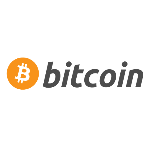
7. Bitcoin
Ok, so this logo you’re probably familiar with. But what makes the cryptocurrency Bitcoin logo so successful? Well, although there is a lot of complex cryptography involved that most regular folks don’t understand, from a design point of view, this is essentially a very successful financial logo, thanks to the simple graphic portion which clearly represents a BTC coin. And money (or at least financial value), is something most people will respond to.
Of course, the logo color in this case is another smart move, departing from traditional blues and greens used by major banks. It’s a color that symbolizes innovation and creativity, so of course it’s fitting for something as daring as the first-ever cryptocurrency!
8. Base58
The name of this fictional company is actually short for Base58 Check Encoding, which was used to create bitcoins (BTC). This cool and crisp wordmark fits perfectly with a company that specializes in the development of blockchain and fintech technologies since it’s both modern but highly professional. On the other hand, it has a special meaning to it. Since the Base58 algorithm doesn’t contain any visually similar characters (like 0 and O, I and l), the logo designers decided to fuse together the similar-looking 5 and E into one memorable symbol.

Geometric logos representing blockchain technology
Together with fluid shapes, crisp geometric elements are another great direction to take your blockchain logo design. If you check different heatmaps, you will see this logo trend is quite prominent with cryptocurrency logos.
These shapes are also very popular in technology logo design and data logos since they are a great way to create a consistent brand image, across web design, landing pages, and even print materials where applicable.
9. Ethereum
Well, if you’re in the industry, Ethereum is definitely a company you’ve heard of. This open-source blockchain has Ether as its native cryptocurrency, the second largest after Bitcoin. The market leader has an amazing logo, in the shape of a diamond (which is a good, simple nod to value and blockchain cryptocurrency). The additional 3D effect delivers a futuristic edge and lends itself well to color variations.

10. Blockchain
Simple geometric shapes are something easily found with royalty-free vector icon websites. However, it takes skill and talent to combine and transform these basic shapes into something that will stick in people’s minds.
Blockchain is the largest cryptocurrency exchange and wallet. As an established player, this company has a corporate looking logo, composed of squares in different shades of blue, a logo color that is said to represent trust and professionalism. It also bears a stark resemblance to many mobile app icons, which is fitting for this digital company.

11. Kyber Network
Yet another real-life example on our list, Kyber Network is a tool that allows token swapping and enables vendors to accept different types of cryptocurrency (like PayPal for Bitcoin, Ripple, Litecoin, etc.). The design studio behind this company’s new logo took inspiration from the initial design, but updated it to a more minimalist and modern look. I recommend you check out the full project, as it’s an interesting example of manipulating shapes to create dozens of interesting logo concepts or vector icons.

Tech-inspired modern logos
If you are still not satisfied with how well the previous examples represent this exciting industry, here are a couple of more direct approaches to designing a great blockchain logo.
12. Vertobase
Blockchain patterns are a great graphic design idea for both your logo, but also things like tech business cards. In this case, the logo is created for a cryptocurrency exchange. The dynamic shape suggests movement (or exchange), and it also manages to incorporate the beginning letter of the company name in a seamless way.

13. Circuit logo
As you’ve probably realized by now, when it comes to blockchain logos, it’s no easy task combining the different elements representative of a certain company or startup, in a way that doesn’t look forced. Well, the lovely concept is another reminder of the power of good graphic design. The logo creator managed to combine the letter N, circuits and cubes in one simple and dynamic brand mark.

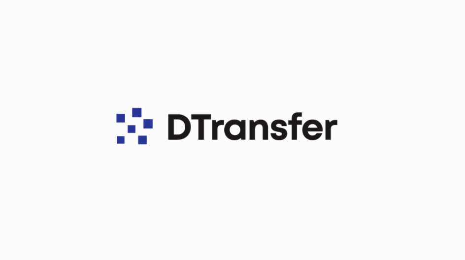
14. DTransfer
This is a simple and creative logo design that uses squares that may remind us of the design world of pixels, but in the tech world, they could easily be seen as a simplified representation of a blockchain pattern. The logo was actually created as the company wanted to move away from a crypt-focused market into a broader financial one.

Having lived and studied in London and Berlin, I'm back in native Serbia, working remotely and writing short stories and plays in my free time. With previous experience in the nonprofit sector, I'm currently writing about the universal language of good graphic design. I make mix CDs and my playlists are almost exclusively 1960s.

Top-quality designers
A complete creative team at your fingertips: graphic and web designers, illustrators, and more.

Lightning-fast turnaround
Get start today and receive your first update on the next business day.

All-inclusive pricing
Unlimited requests and revisions. One flat monthly fee. No surprises.

Flexible & scalable model
No contract. Scale up and down as needed. Pause or cancel at anytime.
Continue reading

Explore some of our best designs
Get inspired by a curated selection of ManyPixels work. Download the portfolio to see what our team can create.


