
17 Gym Logo Designs to Help You Get Your Branding in Shape
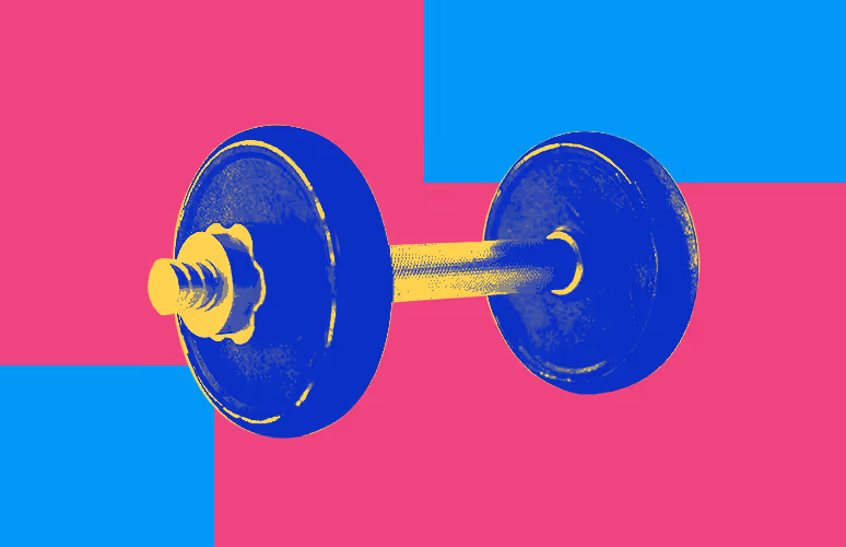
TABLE OF CONTENTS


From classic dumbbell logos to exciting typography, here’s a list of gym logo ideas to fit all kinds of fitness centers.
People hit the gym because they want to stay healthy and look good. So if you’re a personal trainer or fitness club, it makes sense to have a professionally designed logo that has a certain aesthetic appeal.
A free gym logo template anyone can grab from an online logo maker doesn’t exactly signal to potential clients that you have a personalized and custom approach. Make sure that your logo and brand identity “speak” to your intended audience; whether it’s through using a specific color palette, typography, or icons and illustrations that match the experience of your fitness center.
Here are 17 great examples to inspire you!
{{BRAND_BANNER="/dev/components"}}
Gym logos with human characters
This type of logo is especially popular as a bodybuilding logo, but can certainly make a good choice for all sorts of fitness centers. Whether you go for a muscle man or a woman figure doing cardio, going with this type of pictographic logo is great to show that the center of your gym business are your customers.
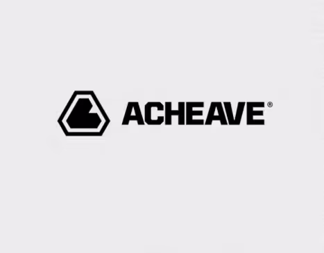
1. Acheave
This elegant logo design created for a gym that specializes in crossfit boxing programs is a great tip on how to use the human figure to create a timeless logo. The simple pictorial mark takes inspiration from a flexed biceps, but in a stylized and minimalistic way. It’s a great source of inspiration for your own logo if you’re looking to create a simple symbol that derives from the human body.
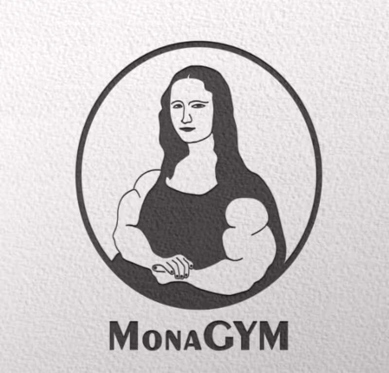
2. Mona Gym
This quirky and creative example of a bodybuilding logo gives possibly the most famous portrait in the world a funny twist. The image is great since it’s highly recognizable, yet simple enough to be a good addition to custom t-shirts or business cards. And if you think about it, it’s a very clever concept as well: who says that women bodybuilders can’t be equally elegant and ladylike as Mona Lisa!
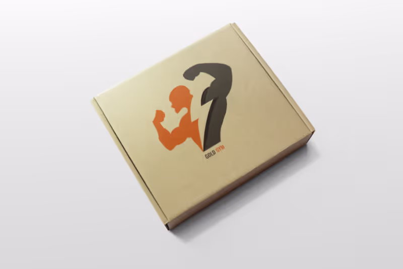
3. Gold gym
For something a little more conventional, check out this strong man who exudes the power of lighting. The use of contrast here is a very clever design tip: both in the two colors used, but also in the slight difference in size between the character’s left and right biceps. Perhaps a result of some weightlifting and hard work?
Elegant typography logos
The versatility of professional logotypes means that they could make a great fitness logo for any type of gym or personal trainer. Whether you opt for a modern wordmark or classy monogram, here are a few great logotypes to inspire you.
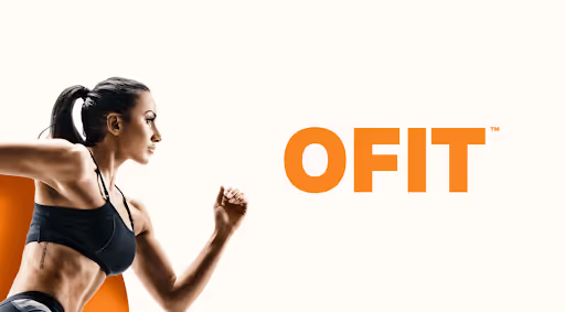
4. OFIT
Choosing the right color for your wordmark is almost equally important as the right choice of font.
This fitness center offers a range of different programs, to standard group workouts like hiit or outdoor training. That’s why they needed a universal logo that will inspire a sense of strength and optimism with gym-goers.
Orange is a bright color that is said to represent good communication, while the heavy bold font exudes a sense of power you’d want to feel from your workout. The brandmark (circle with the word “fit” inside) is another nifty branding feature that's perfect for use on their social media profiles, or even as a custom sticker that clients can put on their exercising equipment.
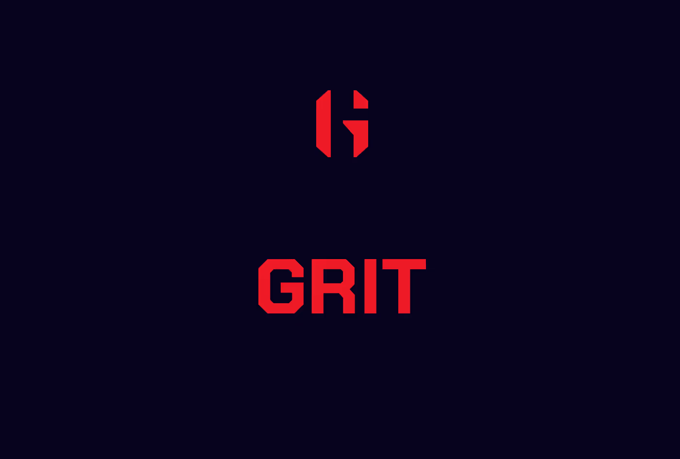
5. Grit
This elegant gym logo design is a great example of effectively using typography. The full wordmark is professional and exudes a sense of strength and power. The monogram has a more custom look and gives the branding a unique edge.
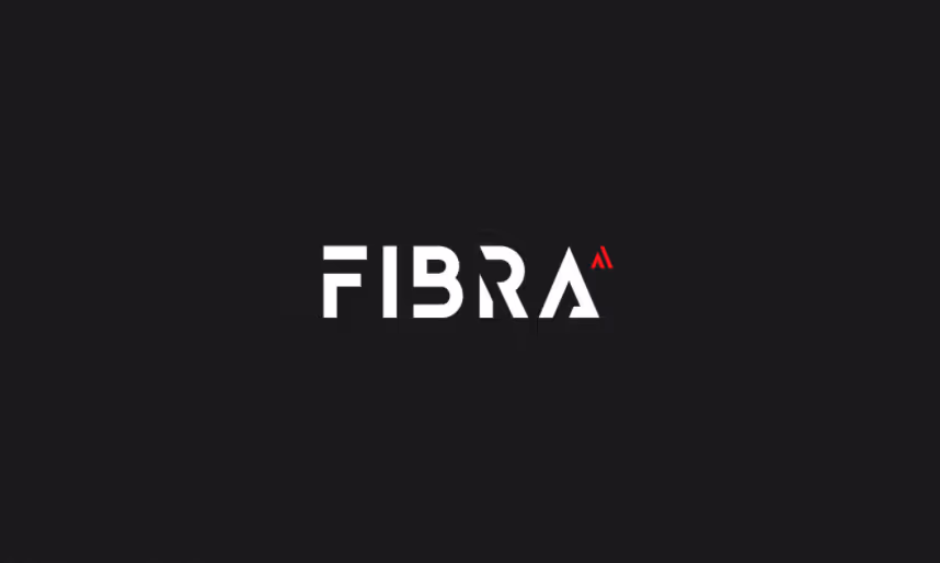
6. Fibra
Gyms usually have a very modern aesthetic (even though I love the idea, I am yet to see people prancing around their local gym in those 1980s leotards and leg warmers). So a logo like this with futuristic lettering is a great way to tell clients that in your fitness studio they can expect modern equipment.
Dumbbells logos
Barbells, kettlebells, dumbbells… whatever your training equipment consists of, you’re bound to recognize these shapes in a gym logo. Weights are something that you can easily find with design templates online, so be sure to create a custom logo by adding a personal touch to these well-known fitness icons.
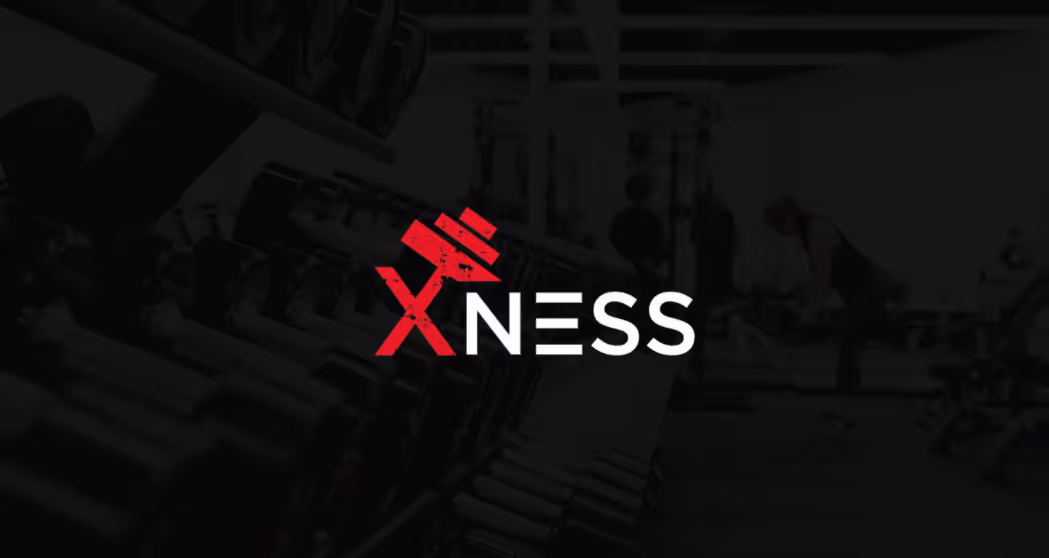
7. Xness
This simple logo design is a great example of how you can incorporate images of weights in your logotype. The letter X can be seen to represent a weightlifting human figure, which is why the combination of different design elements on this logo works so well.
8. Heliot
Another idea of how you can incorporate a dumbbell into your gym or sports logo design is using your business name. This simple logo looks super professional which matches the brand promise of helping clients get fitness results in “minutes per week, not hours”.

9. Strong App
If you want your logo to stand out that doesn’t necessarily mean creating an overly intricate concept that people will struggle to remember. Keeping it simple is always a good idea in logo design, so long as you make sure that the design perfectly matches your brand.
This graphic designer came up with a new logo for a fitness app. The logo seems to be unused, which is a shame since the new logo gives a very basic dumbbell icon a more interesting and brand-specific edge.
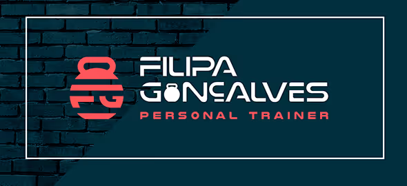
10. Filipa Gonçalves
This personal trainer logo seamlessly incorporates the simple image of a kettlebell with the trainer’s initials. Even though the icon itself is pretty simple the way everything works as a whole makes a terrific custom logo that clients are bound to remember.
Health and wellness logos
Gym fitness is a form of exercising physical fitness, which of course connected to our general wellness and health. In this respect, gym logos can also take some inspiration from yoga studio logos which do a great job at representing a balance between physical and mental wellbeing. Here are a few good fitness logos that follow a similar thought process.
11. Fit Supple
If your gym also provides natural supplements, this type of simple logo is a useful source of inspiration. It would fit equally well on your gym staff’s t-shirts and on the packaging design of supplements or refreshments available at the gym.

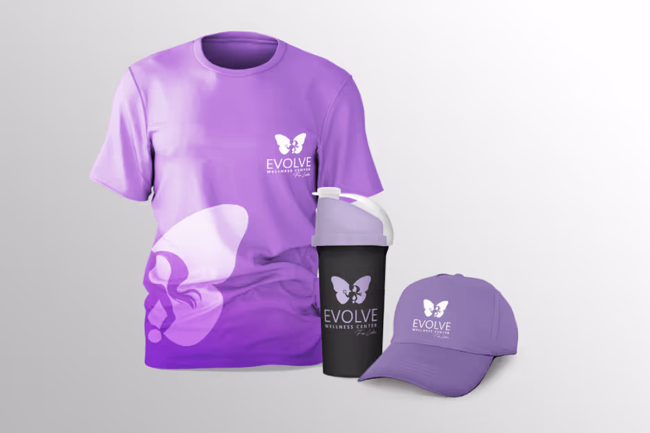
12. Evolve Wellness
This is another great logo concept that’s been unused but makes a perfect redesign of this ladies’ gym logo. The graphic designer kept the signature purple color palette of this fitness club, as well as the butterfly icons, but updated their cursive logotype with a more clean and modern sans serif gym font.
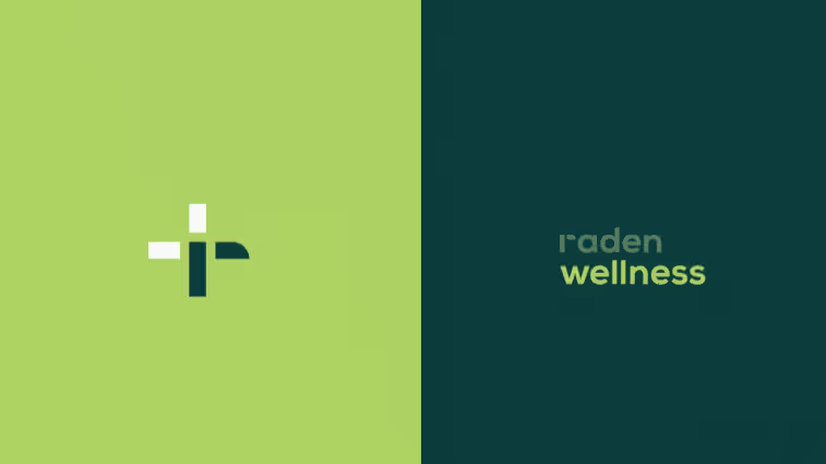
13. Raden
This cool brand identity has a strong connection to health with a brand mark that resembles a cross, a symbol often used in hospital logos. However, it stays industry-relevant with this fresh color palette and modern logotype that will appeal to people hitting the gym not just for the sake of looking good, but also to feel healthier.
Modern abstract logos
I absolutely love my local gym where people show up in washed-out t-shirts and with greasy hair, just wanting to exercise in peace without having to feel self-conscious. On the other hand, I know plenty of folks who appreciate their gym having a more exclusive feel.
If your fitness studio is a place to flaunt pricey workout gear and maybe even sneak a gym selfie or two, then these unique logos might be the perfect source of design inspiration.
14. Mezan Gym
This cool concept could easily be mistaken for a cutting edge tech logo. It was created with a unique fitness app in mind that provides users with personalized fitness consultations. The pictographic element of this logo design has a very dynamic feel; it almost resembles a human character running.

15. Smash
We’ve already mentioned weightlifting folks, so how about a design idea for another type of strong fitness routine that involves a lot of strength—boxing. This lovely logo combines an abstract pictorial mark that may be representative of boxing gloves or pear, or even sweat that you usually can’t avoid in this high-intensity crossfit workout.

16. Tan Fit Fun
Many fitness centers have a brand identity that’s heavily influenced by their target audience. This is of course a must in good branding, but on the other hand, make sure that you’re actually considering what type of brand your clients want to see.
For example, it’s totally fine to use pink for a ladies’ gym, but consider if ladies of the world are just a tad tired with every single product marketed for them being pink or purple. That’s why a great, universal logo like this modern brand mark is a great way to ensure that your branding is not excluding any potential clients.
17. Superkid
The last example on the list belongs to a rather creative concept, a gym made for kids. It’s actually a pretty cool idea for kids that aren’t particularly good at sports, but still have a lot of excess energy they need to channel in some healthy way (speaking from experience, folks).
And this branding concept is awesome too because the logo is not overly childish, but still has an appeal to a certain demographic (the star incorporates the letter K, which makes for a pretty cool brand mark).


Having lived and studied in London and Berlin, I'm back in native Serbia, working remotely and writing short stories and plays in my free time. With previous experience in the nonprofit sector, I'm currently writing about the universal language of good graphic design. I make mix CDs and my playlists are almost exclusively 1960s.

Top-quality designers
A complete creative team at your fingertips: graphic and web designers, illustrators, and more.

Lightning-fast turnaround
Get start today and receive your first update on the next business day.

All-inclusive pricing
Unlimited requests and revisions. One flat monthly fee. No surprises.

Flexible & scalable model
No contract. Scale up and down as needed. Pause or cancel at anytime.

Continue reading


Explore some of our best designs
Get inspired by a curated selection of ManyPixels work. Download the portfolio to see what our team can create.


