

Realtor Logos That Are the Foundation of a Great Brand
Find inspiration for your real estate agency’s logo design with these examples sorted into four categories.

.svg)
Find inspiration for the logo of your real estate agency or realtor-associate business, through these evergreen and classy examples.
The real estate industry is one that will keep existing. People will always need a home, and with time it’s getting harder to find one. Realtors need a strong brand to stand out from the competition, starting with a good logo. Here are some great examples, ranging from small members of the National Association of Realtors (NAR) to giants in the real estate business.
{{BRAND_BANNER="/dev/components"}}
Modern simplicity
Houses, foundations, buildings, families are common symbols used in realtor logos. Although they sometimes feel uninventive and bland, these symbols can be implemented into the logo with a smart and fresh twist, giving them a taste of the modern and minimal. Here are some realtors that opted for this approach when building their branding.
1. District Partners
This real estate business infused playfulness, modernness and freshness to its logo that can rarely be seen in an industry that generally has a more stern and conventional character. By making the letters D and P in lowercase into a knot, this logo communicates perfectly the idea that realtors will find you a home where you’ll feel connected and interlinked with those most important to you. Combined with a sans serif font in all caps, this logo makes for a youthful, but a still professional look of a dedicated brand.

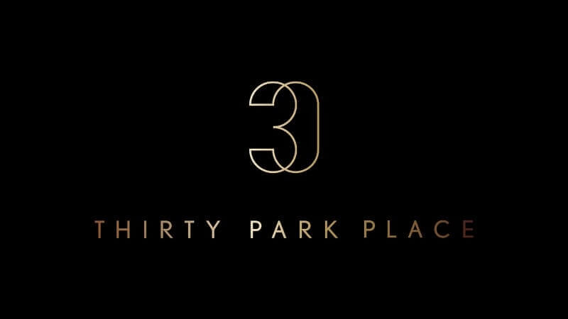
2. Thirty Park Place
Thirty Park Place is a luxurious residential building in New York, designed by Robert A.M Stern, the legendary architect who is responsible for a huge portion of the New York skyline of today. The logo is luxurious and modern, with a splash of Art Deco and contemporary minimalism.
3. Quadra Realty
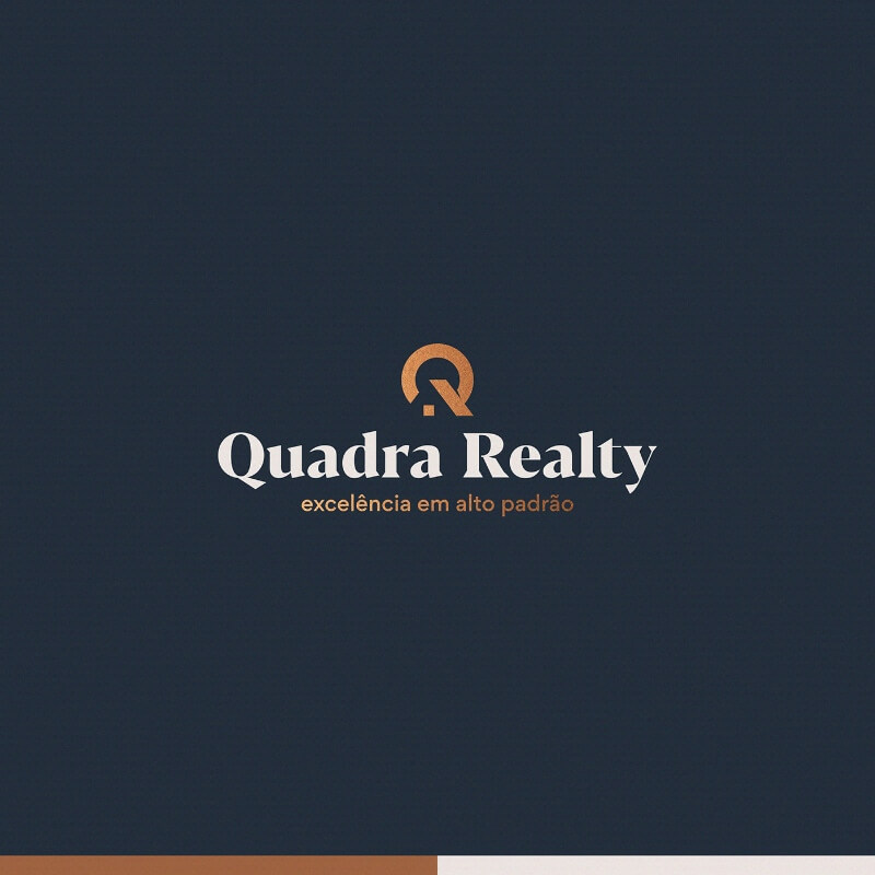
The graphic designer behind the Quadra Realty logo did a great job of creating a pictogram based on the letter Q, combining the rising sun over a home’s roof. It is a simple, yet effective idea, and the combination of dark blue and gold enhances the stylishness of it. The vintage feel of the subtle serif font also works well with the whole concept.
4. Fairhomes
This logo design concept for a real estate and property management online tool screams Software as a Service aesthetic, with the professional logo designer infusing a tiny element such as a roof into the wordmark to remind us of the nature of the business. It’s easy to imagine this fitting well with social media because of the lively salmon-red color and minimal wordmark.

Creative and classy monograms
Taking the initials of the realtor-associate or sometimes the first letters of the names of partners in a real estate firm can make a solid starting point in creating a timeless monogram that will look great anywhere: from stationery to business cards. Some are classy enough to be made into cool custom cufflinks.
5. Terry Vo Real Estate Broker
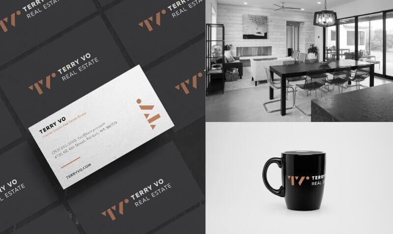
This real estate agent working in Seattle has a stylish and minimalistic monogram logo. The color palette is based on ground and gold tones, while the shape of the monogram resembles sharp and modern architectural forms. The fonts used in the logo are Muller Extra Bold Caps and Muller Thin Caps as a secondary font, both of which are clean and simple sans serifs, adding a professional tone and reliability to this realtor logo.
6. Hilton & Hyland
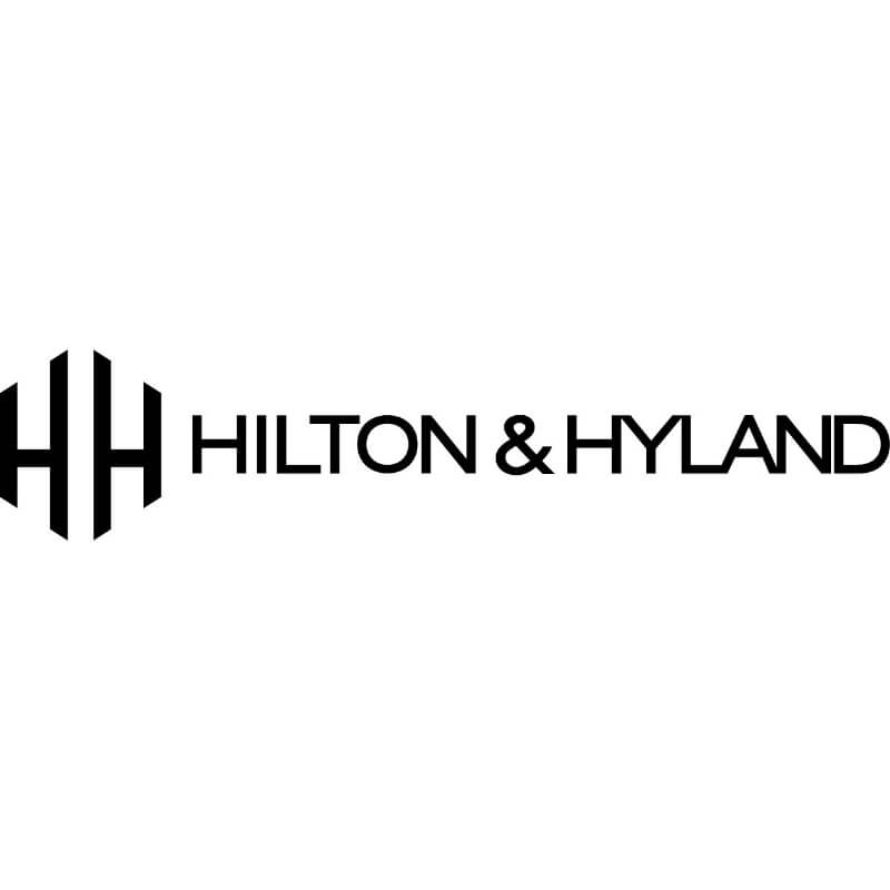
Now, this is a real estate logo that exudes luxury and professionalism. The glitz and glam of their main market—Los Angeles—is easily translated into the simplicity of this monogram, which creates the illusion of a house or building with the mirroring letter H.
7. Luxury Portfolio International
This cool and minimalistic monogram is the new logo of Luxury Portfolio International, that previously used a subtle slab serif wordmark with some decorative elements. This new logo is far more fitting and contemporary, making it easier to take the branding of this real estate giant that is the luxury property division of the Leading Real Estate Companies of the World®.

8. Gregg Lynn
According to this real estate professional’s website, he is ranked one of two top real estate agents in San Francisco by the MLS (Multiple Listing Service). And being on top of such a market means that Gregg Lynn needs to reflect that status in his brand. The realtor does that well with this classy monogram logo, paired with a simple sans serif wordmark.

9. Pilarski Real Estate Group
This vertically mirrored logo design combines the initials of real estate agent Julian Pilarski, creating an evergreen emblem logo in a circular frame. Some versions of the logo include value propositions that make it noisy, but in its simple form with name and monogram, it makes for a cool logo.

Classic wordmarks
Sure, monograms, symbols and emblems are cool, but a simple wordmark goes a long way, especially in a business where professionalism and reliability are most valued. Here is a selection of wordmarks, both contemporary and classic, that might help you make up your mind for just some good old typography.
10. Corcoran
This New York-based real estate agency has a logo that could easily pass as a fashion logo: clean, classy, slightly Italic. Even though there is no fluff or immediate association of a realtor business, it is a beautiful logo design that can stand the test of time.

11. Park Kiara
This luscious green haven in the heart of Hanoi is an exotic oasis in a metropolis, bringing the jungle and nature to its inhabitants. As a real estate park whose design is based on combining nature and modernism, it’s only fitting that it has a logo that encapsulates this. The slightly tribal but elegant font in dark green is the perfect solution to represent that.

12. Hestia Real Estate
A simple wordmark in Montserrat Bold (learn more about it in our list of free construction fonts) and a lovely dark blue and gold color combination makes this emblem logo a stylish solution. The concept draws inspiration from the Greek goddess Hestia and ancient Greek aesthetics, including a recognizable post that makes a nice addition to the whole design.

13. Century 21 Action Realty
This member of the National Association of Realtors went for a super simplistic wordmark that some might argue isn’t an innovative logo. But in a business where companies usually try to pitch as much as possible with their basic branding elements, a little bit of mystery can draw more attention.

14. AmeriHomes
Another example that says “This is simple as simple can get”. A crisp vintage slab serif wordmark in white put over a red background is a logo design that lets the audience focus on the brilliance of this company’s name: American Homes, or AmeriHomes for a fun and creative option.
A touch of trendy and digital
This last category on our list has both realtors and property management and real estate search apps and tools, so you will notice that they are more suitable for a SaaS design trend and a digital-era aesthetic.
15. Homely
Homely is an Australian tool for searching real estate and easily finding reviews and Q&A for certain properties and suburbs. The fact that they are strictly digital is easily noticeable from the look of their brand identity: the simple icon and logomark seem to be a winning recipe for tech-oriented businesses in the past few years.

16. Leftbank
This concept is essentially a logo for sale, that would be suitable for a real estate business or app. The L looks like a building block, and the color scheme is fresh and youthful, suitable for a new company entering the real estate market.
17. RealScout
This platform that connects agents and homebuyers and helps them search for a home together also opted for a house icon but went with a black-and-white color combination and a simple shadow that adds some three-dimensionality to the design. This is yet another redesign, and definitely a welcome one.

18. Vincer
This real estate logo design concept is creative, refreshing and definitely an unexpected burst of color in this list. By adding pastel colors and shadows, the graphic designer managed to outline a heart over the icon, reminding us that home and love often go together.


19. Rental Zebra
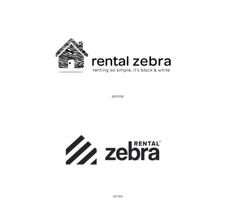
This property management firm exists, but the rebranding concept hasn't been adopted. I would argue that it is a much-needed rebranding that will take a bad logo to a one that is cool and makes the company look ready for the digital wave.
20. Homey
The last concept in our selection combines a simple wordmark with an abstract icon, that overlaps a house shape with an office building shape. It is a logo that combines the two figures “in a way that feels accessible, modern and friendly”.

Tips for using real estate trademarks
We hope you found inspiration and are already developing an idea for your own cool realtor logo. The 20 examples in our list are our selection, but there are plenty of other companies with good branding that you can search for on realtor.com, NAR, Google or LinkedIn, to name a few.
However, keep in mind that there is a certain code of ethics and rules for using the term realtor and the realtor® trademark.
Keep in mind that in the USA, this term and trademark can only be used for realtors that are members of the National Association of Realtors.
The four different Realtor® trademarks are Realtor®, Realtors®, Realtor-Associate® and the Realtor® block “R” logo.
Journalist turned content writer. Based in North Macedonia, aiming to be a digital nomad. Always loved to write, and found my perfect job writing about graphic design, art and creativity. A self-proclaimed film connoisseur, cook and nerd in disguise.
A design solution you will love
Fast & Reliable
Fixed Monthly Rate
Flexible & Scalable
Pro Designers


.jpg)