

Serif vs. Sans Serif Fonts: When and How to Use Them
TABLE OF CONTENTS


Learn the difference in use between serif and sans serif fonts, what do they say about your brand and how to make the correct font choice for your design projects.
As a non-designer, you probably don’t spend too much time analyzing and thinking about typography. But any graphic designer will tell you that a font makes a big difference when it comes to the quality and impression a design leaves.
Different typefaces bring different qualities to the table, and you need to decide on a font that bodes well with the brand image you want to achieve but also be contemporary and in line with the current trends.
In your branding efforts, there is a big chance you’ll either go for a serif, or sans serif font. Most subcategories fall under these two basic types of fonts, and in this article, we’ll show you what you should base your choice on and what these typographies mean for your brand.
{{BRAND_BANNER="/dev/components"}}
What is the difference between serif and sans serif fonts?
Technically, the only difference between serif and sans serif fonts is that visually, serif types have an extra decorative stroke at the endings of lines in the lettering and the so-called feet of letters.
Sans serif, as that “sans” says, don’t have extra swooshes and ornamental endings.

But, from an aesthetic standpoint, the difference is much deeper than this practical distinction we make between these two types of fonts. Designers and branding gurus know that different fonts have different personalities, and offer a unique message and character to the design.
Why is choosing the right font important?
In graphic design, the final look needs to be well aligned with the branding identity, messaging, industry and even current policies of the brand. The image audiences see forms a subconscious picture in their head that a company is friendly, youthful, corporate, trustworthy, traditional… Anything the company itself wants to position as and showcase, a graphic designer will know how to translate into visual branding.
Designers use fonts, but also colors, shapes, imagery, and combined with the right messaging, branding and marketing are crucial to the market success of a brand.
Here are some of the reasons why finding the right font is extremely important.
Branding
When buyers and audiences first discover a brand, the first thing they see is the logo, colors and other branding elements. They form an impression based on these assets, and then, willingly or not, decide whether to trust the brand enough to make a purchase.
Typography is one of the most crucial elements that make a difference in this decision. Here’s a simple example: Vogue, the most famous fashion magazine in the world, uses a logotype, i.e. a typographic logo consisting of only the brand name. It looks like this:
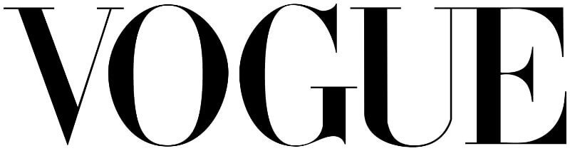
The Didone font you see in this logo is serif typography that shows class, elegance, tradition and longevity.
What would happen if we were to use, let’s say, a sans serif modern typeface that is mostly used for body text?

When the logotype is in the Roboto font or a similar font family, the impression is immediately different. It looks like a lighter, more casual brand identity, that one wouldn’t take seriously and definitely wouldn’t think is an established name in the fashion industry.
Legibility
This might be a more practical reason, but the font you use needs to be easier to read. Sometimes, decorative or script fonts that compromise the legibility a bit are used for aesthetic purposes, but mostly as a secondary font. The font you choose as your primary font needs to check the readability mark too.
Here is the Facebook logo in its original look.

Now, here is Facebook in the Goldmarie font. Even a name as memorable as this would fly over your head if you can’t read it well.

First impression
All the aforementioned reasons help form the right first impression. An illegible, funny or completely misleading typography will make a person judge your brand wrongly.
Don’t believe me? I’ll use the example of this planet’s most hated typeface—Comic Sans. It is indeed comical and somewhat of a meme at this point. People use it ironically or not, but the impression it leaves is always the same: Comic Sans means bad design.
Here are a few examples of world-known logos, and how they would look if Comic Sans was used instead of the font of choice. Would you take any of these brands seriously? What would your first impression be?

Now that I’ve proved my point that typography matters, let’s go over the characteristics and spirit of serif and sans serif fonts.
Serif typeface characteristics and notable serif fonts
Serif fonts are more traditional and classic since they are the first kind of typography that dates back to the 18th century, when old style typography started being used in print. Companies who use them try to exude a sense of refinement, tradition and respectability as the core characteristics of their brands.
A subcategory of serif typography, called slab serif, is also quite popular in logo design. It is characterized by heavier feet on the lettering, and thicker, block-like serifs. The robustness of these letters exudes a bold, noticeable and confident branding style.
Serif fonts, as well as slab serifs, are used by a wide array of companies in plenty of industries, from fashion to technology.


Some of the most notable serif fonts that are widely used both in graphic design and in everyday life are Times New Roman, Baskerville, Garamond, Georgia, Bodoni, Bookman Old Style, and many others.
Notable slab serifs, on the other hand, are Serifa, Egyptian Slate, Rockwell, Glypha, Memphis, ITC Lubalin Graph, etc.
Sans serif typeface characteristics and notable sans serif fonts
The sans serif font style is showing that your brand is approachable and modern, but still trustworthy and serious. Sans serif fonts are typically clean and perfectly legible because of the lack of extra ligatures and ornaments. The casual and youthful look of sans serif typography makes it a popular choice among tech companies, which is why you’ll see them often in SaaS design.
The lack of extra swooshes also allows for more generous spacing between letters, and more similarity between uppercase and lowercase symbols.
Other industries, such as retail, appliance and fashion, also often use sans serif fonts.

Notable sans serif fonts include Arial, Helvetica, Futura, Verdana, Calibri, Franklin Gothic, and plenty of other typefaces.
When to use serif vs sans serif?
Now that you know the subtle differences in the sans serif vs serif debate, it’s time to get to the practical side. When to use sans serif vs serif, and why?
A quick Google search might tell you that sans serifs are suitable for web use, and serifs are more often found in print design and headings. But the truth is not quite so straightforward.
With the development of different technologies and hundreds of thousands of fonts easily available online, your options are truly endless. Instead of choosing the font based on its purpose, choose it according to your target audience and industry.
Here are a few ideas.
Sans serif for tech businesses
Truth be told, it’s not easy finding tech or startup branding with serif fonts. This is because minimalist, geometric sans serfs usually look more modern. Besides that, they are generally more legible than serifs, and easier to use for websites and especially apps.
Serifs for lawyers and medical professionals
Most law firm branding uses serif fonts as a way to inspire a sense of tradition, which can be vital in this profession. The same goes for medical and hospital branding - it’s an ancient discipline, so a more traditional sans serif font makes sense.
Sans serif for fashion industry
Vogue, Prada, Louis Vuitton are one of the many iconic fashion logos using sans serif fonts. The reason for this is because this type of font usually creates a sense of luxury, and is perfect for high-end brands. On the other hand, an urban streetwear logo would be a much better match for an edgy sans serif or even graffiti style font.
Serifs for education
When we think about education as an industry, the first thing that comes to mind are Ivy League institutions, that usually have traditional emblematic logos and use serif typography. Therefore, whether you have a private university or kindergarten, you can hardly go wrong with a beautiful serif that resembles old-timey penmanship and inspires a sense of wonder and thirst for knowledge.
Sans serifs for construction, plumbing, electrical, etc.
These services are often a lot more personal than say, hospitals and law firms. So, a casual sans serif is a great choice to create a friendlier brand image. It’s better to opt for simple, geometric fonts though, so as not to lose a sense of professionalism.
Serif for headings, sans serif for CTAs
We’ll make an exception with this last tip, and suggest an ideal use case for sans serif vs serif. A serif font traditionally looks great in a heading, especially paired with a suitable sans serif in a body text. However, the CTA text is usually much better in sans serif thanks to higher legibility (don’t forget that CTAs can appear on small buttons and ads of all sizes).
Conclusion
We hope this settles the serif font vs sans serif debate. The truth is there are no definite answers. Every brand is unique, and finding the right font will require careful consideration of your target audience and brand personality.
For more helpful tips, be sure to check out our list of the best logo fonts, as well as this list of free commercial fonts that will help you stay on budget.

Journalist turned content writer. Based in North Macedonia, aiming to be a digital nomad. Always loved to write, and found my perfect job writing about graphic design, art and creativity. A self-proclaimed film connoisseur, cook and nerd in disguise.

Top-quality designers
A complete creative team at your fingertips: graphic and web designers, illustrators, and more.

Lightning-fast turnaround
Get start today and receive your first update on the next business day.

All-inclusive pricing
Unlimited requests and revisions. One flat monthly fee. No surprises.

Flexible & scalable model
No contract. Scale up and down as needed. Pause or cancel at anytime.
Continue reading


Explore some of our best designs
Get inspired by a curated selection of ManyPixels work. Download the portfolio to see what our team can create.


