6 Tips for creating an awesome Instagram color palette

TABLE OF CONTENTS

The right Instagram color palette can make or break your brand’s social media. The most popular aesthetic color schemes might be everywhere, but they might not be the perfect match for your brand. Here you’ll learn how to find your Instagram color palette that’s just right.
Social media is one of the most important types of marketing today since over half of the world’s population is using at least one social media channel, with numbers growing steadily for years.
While Facebook is still the most used network, its younger subsidiary Instagram has an impressive user base as well: as of January 2020, Instagram reportedly has more than 1 billion active users! And while we can expect new platforms such as TikTok to drive a bit of traffic away from Instagram, it’s still a leading marketing and e-commerce platform. Here are some stats:
- Instagram is the 4th most used mobile app (Hootsuite)
- 200 million users visit at least one business profile daily (Instagram)
- 81% of people use Instagram to research products and services (Instagram)
- Over 130 million users engage with shopping posts on a monthly basis (Instagram)
So, if you haven’t had time to do that so far, it’s high time to invest some time and effort into creating a professional-looking Instagram account. Since this is a very visual platform, having a consistent color palette is a great first step.
While opting for a random Instagram color palette generator can help you get started and find initial inspiration, it’s often best to be intentional about these things.
Here’s how to choose a color palette for Instagram with 6 easy tips.
{{SOCIAL_BANNER="/dev/components"}}
Include your brand color
You might think that using bold colors or outrageous color combinations is the only way to get noticed on a visually oversaturated platform like Instagram, but remember that getting noticed is only the first step. No Instagram color palette generator will be able to give you the ideal combination better than your social media brand guide..
Ultimately, you want people to remember your brand. And if your brand image should be corporate and serious, or even a little conservative, then opting for funky neon Instagram color schemes might not be the choice. This will probably get you noticed, but won’t inspire trust with potential customers, causing them to ultimately turn to another brand.
Find good color pairings using color theory
Many, if not the majority, of color schemes include more than one color. How to choose a color palette for Instagram often hinges on combining a few different colors together. So, how do you choose additional colors that will pair well with your primary color (e.g. the color of your logo)? The answer is the color wheel.
The color wheel includes three types of colors: primary (red, blue and yellow), secondary (mix of two primary colors) and tertiary (mix of two secondary colors). In addition to that, you can see which colors are complementary (on the opposite sides of the color wheel) and which are analogous (colors that stay side by side).
There is plenty of good online Instagram color palette generator software that will allow you to create a perfect color palette even without any design knowledge. For example, Coolors is a great platform for creating wonderful color schemes for your Instagram page. You can either upload your own photos to get unique color schemes, or find a premade Coolors palette that works for your brand aesthetic.
Here are a few popular types of color palettes, based on color theory, that you might want to consider for your Instagram.
Monochromatic color palettes
This type of color scheme consists of just one color in several different shades. If you choose your brand color as the star of the show, it can make for an amazing and consistent Instagram feed color palette that will keep brand awareness strong.
If your brand is strongly associated with one color (e.g. Coca Cola and red), then a monochromatic color scheme is a very good choice for you.

Monochrome can also mean a black and white color palette. This look certainly isn’t suitable for every type of business, but if executed well it can give your Instagram a truly sophisticated look.
Analogous color palette
As already mentioned, analogous colors are colors that are similar and positioned next to one another on the color wheel (e.g. red, orange and pink).
An analogous Instagram color palette will also be a great way to build brand awareness, giving you more wiggle room and options to experiment with. Chambord has a beautiful color palette that centers around the rich, burgundy color of their signature product. Using red/pink/purple elements in different types of photos creates a very pleasing visual effect, whilst still allowing them to create a variety of different visuals.

Complementary color palette
Complementary color schemes (also known as contrasting) involve a pairing of colors which are on the opposite sides of the color wheel. They are eye-catching and usually deliver a stronger impact. If your brand image is meant to inspire a sense of calm and serenity, then an analogous or neutral Instagram color palette will probably be a better choice.
However, if you want your brand to come across as innovative, playful and communicative, bold color pairings are a great way to go. Hubspot is known for its signature coral color, but on its Instagram profile, you’ll often see it paired with navy blue. Complementary color combinations are great for data visualization, as they allow certain bits of information to stand out.

Triadic color palette
A triad color palette uses three colors that are equal distance from each other on the color wheel. If it sounds a bit tricky to pull off, it’s because it is. A triadic scheme can easily look overbearing and aggressive.
A great example of a well-done triadic color palette is Slack. Combining purple, blue and yellow works great in their case, since some of these colors are also found on their logo so the vibrant color scheme looks in line with the brand. And of course, it matches their playful, casual and fun brand image.

Neutral and neutral plus color palette
One of the most popular color palettes nowadays, thanks to the recurring trend of natural and earthy tones, neutral plus means using neutral colors along with an additional non-neutral color for contrast.
A completely neutral color palette can also be an excellent choice for certain brands. Content creator/author Taline Gabriel uses lovely, soothing tones which match her personal brand promoting healthy eating and a holistic approach to personal wellbeing.

Candy pastels
Who doesn’t love candy? The playful and vibrant colors make for an extremely popular Instagram feed color palette, and it’s easy to see why. The pastels are vibrant, yet sophisticated colors that are perfect for adding a bit of pep.
While they’re quite versatile, they don’t fit each and every type of brand. For example, outdoor sports and tech brands could be hard-pressed to pull off a pastel color scheme.

Fresh greens
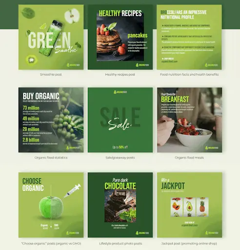
Green is having a moment in interior design, but also in social media. After lockdowns, we all missed nature. Incorporating wonderful greens that evoke foliage will certainly make your Instagram feed color palette stand out, yet still be soothing and elegant.
Green can be a great addition to a color scheme, as it can work well with neutrals, as well as brighter colors. If you combine it with a brighter, bolder color, make sure you use a more understated shade of green, such as olive or sage.
Make photos consistent
Using the same color scheme is easy with graphics, but how can you make sure that your photos also maintain a uniform color palette?
There are a few useful tricks you can employ. You can easily add an overlay on your photos (kind of like a filter), to ensure that they all match your chosen color theme. Another trick is to make sure the photos are arranged in a way that maintains visual consistency.
We use this technique on our own social media, as the duotone effect allows us to create cohesive social media graphics quickly with some stock photo elements.

Focus on a theme
It can be tempting to just post anything that comes to mind, which seems like it will boost your engagement and earn more likes. But a business Instagram is much more than a single post. Ultimately, it’s another place where people can learn more about your company, so you want the entire feed to tell a cohesive story.
If you have physical products then aside from the product shots which you will invariably feature, you should consider what kind of atmosphere or feelings you want these shots to evoke. Yankee Candle’s Instagram includes a variety of different shots of their candles, but each photo has a similar mood: homeliness and warmth. For example, you’ll rarely find them posting photos of the outdoors, even though people probably use their products outside as well, since they want to evoke that “cozy indoors feeling”.

Switch things up gradually
Having consistent and recognizable Instagram colors doesn’t mean that you’re stuck with just one option for the rest of your days. Many companies switch things up a bit to match a particular season or a current campaign they’re running.
The main thing is to do this gradually and, again, consistently.
If you create just one post that sticks out it will make your Instagram look a bit sloppy and people might even miss it will be “drowned out” by the other posts. Instead adding several posts in the same style will create a natural sense of transition, whilst also keeping your brand image consistent. And it will also help people to find specific campaigns or seasonal product information more easily.
Starbucks is a brand that is well known for its seasonal offers and the color scheme on their Instagram page regularly changes to match the seasonal drinks and offers.


Test your color scheme with filters
Filters are a quick and easy way to make Instagram posts more visually appealing or polished. But, when you’re creating posts for a company Instagram profile, you shouldn’t use filters on an ad hoc basis.
After you’ve selected your Instagram color palette, make sure to try it out against different filters. Some filters might distort certain colors in a way that won’t align with your overall brand look, so you need to choose filters carefully.
Here’s an example. The first picture is an analogous color palette without a filter applied, and you can see that the two pink shades look very similar. With the Slumber filter, however, the difference is quite stark. On the other hand, some filters might make the two colors look almost unrecognizable, which could cause issues when creating your Instagram posts.


Conclusion
Selecting the perfect color scheme for your brand is a fascinating creative process. It involves a lot of trial and error. In the end, only you can decide how to find your Instagram color palette.
Whichever color palette you choose, make sure you stay consistent and keep your feed organized and streamlined.

Top-quality designers
A complete creative team at your fingertips: graphic and web designers, illustrators, and more.

Lightning-fast turnaround
Get start today and receive your first update on the next business day.

All-inclusive pricing
Unlimited requests and revisions. One flat monthly fee. No surprises.

Flexible & scalable model
No contract. Scale up and down as needed. Pause or cancel at anytime.

Continue reading
Explore some of our best designs
Get inspired by a curated selection of ManyPixels work. Download the portfolio to see what our team can create.






.jpeg)