
Best social media colors to use for posts & ads

TABLE OF CONTENTS


Colors are a vital part of graphic design, and social media is no different. How to use colors in your visual social media? That’s why we’re here. Let’s learn all about the best color colors for social media.
While it is often said tastes and colors shouldn’t be debated, humans are wired to detect and respect harmony, whether it’s the shapes, forms, or the patterns and colors that surround us. Social media colors are no exception.
There isn’t one answer to the question ‘what colors grab attention on social media’. But, there are some ways to make sure your social media color palette draws and keeps the users’ attention.
Your posts need to include at least one color that your brand regularly uses, for consistency and brand awareness. Social media colors are often picked according to popularity and the basics of color psychology (how certain colors affect our psyche). However, completely abandoning your brand guidelines can be hurtful in the long run.
{{SOCIAL_BANNER="/dev/components"}}
Different types of colors: the color wheel
If you want to create an effective social media color palette (or any color palette) you first need to understand the foundation of color theory, which is the color wheel

There are primary colors – red, blue, and yellow – and secondary colors that are made out of the primary colors. Naturally, the full color wheel has tons more different tones of colors, but the basic principles of combining colors remains the same .
There are several ways in which you can combine colors. Some of the most well-known color combinations are:
- Complementary – complementary colors are two colors on the opposing ends of the color wheel. For example red and green, blue and orange, and yellow and purple. These colors together make for dynamic and in-your-face color schemes.
- Analogous – analogous colors are the colors next to each other on the color wheel. Analogous color schemes can be for example red, violet, and blue, or yellow, orange and red. These color schemes can be used for all kinds of projects. They are usually more subdued and elegant.
- Triadic – as the name suggests, triadic color schemes are three colors, evenly spaced on the color wheel. One of the most popular (and obvious) is combining the three primary colors.
- Tetradic – the combination of four colors equidistant from each other on the color wheel. These color combinations can get quite loud and busy, so if you opt for a tetradic social media color palette, consider having one or two dominant colors and the rest being accents.
- Cold and warm colors - This classification splits the color wheel in two. The colors with yellow and red tones are warm colors, and the ones with red and blue are cold colors.
Social media platforms color combinations
If you want to find the best colors for social media, it pays to know which color combinations the leading social media platforms use.
Facebook: monochromatic

Focusing your social media on one signature color will help you build brand awareness and recognition. Using neutral colors, such as black, white and grey will allow you to create diverse designs that always feel like you.
Instagram: analogous colors
Instagram has a very recognizable analogous color scheme with warm colors that sit next to each other on the color wheel: pink, purple, orange, and yellow.
Although it’s quite busy, this is a great color combination for social media posts, as it makes content pop on the screen, while maintaining visual balance.
Snapchat: complementary

Complementary (or contrasting) color palettes include two colors on the opposite sides of the color wheel. In this case it’s bright yellow, white and black.
This is a great color combination for social media posts, as well as ads as it demands attention.
TikTok: split-complementary

TikTok’s color palette is split-complementary, meaning that instead of pairing one color with the direct opposite (its complement), you pair it with the two colors on either side of that complement.
In this case it’s cyan/aqua, and pink/red. This type of palette can look quite bold and vibrant, so it’s a good choice for brands that want to exude confidence and/or innovation.
Modern social media color combinations to try out
These basic color combinations are a good place to start. However, if you want some more ideas on the best social media colors, here are 7 great options for a visually appealing social media presence.
Bright colors on neutral backgrounds
Many brands opt for this route when choosing their social media colors, as neutrals allow them to use their brand colors to their full potential in their posts. Neutral backgrounds will contain and ground the brighter colors and prevent the design from looking cluttered and tacky.
Black and white are usually the go-to background colors, but they aren’t the only neutral colors out there. Blue and white is a popular color combination that ensures a professional look and high readability.
On the other hand, a lovely, warm tan or gray color can be a wonderful background for brighter colors, creating stunning visuals for a variety of styles.

Colorful monochrome
When we hear monochrome, we usually think black and white. However, monochrome can also be the various shades of one color.
This is a great way to infuse color, yet still keep the palette streamlined and neat. Using one color can save you from having to come up with appropriate tints for your attractive 3 color combinations.
Single color palettes can bring a sense of unity into your social media designs. The picture below is the perfect example of that. The lovely shades of violet are anything but boring and they make for elegant, yet still interesting design elements.
Warm+cool
Finding the right social media colors is all about creating visual harmony. Pairing cold tones like blues and greens, with warm ones, such as yellow and red creates a striking yet harmonious look.
The graphic below is a wonderful example of this. The cool dark and light blues and grays suggest professionalism, stability, and dedication, while the little splashes of warm oranges and yellows help to round out the sharp edges and make the design more grounded and dynamic. It’s also a great example of a tetradic color scheme – main colors augmented by accents.

Soft pastels
Pastel colors have ruled the social media sphere for a while now, and the trend shows no sign of stopping or being perceived as dated. We loved them in the early 2010s, during the early flights of social media as we know it today, and we love them now, a decade later.
Why is that? It could be because pastels are closer to colors we might see in real life – muted, softer, and relatively unintrusive.
Some of the most popular instagram colors are millennial pink, baby blue, mint green, mauve, and pale yellow. Cheerful and easy to combine, they can make tons of cute color schemes that will brighten the users’ day.
The visual below is a stellar example of the use of pastels. The combination of millennial pink and black and white makes for an interesting, yet sophisticated design.
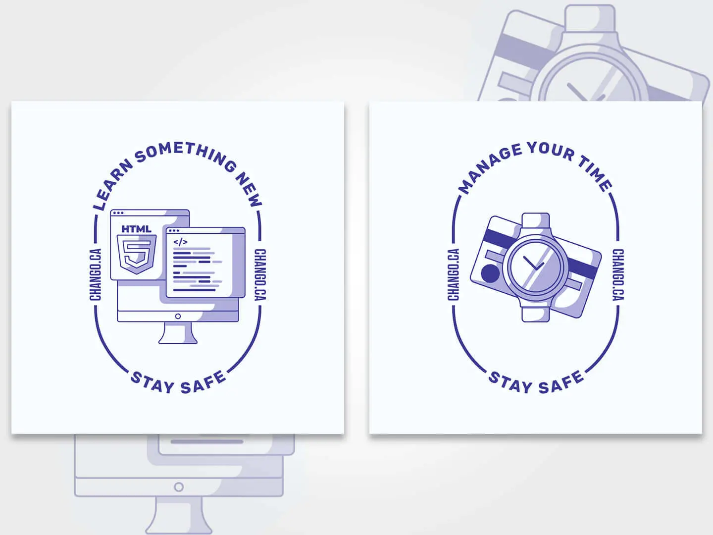
Primary colors
You might be surprised to learn that sometimes the best colors for social media are precisely the three primary colors.Primary colors contain all the hues, and have been popular in marketing and branding for decades, if not centuries.
Whether you use two or all three, primary colors are bound to attract the gaze of the viewer. They’re vibrant, colorful and demand attention.
If you opt for a primary color palette, a good idea is to use simple, geometric shapes and outlines. This creates a Mondrian-esque look that always looks impressive and fresh.

Neon on dark
When you ask yourself “What colors grab attention on social media?”, neons usually spring to mind. Neons are excellent color choices for social media. They’re eye-catching, loud, and screens give them extra glow.
Neons are often associated with being cutting-edge, futuristic, and powerful. Pairing them with a dark background gives them a cyberpunk vibe that works wonderfully for tech, finance, or even companies in creative fields. Neons are excellent color choices for specific social media platforms, such as Instagram, Twitch, and X.
The graphic below shows us how effective this color combination is. However, when choosing specific colors, especially neons and accents, make sure they fit your brand aesthetic.

Black and white with a splash of color
Black and white is the ultimate elegant, classy color combo. It’s one of the best color combinations for social media. In a sea of loud colors everywhere, sometimes the most impactful thing to do is the opposite.
If you have text in your posts, selecting a black and white color scheme and showcasing a beautiful font is a great way to add visual interest. However, there’s no rule that says you can’t add a splash of color, too.
A black and white post can really come to life with a high-contrast detail. A shape in a bold color can work wonders in social media. In the next example you can see how a simple color scheme seems elevated and fun through well-designed elements.
Conclusion
We hope this list has inspired you to experiment with your social media colors. Thoughtful design pays off in heaps, and choosing the right color palette is one of the pillars of any design project. This is true for social media marketing, and even more so for branding, logo, web, or app design.
Have the right color picked out for your graphics, but still need help with design? Try our unlimited design service and get all your social media graphics at a flat monthly rate. Pick your pricing plan or book a free consultation to find out more!

Journalist turned content writer. Based in North Macedonia, aiming to be a digital nomad. Always loved to write, and found my perfect job writing about graphic design, art and creativity. A self-proclaimed film connoisseur, cook and nerd in disguise.

Top-quality designers
A complete creative team at your fingertips: graphic and web designers, illustrators, and more.

Lightning-fast turnaround
Get start today and receive your first update on the next business day.

All-inclusive pricing
Unlimited requests and revisions. One flat monthly fee. No surprises.

Flexible & scalable model
No contract. Scale up and down as needed. Pause or cancel at anytime.
Continue reading


.jpeg)
Explore some of our best designs
Get inspired by a curated selection of ManyPixels work. Download the portfolio to see what our team can create.


