
What Makes Bad Website Design with Examples
.avif)
TABLE OF CONTENTS


Bad website design is much more than pure aesthetics. Learn what makes bad website design and how to avoid it.
In 2023, there’s no doubt about it - every business needs a website. Whether your main source of profit comes online from ecommerce, or you’re working on SEO efforts to reach local customers, the design of your website impacts business success.
Still, with over a billion websites online, there’s bound to be a few bad eggs. Buckle up as we take a bumpy ride though some pretty badly designed websites!
What makes bad website design?
First thing’s first - how to tell bad website design from good? Is it just the looks? Slow loading speed? Lack of fancy design elements, like motion graphics or videos?

Lack of white space
Cluttered design is probably the most common issue with poorly designed websites. Many non-designers have the urge to incorporate as many elements as possible, leading to a messy user interface that leaves users frustrated.
Arngren’s site is probably one of the worst website designs ever. On the other hand, it’s so often quoted as a bad website design example that the site may have inadvertently ended up with a lot of unexpected traffic!
However, this is probably not a gamble worth taking!

Bad navigation
Another major UX crime is making it difficult for users to find what they’re looking for. Poorly placed or incomplete navigation menus, and a complicated website layout will result in high bounce rates.
Remember, the goal of a good website is to allow users to find information or complete an action as easily and as swiftly as possible. Everything else (e.g. your content marketing efforts, a gallery of photos, etc.), should be organized in a different section of the site.
Poor-quality images and graphics
Aside from cluttered designs, one of the easiest ways to tell bad website design are bad graphics.
Remember that photos are raster files, which means that they can become pixelated if stretched out. On the other hand, custom graphics can also look below par, especially if you simply pick out a free image and don’t adapt it to suit your brand.
Finally, remember that all images and media on your site should be optimized for web use. This is important to ensure a fast loading time (more about it in the next section).
Slow loading speed
Loading time is one of the biggest factors that affects your site’s bounce rates. In fact, research shows that most users expect websites to load within 3 seconds.
Aside from using adequate file types and sizes, there are a few other factors that can slow down your site. For example, if you’re using website videos, you should consider whether to host them on your own site, or embed them from a third-party site like YouTube. Embedding is usually preferred as it makes your site faster and helps your SEO.
Finally, there are a lot of technical details, such as removing unnecessary scripts and using browser caching (you’ll need a web developer’s help for this).
Wrong fonts
So you have a great website layout and top-quality content? And people are still leaving your site almost immediately upon landing on it?
The problem might be poor readability, due to fonts that are too small to read. This is especially important with content marketing efforts. At the end of the day, no amount of clever keyword usage, and well-researched content can make up for users who simply can’t be bothered with text that’s difficult to read.
Most professional websites use sans serif fonts, as they generally have better readability. But, you can still achieve the desired aesthetic effect by using decorative serif or script fonts for your headings.
Lack of mobile responsiveness
Just think about how many times you’ve visited a website on your phone this week. If a site didn’t look right on your mobile device, you probably didn’t even bother coming back to it on the desktop.
Creating a mobile-friendly website is one of the top priorities for any web designer.
No branding
Last but certainly not least - remember that a professional website is your business’ online storefront. No matter how good it looks, or well it performs, if it doesn’t match your brand identity it’ll turn out to be a bad company website.
Use images, color scheme, and typography that fit your brand identity, and evoke desired feelings with your target audience.
15 Examples of truly horrible website designs
How about seeing some of these bad web design mistakes in practice? Here are 15 examples that do it!
Penny Juice
Feeling nostalgic? Then I recommend you visit this website for a trip to the 90s and the beginnings of the Internet!
The worst thing about this website is its outdated design, with poor color choices and random stock photos. The rest of the user experience isn’t even that terrible. They have handy CTA buttons, like “Learn More” and “Order Now”.
But it’s just really hard to get a total lack of visual appeal with this site.

Berkshire Hathaway
This web page might seem like an outdated online directory at first. However, it’s actually the homepage of a huge conglomerate, mostly focused on insurance. Yes, it’s all drab and businessy, but there’s no excuse for a page this basic and uninviting.

Toronto Cupcake
There are so many great bakery websites out there, but this is not one ofthem. Toronto Cupcake has a truly underwhelming homepage image and very poor navigation. A side bar is visible once you click on it, although you can also find the same exact options at the button of the page.
The worst thing about it is this top banner that looks like it should be a navigation menu, but instead it’s just unnecessary decoration.

MSN
A news portal is expected to have a lot of content. But the content needs to be presented in a user-friendly way.
MSN is so cluttered with stories that it’s virtually impossible to find something you’d focus on long enough to click on it. Add ads to the mix, as well as a huge navbar with the company’s many related services and products (Outlook, Skype, Bing), and you’ll end up with a page that’s completely unusable.

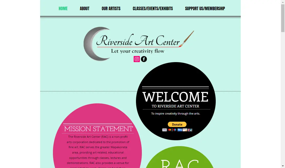
Riverside Art Center
Here’s another bad website design example that isn’t terrible regarding usability. However, the design isn’t what you expect from websites in 2023.
It uses some good techniques like framing text, a nice video, and social media buttons. Still, the color scheme is all over the place, there are several different incohesive fonts, and none of it suits the organization’s logo. So, the website fails to build any sort of brand image that visitors can connect with.
007 Museum
Nothing about this website’s design is particularly good. But the thing that irks me the most (aside from the fact that I adore James Bond and find this whole site an offense), is that it’s not properly centered. Every image is a different size, so the whole web design is slightly shifted to the left, resulting in an amateurish look.

eBay
Don’t think we’re prejudiced towards the “little guy”. There are some pretty bad website design examples even with major companies.
eBay is one of them. Although at first glance this website may seem like it’s a decent example of what it’s for (an online marketplace), the product pages offer a very poor user experience. Although it’s advisable to add as much information as possible to your product pages, you should do it in a user-friendly and accessible way.
Ebay’s product pages are so cluttered with information, making it difficult to focus on a single CTA.

Craigslist
In all fairness, creating a good website for thousands of different places is a pretty tall order. But the basic idea behind Craigslist’ UI is all wrong. Cluttered and with a total lack of design, it’s a good thing this company started way back in 1995, so people have gotten used to the messy interface.

Suzanne Collins Books
A writer might get away with a poor website. But you’re the author of a bestseller like Hunger Games, this definitely gives you a spot on a this list!
The biggest issue with this badly designed website is the lack of information architecture. There are so many quotes and links that it’s hard to understand what you should focus on first (presumably it would be a short author bio).

Lipton
This website page might seem perfectly fine at first glance. In fact, if you visit this website on your desktop, chances are that you won’t notice anything wrong with it (the visuals are a tad on the lower-quality side, but it’s not that noticeable).

However, this site doesn’t scale well with smaller screen sizes. As you can see one of the pop-ups blocks part of the main value proposition.

Cloud 9 Walkers
The giant Facebook button is probably a good telltale sign of an outdated website. But beyond that, this badly designed website is stuck in a different era.
Poor font choices, low-quality images, lengthy content that’s not reader friendly, a puzzling website layout… the list goes on.

Mr Bottles
This is one of the most disappointing examples of ugly websites. The reason is that the hero section of this site is actually designed quite well. There are cool interaction elements and the custom graphic really makes a great first impression.

But then you scroll down…
The color scheme is all over the place, and giant blocks of text are virtually impossible to read for the average site visitor. Sure, this is a bit of a niche site, but that doesn’t mean you can’t present longform content better (e.g. using a larger font, breaking up long paragraphs, using headings, etc).

IMDb
Although parts of IMDb’s website are terrific, there are areas leaving a lot to be desired. For example, I headed over to the “staff picks” section. Scrolling through the picks is pretty unintuitive, and the text itself is also not presented very well (it covers half the picture and the image credits section is way too big).

Ling’s Cars
Dubbed “UK’s craziest car leasing website”, this one certainly fits the bill. I suppose the bad site design here was more intentional than in some of the other cases. However, the aggressive color scheme and design makes it very straining to browse through the site.

Peter Buss AB
There’s nothing wrong with a simple website design. But, if you go with this route, make sure your offer is immediately obvious to everyone (preferably, irrespective of the language they speak).
Sure, this website is in Swedish, but I’m sure it’s conflicting visuals would confuse even native speakers. The hero image is that of a bus, including the shape of the company logo. However, as you scroll down you’ll see images of cruisers, moonlit sea, and plates of food, which have little to do with buses.
The moral here is to pick your visuals carefully. If you don’t have high quality images, a minimalist website design and custom illustrations can do the trick!

Final word
We hope this helps you understand how to tell bad design, and gave you a few eye-opening cautionary examples.
If you go the DIY design route and make your own website, it’s much easier to make some of these mistakes. Luckily, there’s more than one way to get affordable website design for your small business.
Get started with our unlimited design service and get all the designs you need with a monthly rate of just $599! No contracts or fine print - you can pause or cancel the service at any time.

Having lived and studied in London and Berlin, I'm back in native Serbia, working remotely and writing short stories and plays in my free time. With previous experience in the nonprofit sector, I'm currently writing about the universal language of good graphic design. I make mix CDs and my playlists are almost exclusively 1960s.

Top-quality designers
A complete creative team at your fingertips: graphic and web designers, illustrators, and more.

Lightning-fast turnaround
Get start today and receive your first update on the next business day.

All-inclusive pricing
Unlimited requests and revisions. One flat monthly fee. No surprises.

Flexible & scalable model
No contract. Scale up and down as needed. Pause or cancel at anytime.
Continue reading
.jpg)
.jpg)
.jpg)
Explore some of our best designs
Get inspired by a curated selection of ManyPixels work. Download the portfolio to see what our team can create.


