
What Makes a Good Website: 11 Best Tips with Examples

TABLE OF CONTENTS


Web design is one of the most complex and exciting areas of graphic design. It combines branding, user interface, and user experience design with the technical considerations of web development. So, creating a good website is by no means an easy feat.
Whether you run a local coffee shop or a multinational corporation, your business needs a website. We’re so used to searching for information online that it’s virtually impossible to build a successful brand and business without a solid online presence.
But while you may be aware that a professional website is a must, knowing what makes a good website can be a little more challenging to understand. You’re in luck! We’re about to share some top web design tips and a few good website design examples you can learn from.
But I’m getting ahead of myself. Let’s start with the basics: why does a website need to be good, anyway?
{{WEBSITES_PORTFOLIO="/dev/components"}}
Why do you need good website design?
Did you know that 75% of people will judge your website’s credibility based on your website? And you don’t have a lot of time to make a good impression either: people only need around 0.005 seconds to form an opinion about your website design!

If a website is slow to load, 25% of people will leave it, and 38% of visitors will stop engaging with an unattractive website.
So, as you can see, good website design is as necessary as the website itself.
So before we explain what makes a good website, let’s answer one fundamental question: how can you judge the quality of your website design?
The most critical statistic, of course, is the bounce rate. If you don’t know, bounce rates represent the percentage of website visitors that leave the site instead of engaging with it.
So, what is a good website bounce rate? It depends on the industry, but generally, a decent bounce rate is between 20% and 40%. Anything under is a bit unrealistic (or you may have really slow traffic, which is a more significant issue). If you’re experiencing extremely high bounce rates (90% and over), it’s time to sound the alarm.
Luckily, the reason for extremely high bounce rates is usually a single issue that could be (easily) fixed. For example, it might be an unattractive or overbearing graphic, incorrect website code, or browser incompatibility. You must identify the issue and resolve it since you don’t necessarily need to overhaul your entire website design for this.
What makes a good website?
Now that you know what is a good bounce rate and how you can measure the effectiveness of your website let’s look at some of the key features of the best websites.
A clear sense of purpose
A website is the digital storefront of your business. Have you ever walked inside a shop and left because you weren’t quite sure what it was about? A similar thing can happen with websites.
You must ensure that your homepage instantly communicates the purpose of your website. If you have an online shoe store or legal firm, this might be as simple as including the title “Shoe Store” or “Legal Firm.”
But what about software-as-a-service businesses? Explaining complex software can be challenging even if you have the space of a whole paragraph, let alone one sentence.
The key here is to focus on your value proposition. Don’t say, “we have tax compliance software”; say, “we make taxes simple.” Highlight how you help solve a user’s problem.
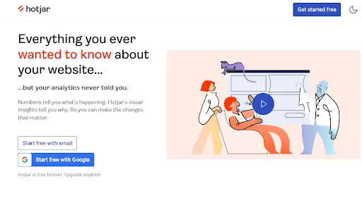
There are many good website design examples to learn from, but I’m particularly fond of this one. Hotjar is a well-known website analytics tool that’s heavily user-focused. If you don’t know much about website traffic and SEO, throwing in terms such as bounce rates, keywords, and optimization can be off-putting. Instead, they make their value proposition straightforward and appealing: understand your website.
Sticking to the basics
Many small businesses and individuals, when creating visually appealing websites, make their websites too extravagant and forget the basics.
Choose a simple color scheme that suits your product or service (or your personality), create a custom logo (trust me, brands need a custom logo), choose simple fonts that are easy to read, and most importantly - build your website with a custom domain.
Businesses with custom domains see higher conversion rates than businesses with subdomains because custom domains build trust and authority. In the case of online stores, a custom domain combined with an SSL certificate can boost conversions and help you build a trustable brand.

Apart from the logo, color scheme, and text of your website, easy navigation and responsive design can also be counted as the fundamentals of a good site. I will discuss these points in detail later on.
Aesthetically pleasing interface
We’ve already said that ugly websites repel visitors faster than you can say Jack Robinson. So, a good website design doesn’t just have to fulfill a purpose - it has to do so with style.
But what is style? Despite what Devil Wears Prada tried to teach us, in the digital design and marketing world, it’s much more elusive than a single person’s opinion. The most important thing about your website aesthetic is that it’s on-brand.
If you haven’t sorted it, you should always start with your logo, followed by a complete brand guide. Here, you’ll compile the design elements (colors, fonts, images, etc.) that represent your brand. Only then can you start to design a website, following the principles and rules you’ve established.
Here’s a good website example to learn from. If your website has to include several stunning artworks, the importance of a beautiful interface might not be obvious. However, you can see how the old website design seemed a little cluttered and a tad dated due to the grey background.

Art Institute Chicago's website redesign has a much more dramatic look (it features one striking image to promote an ongoing exhibition).


Beyond that the website has a new, crisp look with a simple white background and a layout that allows each image to shine through. The minimalist style is much more appropriate for an art space and will likely remain relevant for years to come.
Easy navigation
So we’ve talked a bit about the importance of making that first impression. Still, if you’re doing your job right, you ought to move visitors beyond your homepage so they can learn more about your business and move down the sales funnel.
The critical aspect of good website design here? Good navigation. If you don’t know, navigation is a term that describes the organization of a website. The most critical aspect, of course, is the menu which helps users find the relevant web pages.
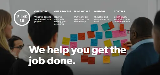
Here’s a great example from a design agency called Punk Ave. The main menu is straightforward and has all the most vital sections. They’ve also included a short description/CTA below each menu option to make it more clickable.

Mobile optimization
A little over half of the world’s Internet traffic comes from mobile devices. So, even if you think your customers will primarily use desktops, you definitely need a mobile-friendly, responsive design for your website.
Suppose you don’t know much about web design. In that case, you might be surprised that the design of a mobile website is an entirely separate project from the design of your desktop version. While using the same colors, content, and images, you might have to rethink the layout to keep your mobile website user-friendly.
Here are some good website design examples for mobile and desktop website versions. This stunning website belongs to a project from legendary graphic designers Stefan Sagmeister and Jessica Walsh. The site is dedicated to their Beauty exhibition and book.
The desktop website features an ornate animated logo against a stylish dark background. It has 4 clickable options allowing visitors to find out more about the exhibition, book, their design agency or get in touch.

In contrast, the mobile version of the website features a different image that’s also static. The image is much more ornate, so there’s no need for additional motion design to make it more engaging. This also improves the loading speed of the mobile website, which is paramount since 53% of people leave a mobile site if it takes more than 3 seconds to load.
The drop-down menu is placed in the top left corner to help achieve the same effect as the desktop website: one powerful visual you can dwell on before browsing the site.

Fresh content & visuals
What’s more important, a website’s content or design? For most parts, they are equally important. A beautifully–designed website won’t be able to fulfill its purpose without relevant content in the form of menus, value propositions, call to action (CTA) buttons, etc.
Equally so, no matter how much informative and helpful content you produce, nobody will engage with it if it’s not reader-friendly.
It’s evident how content can improve the design (it’s often a critical component of graphic design). However, the power of graphic design is sometimes less obvious - but often even more vital. Since people read only about 25% of a webpage, visuals are the only way to keep audiences engaged.
For example, infographics and good website design are a match made in heaven since this allows you to share critical information in a fun, digestible way.
We have a list of infographic-driven website design examples that you can take inspiration from, but here’s one that perfectly illustrates the point. The Arnold Clark Saving Challenge website is designed like one long, interactive infographic. The visuals are fun and beautiful, and the site provides heaps of information without being overbearing or boring.


Clear CTAs
After you’ve ticked all the boxes of good website design, there’s only one thing left to do: get prospective customers to take action.
The way you phrase and design your CTA is one of the most vital decisions you’ll have to make. A call to action should be:
- Concise: Don’t add any additional information to the CTA. Rely on the information provided elsewhere to send a simple message such as “buy now,” “sign up,” “learn more,” etc.
- Timely: Give visitors enough time to get to know your business and value proposition before asking them to take action.
- Unambiguous: Green usually means “yes”; red is often used to designate “no.” Pay attention to the usual graphic design conventions and the context of your CTA buttons to avoid frustrating users or creating horrible design fails like the one below.

Content marketing + search engine optimization
Search Engine Optimization (SEO) is vital for effective websites, enhancing visibility in search results and boosting organic traffic. SEO prioritizes user experience by optimizing page speed, mobile responsiveness, and usability.
For content marketing, align your content with user intent by using relevant keywords to attract and engage visitors. This establishes your site as a valuable resource. SEO builds trust by improving rankings, which is crucial for a positive online reputation and brand confidence.
One excellent website example is Ahrefs. Just check out their YouTube channel and their blog, and you will know how much effort they put into their videos and blogs.

Local SEO strategies benefit businesses in location-based searches, attracting nearby customers. Crafting compelling page titles and meta descriptions, along with link building, adds to the site's authority.
So, if you want to build a brand in today’s digital world, your content marketing efforts and a well-planned SEO strategy must go hand in hand. Some of the most effective websites nowadays invest a lot in SEO.
Social media integration
Social media integration is crucial for a good website, seamlessly allowing users to share content on platforms like Facebook and X.The best thing about social media integration is that you can build a strong community by interacting with your audience in real-time.
Also, urging your audience to like, comment, and share your content will give you free exposure and possibly new audience, too.
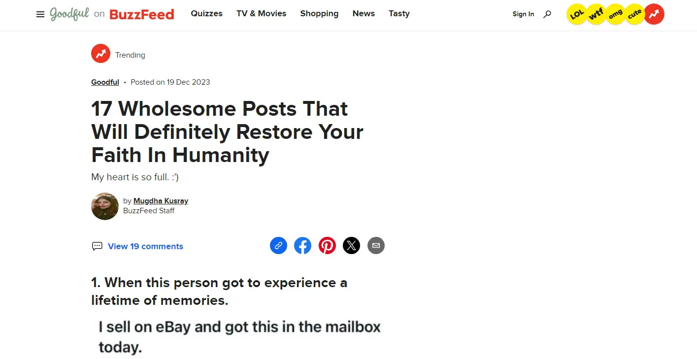
Look how Buzzfeed lets its users share the article on their social media feeds with just one click.
If your audience is talking about your brand on social media sites, then you are going to get thousands of organic eyeballs. Because, user-generated content act as testimonials, a social proof, which makes your brand look authentic and builds trust.
You can also use analytics to track social media-driven traffic and interactions, and cross-sharing extends reach, attracting diverse audiences.
Clear contact information
Providing clear contact details can affect user experience positively. It can instill customer’s confidence in your brand and also facilitate engagement. Another advantage is it streamlines communication processes, enabling seamless interactions with potential customers, partners, or collaborators.
Look at how Zendesk, one of the best CRM software for bettering customer experience, presents its contact information on its page. You can talk to a member of their sales team if you want to buy their product. Or, if you have already bought their product and need help with something, they have a separate section, and a team, for you.
I really like how they give addresses of their offices around the world, with map links, for people looking to visit their offline stores.

Utilizing analytics and data insights
Analytics and data insights are essential for optimizing business websites. These tools provide valuable information about user behavior, preferences, and website effectiveness. Businesses can use data to make informed decisions, refine strategies, and improve the user experience.
Website analytics help track traffic sources, understand user demographics and identify popular pages. This information can help you create targeted content for a specific set of audience. Also, track conversions to assess your sales success.
How can you get a good, affordable website?
Now that you know what makes a good website, what if you’re still struggling? Here are a few ways to get a custom website without breaking the bank!
Website builders
Popular website builders like Shopify, WordPress, Squarespace, and Wix often offer a free plan to create your website, which is enough to get a headstart.
These platforms provide high-quality one-click import templates, drag-and-drop editors, and various other features to make your website in an hour. However, with the free plan, you will have limitations, and a truly effective website WILL need a bit more work, effort, and expertise.
Freelance web designers
If you do not want to design your website, a freelance web designer offers you the expertise and personalization you require for your custom website. Freelancers charge fixed or hourly rates, so you’re probably looking at paying a few thousand dollars for your design.
Unlimited design service
An unlimited graphic design service like ManyPixels offers you the best of both worlds: the experts in designing your custom website at affordable flat monthly rates - often lower than a single website design project with a freelancer.
With our service, you can request unlimited graphic assets (social media posts, ads, landing pages, illustrations, and more). We have created amazing website designs for businesses and individuals, and we can do the same for you!
Find out more about the service, or book a free consultation with us to discuss your design needs!

Having lived and studied in London and Berlin, I'm back in native Serbia, working remotely and writing short stories and plays in my free time. With previous experience in the nonprofit sector, I'm currently writing about the universal language of good graphic design. I make mix CDs and my playlists are almost exclusively 1960s.

Top-quality designers
A complete creative team at your fingertips: graphic and web designers, illustrators, and more.

Lightning-fast turnaround
Get start today and receive your first update on the next business day.

All-inclusive pricing
Unlimited requests and revisions. One flat monthly fee. No surprises.

Flexible & scalable model
No contract. Scale up and down as needed. Pause or cancel at anytime.
Continue reading
.jpg)
.jpg)
.jpg)
Explore some of our best designs
Get inspired by a curated selection of ManyPixels work. Download the portfolio to see what our team can create.


