
Restaurant Website Design Examples for Your Inspiration
.jpg)
TABLE OF CONTENTS


A great restaurant website is not a portfolio piece. It’s a sales tool. It helps people make quick decisions, find what they need, and take action (reserve, order, or call). Social media might bring attention, but your restaurant website is where people confirm details and make a commitment.
Good restaurant websites are designed with intense purpose. It makes the restaurant feel desirable, but it also makes the experience frictionless. That’s how you get more bookings, more orders, and fewer lost customers.
Do restaurants need a website?
Do restaurants need a website in 2026 if they already post on Instagram and TikTok? Yes. People still Google restaurants, and they still click the official site for hours, menus, directions, and pricing. It’s also where you control the story, instead of relying on third-party listings that may have outdated contact information.
If you’re wondering how to create a restaurant website, start with structure, not trendiness. Use restaurant website builders like Squarespace, Wix, Webflow, or WordPress. Keep it easy to navigate, make it easy to update, show real food photos, and put the key actions up front. Strong, converting websites are one of the best ways to help customers to find you and take action quickly.
Below are 25 examples of the best restaurant website experiences (international + US). You’ll also likely find a new favorite restaurant website while browsing.
25 Best Restaurant Websites (And Why They Work)
1. Quay (Sydney, Australia)
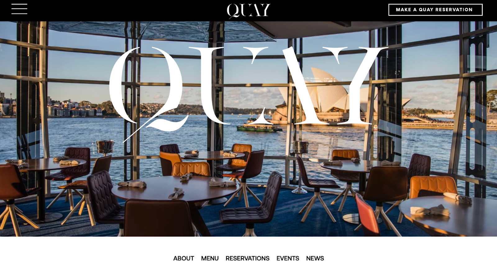
Luxury restaurant design that still respects usability. Strong hero imagery sets the tone immediately, while the navigation stays clean so the booking table never feels hidden.
2. Noma (Copenhagen, Denmark)
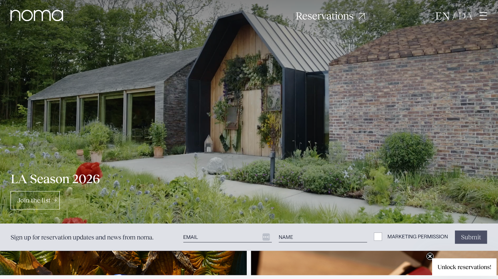
More editorial than commercial, in a good way. The site feels like a curated story and uses minimal text, bold photography, and space to signal high-end craft.
3. Eleven Madison Park (New York, USA)
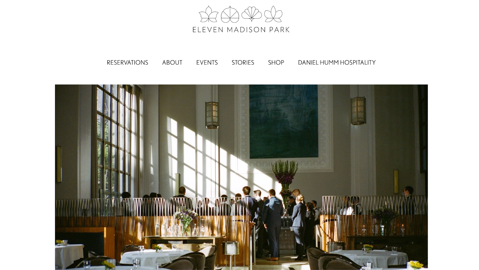
A masterclass in restraint. Everything supports one goal: reservations, while the brand story gives context without distracting from conversion.
4. Disfrutar (Barcelona, Spain)
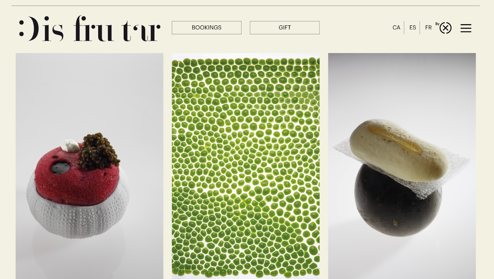
Bright, creative visuals paired with a structured layout. You get energy and personality without losing clarity or readability. This particular example also makes it easy for guests to purchase gift cards without having to scroll. That’s definitely something to take note of.
5. Osteria Francescana (Modena, Italy)
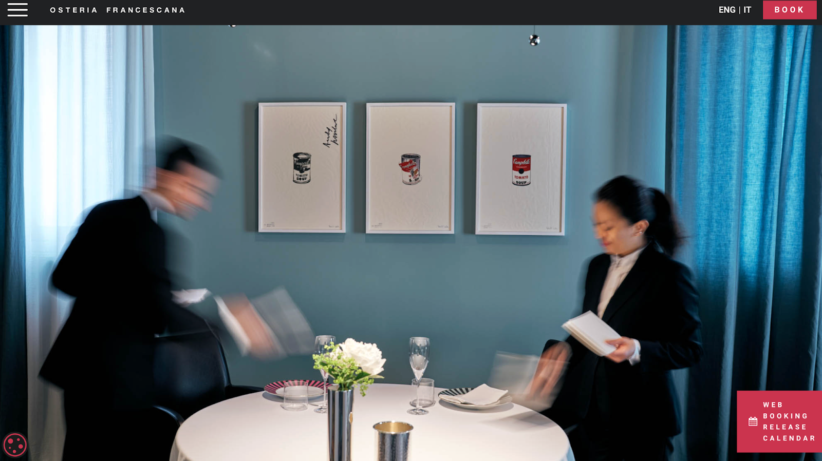
The website feels exclusive, but not confusing. A simple hierarchy guides visitors toward key info without overloading the page.
6. The Ledbury (London, UK)
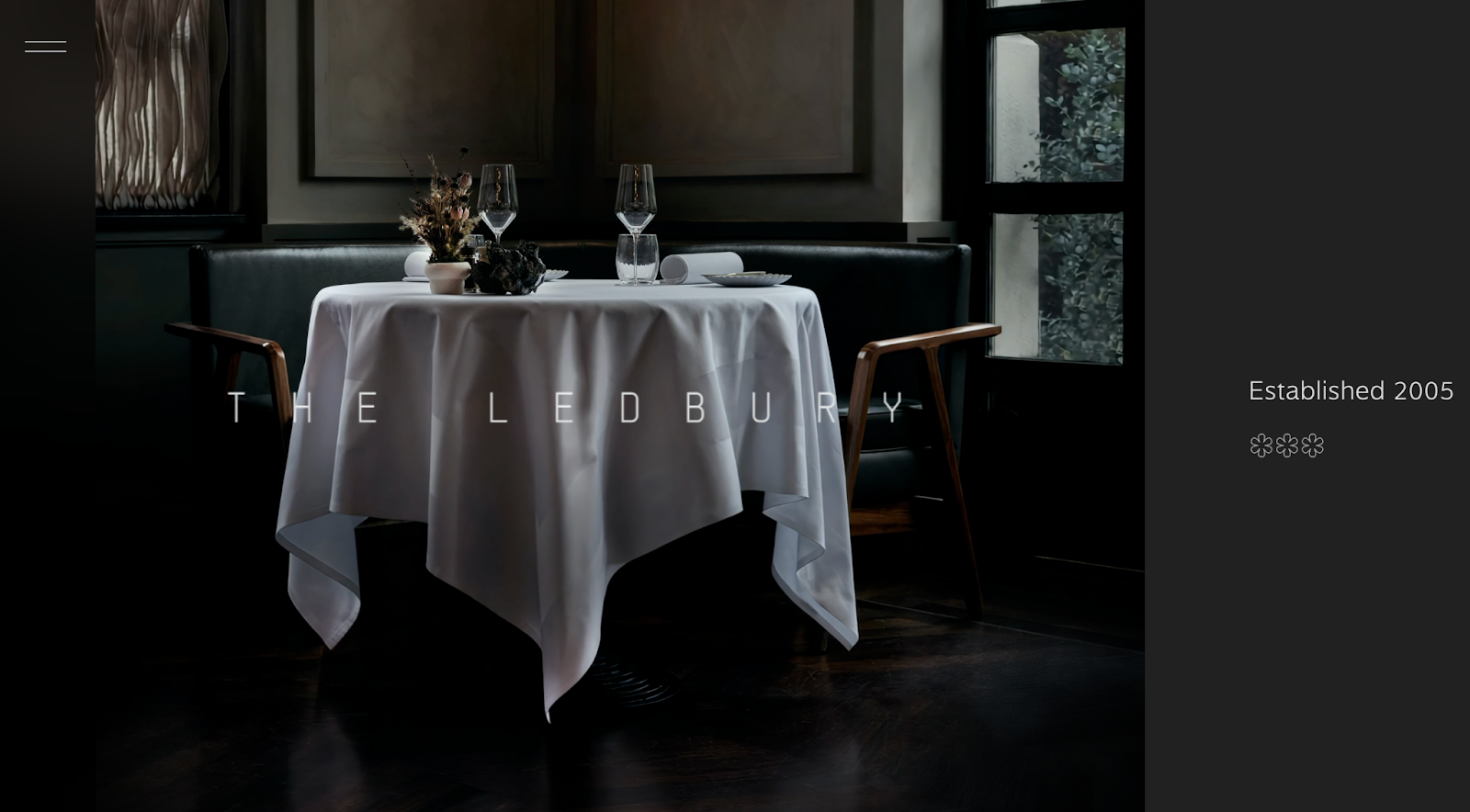
Polished fine dining design that’s still practical. Typography and spacing do the work, keeping the site calm and premium.
7. Attica (Melbourne, Australia)
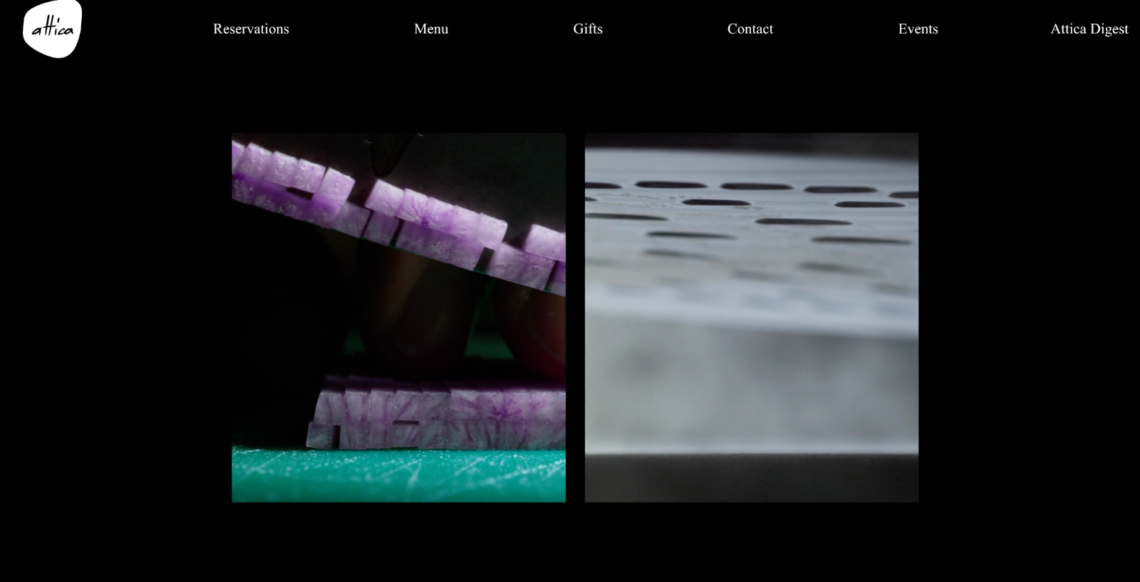
Great example of using storytelling without becoming long-winded. Clear sections keep visitors moving while building trust and meaning.
8. Central (Lima, Peru)
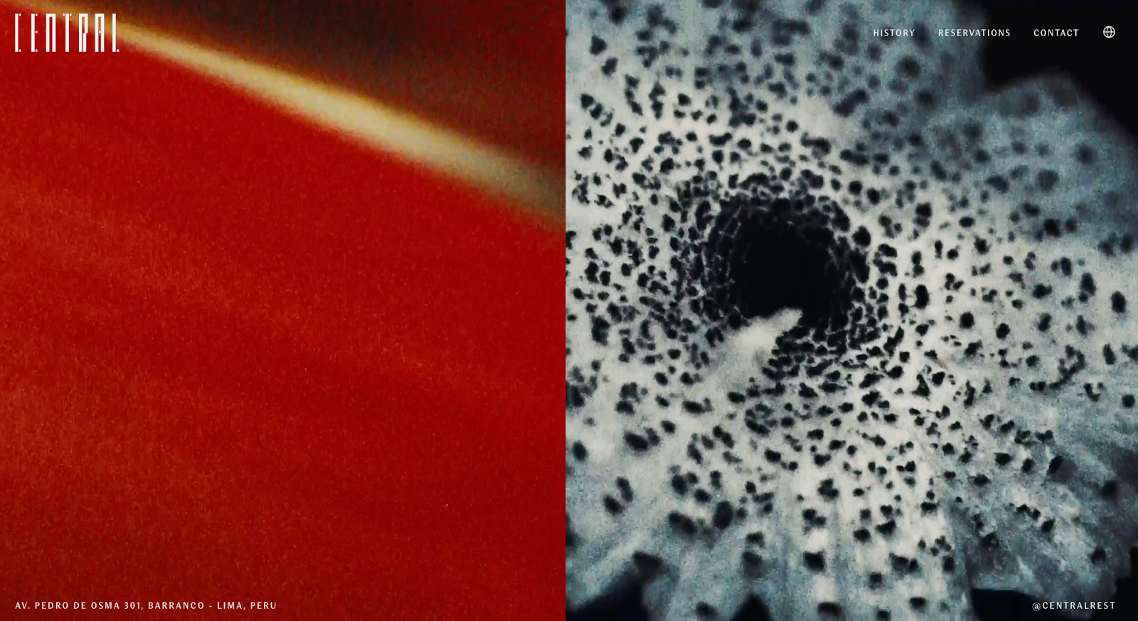
One of the strongest “concept restaurant” websites. It explains the experience quickly, then sells it through visuals and structure.
9. Le Bernardin (New York, USA)
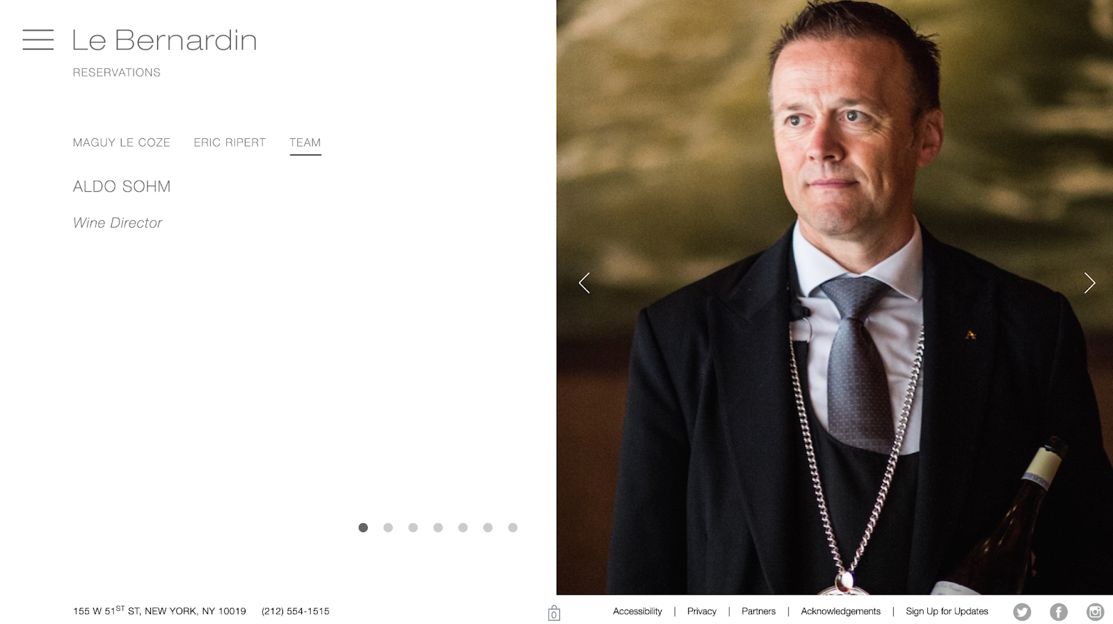
Classic and timeless. The site has excellent information design: menus, hours, and location are always easy to find.
10. Pujol (Mexico City, Mexico)
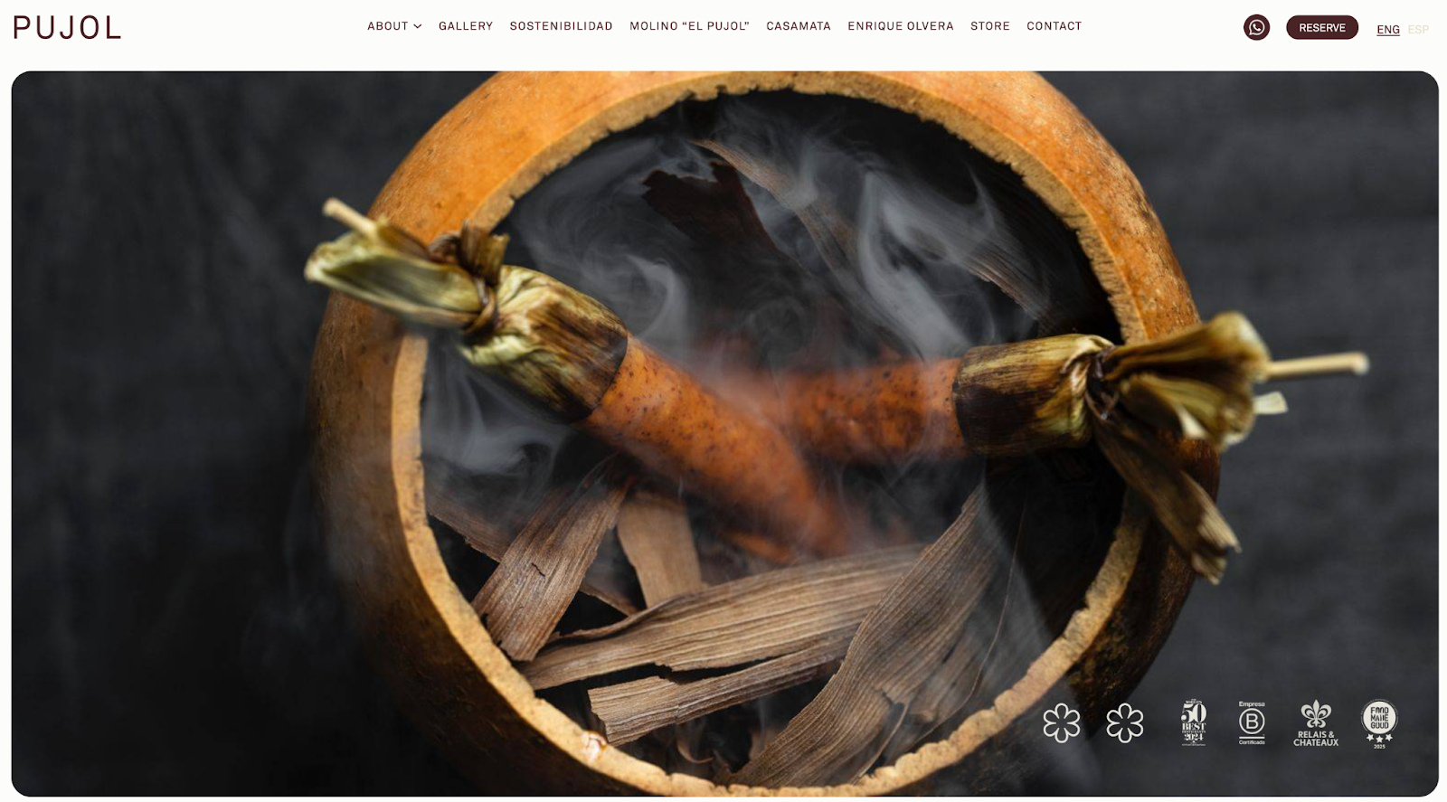
Efficient for international visitors. The experience feels premium, but the site stays straightforward and conversion-driven.
11. Alinea (Chicago, USA)
Feels like booking an event rather than dinner. Bold brand decisions, strong visual flow, and clear CTAs make it a true conversion site.
12. The Original (Denver, USA)
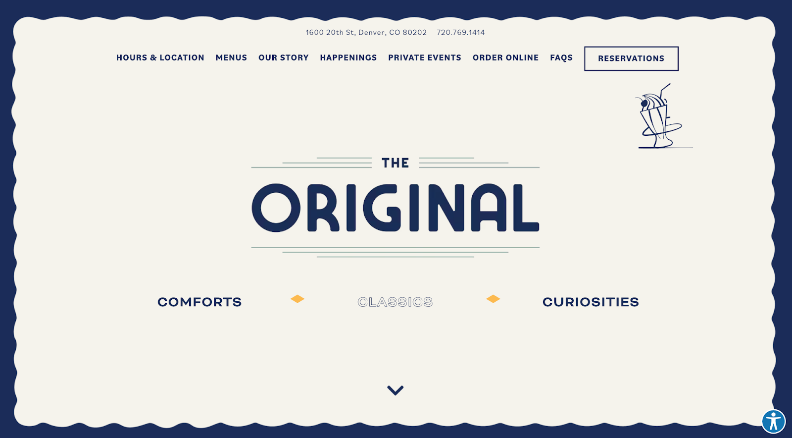
Unique personality without UX chaos. The design is playful, but the reservation path stays obvious and frictionless. Also, take note of the subtle contact info right at the top of the page.
13. Colletta (Alpharetta, USA)
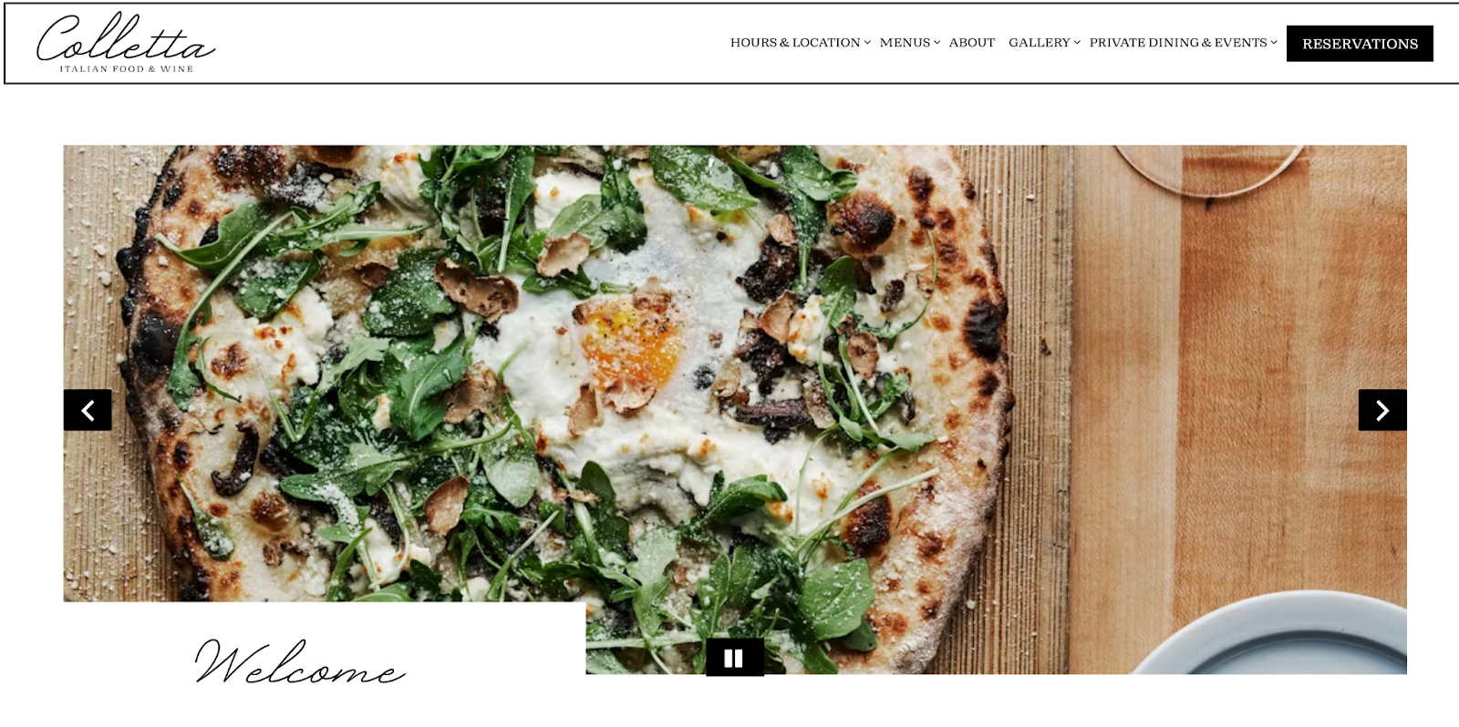
Elegant restaurant website design built around action. On mobile, the site is especially fast and clean, which matters most for restaurants.
14. Roman’s (Brooklyn, USA)
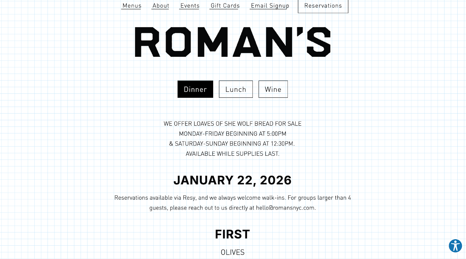
Menu-first, no nonsense, no fluff. It respects user intent and delivers the main answers instantly.
15. Damian (Los Angeles, USA)
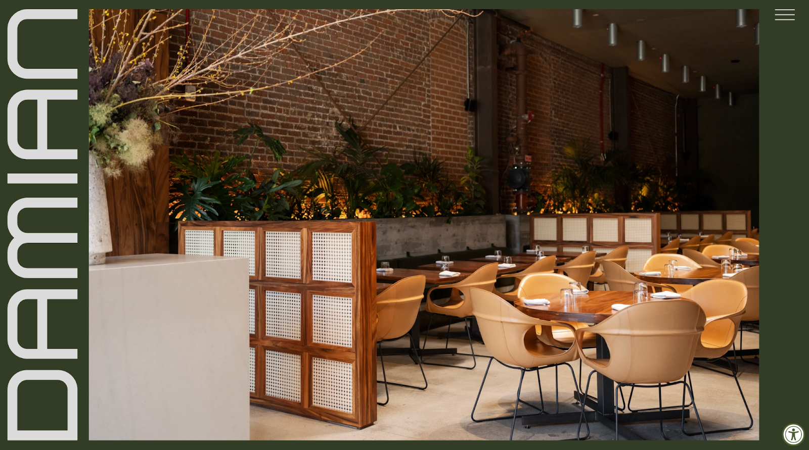
Minimal pages, maximal mood. Strong photography and layout keep attention on what matters, booking and credibility.
16. Dim T (UK)
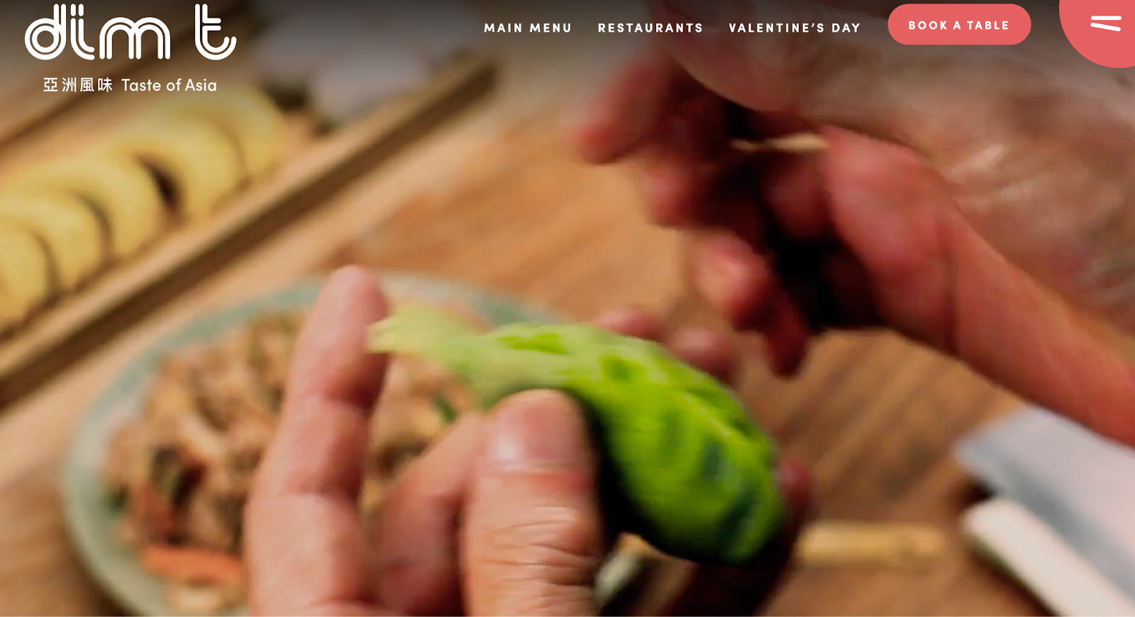
Modern design that makes it easy for a group to decide quickly. The booking flow is simple, and the menu presentation stays readable.
17. Mowgli Street Food (UK)
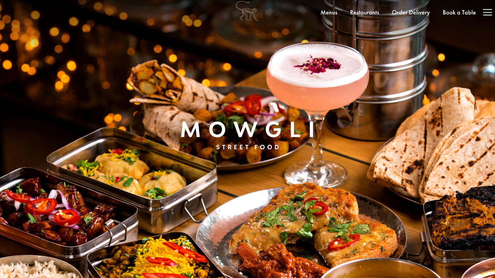
Warm, human branding. It feels friendly while staying structured, with a strong reservation experience.
18. Sunday in Brooklyn (New York, USA)
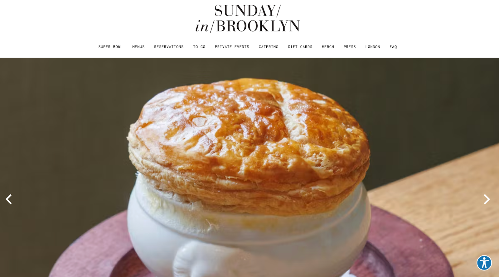
It sells desire through photography and press proof. The design stays clean so visitors can move from browsing to action quickly.
19. Shake Shack (Global)
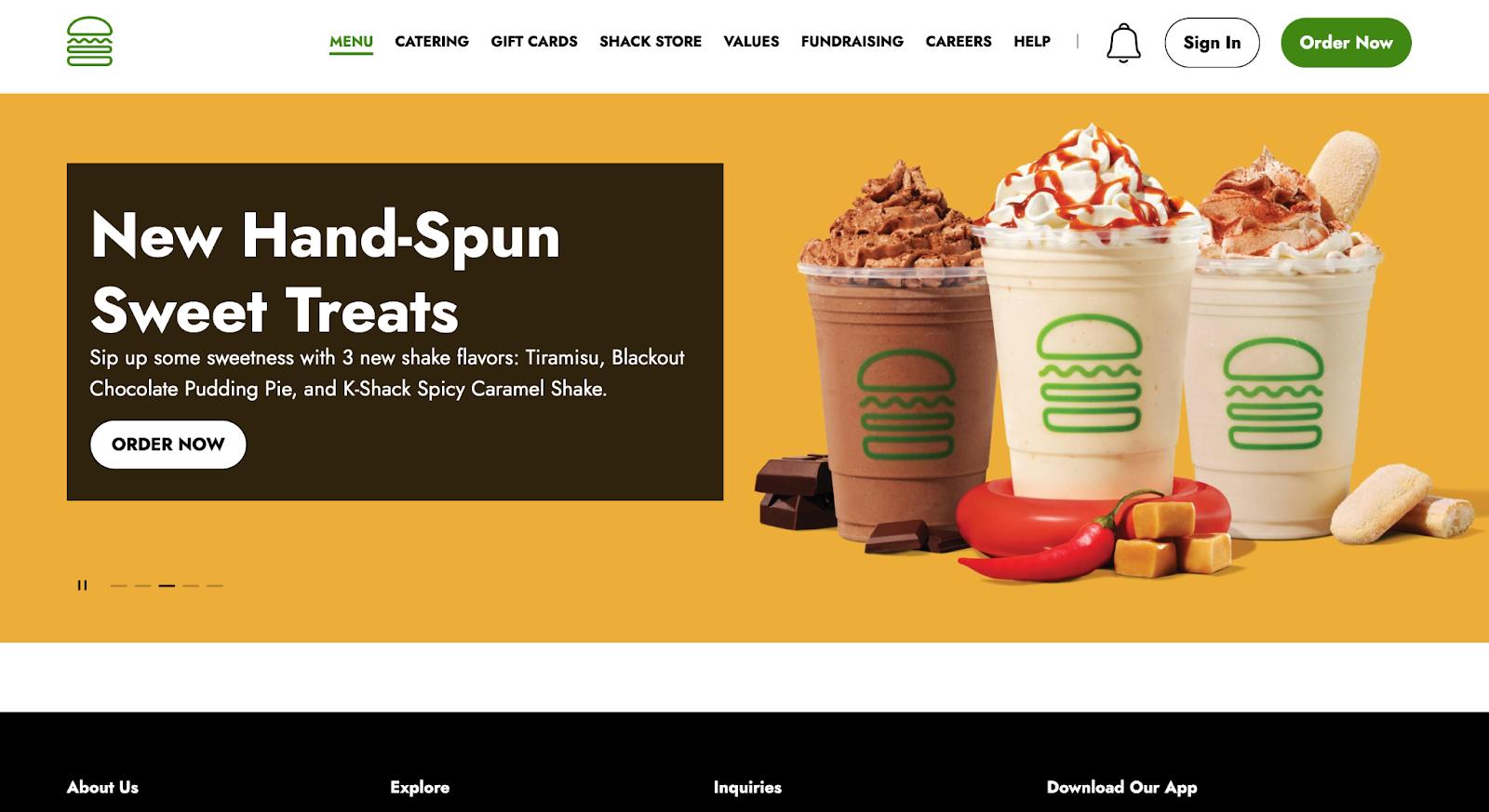
Fast casual done properly. Menu clarity, easy location search, and smooth ordering paths are handled at scale.
20. Lucha Libre Taco Shop (San Diego, USA)
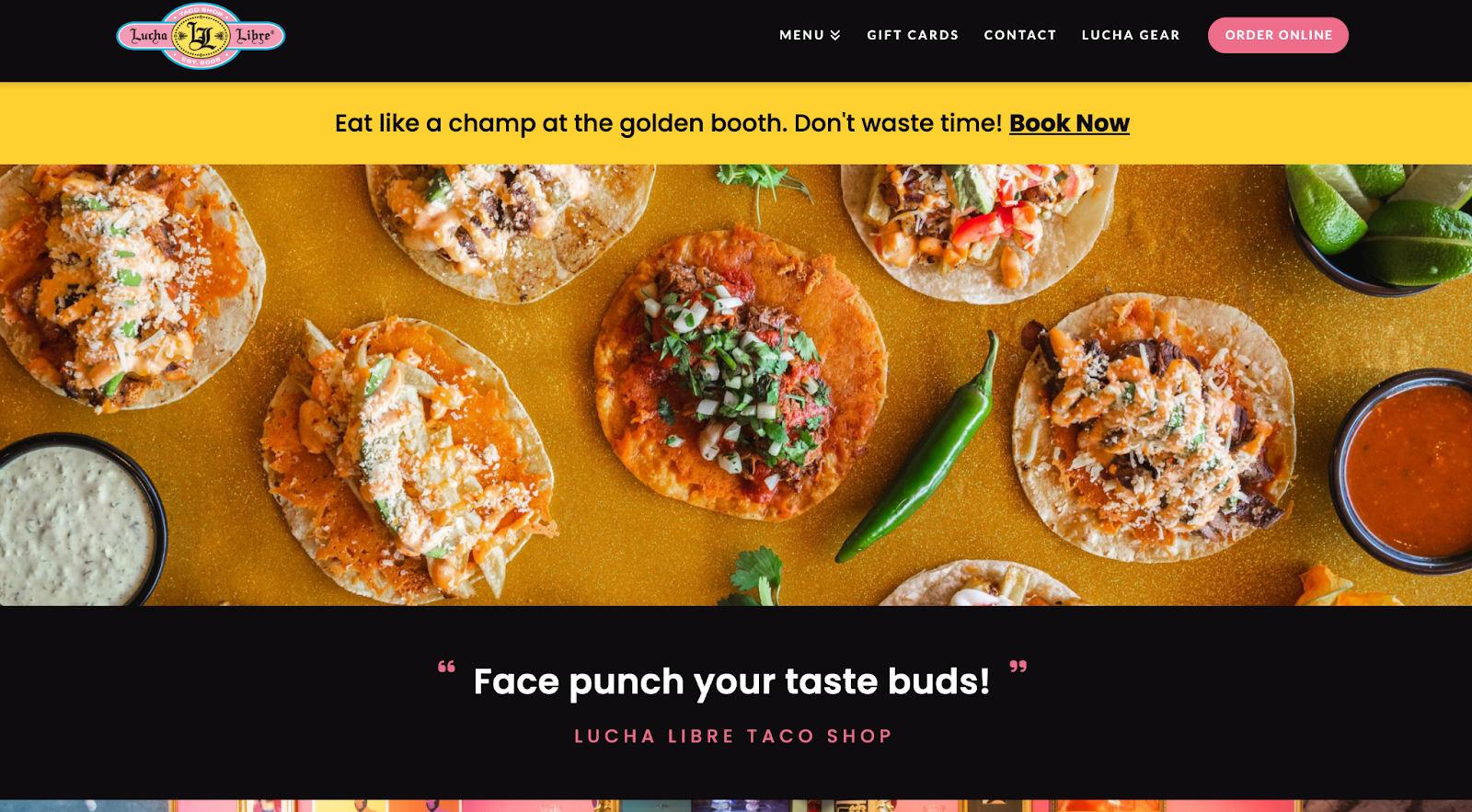
Strong personality with smart structure. It turns visitors into customers fast by highlighting online ordering and providing simple navigation.
21. Bavet (Belgium)
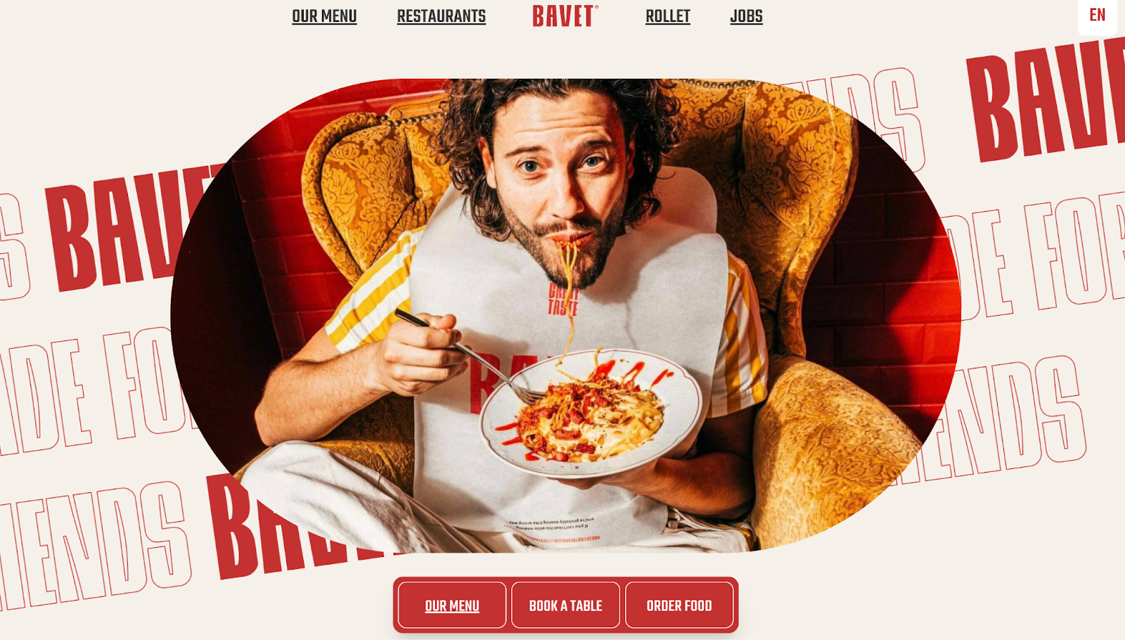
Brand-forward but organized. A great example of fun storytelling that still stays clear and conversion-friendly.
22. Dishoom (UK)
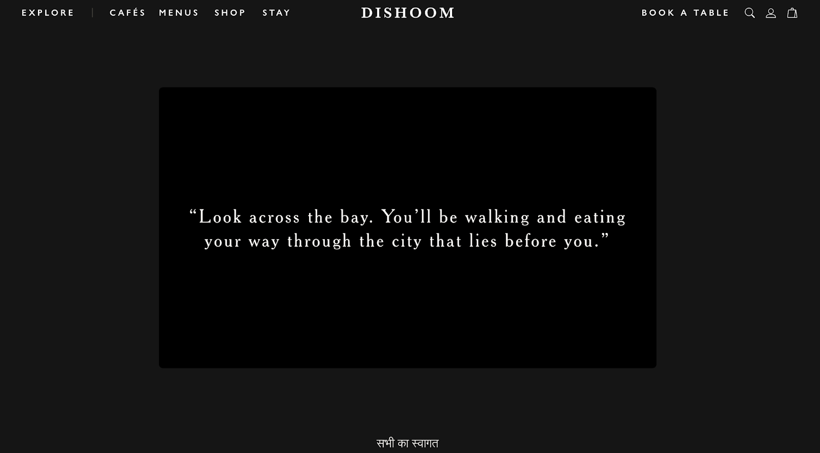
Great atmosphere translated online. Strong typography and photography recreate the feel of the restaurant while keeping the experience simple for users.
23. Restaurant Frantzén (Stockholm, Sweden)
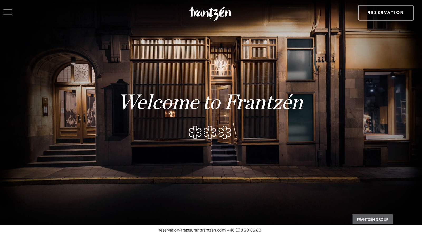
Ultra-premium visual design with careful typography and plenty of whitespace. The site feels like fine dining before you even arrive, while keeping menus and reservations easy to access.
24. L’Enclume (Cartmel, UK)

Simple, calm layout that makes the experience feel refined and intentional. Strong photography and clear navigation do the work without over-designing.
25. Odette (Singapore)
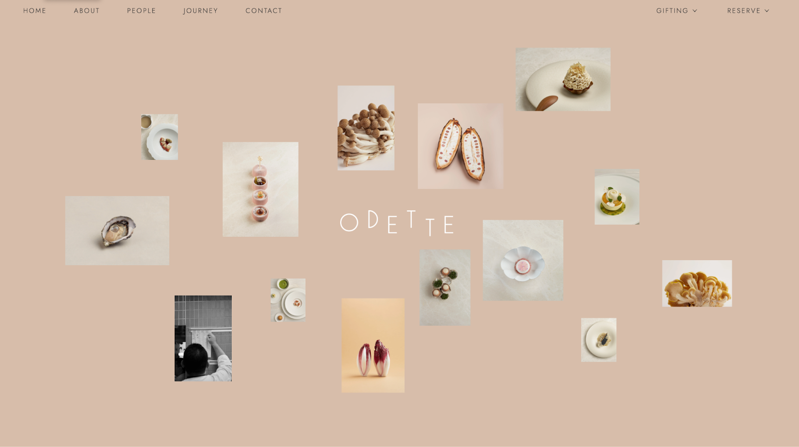
High-end and modern with an art-gallery feel. Excellent hierarchy and pacing of food photos keep attention high and drive visitors toward booking.
What the Best Restaurant Website Design Always Gets Right
The common thread across every best restaurant website design is not fancy visuals. It’s clarity. Great websites are built for real users: they’re easy to scan, easy to trust, and easy to act on. They use great logos and photography to sell the experience, they make key details obvious, and they reduce friction in the moment of decision.
If you’re building a restaurant website, remember that design choices affect revenue. A clean layout can increase reservations. A menu that loads fast can lead to more orders. A strong CTA can be the difference between someone visiting and bouncing. That’s why restaurant websites are still one of the most effective marketing assets you can own, even in a world dominated by social media.
If you’re still wondering how to create a restaurant website and want some help, ManyPixels offers website design services tailored for fast-moving teams. They can help you build a site that looks premium, is easy to update, and works as a conversion engine, not just a digital brochure.
{{BRAND_BANNER="/dev/components"}}

Zach is a content and SEO strategist with an affinity for cars, tech, and animals. He runs a SaaS content agency, and when he's not typing, he runs his small-scale farm at home.

Top-quality designers
A complete creative team at your fingertips: graphic and web designers, illustrators, and more.

Lightning-fast turnaround
Get start today and receive your first update on the next business day.

All-inclusive pricing
Unlimited requests and revisions. One flat monthly fee. No surprises.

Flexible & scalable model
No contract. Scale up and down as needed. Pause or cancel at anytime.
Continue reading
.jpg)
.jpg)
.jpg)
Explore some of our best designs
Get inspired by a curated selection of ManyPixels work. Download the portfolio to see what our team can create.


