
Old fonts: 50 vintage fonts sorted by historical era
TABLE OF CONTENTS
TL;DR
- ✅ Best free picks for business use: Cinzel for a vintage logo, Rye for a period poster and Yellowtail for a menu. All three are on Google Fonts with open licences.
- 🎨 Best era for a modern brand: Art Deco. Its geometry suits minimalist layouts, and Poiret One and Limelight are free for commercial use. Adelios starts at $5 a style if you want a full paid family.
- 💰 Worth paying for: Alathena ($70 for the family) for Art Nouveau and Lempicka ($29) for Art Deco invitations.
- ⚠️ Check the licence first: 27 of the 50 are free for commercial use, 5 are free for personal use only, and 18 are paid. Six fonts this article used to call free are not, including Mesquite, Durango Western and Keep on Truckin'.
- ❌ Do not set body text in a vintage display font. Use it for headlines and pair it with a plain body font (pairings are below).
What counts as an old font? Some typefaces have been in use for so long that we forget where they came from. Others are new designs that borrow a period look. This list includes both, and sorts all 50 by the historical era they belong to, from Roman capitals to 1990s grunge, because the era decides what a font says about a brand. A blackletter says tradition and craft. A 1950s script says fun. A 1920s geometric says glamour.
If you would rather browse by style (serif, sans serif, script, decorative), our retro and vintage fonts list is organised that way.
{{BRAND_BANNER="/dev/components"}}
How we chose and checked these fonts
We grouped every font by the period its design comes from, then checked each one on 28 October 2026 against the designer's own note, the foundry or shop page, or its Google Fonts or Open Font License listing. Each font has one of three labels:
- Free for commercial use: the source says commercial use is allowed, through an open licence (SIL Open Font License or Apache) or the designer's own wording.
- Free for personal use only: the download is free, but you need to buy a licence before using it in anything that earns money or represents a business.
- Paid: you buy the font, or get it through a subscription such as Envato Elements or Adobe Creative Cloud.
The check changed a lot. Eleven fonts from the 2022 version of this list were withdrawn from sale, could no longer be traced to a working source, or had no download we could confirm, so we replaced them with verified fonts, several of them covering decades the old list skipped. Six fonts that were labelled free turned out to be personal use only or subscription-only. Within each era you will find serifs, sans serifs and scripts. If you are unsure of the difference, our guide to serif vs sans serif explains it.
Treat the licences as a snapshot. Terms change, and directories often keep an old label after a designer updates it. Read the licence file in the download before using any font for client work, and keep a copy. Our list of free commercial fonts explains what to look for.Antique fonts
Probably the most famous font from this group is Papyrus. Unfortunately, this font has gotten a bit of a bad rep due to unsuitable uses, including the now-notorious Avatar movie logo.
However, these fonts inspired by ancient civilizations (Greek, Roman, and Egyptian, mostly) can be a terrific choice for businesses such as spas, beauty salons, or museums. Basically, anywhere where the nod to these ancient times makes sense.
Ancient and antique fonts
These fonts borrow from Greek and Roman inscriptions and early Celtic manuscripts. The most famous of the group is Papyrus, which earned a bad reputation through overuse, including a lightly modified version on the Avatar logo. The better options below suit spas, museums, law firms and anything that wants to signal age and permanence. All five are free for commercial use.
1. Forum
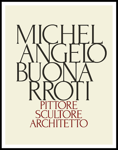
Forum has classic Roman proportions and was designed by Denis Masharov to work in headlines and body text alike, which is rare for a vintage face. It supports Cyrillic as well as Central and Eastern European languages. It is released under the SIL Open Font License, so it is free for commercial use.
Licence: free for commercial use. Best for: Legal, health and accounting brands.
2.Cinzel
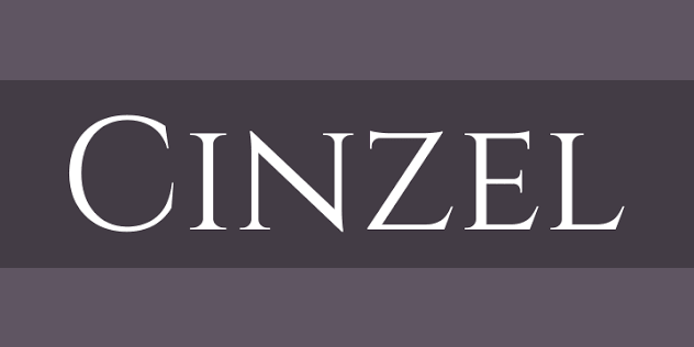
Cinzel is based on first-century Roman inscriptions, the same source that gave us the capital letters on Trajan's Column, but its designer gave it a cleaner, contemporary finish. It is all capitals, so use it for names and titles rather than sentences. It is our pick for a vintage logo because it holds up at small sizes. Open Font License.
Licence: free for commercial use. Best for: Vintage logos, wine labels, book covers.
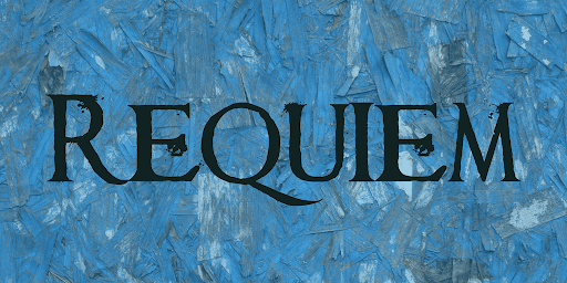
3. Requiem
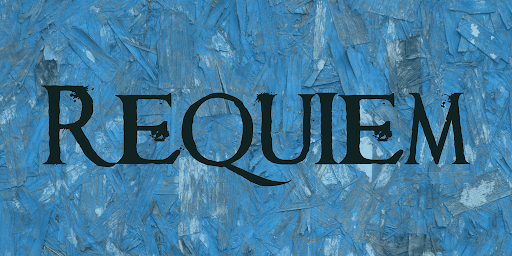
Requiem is a heavy, slightly eroded serif with an ancient feel. Its designer, Chris Hansen, updated the terms in 2020: the font is now free for commercial use, and he asks that you consider a donation to the koala hospital in New South Wales. Some directories still list it as personal use only, so download it from a source that carries the 2020 note.
Licence: free for commercial use. Best for: Posters, event titles, gaming.
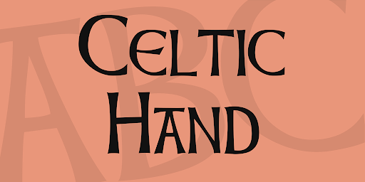
4. Celtic Hand
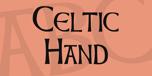
Celtic Hand moves from Greco-Roman forms to insular lettering. It is decorative without being cartoonish, and it would make a good start for a craft beer logo. It is by Typographer Mediengestaltung, with the full character set added by Dieter Steffmann, and 1001 Fonts lists it as free for commercial use.
Licence: free for commercial use. Best for: Pubs, breweries, Irish and Scottish brands.
5. Uncial Antiqua
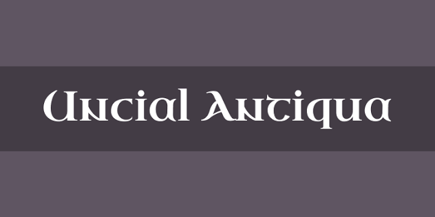
Uncial Antiqua mixes the uncial and half-uncial hands of early medieval manuscripts into a typeface you can actually read in a sentence. It replaces Paleo in this list, whose free download we could no longer confirm. Released under the Open Font License by Astigmatic.
Licence: free for commercial use. Best for: Fantasy titles, heritage and folk brands.
Blackletter and medieval calligraphy fonts
Blackletter, also called Gothic or Old English, is the dense, broken-stroke script of medieval European scribes, and it stayed in everyday German printing well into the 20th century. It reads as old instantly. Used against plain modern layouts, it also creates the kind of contrast that makes metal band merch, tattoo studios and craft spirits so recognisable.
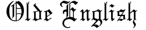
6. Olde English
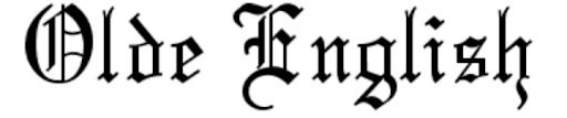
This is the default blackletter for a reason: it is legible, complete and free. It is the look of newspaper mastheads and certificates, and of plenty of metal band t-shirts. 1001 Fonts lists it as free for commercial use and dafont as 100% free. Get Olde English.
Licence: free for commercial use. Best for: Newspaper mastheads, diplomas, merch.
7. Alte Schwabacher

A rounder, more German take on blackletter, based on the Schwabacher style that appeared in the 15th century. Pair it with very minimal layouts so the letters carry the message, whether on merch, banners or coffee shop branding. Free for commercial use per its 1001 Fonts licence. Get Alte Schwabacher.
Licence: free for commercial use. Best for: Merch, beer labels, coffee branding.
8. UnifrakturMaguntia
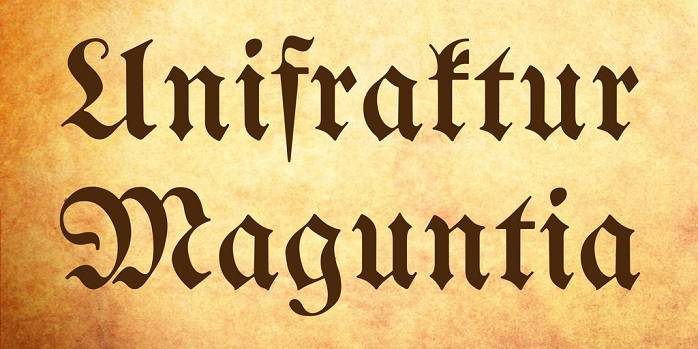
UnifrakturMaguntia is based on a 1901 Fraktur by Carl Albert Fahrenwaldt, so it is a genuine period design rather than a pastiche. It is on Google Fonts under the Open Font License, which makes it one of the few blackletters you can serve on a website without any licensing questions. It replaces Glaive, which we could no longer find for sale.
Licence: free for commercial use. Best for: Editorial headlines, websites that need a web-safe blackletter.
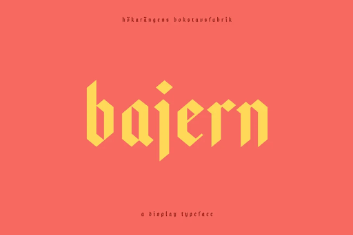
9. Bajern
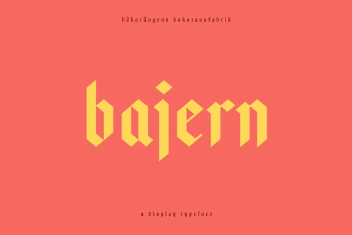
Bajern takes old blackletter forms and makes them geometric and clean, so it reads easily at small sizes. It was designed by Anton Bolin of Hökis Bokstavsfabrik, and the free download is listed as allowing commercial use. The old version of this article said it cost from $5, which is no longer correct.
Licence: free for commercial use. Best for: Modern brands that want a blackletter hint.
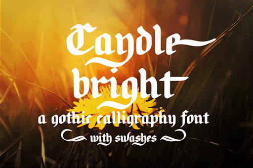
10. Candlebright
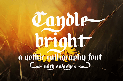
Not every Gothic font is stern. Candlebright is a flowing blackletter calligraphy that suits wedding stationery as much as a gothic poster. It costs $16 per style on MyFonts. A free version circulates on font directories, but treat that as personal use only.
Licence: paid. Best for: Wedding invitations, candle and soap labels.
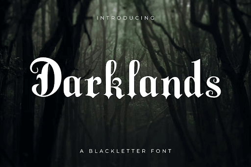
11. Darklands
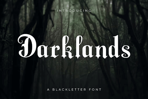
Darklands is playful and slightly ominous, like the original Grimm fairy tales, which makes it a strong book cover font. It is surprisingly legible, but its personality is too loud for body text. Available with an Envato Elements subscription.
Licence: paid. Best for: Book covers, fantasy games.
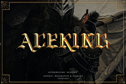
12. Aceking
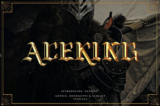
Aceking looks its best in gold foil. It suits any business that wants a sense of luxury, and it would sit well on a black business card. Available with an Envato Elements subscription.
Licence: paid. Best for: Luxury packaging, barbershops, tattoo studios.
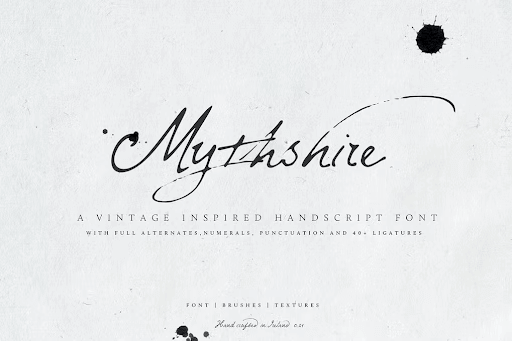
13. Mythshire
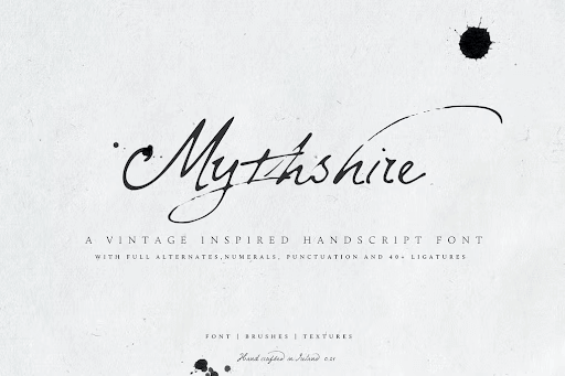
Mythshire looks like quill writing and comes with decorative extras. It adds mystery and elegance to labels, maps and invitations. It is $19 on MasterBundles and also included with Envato Elements.
Licence: paid. Best for: Fantasy maps, apothecary labels.
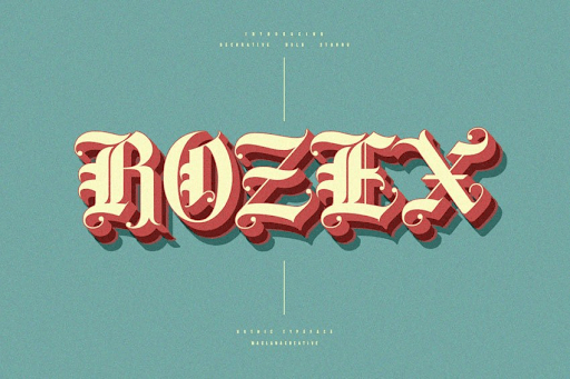
14. Rozex
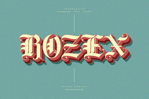
Rozex is a bold hand-lettered Gothic that works best as a statement piece, ideally with a 3D or extruded treatment from a designer. It looks surprisingly fresh in pastel colours. Available with an Envato Elements subscription.
Licence: paid. Best for: Statement posters, 3D lettering, apparel.
Victorian and wood type fonts (the 1800s and 1880s)
The 19th century gave us mass printing, wood type and the poster. Printers needed big letters that could be read across a street, so they cut them from wood: heavy slab serifs, decorative Tuscan shapes and tightly spaced capitals. If you are searching for an 1880s font, a Wild West look or a circus poster, this is the section. It also holds our pick for 19th-century handwriting.
15. Mesquite
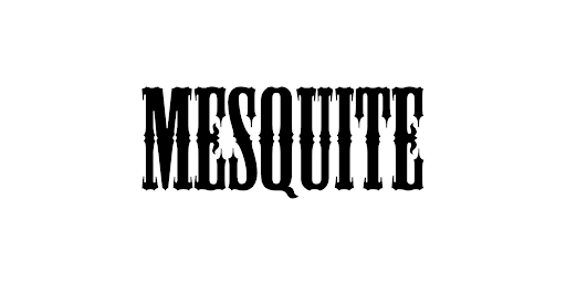
Mesquite, by Joy Redick, has a distinctive Western wood-type look. The old version of this article called it free. It is on Adobe Fonts, which means it is licensed for personal and commercial use, but only with a Creative Cloud subscription, so it is free only if you already pay for Adobe.
Licence: paid. Best for: Mexican restaurants, tequila labels, food packaging.
16. Brim Combined
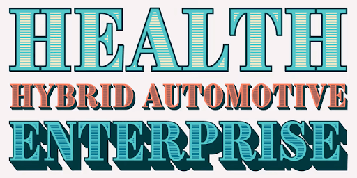
Not every vintage font has to shout. Brim Combined is a layered sans serif family from Jamie Clarke Type that nods to old signage while working in contemporary branding. On MyFonts it starts at $20 per style, not the $10 this article used to quote.
Licence: paid. Best for: Brands that want a subtle period nod.
17. Durango Western
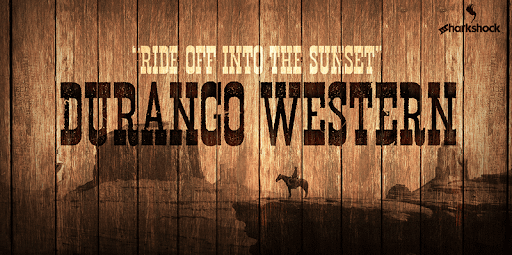
Durango Western is as Western as it gets: all caps, tight spacing and thick serifs. It fits a woodworking logo well. The free file on dafont is a demo by Sharkshock, labelled free for personal use, so buy the full version before you use it commercially. This article previously listed it as free.
Licence: free for personal use only. Best for: Wanted posters, woodworking logos, Western events.
18. Carnivalee Freakshow
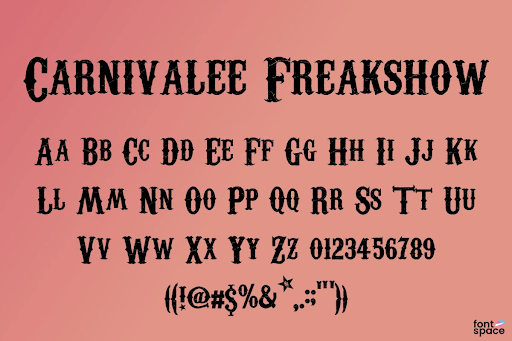
Carnivalee Freakshow is one of the most memorable free vintage fonts, and more versatile than it looks. On a dark or wood background it says Wild West or old circus. On a soft pastel it turns decorative. Chris Hansen made it free for commercial use in 2020, although dafont still shows the older personal-use label.
Licence: free for commercial use. Best for: Circus, carnival and Halloween themes.
19. Blue Angel
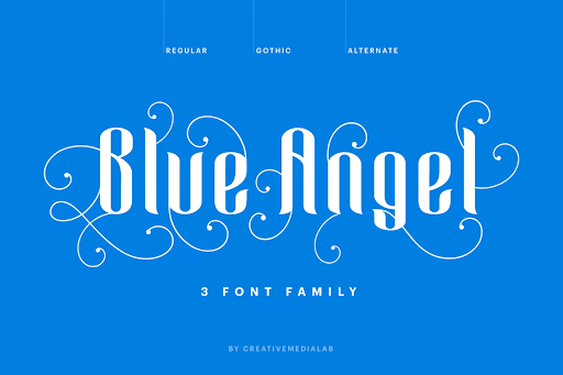
Blue Angel is a Victorian display font with generous ligatures and strong contrast between thick and thin strokes. It comes in several alternative styles, which makes it useful for a full brand system. Sold by Creative Media Lab on Fontspring and included with Envato Elements.
Licence: paid. Best for: Branding, beauty, boutique packaging.
20. Hava Shine
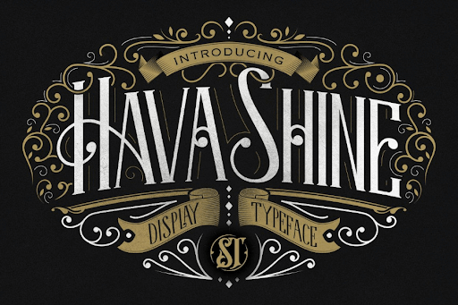
Hava Shine is eye-catching but still elegant. Set it on a plain background for restraint, or on something glossy for prestige. It is $21 on MyFonts from Storictype.
Licence: paid. Best for: Premium labels, hospitality.
21. Rye
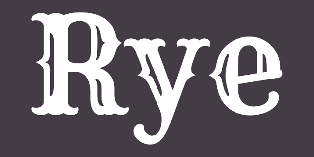
Rye is inspired by wood-type posters and has the feeling of the American West, according to its designer, Nicole Fally. It is our pick for a period poster: bold at a distance, free for commercial use under the Open Font License, and it works on the web. It replaces Sea Horse, which we could not find for sale.
Licence: free for commercial use. Best for: Period posters, saloons, barbecue brands.
22. Victorian Parlor
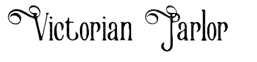
Few free vintage fonts come with this many variations, which makes Victorian Parlor practical for a whole brand. The author's note on dafont says it is free for personal and commercial use, with donations welcome. It has a very obvious vintage feel, so it will not suit everyone.
Licence: free for commercial use. Best for: Full brand systems with a strong vintage feel.
2. Cretheus($14)
For a more artsy feel, consider this gorgeous font. As you can see from the example below, it looks terrific on busy backgrounds, so you can use it on banners, posters, and colorful printed materials.
3. Requiem (free)
Who would have thought you could get this awesome bold vintage font for free? Although the designer encourages you to make a donation to the Koala Hospital in Australia, which I find to be an added bonus for choosing this stunning typeface.
It’s slightly less versatile than the previous two examples. Still, if you want to emulate that ancient feel, this font won’t disappoint you.
4. Celtic Hand (free)
Let’s move on from Greco-Roman styles to explore this stunning typeface inspired by Celtic typography. It’s cool and fun without being overly cartoonish, and I think it would be a terrific fit for a cool beer logo.
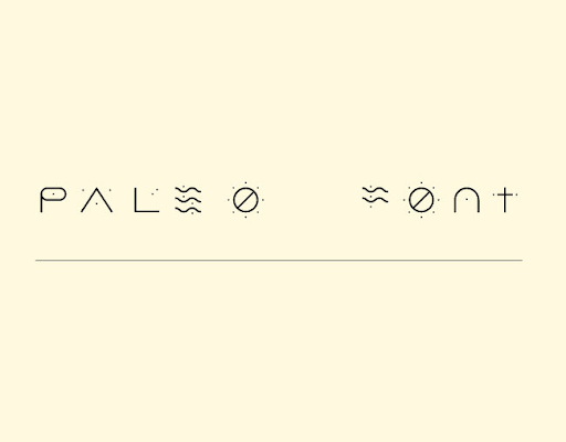
5. Paleo (free)
And how about something even more creative? If you want to travel back to the past, you probably can’t go further than this font. It’s inspired by ancient cave inscriptions. Surprisingly, due to the minimalist design, it has a refreshingly modern look that would suit trendy businesses. It’s a rare find, and best of all: you can get it for free!
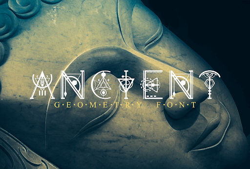
6. Ancient Geometry ($16)
What is a good vintage font for a logo? I’d say we have a winner right here! The totally unique lettering on this one will ensure you have a creative logo design, even with very few alterations.
Blackletter & calligraphy fonts
Blackletter (also called Gothic or Old English) typefaces are inspired by Medieval calligraphy. They are dark, usually with thick lines, and have a compelling old-timey look. However, used in contemporary designs, they can contribute to a powerful contrast and eye-catching visuals.
7. Olde English (free)
These letters remind me of the opening credits to Disney’s Robin Hood and Sleeping Beauty. You might think this kind of typography firmly set in a particular historical era has few uses. For example, museums, historical publications, or medieval theme parks.
However, remember that many metal bands have used this typography, and it’s pretty common to see it on a plain black t-shirt. Contrast creates memorable design!
8. Alte Schwabacher (free)
Similar to the previous example, this is more German-style. Other ideas on how to use these free vintage fonts differently are on all sorts of merch, website banners, and even coffee shop branding. Remember to pair the letters with minimal design elements to convey the message.

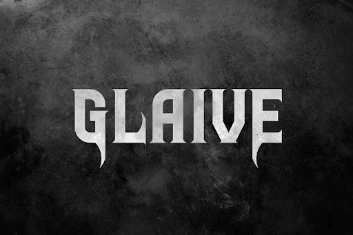
9. Glaive ($16)
Yet another delightful option marries a distinctly vintage feel with a more modern flair. The letters aren’t overly ornamented, which helps with legibility. But you still get that badass gothic look if that’s something you fancy.
It’s available with an Envato Elements subscription that starts at $16.50 per month. However, you can also get it with a free 7-day trial!
10. Bajern (from $5)
Speaking of more modern takes, here’s yet another excellent contender. The designer behind this one was inspired by old blackletter styles but made this font geometric and more contemporary. The clean look and excellent readability make it a font with vast use.
11. Candle Bright ($16)
By now, it may seem that all Gothic fonts have that slightly ominous, stern look. But, there are always alternatives. This lovely calligraphy font is very flowy and gentle. I could easily see it as a perfect wedding invitation font!
12. Darklands ($16)
If you’re looking for an ideal typeface for a book cover design, this might be it. Darklands is a combination of playful and slightly ominous, just like the original Grimm fairy tales. It’s surprisingly legible, so you could consider using it as a body text font. However, its unique look might seem overbearing that way.
13. Aceking ($14)
How good does this font look in gold? It’s practically made for any business wishing to convey a sense of luxury. It would pair perfectly with a sleek black business card.
14. Mythshire ($19)
Want something a little different? Get this beautiful script font that looks like quill writing. It’s sure to add a dose of mystery and elegance to your designs!
15. Rozex Bold ($16)
This hand-lettering Gothic font is sure to be a statement piece in any design. Get a graphic designer on board to create this stunning 3D effect for added impact. The example below, using trendy pastel colors, demonstrates perfectly how creative you can get with a font like this!
23. Pinyon Script
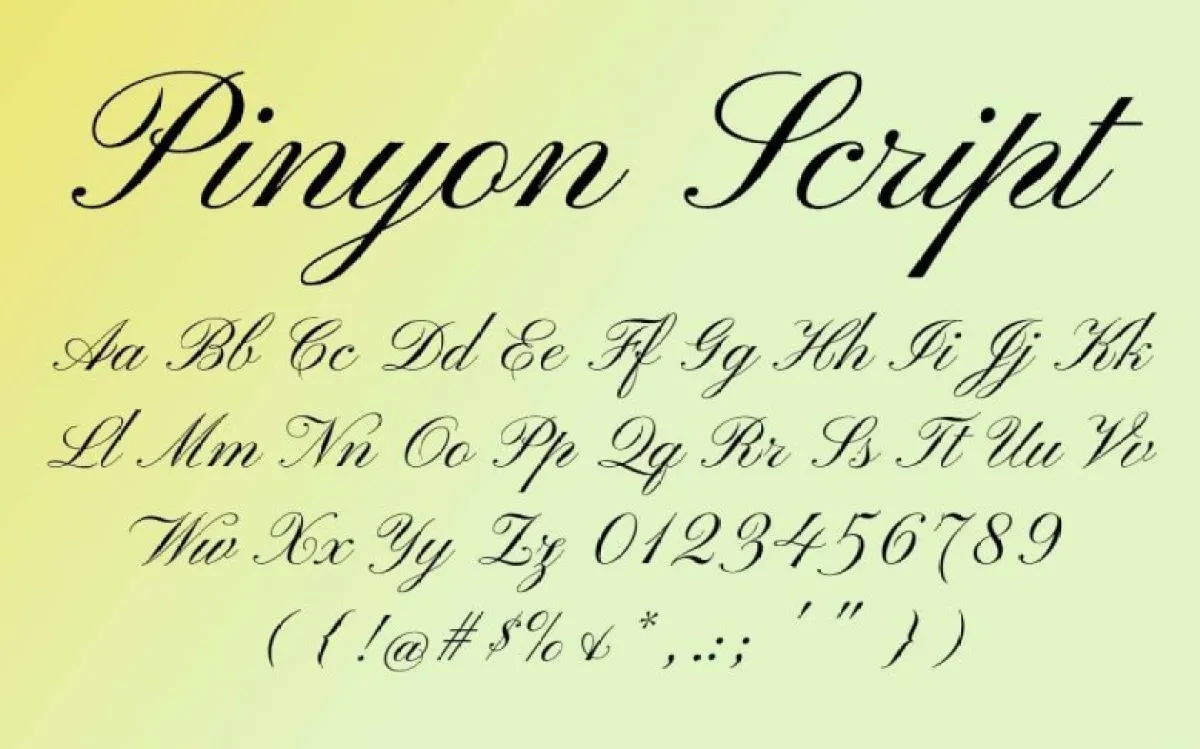
If you are after a 19th-century handwriting font, this is the one to start with. Pinyon Script is a round hand script, the formal joined-up style that clerks and letter writers used through the 1800s, with high contrast and showy swashes. Open Font License.
Licence: free for commercial use. Best for: Certificates, invitations, period letters.
Art Nouveau fonts (1890s to 1910s)
Art Nouveau emerged at the turn of the 20th century and took its shapes from plants, flowers and flowing hair. Alphonse Mucha's posters are the reference most people know. The lettering is soft and organic, with whiplash curves and unusual letterforms, and it is still one of the most popular vintage styles for beauty, florists and wellness brands.
24. Art Nouveau Caps
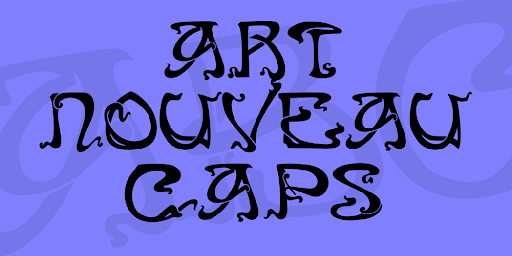
This ornate, all-caps display font needs a calm partner, so think about font pairing early. A sharp modern serif works well. By Typographer Mediengestaltung, and free for commercial use per its 1001 Fonts licence. Get Art Nouveau Caps.
Licence: free for commercial use. Best for: Drop caps, labels, beauty packaging.
25. Amarante
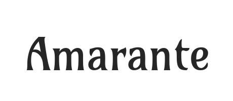
Amarante is one of the most versatile fonts in this list. Karolina Lach designed it as a medium-contrast condensed face with Art Nouveau shapes, and it works in body text as well as headlines. Open Font License.
Licence: free for commercial use. Best for: Beauty, wellness, editorial.
26. Nerea
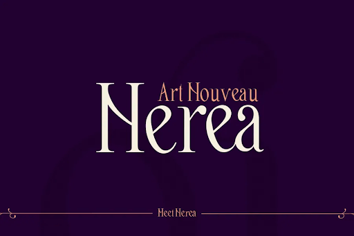
Nerea is classy and subtle, with ball terminals and fine hairlines. The free download is personal use only: the designer, Patricia Rueda Sáez, sells the complete font and a commercial licence at nerea.lllu.es. The old version of this article listed it as free.
Licence: free for personal use only. Best for: Beauty salons, boutique print.
27. Trinigan FG
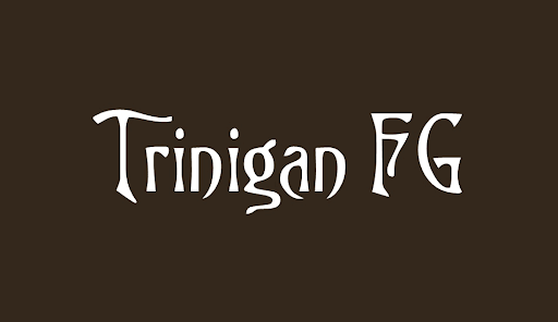
Trinigan has an unmistakable Art Nouveau look because it descends from a real 19th-century design: the same lineage as Victorian Swash and Burton's Nightmare, traced back to a face called Columbian. It is free for commercial use, by Fontgrube. Get Trinigan FG.
Licence: free for commercial use. Best for: Packaging, interiors, period signage.
28. Alathena
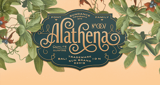
Alathena is a graceful Art Nouveau family with six weights and alternative ligatures. On MyFonts it starts at $20 per style, or $70 for the family, from Studio Sun.
Licence: paid. Best for: Calligraphic logos, florists.
29. Briar
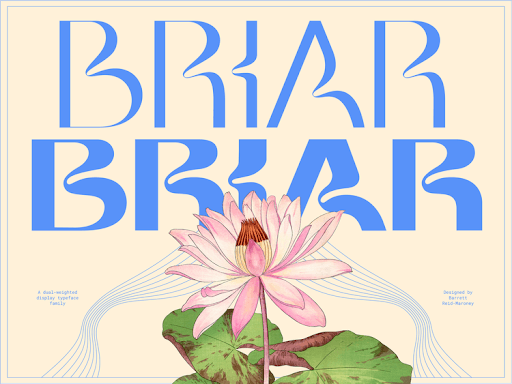
Briar combines an Art Nouveau feel with a modern finish, so it can work for anything from cosmetics to software. Barrett Reid-Maroney now sells it as Briar Display on Gumroad, at $20.
Licence: paid. Best for: Beauty and SaaS brands that want warmth.
Art Deco fonts (the 1920s and 1930s)
Art Deco followed Art Nouveau and swapped its curves for geometry: sharp lines, stacked forms, high contrast and a sense of glamour. It is the style of 1920s Paris, Hollywood cinemas and Manhattan skyscrapers. If someone asks what font looks like the 1920s, the answer is in this section, and its clean shapes are why Art Deco adapts so easily to minimalist modern branding.
30. Catallina
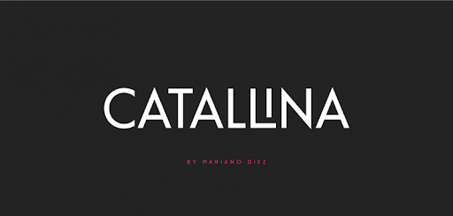
Catallina is a sharp, geometric font with playful variations on a few letters, especially i, o and q. Mariano Diez offers a free version that is listed as allowing commercial use.
Licence: free for commercial use. Best for: Cocktail bars, fashion, modern deco.
31. Poiret One
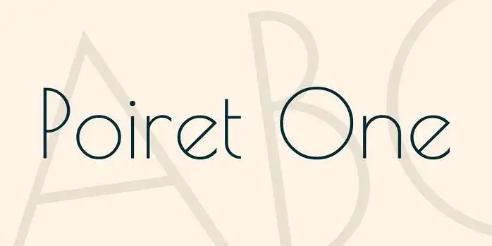
Poiret One is a light geometric face with a hint of Art Deco and constructivism, by Denis Masharov. It is elegant, simple and free for commercial use under the Open Font License. It replaces Komi, which we could no longer trace to its designer.
Licence: free for commercial use. Best for: Fashion, jewellery, light deco headlines.
32. Adelios
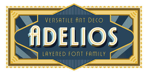
Adelios is an affordable deco family. Individual styles start at $5 and the full family is $69 on MyFonts, from Ilham Herry. You rarely need all of it: three or four styles cover most brands.
Licence: paid. Best for: Brands that need a full deco type system.
33. Limelight
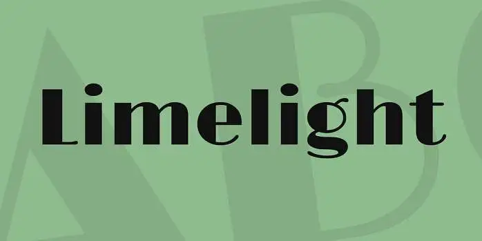
Limelight is a high-contrast geometric sans in the classic Art Deco style. Its designer describes it as the style most often used to suggest the 1920s, theatre and Hollywood. It is free for commercial use and replaces Decolot, which MyFonts no longer sells.
Licence: free for commercial use. Best for: Theatres, cinemas, speakeasy menus.
34. Lempicka
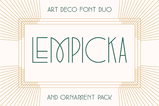
Named after the Art Deco painter Tamara de Lempicka, this font duo by Molly Suber Thorpe has elegant thin lines and comes with vector ornaments. The family is $29 on MyFonts.
Licence: paid. Best for: Invitations, luxury packaging.
35. Park Lane NF
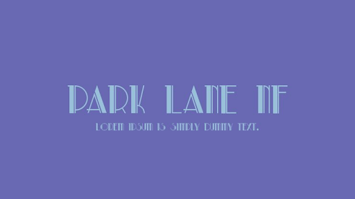
Park Lane has the glamour of a 1930s film poster. It is legible at large sizes but loses clarity when small, so keep it to headlines. It is by Nick's Fonts and listed as 100% free on dafont. Get Park Lane NF.
Licence: free for commercial use. Best for: Gatsby-style events, hotel branding.
36. Coventry Garden
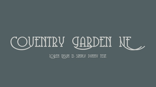
Coventry Garden has a lovely sense of flow and movement, and looks more expensive than it is. It is free for commercial use on 1001 Fonts and listed as 100% free on dafont.
Licence: free for commercial use. Best for: Florists, tearooms, luxury stationery.
1950s fonts
The 1950s brought diner signs, surf culture, motel neon and the Atomic Age. Lettering was hand-painted and confident: bouncy brush scripts, boomerang shapes and sharp, swinging serifs. This section is new in this update, and all three picks are free for commercial use.
37. Pacifico
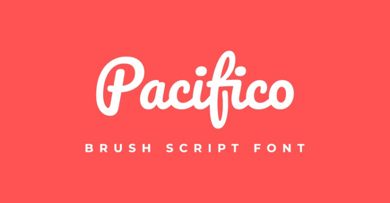
Pacifico is a fun brush script by Vernon Adams, inspired by 1950s American surf culture. It is heavy enough to read at a distance and friendly enough for food and beverage brands. Open Font License.
Licence: free for commercial use. Best for: Surf shops, ice cream, summer campaigns.
38. Yellowtail
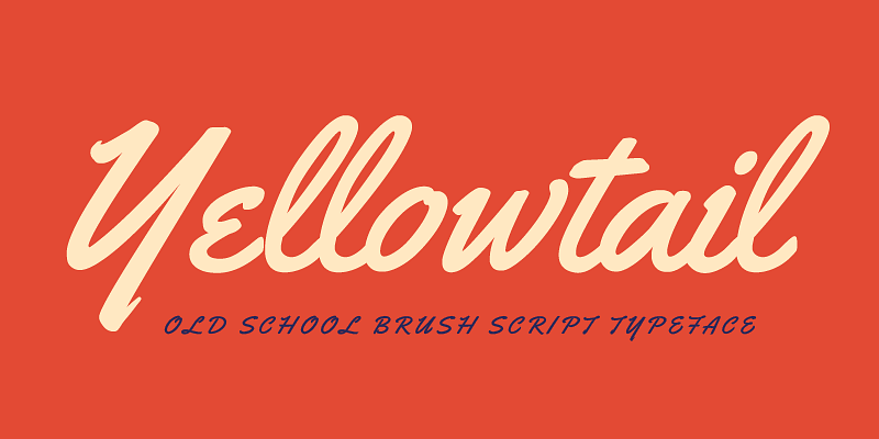
Yellowtail is a flat brush script that nods to 1930s typefaces like Gillies Gothic and Kaufmann, with the loose rhythm of a sign painter. That is exactly the look of a 1950s diner sign, which makes it our pick for a menu. Released under the Apache License 2.0, so it is free for commercial use.
Licence: free for commercial use. Best for: Diner menus, barbershops, vintage car events.
39. Fontdiner Swanky
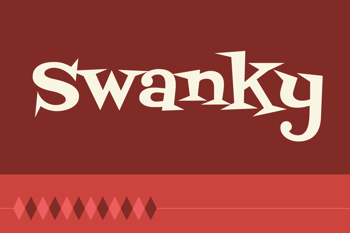
Fontdiner Swanky is a swinging, sharp serif with Atomic Age attitude, from the Font Diner foundry. Use it for short titles where you want mid-century fun rather than elegance. Apache License 2.0.
Licence: free for commercial use. Best for: Retro cocktail bars, Atomic Age themes.
1960s fonts
1960s lettering was fluid and playful, from Saturday-morning cartoon credits to psychedelic concert posters and mod fashion. If you want something formal, skip this section. If you want to reach a younger, fun-loving audience, start here.
40. Action Is
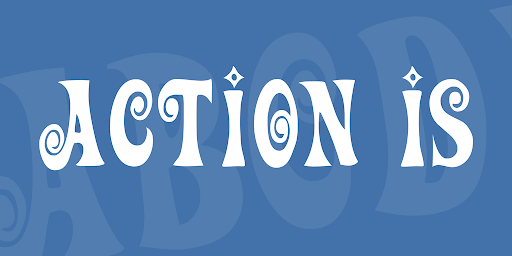
Action Is has the bouncy look of 1960s and 1970s cartoon credits. The author calls it completely freeware, and 1001 Fonts lists it as free for commercial use. It also appears in our retro fonts list, which sorts fonts by style rather than by era.
Licence: free for commercial use. Best for: Kids' brands, toy packaging, playful titles.
41. Oregano
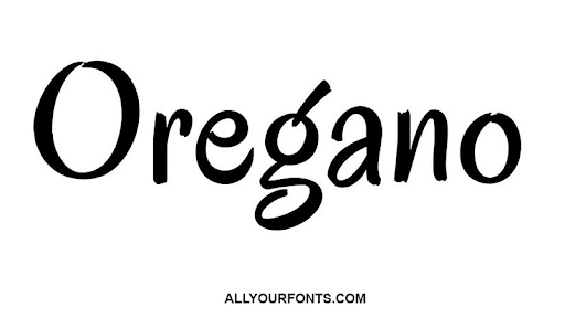
Oregano is based on the cartoon lettering of calligrapher Rand Holub, a style found on brochures and adverts from the late 1940s through the 1960s. It is casual and less on the nose than the other fonts here. Make sure you get Astigmatic's Google Fonts version, which is free for commercial use: a different font with the same name on dafont is personal use only.
Licence: free for commercial use. Best for: Cafés, bakeries, casual brands.
42. Psychedelia HM
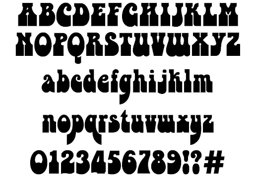
Nothing says 1960s like psychedelia. This font recalls hippies and flower power, and most people will get the reference immediately, so it does not suit serious brands. It is released under a Creative Commons NonCommercial licence, which means free for personal use only. This article previously listed it as free. Get Psychedelia HM.
Licence: free for personal use only. Best for: Personal projects, festival-style posters.
43. Antipoda
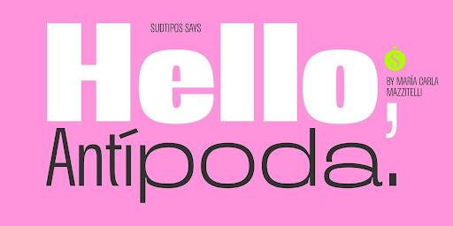
Antipoda is inspired by the English mod subculture of the 1960s. It is unmistakably retro, but as a full family with several styles it can stretch to most uses. It is sold through the Sudtipos foundry.
Licence: paid. Best for: Fashion, music, retro editorial.
1970s fonts
The 1970s sound like a contradiction: soft, heavy, rounded type that still feels warm. Think of Cooper Black on album covers and Souvenir in adverts, along with chunky, groovy hand lettering. This section is new in this update.
44. Keep on Truckin'
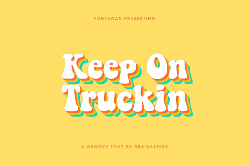
Groovy tunes, anyone? Keep on Truckin' captures the look perfectly with chunky letters that stay legible. It used to sit in our 1960s section, but its rounded weight is pure 1970s. The free download is personal use only, and commercial licences are sold through FontBros. This article previously listed it as free.
Licence: free for personal use only. Best for: Music, vintage apparel, festivals.
45. Fraunces
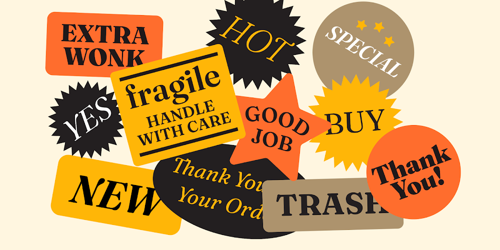
Fraunces is a soft, old-style serif inspired by Windsor, Souvenir and the Cooper series, the faces behind so much 1970s design. It is a variable font with a 'wonky' axis that adds quirky alternate letters. Open Font License, by Undercase Type, and a good free way to get a 1970s look without the cliché.
Licence: free for commercial use. Best for: Food brands, editorial, warm retro logos.
1990s fonts
The 1990s split into two moods: grunge and skate culture, with distressed, brushy and collage lettering, and the bright, chunky type of video games and kids' TV. Magazines like Ray Gun made broken typography a style of its own. If you are searching for a 90s font, these are the strongest options.
46. Okami
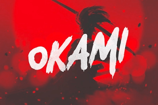
Brush fonts often struggle with legibility, but Okami does not. It has the rugged energy of 90s design and still reads clearly at large sizes. This article used to list it as free. It is now sold on Creative Market and included with Envato Elements.
Licence: paid. Best for: Signage, posters, large web banners.
47. Wasted Youth
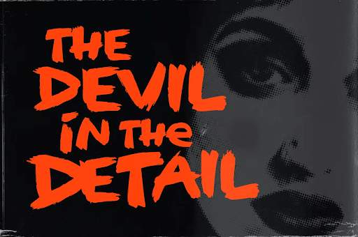
The name alone sounds like a 90s B-side. The rough brush effect is distinctive, and unlike many display fonts it has both upper and lowercase. Sold by Wingsart Studio on Fontspring and included with Envato Elements. Get Wasted Youth.
Licence: paid. Best for: Band merch, streetwear, skate brands.
48. Gumzilla
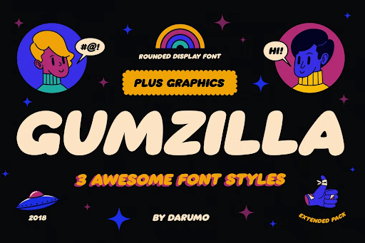
Gumzilla's chunky, bubbly letters recall arcade games and 90s kids' TV, and it comes with a graphic pack. That style is back in a lot of current design. Available with an Envato Elements subscription.
Licence: paid. Best for: Gaming, snacks, kids' products.
49. Bee Dee Groovy
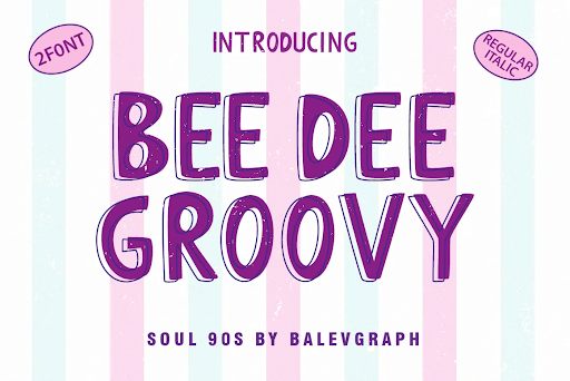
If your audience is millennial, this font will take them straight back to childhood. The dafont file is a demo for personal use only. The author, Balevgraph Studio, sells the full version with commercial licences on Gumroad. Get Bee Dee Groovy.
Licence: free for personal use only. Best for: Millennial-nostalgia campaigns.
50. Bronxos
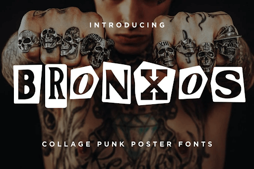
Inspired by 90s punk and collage posters, Bronxos is a strong choice for edgy designs. Use it big and sparingly. Available with an Envato Elements subscription.
Licence: paid. Best for: Gig posters, zines, edgy campaigns.
How to pair a vintage font with a body font
A vintage display font does one job: the headline. Everything else needs a quiet, readable partner. As a rule, set the display font at roughly three times the size of the body text, keep it to a few words, and choose a body font that shares one quality with it (its structure, its warmth or its geometry) without copying its decoration. All the body fonts below are free on Google Fonts. Our guide to font pairings has more combinations.
How to use a vintage font without looking dated
A vintage font should make a brand feel rooted, not old-fashioned. The difference usually comes down to what surrounds the font, not the font itself.
- Use one vintage face per layout. A period headline font plus a modern body font reads as intentional. Two or three vintage fonts together reads as a costume.
- Modernise everything around it. Generous white space, a restrained colour palette and clean photography let a blackletter or Art Deco headline feel current. Our guide to turning modern design retro shows how far you can push this before it tips into pastiche.
- Match the era to the story. A Victorian slab suits a barbecue joint or a whisky distillery. It confuses a fintech app. Choose the period your brand can genuinely claim a connection to.
- Test it small. A logo font has to work on a favicon and a social avatar as well as a sign. Ornate faces such as Art Nouveau Caps and Park Lane NF fall apart at small sizes, which is why our list of best logo fonts favours simpler shapes.
- Respect the basics. Vintage fonts often have tight spacing and unusual letterforms, so check kerning, line height and contrast. Our typography guide covers the fundamentals.
Vintage fonts FAQ
Bottom line
✅ Start with the era, then the font. Cinzel, Rye and Yellowtail cover the three most common jobs (a logo, a poster and a menu) at no cost. 🎨 For modern brands, Art Deco adapts best, and Poiret One and Limelight are free. 💰 If the project justifies a budget, Alathena and Lempicka are the paid fonts that look most authentic. ⚠️ Treat every personal-use-only font as off limits for anything that earns money until you have bought the licence.
For finished examples of these eras at work, see our collection of vintage logo designs.
Want vintage branding without the font hunt?
Choosing a period font is the easy part. Building a logo, packaging and social graphics around it, and making sure every font is properly licensed, takes design time.
A ManyPixels subscription gives you a design team for a flat monthly fee, starting with the Advanced plan at $699 a month, with unlimited requests and revisions. You can pause for $10 a month when you do not need design.
Planning a full rebrand rather than ongoing design? Our list of the best branding agencies covers project-based options. Otherwise, explore ManyPixels plans.

Having lived and studied in London and Berlin, I'm back in native Serbia, working remotely and writing short stories and plays in my free time. With previous experience in the nonprofit sector, I'm currently writing about the universal language of good graphic design. I make mix CDs and my playlists are almost exclusively 1960s.

Top-quality designers
A complete creative team at your fingertips: graphic designers, illustrators, motion designers and more.
Lightning-fast turnaround
Get started today and receive your first update on the next business day.

All-inclusive pricing
Unlimited requests and revisions. One flat monthly fee. No surprises.

Flexible & scalable model
No contract. Scale up and down as needed. Pause or cancel anytime.
Continue reading

Explore some of our best designs
Get inspired by a curated selection of ManyPixels work. Download the portfolio to see what our team can create.