
Best colors for business cards (+ free templates)
.webp)
TABLE OF CONTENTS


Color is one of the most important parts of your business card design. But what’s the best one to use?
If you believe business cards are a thing of the past, think again! This report suggests that sales increase by 2.5% for every 2000 business cards passed out. Bearing in mind that business cards are usually quite cheap, this means that a small investment can generate a considerable return.
Another interesting statistic says that people will keep a colorful business card 10 times longer than a standard one! So, investing some time and effort into choosing the right business card color definitely pays off!
But how to choose the right colors? And what are the most effective color combinations? We’re here to answer all your questions.
{{BRAND_BANNER="/dev/components"}}
Color theory
Understanding the basics of color theory can help you choose the right color business card color combinations for your business card design.
Color theory is based on the color wheel. This way colors are categorized as primary, secondary (mix of two primary colors), and tertiary colors (the combination of primary and secondary colors).
More importantly, the color wheel also suggest three ways in which colors can be combined:
- Contrasting colors: two colors on the opposite sides of the color wheel, e.g. red and green.
- Triadic colors: three colors at an equal distance from each other on the color wheel, e.g. red, yellow and blue.
- Complementary colors: pairs of colors which, when combined or mixed, cancel each other out by producing a grayscale color like black and white, e.g. yellow and purple.
- Analogous colors: groups of colors next to each other on the color wheel, e.g. green, yellow and orange.
Color psychology
Delving deeper into color psychology can help you choose business card colors that best match your brand’s mission, vision and values.
Color psychology is an area of study that is concerned with the effect colors have on us.
Admittedly, this area of research is still in development and is highly dependent on a number of factors; for example, different colors may have opposing cultural meanings in different parts of the world. The most famous example for this is the color white—associated with weddings in Jude-Christian cultures, in many Eastern cultures white is considered the color of grief and death.
Best colors for business cards
What are the best colors for business cards?
Short answer is, it depends on your industry and your brand. If you produce toys a daunting all-black business card might not be the most suitable. If you’re a psychotherapist, a hot pink business card with neon details won’t exactly inspire a sense of serenity or trust.
So to help you pick the right color that will reflect your business and impress your target audience, here’s a list of popular business card colors and our suggestions on who should use them.
White
Best for: virtually anyone, from artists to bankers
Design idea: stick with minimalism, or add bright and colorful contrasts
The main advantage of a white business card is that it’s very versatile and adaptable. Whatever your logo colors or design is, it will definitely stand out on a basic white business card.
Keeping things simple and minimalistic is a great idea. On the other hand, you can treat a white business card as a blank canvas and add interesting colorful elements to it.


Black
Best for: tech industry, CEOs, fashion industry
Design ideas: add gold or embossed elements to exude a sense of luxury and prestige
I don’t know about you, but whenever someone gives me a black business card I suddenly feel like I’ve been invited to a secret society.
Whether you share the sentiment or not, there’s no denying that black business cards are incredibly elegant and eye-catching. Because we are so used to seeing white paper, its exact opposite is something we are bound to notice.

Yellow
Best for: nonprofit organizations, gyms, children’s products
Design ideas: pair a yellow background with bold lettering to ensure it’s visible
Yellow is often considered to be the color of optimism and warmth, but it’s also a very good choice for business card design.
The bright background color will make contact information more legible and different finishes (coated or uncoated) will be more visible.

Orange
Best for: marketing industry, PR
Design ideas: pair it with gray
In some ways, orange is yellow’s more professional counterpart: where yellow is playful and retro, orange can be modern and innovative.
Some color psychology findings associate orange with creativity, communication and imagination. So this could be a great color for people in the marketing and PR industries.
From Hubspot to Hotjar -, a lot of big players in this space pair orange with grey. So, this is definitely one of the best color combinations out there!

Blue
Best for: law firms, medical professionals, consultants, finance industry
Design idea: pair it with a blue logo
Blue is one of the most commonly used colors in professional graphic design. Some color psychology findings associate blue with trustworthiness and honesty, so you’ll often find this color is used by financial professionals. More recently, blue is also quite popular with tech business cards.
This is also a popular business card color because it pairs really well with itself. A dark and light blue is a classic combination. So if you’re one of the many businesses with a blue logo, this can make for a beautiful colorful business card.

Purple
Best for: tech industry, SaaS companies, wellness industry
Design idea: use abstract patterns to make your purple business card even more eye-catching
There’s no doubt that purple can make a great business card. The color seems to have layers of meaning, ranging from mysticism, wisdom, dreams and imagination to royalty and authority.
In more recent years, it’s certainly been very trendy in the SaaS industry. Because of its associations with the unity of mind and body, purple is also a great color choice for yoga and massage studios, life coaches, wellness experts etc.

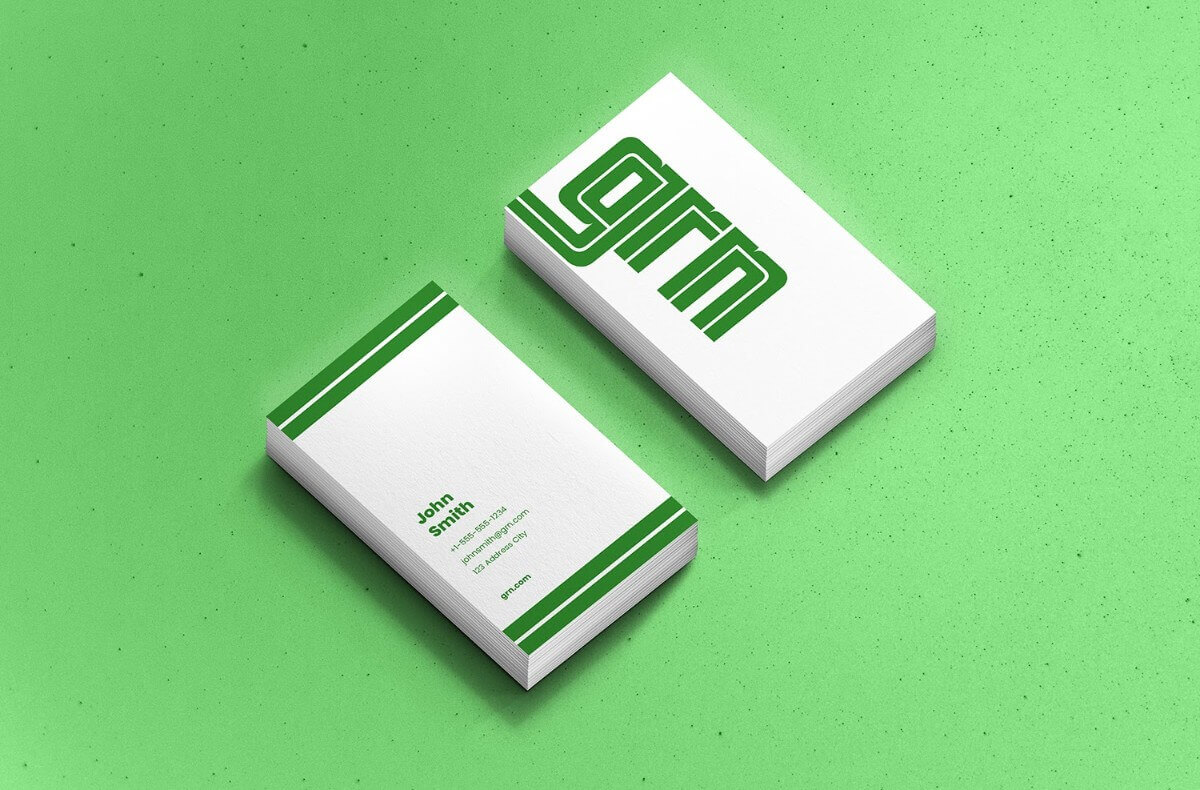
Green
Best for: organic and wellness brands, gyms, medical professionals
Design idea: make sure you’re using the right shade of green that will look good in business card printing.
Just like blue, green has strong connections to the natural world so it’s a color that people are inherently drawn to.
That said, green might be one of the most difficult colors to get right in print (we’ve all seen the not-so-appealing shades between brown and green). If you decide to tackle the design yourself, make sure you’re using the CMYK (cyan-magenta-yellow-black/key) color mixing mode, as this is used for all print designs.
Gray
Best for: marketing professionals, coaching business,
Design idea: use intricate custom illustrations to elevate your card design
You might think gray business cards are quite similar to white. However, that’s not exactly true.
Grey is quite rare as a business card color, but can be extremely effective. It often creates a sense of elegance and modernity, especially if you pair it with other interesting design elements.
A pop of color or a gorgeous illustration will look great on a great business card without being overbearing.

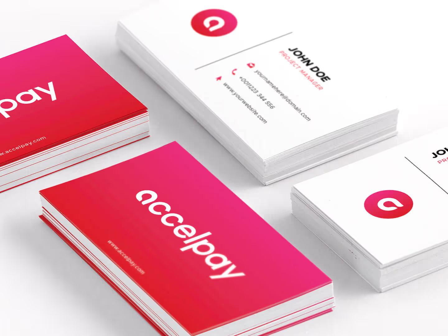
Red
Best for: tech, CEOs, athletic brands
Design idea: use plenty of white or negative space to avoid a busy design
Generally speaking, red is not the best color for business cards. It can often be perceived as flashy or aggressive, and a loud red business card can make reading contact information challenging.
That being said, if you think you’ve got the confidence and a great brand to back it up, a red business card will definitely not go unnoticed.
Just make sure you leave plenty of white space (or in this case red) so that your bright color doesn’t seem too aggressive.
Pink
Best for: fashion, wellness, beauty brands
Design idea: personalize with a portrait
Pink is very versatile—just think how differently we tend to use, for example magenta and a soft baby pink. This is a great color to adapt to the needs of your brand identity, whether you go with a lighter shade of pink that’s traditionally associated with tenderness and relaxation, or a bolder tone closer to red.
If you’re a massage therapist, hair stylist or event planner - adding a custom portrait illustration can be a great addition to your beautiful pink cards.

Need new business cards - we can help!
We hope this gave you some insight on how to choose the best business cards for yourself.
Don’t forget that it all starts with creating a brand identity - choosing the color scheme, typography, and imagery that best represents your brand.
Whether you need help creating a branding design from scratch, or just some assistance with your business card size and design, we can help! ManyPixels provides unlimited graphic design at a flat monthly rate.
Get all the graphics your business needs, from a team of design pros. Start today or get in touch with us if you have any questions.
Having lived and studied in London and Berlin, I'm back in native Serbia, working remotely and writing short stories and plays in my free time. With previous experience in the nonprofit sector, I'm currently writing about the universal language of good graphic design. I make mix CDs and my playlists are almost exclusively 1960s.

Top-quality designers
A complete creative team at your fingertips: graphic and web designers, illustrators, and more.

Lightning-fast turnaround
Get start today and receive your first update on the next business day.

All-inclusive pricing
Unlimited requests and revisions. One flat monthly fee. No surprises.

Flexible & scalable model
No contract. Scale up and down as needed. Pause or cancel at anytime.
Continue reading
.jpeg)
.jpeg)
Explore some of our best designs
Get inspired by a curated selection of ManyPixels work. Download the portfolio to see what our team can create.


