

12 Best business card fonts for 2026 (free & professional picks)
TABLE OF CONTENTS

TL;DR:
The best business card fonts read cleanly at 8pt and match your brand's voice. For modern brands, a geometric sans like Inter or DM Sans is the safe, sharp default. For classic or professional-services brands, a refined serif like EB Garamond wins.
❌ Skip hairline display serifs and script fonts for anything but the name, they vanish or blur at contact-detail size.
{{PRINT_PORTFOLIO="/dev/components"}}
What makes a font work at business card size?
A font works on a business card when it stays legible at 8pt on the stock you're printing. Three things decide that: open counters (the gaps inside letters like "a," "e," and "o"), a generous x-height (tall lowercase letters), and some weight in the strokes so thin lines don't drop out in print. If a font has all three, it will hold up. If it doesn't, no amount of styling saves it.
The stock matters more than people expect. On smooth coated stock, tight letterforms are fairly forgiving. On uncoated, textured, or cotton stock, ink spreads slightly and fills in tight counters, so open, sturdy fonts win. This is why a font that looks perfect in your design software can still disappoint in your hand.
Be real: most "best font" lists are ranking fonts by how they look at poster size. On a card, the question is narrower. Will the phone number still be readable when it's 8pt on off-white paper? That's the bar every font below clears. For a deeper look at how typefaces behave across different jobs, our guide to typography basics covers the fundamentals.
1. Inter: the safe modern default
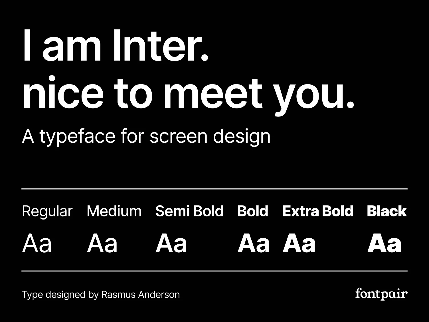
Inter is the closest thing to a no-regrets choice for a modern card. It was drawn for screens, but its open counters and tall x-height keep it crisp down to 8pt in print. It ships in 18 weights, so you can build a full hierarchy (bold name, regular title, lighter contact line) without leaving the family.
If you're not sure what to pick and the brand skews modern, start here. It's clean without being cold, and it never looks like a default. Grab it on Google Fonts.
Best for: Tech, SaaS, and any brand that wants clean and current. ✅
2. DM Sans: geometric with a little warmth
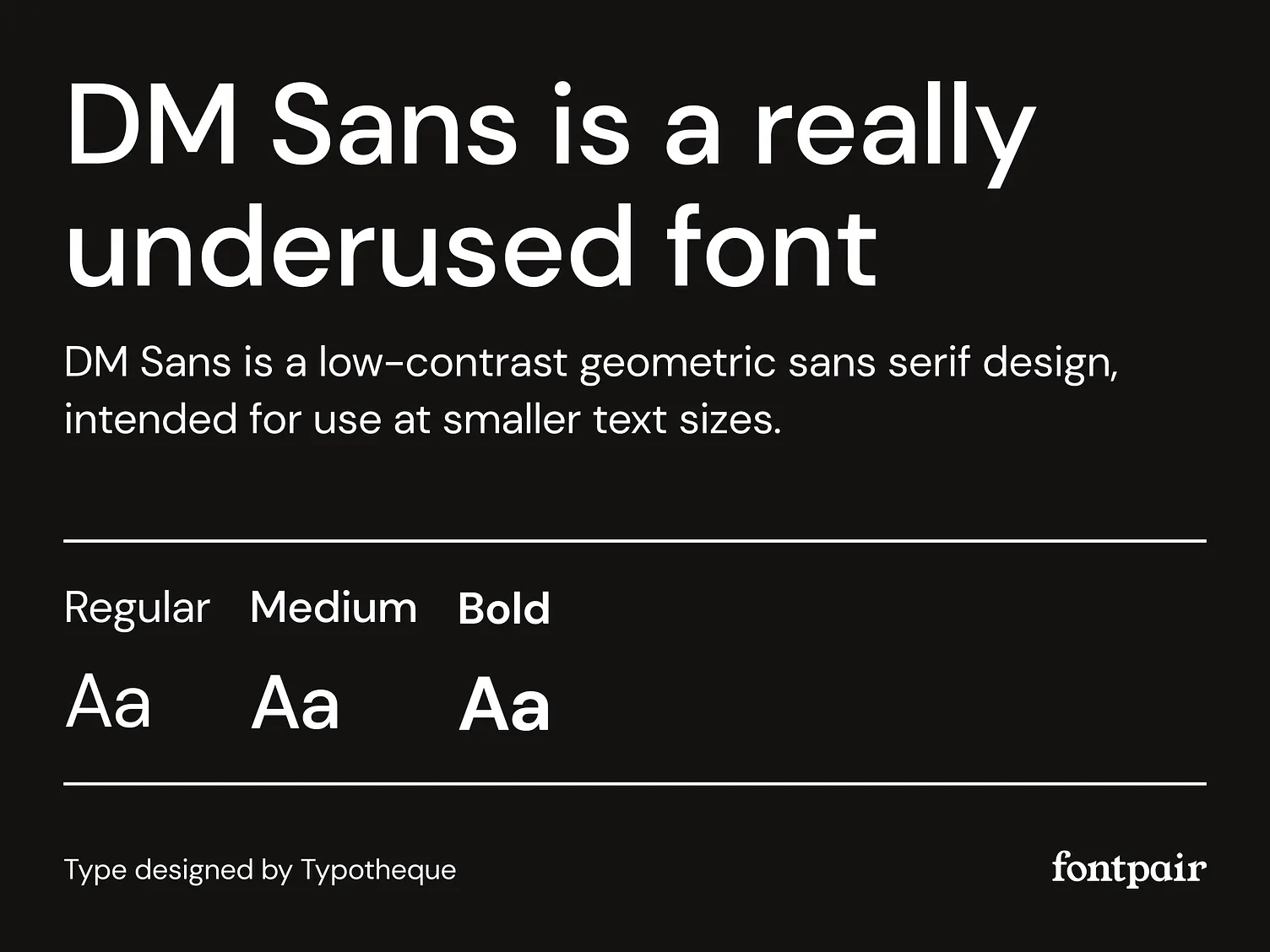
DM Sans is what you reach for when Inter feels a touch too neutral. The slightly rounded shoulders give a card a softer, friendlier feel while staying firmly professional. It has 18 styles too, so hierarchy is never a problem.
It has become the default for design studios and startups over the last two years, and for good reason: it reads as considered without trying hard. Available free on Google Fonts.
3. Montserrat: modern, geometric, everywhere for a reason
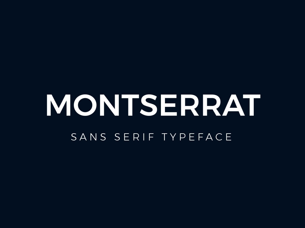
Montserrat is a geometric sans inspired by old Buenos Aires signage, and it brings a confident, contemporary edge to a card. It's popular to the point of being common, but on a business card that familiarity works in your favor: it reads instantly and never feels risky.
Use the heavier weights for the name and a lighter weight for contact details to avoid a flat, single-tone look. Free on Google Fonts.
Best for: Creative, lifestyle, and consumer brands. ✅
4. Roboto: friendly and dependable at small sizes
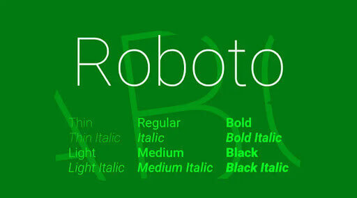
Roboto pairs mechanical structure with friendly, open curves, which is exactly the combination you want on a small card. Its open design keeps it readable at contact-detail size, and it feels approachable rather than corporate.
It's the system font for Android, so it can read as slightly "default" to design-savvy eyes. For most brands that's a non-issue. Download it from Google Fonts.
Best for: Digital agencies, service businesses, and tech-adjacent brands. ✅
5. Lato: warm humanist sans for people-first brands
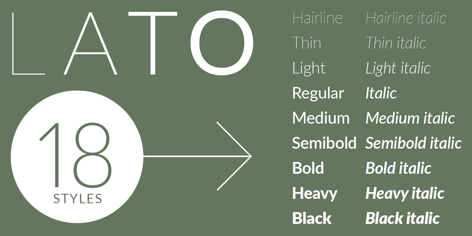
Lato reads as warm and approachable without giving up professionalism, which makes it a strong pick for brands built on trust. It has just enough character in the letterforms to feel human, and a wide weight range for hierarchy.
The short version: if you want your card to feel welcoming rather than technical, Lato does that quietly. Free on Google Fonts.
Best for: Health, education, coaching, and consultancies. ✅
6. Open Sans: maximum legibility when you have a lot to fit
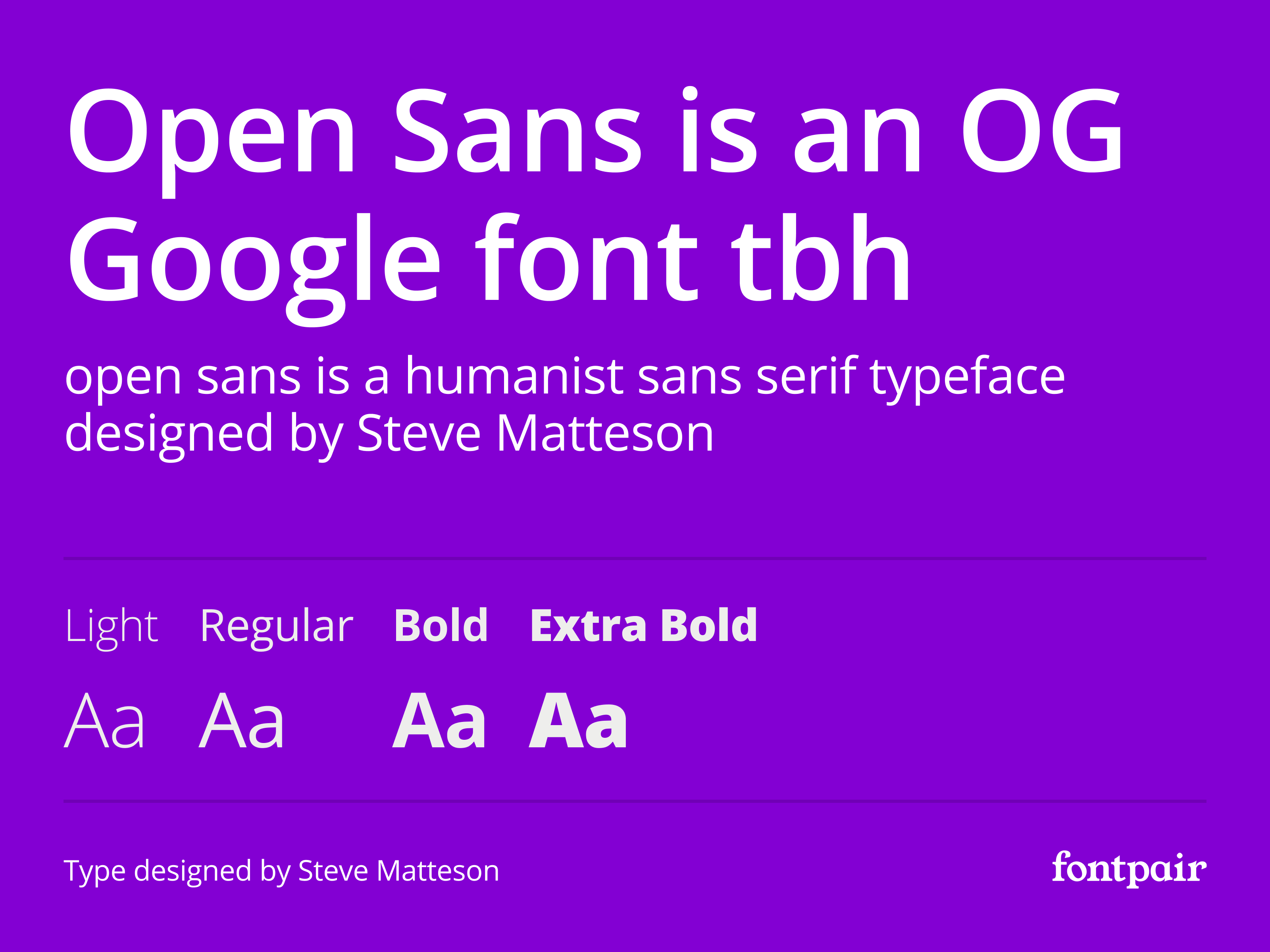
Open Sans was engineered for legibility above all, so it's the one to reach for when a card has to carry a lot of information (multiple phone numbers, a long title, social handles). It stays clear and uncluttered even when the layout is tight.
It won't win any awards for personality, and that's the point. It's a workhorse. Available on Google Fonts.
Best for: Information-dense cards, retail, and service directories. ✅
7. EB Garamond: the classic serif that still reads at small sizes
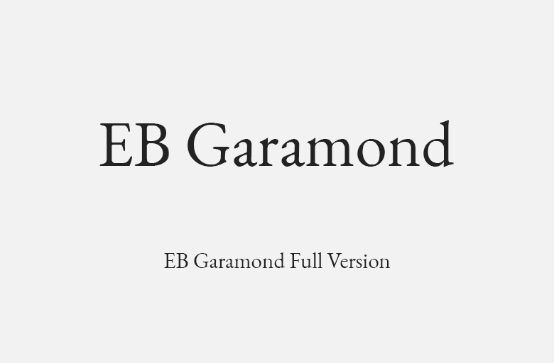
EB Garamond is a faithful revival of the classic Garamond, and unlike most old-style serifs it holds up at small sizes thanks to sturdy strokes and proper italics. It's the serif to use when a card needs to feel established, traditional, and quietly expensive.
This is a better modern choice than the dated "Apple Garamond" cut, and it's completely free. For more options in this style, see our roundup of modern serif fonts. Get EB Garamond on Google Fonts.
Best for: Law firms, finance, consultants, and editorial brands. ✅
8. Playfair Display: striking on the name, risky everywhere else
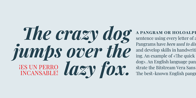
Playfair Display is a high-contrast display serif that looks gorgeous set large on a name. The catch is its hairline strokes: below roughly 12pt they thin out and can disappear in print, so it's a name-only font.
Pair it with a clean sans (see the pairings section below) for the title and contact details. Used that way, it's one of the most elegant choices on this list. Free on Google Fonts.
Best for: Fashion, beauty, and lifestyle brands, on the name only. ✅ Not ideal for: Contact details or anything under 12pt. ❌
9. Helvetica: the timeless corporate standard
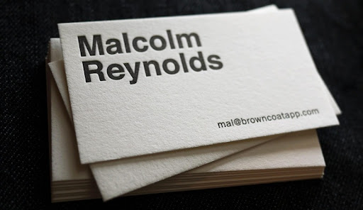
Helvetica is the font people picture when they picture a clean, professional card. Its neutrality is the feature: it pairs with almost any logo and never dates. On a card it reads as steady and corporate in the good sense.
It's not free, which is the main reason to consider Inter or Roboto first if budget matters. If the brand specifically wants that Helvetica feel, license it from Adobe Fonts.
Best for: Corporate and established brands that want a timeless look. ✅
10. Futura: geometric, confident, and premium
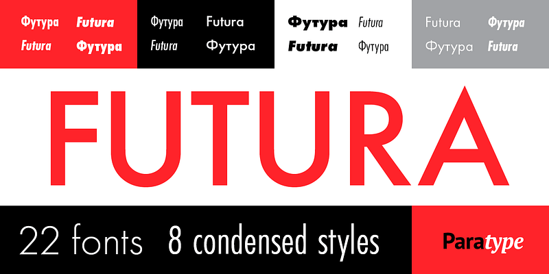
Futura is built from near-perfect circles and clean lines, and it carries a forward-looking, premium feel that has held up for nearly a century. On a card it signals design confidence, which is why architecture and high-end retail brands lean on it.
The geometric caps look sharp on a name; watch the wide letterforms so contact lines don't run long. License Futura PT on Adobe Fonts.
Best for: Architecture, premium retail, and design-led brands. ✅
11. Times New Roman: traditional, and quietly divisive
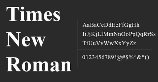
Times New Roman is a clean, robust serif that signals tradition and reliability, and it's already installed on virtually every computer. For genuinely formal professions it still works. That's the honest case for it.
The counter-case: because it's the default word-processor font, it can read as "no type decision was made." Use it deliberately, at a slightly larger size, and never by accident. It ships with your operating system; Microsoft's font reference has the details.
Best for: Traditional and formal professions where convention is the point. ✅ Not ideal for: Brands trying to look modern or distinctive. ❌
12. Proxima Nova: the paid sans that looks like money
Proxima Nova sits between geometric and humanist, which gives it a polished, contemporary look that feels a step above the free defaults. You've seen it on thousands of startup sites, and it carries that same modern-professional signal onto a card.
It's a paid font, so it only makes sense if the brand already uses it or specifically wants that look. Otherwise Inter gets you most of the way for free. License it on Adobe Fonts.
Best for: Startups and brands wanting a paid-feel sans. ✅
Best font pairings for business cards
The simplest strong card uses one font in two or three weights. Single-font discipline reads as confidence. If you do pair, the rule is to contrast clearly (sans with serif, geometric with humanist), never pair two fonts that are almost the same.
Four pairings that work at card size:
- Inter + EB Garamond: modern sans on the name, classic serif on the details. Clean and considered.
- DM Sans + Playfair Display: striking display serif name, calm geometric sans everywhere else. The design-studio default.
- Montserrat + Lato: bold geometric name over a warm humanist body. Friendly but sharp.
- Futura + EB Garamond: geometric confidence balanced by editorial warmth. Great for premium and cultural brands.
For pairing logic that applies beyond cards, our full guide to font pairings goes deeper, and if you're choosing type for a logo alongside the card, see the best fonts for logos.
Common business card font mistakes to avoid
Most bad business card typography comes down to five repeat offenders. Avoid these and you're most of the way to a card that looks professionally designed.
- Using too many fonts. Two is the ceiling. Three fonts on a card the size of a matchbook reads as chaos. One font in multiple weights almost always looks better.
- Script or decorative fonts for body text. They blur at 8pt. Reserve them for the name, and only if the brand genuinely calls for it.
- Hairline serifs at small sizes. Playfair, Bodoni, and Didot lose their thin strokes in print. Beautiful on the name, invisible on the phone number.
- Going below 8pt. If contact details don't fit at 8pt, the problem is your layout, not your font size. Cut content, don't shrink type.
- Defaulting to a system font by accident. Arial or Times by choice is fine. Arial or Times because you never changed it reads as effort not spent.
Color trips people up too. Low-contrast text on a tinted card can undo a good font entirely, which is why we cover the best colors for business cards separately.
What is a good font size for business cards?
Use 10 to 16pt for the name or company name, 8 to 10pt for the job title and contact details, and never go below 8pt for anything on the card. Most designers treat 8pt as the hard floor for print legibility, and drop to 9pt minimum on textured or colored stock where ink spreads.
Build a clear hierarchy with two or three size steps so the eye knows where to land first: name, then title, then contact block. The single most common fix we make on client cards is bumping contact details up from a cramped 7pt to a readable 9pt. Always proof at actual print size on paper before ordering, because type that looks fine zoomed in on screen can be a strain in the hand.
Physical dimensions feed into this: a standard card gives you limited room, so if you're tight on space, check the standard business card sizes before shrinking your type.
Need the whole card designed, not just the font?
Picking the font is the easy part. Turning it into a print-ready card that balances name, logo, hierarchy, and stock is where most DIY attempts stall. If you'd rather hand that off, ManyPixels' design subscription includes business cards, logos, and full brand identity work with a professional designer, at a flat monthly rate with unlimited revisions.
- 🎨 Business cards, letterheads, and brand identity handled by a dedicated designer
- ⚡ First drafts back in about 24 to 48 hours on business days
- 💰 One flat monthly price, unlimited requests and revisions, no per-project fees
As Valentina Lamb, Project Manager at East Coast Catalyst, put it: "The quality is consistently strong, and they're always quick to respond and iterate based on feedback. They definitely have made our life easier."
Pricing is approximate and starts around $699/month; check manypixels.co for current plans. 👉 Explore ManyPixels plans.
Frequently asked questions
The bottom line
For a modern brand, start with Inter or DM Sans, both free and both sharp at small sizes. For a classic or professional feel, use EB Garamond. Whatever you choose, the test is the same: print it at actual size and check that the contact details are still comfortable to read. If they are, you've picked the right font.

Journalist turned content writer. Based in North Macedonia, aiming to be a digital nomad. Always loved to write, and found my perfect job writing about graphic design, art and creativity. A self-proclaimed film connoisseur, cook and nerd in disguise.

Top-quality designers
A complete creative team at your fingertips: graphic and web designers, illustrators, and more.

Lightning-fast turnaround
Get start today and receive your first update on the next business day.

All-inclusive pricing
Unlimited requests and revisions. One flat monthly fee. No surprises.

Flexible & scalable model
No contract. Scale up and down as needed. Pause or cancel at anytime.
Continue reading
Explore some of our best designs
Get inspired by a curated selection of ManyPixels work. Download the portfolio to see what our team can create.







