

40 Iconic designer logos and what makes them work

TABLE OF CONTENTS

TL;DR
The most iconic designer logos share three traits: instant recognizability, a clear connection to the brand's identity, and the ability to scale from a hangtag to a billboard. If you want the short answer: Chanel's interlocking Cs (c.1921), Louis Vuitton's LV monogram (1896), and the Nike swoosh (1971) are the gold standard. Below you'll find 40 designer logos organized by approach, with a note on why each one works and what you can apply to your own brand.
What makes a great fashion brand logo?
A great fashion brand logo does one job above everything else: it signals who you are before a single word is read. In fashion, where identity and aspiration drive buying decisions, that signal is everything.
Most of the best designer logos fall into one of four categories: monograms (Chanel, Gucci, Louis Vuitton), wordmarks (Burberry, Marc Jacobs, Miu Miu), signature marks (Oscar De La Renta, Stüssy, Christian Louboutin), and symbols (Nike, Adidas, Versace). Each approach has its logic. Monograms create heritage and exclusivity. Wordmarks prioritize the name itself as the brand asset. Signatures feel personal and handcrafted. Symbols travel across languages and product types.
The constant across all 40 logos here is simplicity. The most enduring fashion logos work in black and white, at 16px and on a 10-foot sign. If your logo can't survive those conditions, it isn't ready.
Looking to build your own? Check out the latest logo design trends and the best fonts for logos before you start.
Monograms
Monograms are the signature move of legacy luxury fashion. Interlocking initials create a mark that references the founder directly while producing a pattern that works on products, packaging, and hardware. The LV, CC, and GG monograms are so well known they function independently of the brand name. For a deeper look at how heritage marks are built, see our guide to luxury brand logos.
Designers often used their initials to form a unique monogram or emblem. Some of them also created iconic patterns that extend across their entire product line.
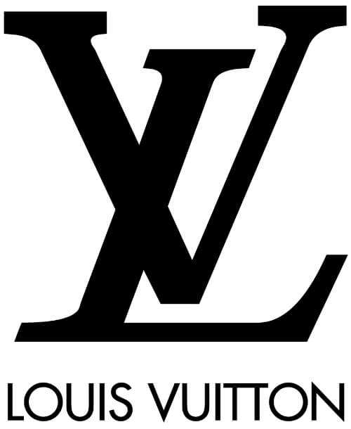
1. Louis Vuitton
Georges Vuitton, Louis's son, created the interlocking LV in 1896 and built it into the Monogram canvas, partly to make the company's trunks harder to copy. It's now one of the most recognized logos in fashion, and one of the most counterfeited. The mark works because it was designed as a system from the start: letters, flowers and stars that tile endlessly across a product.
Borrow this: design your mark so it can repeat as a pattern, not just sit in a corner.
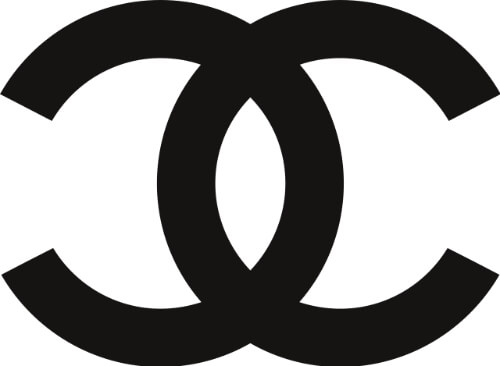
2. Chanel
The two interlocking, back-to-back Cs stand for Coco Chanel and date to the 1920s. More than a century later the mark is essentially unchanged. Because the Cs face away from each other and overlap, the eye reads them as one shape, which is why the logo works as a clasp, a button or an embossed stamp.
Borrow this: overlap your initials until they read as a single shape.
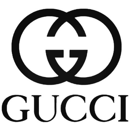
3. Gucci
The interlocking GG takes the initials of founder Guccio Gucci and mirrors them. Unlike Chanel's Cs, the Gucci mark is perfectly symmetrical, which gives it a more architectural, hardware-like feel. That's exactly how it's used: as belt buckles, bag clasps and an all-over print.
Borrow this: symmetry makes a monogram feel solid and works well in metal.
5. Fendi
The double F was sketched by Karl Lagerfeld in 1965, shortly after he joined the house, and is often said to stand for "Fun Fur". One F sits upside down against the other, so the mark tiles neatly into the brand's Zucca print. It's a good example of a logo designed by someone thinking about product first.
Borrow this: test your monogram as a fabric print before you commit to it.
5. Saint Laurent
The stacked YSL monogram was drawn in 1961 by A.M. Cassandre, the French poster artist. The three letters overlap vertically, mixing serif and sans serif strokes. In 2012 the ready-to-wear line was renamed Saint Laurent with a plain sans serif wordmark, but the Cassandre monogram stayed on bags and accessories, where it does the heavy lifting.
Borrow this: you can run a quiet wordmark and an expressive monogram side by side.
.png)
6. Jimmy Choo
This British shoe brand pairs a custom wordmark with a monogram where the J curls up inside the C, giving the mark a sense of motion. The Os in the wordmark are perfectly round and wider than the other letters, which gives the whole thing a graceful rhythm.
Borrow this: one exaggerated letter can give a simple wordmark its personality.
7.Valentino
Strictly speaking this is closer to a pictogram than a monogram: a single V inside an oval, set above a serif wordmark with classical proportions. Valentino Garavani founded the house in Rome in 1960, and the logo has the same restraint as the clothes.
Borrow this: if your name has one strong initial, a single letter can be enough.
8. Victoria's Secret
The lingerie brand pairs a decorative VS monogram with an all-caps serif wordmark. The contrast does the work: the monogram brings fantasy and playfulness, while the serif keeps it confident and premium.
Borrow this: balance a decorative mark with a sober typeface so neither feels too much.
Heritage emblems and crests
Heritage emblems use an illustrated symbol, often an animal, a figure or a crest, to tell a story about where a brand came from. They suit fashion houses with real history behind them, and they've outlasted decades of trend cycles because the meaning is specific, not decorative. See our guide to vintage logo design for how to build one.
9. Versace
Gianni Versace founded his house in 1978 and chose Medusa as its face, the mythological figure who made anyone who looked at her fall under her spell. The head is drawn in the style of Greek marble sculpture and framed by a Greek key border. It appears on buttons, hardware and even floor tiles in the brand's stores.
Borrow this: a symbol with a story people can retell is worth more than a pretty one.
10. Hermès
Hermès started in 1837 as a Paris harness maker, and its logo still says so. The horse-drawn Duc carriage comes from a drawing by 19th-century painter Alfred de Dreux and became the house emblem in the early 1950s. The carriage has a waiting groom but no driver, which is often read as Hermès supplying the craftsmanship while the customer takes the reins.
Borrow this: point your logo at your origin story, even if the business has moved on.
11. Prada
Mario Prada opened his Milan store in 1913. A few years later the company became an official supplier to the Italian royal household, which gave it the right to use the House of Savoy's coat of arms and knotted rope. Both still sit in the Prada emblem above a clean, all-caps wordmark.
Borrow this: only use a crest if you've earned something that justifies it.
12. Ralph Lauren
The polo player has been the brand's symbol since the early 1970s, and it's a clever fit: the signature product is the polo shirt, so the logo and the product reinforce each other. A Roman-style wordmark finishes the system.
Borrow this: when your hero product has a strong image, put it in the logo.
13. Coach
Like Ralph Lauren, Coach builds its emblem around wordplay: a coach is a horse-drawn carriage. Underneath, the name is set in a bold custom serif that's easy to read at any size.
Borrow this: if your brand name has a literal meaning, consider drawing it.
14. Brunello Cucinelli
Brunello Cucinelli's crest shows a gryphon and a tower, the heraldic symbol of Solomeo, the Umbrian village where the company is based and which the founder restored. It ties the brand to a place and to his idea of "humanistic capitalism".
Borrow this: a specific place can be a stronger brand idea than a generic luxury symbol.
Signature logos
A signature logo uses the designer's own handwriting as the brand mark. It works because no two signatures are alike, and because it tells customers the founder still stands behind the product. It's best suited to designer labels built around one person.
15. Oscar De La Renta
The Dominican designer, best known for dressing Jacqueline Kennedy, worked for houses like Lanvin and Balmain before building his own label. His logo mirrors his style, which mixed old-world craft with modern ease: a plain calligraphy signature and nothing else.
Borrow this: restraint lets a signature look elegant instead of busy.
16. Christian Louboutin
The creator of the red-soled heel uses his signature too. "Christian" sits above the surname, and the curve of the L doubles as the C. The whole composition resembles the arch of a high heel, so the logo quietly describes the product.
Borrow this: let the shape of your mark hint at what you make.
17. Giuseppe Zanotti
The Italian footwear designer is known for loud, statement-making shoes, and his signature logo matches: simple, but confident and impossible to miss.
Borrow this: the weight of a signature should match the personality of the product.
18. Stüssy
Shawn Stussy started signing his surfboards in the early 1980s, and that scrawl became one of the defining streetwear logos. It's been on T-shirts, hoodies and sneakers ever since, mostly unchanged, and it proved that a handwritten mark can feel cool rather than formal.
Borrow this: a rough, authentic signature fits streetwear better than a polished script.
Script fashion logos
Script logos use a flowing, cursive typeface instead of a real signature. They bring movement and personality to a wordmark without adding a symbol, which is why they suit jewelry, eyewear and lifestyle brands. Our roundup of modern script fonts is a good starting point if you're considering one.
19. Ray-Ban
Ray-Ban's logo is as laid-back as its sunglasses: a bold, handwritten-feel wordmark. It was designed to be red but appears in plenty of other colors, and it reads clearly even when it's tiny on the corner of a lens.
Borrow this: a script logo still needs thick enough strokes to survive small sizes.
20. Cartier
Cartier's cursive wordmark suits jewelry worn on almost every red carpet. The flowing script communicates refinement on its own, with no added graphic element.
Borrow this: if the lettering is good enough, you don't need a symbol.
21. Salvatore Ferragamo
This logo starts from the founder's signature but rebuilds it as a refined, consistent typeface. The result sits between a personal mark and a professional wordmark, which suits a brand that's both a family business and a global house.
Borrow this: have a designer redraw your handwriting so it's consistent and legible.
22. Champion
The American sportswear brand pairs a custom script wordmark with a standalone C in red, white and blue. The "big C" sits on the left sleeve or leg of the products, so the brand stays visible even when the wordmark is nowhere in sight.
Borrow this: give your script wordmark a compact companion mark for small placements.
13. Chopard
The Swiss watch and jewelry manufacturer has a playful and elegant logo: the company name in elegant handwriting. The extra swooshes on the C and H make it look fluid and light. Founded in 1860 by Louis-Ulysse Chopard in Sonvilier, Switzerland, the brand has used this script identity for decades.
14. Champion
This American athletic wear brand sports an iconic C with the colors of the flag and custom cursive typeface. The “big C” as a logomark is engraved on the left sleeve or legging of the products.
Serif wordmarks
Serif logos use typefaces with small strokes at the ends of each letter. In fashion they signal heritage, craftsmanship and permanence, and the contrast between thick and thin strokes adds elegance. After years of luxury brands abandoning serifs, several are now coming back to them.
23. Burberry
Burberry is the clearest example of fashion's change of direction. In 2018 Peter Saville, one of the most famous graphic designers working today, replaced the brand's serif wordmark and equestrian knight with a plain, all-caps sans serif. In February 2023, new chief creative officer Daniel Lee brought back a serif wordmark and the Equestrian Knight, a design from a public logo competition held around 1901, now carrying a flag reading "Prorsum" (forwards).
Borrow this: heritage you own is an asset. Don't throw it away to look modern.

24. Alexander McQueen
The British designer's wordmark is a standard serif with generous letter spacing. He also turned two letters of his surname into an icon: a C inside a Q, which appears on some products as a standalone mark.
Borrow this: look inside your name for a letter pairing that can become a symbol.
25. Givenchy
Hubert de Givenchy's original 1952 emblem arranges four Gs into a square, a Celtic-inspired motif. The current wordmark, an all-caps serif with sharp, precise strokes, was redrawn in the 2000s and is now the house's primary mark, with the 4G emblem returning on accessories.
Borrow this: keep an archive mark in reserve. It can come back as a product detail.
26. Bulgari
Founder Sotirios Voulgaris was a Greek silversmith who settled in Italy and opened his first Rome store in 1884. The logo uses lettering modeled on ancient Roman inscriptions, including the V in place of the U, merging his Greek background with his adopted country's classical history.
Borrow this: one unexpected letterform makes a wordmark ownable.
27. Cacharel
Cacharel uses a Didone typeface, a style of serif known for dramatic contrast between thin and thick strokes. Founded by Jean Bousquet in Nîmes in 1962, the brand uses that contrast to signal the feminine elegance at the center of its identity.
Borrow this: high-contrast serifs read as fashion-forward, which is why so many magazines use them.
Sans serif wordmarks
Sans serif logos drop the small strokes at the ends of letters for a clean, modern look. They're the most common choice for contemporary fashion brand logos because they stay legible on screens, tags and signage, though their popularity has made many luxury wordmarks look interchangeable.
28. Balenciaga
In 2017, under creative director Demna, Balenciaga redrew its wordmark in a thicker, more condensed sans serif, which the brand said was inspired by public transport signage. It fits the label's deliberately utilitarian, sometimes provocative style.
Borrow this: a sans serif feels intentional when you can explain where it came from.
.png)
29. Miu Miu
Miu Miu is owned by Prada, and Miuccia Prada wanted it to look distinct from the parent brand. The result is a wordmark with a playful, slightly provocative character, independent of Prada's more restrained look.
Borrow this: a sub-brand needs its own visual personality, not a smaller copy of the parent.
30. Marc Jacobs
Trends change every season, and ready-to-wear has to look good regardless. Marc Jacobs chose a clean, neutral sans serif that works as a blank canvas for whatever ends up on the rack.
Borrow this: if your collections change a lot, keep the logo quiet.
Symbol logos
A symbol logo identifies the brand without any text. It's the most valuable kind of fashion logo once it's established, because it crosses languages and fits anywhere, but it takes years of consistent use and real marketing spend before people recognize it on its own.
31. Nike
Graphic design student Carolyn Davidson created the swoosh in 1971 for $35. Co-founder Phil Knight wasn't a fan at first but expected it to grow on him, and he was right. The shape suggests movement and speed, and it's simple enough to work stitched, printed or molded into rubber.
Borrow this: a simple symbol becomes iconic through repetition, not complexity.
32. Adidas
The three stripes began as a practical detail on the side of Adi Dassler's shoes and became the backbone of the brand. Adidas uses them across several marks: the trefoil for its Originals line, and three angled bars, shaped like a mountain, for performance gear. Rounded, bold lettering ties them together.
Borrow this: one graphic element can carry several logo variations for different product lines.
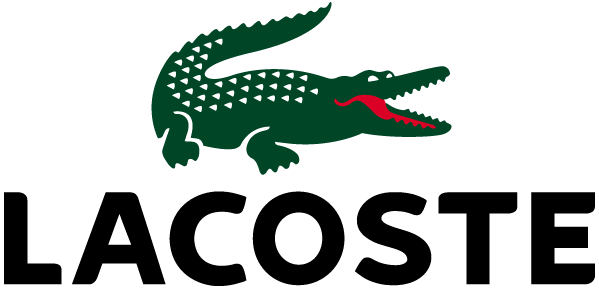
33. Lacoste
Tennis player René Lacoste was nicknamed "the crocodile", and in 1933 the crocodile became the first logo stitched onto the outside of a shirt. It's still there, on the chest of every polo, and it's a reminder that a nickname or inside story can be a great source for a symbol.
Borrow this: look for a story only your brand can tell, then draw it.
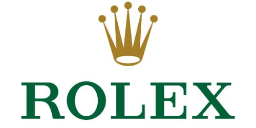
34. Rolex
Founders Hans Wilsdorf and Alfred Davis introduced the five-point crown in the 1920s. It sits above the name in green type, with gold and green chosen to signal excellence and prosperity. The crown says "the best" without a single word of copy.
Borrow this: color can carry as much meaning as the symbol itself.
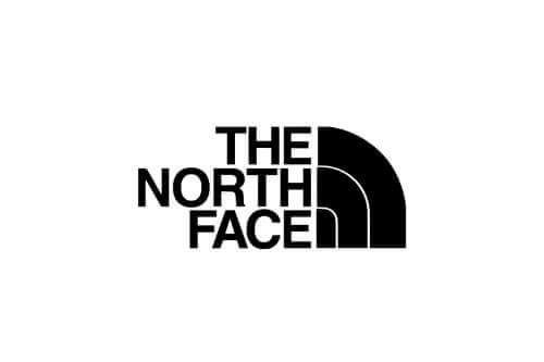
35. The North Face
The three arcs come from Half Dome in Yosemite National Park, a peak with one sheer granite face and three rounded sides. One specific observation turned into one of the most recognizable marks in outdoor clothing.
Borrow this: abstract a real landmark or object until only its essential lines remain.
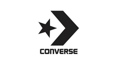
36. Converse
Converse introduced its Star Chevron mark in 2017, combining a star with a chevron. Both shapes already appeared on the shoes themselves, so the logo feels like it grew out of the product rather than being added to it.
Borrow this: pull your symbol from a detail customers already know from your product.
Color-led fashion logos
In an industry dominated by black, white and gold, a bold color is a statement. It makes accessible, youth-focused brands look confident and approachable. The trade-off is flexibility: a colorful logo is harder to emboss, engrave or embroider, so it needs a one-color version too.
37. Levi's
Founded by Levi Strauss in 1853, Levi's uses a red batwing logo that pops against the brand's signature blue denim. Red runs through the whole identity, down to the small tab stitched on the back pocket.
Borrow this: pick a brand color that contrasts with your main product.
38. Supreme
Founded by James Jebbia in New York in 1994, Supreme uses white Futura Heavy Oblique on a red box. The look borrows from artist Barbara Kruger's bold text-on-red work, and it became one of the most recognized marks in streetwear because it's blunt, simple and easy to put on anything.
Borrow this: a box logo is the fastest way to make plain type feel like a brand.
39. H&M
The name joins Hennes, the original women's clothing store, and Mauritz Widforss, a hunting and fishing retailer the company bought in 1968. Bright red, marker-style lettering makes this clothes shop logo stand out on any high street full of neutral wordmarks.
Borrow this: in retail, being instantly spotted from across the street beats being subtle.
40. Tommy Hilfiger
Tommy Hilfiger built its logo from red, white and navy blocks that echo the American flag, a direct link to the all-American preppy style of the clothes. The flag appears on nearly every product, from tags to waistbands.
Borrow this: national colors work when national identity is genuinely part of the brand.
Why did so many fashion logos start looking the same?
Between 2012 and 2018, a wave of luxury houses swapped distinctive serif or script wordmarks for bold, all-caps sans serifs. Saint Laurent, Balenciaga, Burberry and others made similar moves within a few years, and critics nicknamed the trend "blanding" because the logos became hard to tell apart.
The reasons were practical. Clean sans serifs read well on phone screens, sit neatly in social media avatars and look current next to streetwear, which luxury brands were chasing at the time.
The cost was distinctiveness. When five houses use near-identical wordmarks, none of them owns the look. That's why Burberry's 2023 return to a serif and its knight emblem got so much attention: it was a bet that heritage beats sameness.
Our take: a sans serif is a fine choice for a new label, but it can't be your only asset. Pair it with something distinctive, like a monogram, a symbol or a signature color. Read more in our guide to logo design trends.
How to design a fashion logo for your own brand
Start with your positioning, choose the logo type that matches it, then test the mark on real products before you commit. Most new fashion brands get the best results from a clean wordmark paired with a compact secondary mark.
- Define your positioning. Luxury, contemporary, streetwear and heritage brands each have visual conventions, as the groups above show. Decide which one you belong to, and whether you want to follow its conventions or break them on purpose.
- Pick a logo type. Use the logo types table above. A monogram needs short, memorable initials. A symbol needs time and budget to become recognizable. A wordmark is the safest starting point.
- Choose type with care. In fashion, typography carries most of the meaning. Browse the best fonts for logos and consider a custom or modified typeface so the wordmark is yours.
- Design a secondary mark. You'll need something small for woven labels, buttons, zipper pulls and social avatars. Initials or a simple symbol both work.
- Test it on product. Mock it up as a neck label, embroidery, a hangtag, a shopping bag and a 32-pixel favicon. Check it in one color and on dark fabric.
- Build the system around it. A logo is only one part of a visual identity. Lock in colors, type and packaging rules so every touchpoint feels consistent. Our guide to fonts for packaging helps here.
FAQs
Bottom line
The 40 designer logos in this article share one quality above all others: they were built to last. Simplicity is always popular in fashion branding, but it's much harder to do right than it looks. A simple logo that carries real meaning takes craft, and usually a clear-eyed decision about what the brand actually stands for.
If you want to have a professional designer create your fashion brand logo, you’re in the right place. ManyPixels provides quality, simple, and affordable brand design services. Get a logo that looks like a million bucks - without the hefty price tag!
{{BRAND_BANNER="/dev/components"}}
Send your first design request today, and get the first draft back tomorrow! Want to discuss your brand design needs further? Book a free consultation, and we’ll be happy to help.

Journalist turned content writer. Based in North Macedonia, aiming to be a digital nomad. Always loved to write, and found my perfect job writing about graphic design, art and creativity. A self-proclaimed film connoisseur, cook and nerd in disguise.

Top-quality designers
A complete creative team at your fingertips: graphic and web designers, illustrators, and more.

Lightning-fast turnaround
Get start today and receive your first update on the next business day.

All-inclusive pricing
Unlimited requests and revisions. One flat monthly fee. No surprises.

Flexible & scalable model
No contract. Scale up and down as needed. Pause or cancel at anytime.
Continue reading
Explore some of our best designs
Get inspired by a curated selection of ManyPixels work. Download the portfolio to see what our team can create.







