
20 Coffee Websites to Give You a Creative Buzz
.avif)
TABLE OF CONTENTS


Modern coffee shops are known for great and creative branding, and it’s often through great web design that they are able to convey the brand’s story. How to make a coffee shop website for your own business? These 16 examples of stunning coffee websites can teach you!
With the third wave of coffee (artisanal, ethically sourced coffee), coffee companies across the world have been coming up with creative ideas to attract young, hip customers. From eye-catching logos to original spaces, coffee shops have great branding down to a tee.
So, if they mostly do their business in-person, is having a website beneficial for coffee shops?
The answer is absolutely.
While social media is without a doubt an immensely important channel for connecting with customers, coffee shop websites are platforms to really focus on your brand identity: tell your story and show what makes you different. What’s more, many coffee websites nowadays provide customers with additional services, such as online ordering for pickup, or loyalty programs.
So, let’s look at some of the best coffee websites you can find online: from simple and timeless designs to quirky designs to please a hipster crowd!
{{WEB_BANNER="/dev/components"}}
Coffee shop websites with a simple user interface
No matter how beautiful and edgy a website looks, if it’s not user-friendly it’s not doing its job right.
So if you want to learn how to make a coffee shop website, the first thing you should consider is the user experience (UX).
Information should be clear and presented in an accessible way. A good rule of thumb to minimize the number of pages: a homepage, contact information and a products page might be more than enough. Here are a few websites that do simplicity well!
1. Monmouth Coffee Co.
You might at first think that this particular coffee shop website is way too simplistic to be on the list. But it does a lot of things great.
This beautiful image of coffee beans, surrounded by generous white space is a great way for any company to show how seriously they take their craft. The web design is effortlessly elegant, with beautiful typography to a minimal use of images..
On top of that, this website also has a live chat, which is a great CMS feature that will improve the user experience of your website.

2. Cafe Integral
If your dream is to build a large coffee business in several cities or even countries, then a simple website layout can provide visitors with relevant information without confusing them with location-specific issues.
Cafe Integral might not have the most unique design, but it’s pretty, and the website as a whole works very well. You could probably do something similar with a simple WordPress theme like Divi, but whatever website builder you decide to use one thing you can learn from this example is how to make it visually appealing.
Plenty of white space can improve the website experience and help any images shine through. I also love the choice of fonts on this website - although it’s an all caps font, thanks to the right size and spacing it doesn’t look overbearing. Instead, it makes larger chunks of text found on some pages more legible.
.webp)
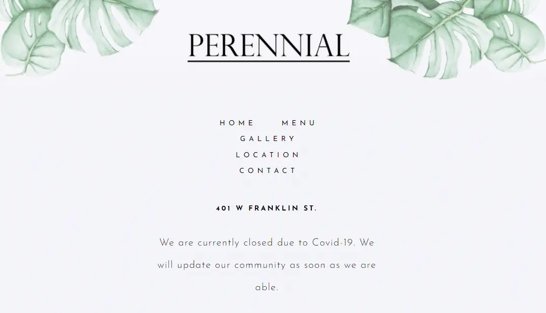
3. Perennial
This cafe website is comparable to Monmouth in terms of simplicity, yet they are quite different in two ways. Where Monmouth has a serious coffee connoisseur in mind, Perennial’s website helps convey the feel of the actual coffee house with its colorful, yet well-curated gallery.
They have a whole page entitled “Location” with a handy Google map, and another photo of the cafe’s exterior to help people find this great place. The information is minimal and to the point: menu, gallery, contact. Use this as a coffee shop website template if you want to establish a local presence and attract potential customers from the area.
It’s another great example of stylish typography, so if you’re looking at typefaces to help your web design stand out I recommend you check out our list of 12 coffee shop fonts.
4. Buzz Coffee
This is one of those coffee shop website designs that proves that simple doesn’t have to be boring. The sidebar menu is straightforward and easy to navigate, with just a few photos that illustrate this cafe’s vibe.
Including your location in the coffee shop website URL is a clever SEO trick that might help your website rank better in local search results.

Coffee sites with eye-catching hero images
A hero image is the oversized banner at the top of the website. With coffee websites, a simple cup of coffee or a smiling barista may be all you need to inspire that caffeine craving with your customers.
Powerful background images are awesome for parallax scrolling (they move differently than the rest of the content when scrolled), which can create a more interesting user experience.
Here are some of the best coffee websites with memorable hero images.
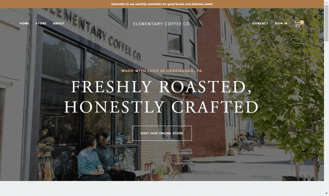
5. Elementary Coffee
If you’re wondering “is having a website beneficial for a coffee shop”, this next example will answer your dilemma.
Although having a cup of coffee outside your home is an offline experience, the purpose of a good coffee shop website is to illustrate that experience for prospective customers.
Elementary Coffee’s homepage is a pretty good example of this, with this custom photo of people enjoying their drinks outside. Adding an overlay filter like this helps to make the photo more pleasing to the eye. It also prevents the website from looking too colorful and noisy.
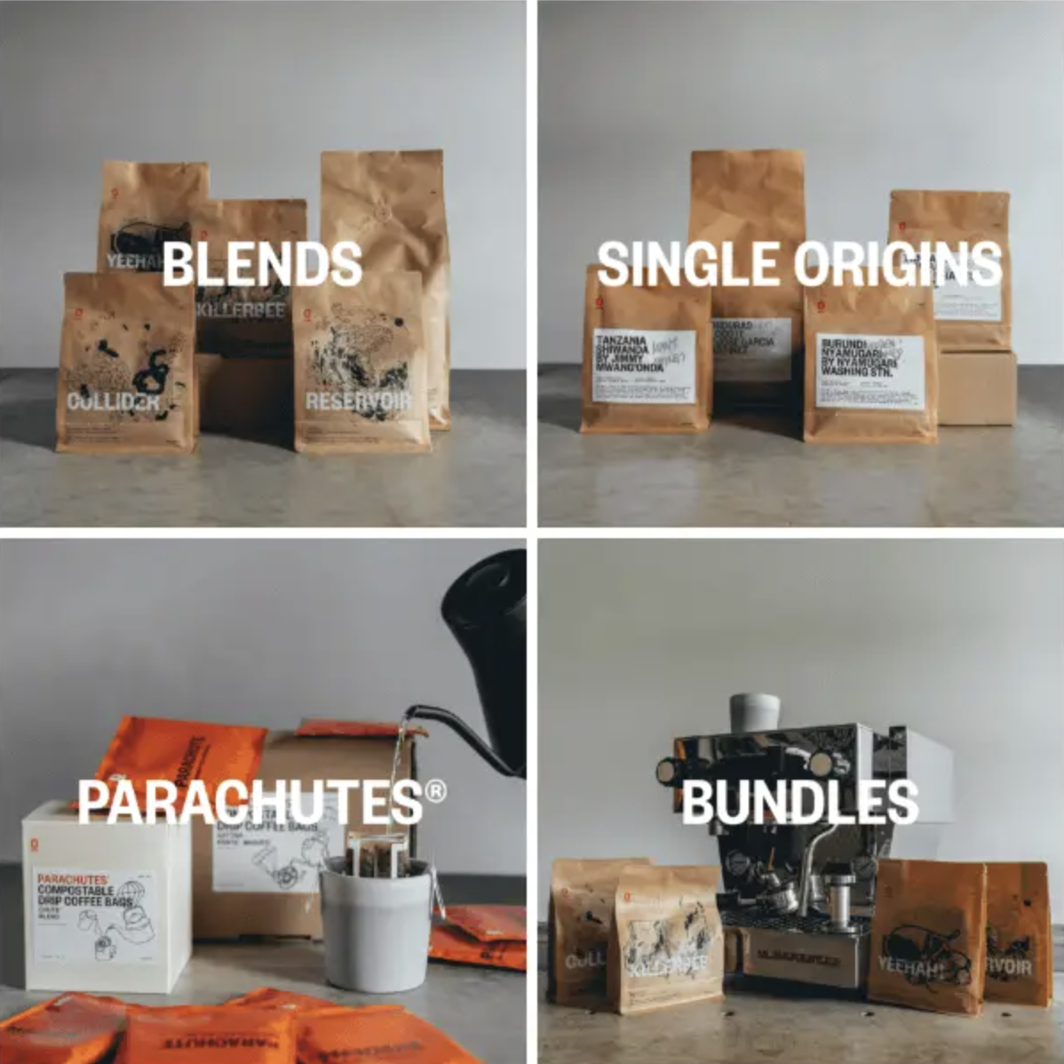
6. Single O
What’s better than one big image to make a statement? Several big, eye-catching visuals that help tell your brand’s story.
Singe O’s homepage is packed with stunning visuals - from their dynamic hero image to photos of their coffee products and founders. Although the photos vary in content, they all have a similar color scheme, which helps the brand identity shine through. If you don’t have a professional photographer on hand, you may want to use an overlay filter to ensure consistency.
True to their aesthetic nature, this coffee website also has a really cool section called “Art Bag Project” (formerly “Random Acts of Art”). This is where they showcase packaging for their coffee beans, with original illustrations from their cafe community.
.webp)
7. Happy Bones
Want something very minimal, yet extremely cool? Then check out this awesome New York cafe’s web design. They literally have 3 pages on the whole website: location, online store and history section (which is just 2 paragraphs).
This website relies on cool photos and plenty of white space to create a sense of a local small business that brings together art and coffee. If you were in the neighborhood, there’s no way you’d like to miss this cozy, effortlessly cool space with a commitment to great brews!

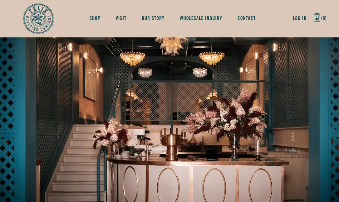
8. Felix Roasting Company
Not all coffee shops are built equal, and this website proves it. With a gallery of their stunning interior, this coffee site could surely entice anyone to pay them a visit.
Although you might think it’s simply thanks to a great interior designer, this is one of the best coffee websites thanks to its impeccable brand design. The color scheme, logo, typography, as well as the gorgeous coffee packaging all work together to tell the story of a truly sophisticated coffee brand.
9. Ipsento Coffee
I’ve mentioned parallax scrolling, so here’s one of the best coffee websites that uses this technique.
A lovely black and white photo of the cafe’s stays in sight, as you scroll down to discover more information about this coffee shop. With the growing popularity of ecommerce (even with coffee shops) this company has a separate ecommerce site which allows for easy coffee subscriptions and purchases.

10. Jimmy's Coffee
Although it doesn’t have a particularly memorable hero image, this website and company is worth checking out for another reason: a sense of community.
Jimmy’s Coffee has one of the best Instagram accounts among coffee shops, so it makes sense they integrated their feed into the website design. This is a way to connect with potential customers by showing them a peak at “real life” behind a professional site.

By the way, if you have a Squarespace website and want to learn how to add your Instagram to it, we have a handy article on that.
Best coffee shop websites with motion design
Good animation and motion graphic design work don’t come cheap. But, if you want your coffee house to really stand out in terms of web design, there’s arguably no better way to do it.
Remember that this is the part where you really need to make sure that your website is responsive. A web page that takes ages to load or glitchy animation can seriously harm your online presence.
11. NOC Coffee
This stunning website belongs to a Chinese coffee company and is surely one you’re going to remember.
The motto of the coffee shop is ‘Where coffee meets design” and this sleek website certainly reflects that. The landing page features a short video clip of a girl coming out of the coffee house, but even with this busy background the focus is on the clean white navigation bar found in the center. There’s also a few more clips of baristas preparing and selling coffee in beautiful spaces.
Hovering over the menu changes the background to different images all related to this stylish cafe and coffee roasters.
The best thing about this website is that even though there is a lot going on, it’s still very responsive and easy to navigate. Text is used sparingly just as a side note to the beautiful, moving images that tell most of the brand’s story.

12. Couvee
This website design combines the power of a large background image with some motion (if you hover over the two hands holding the coffee cups they move). There are some other simple motions with text boxes or call to action (CTA) buttons, which make the whole website feel a little more dynamic.
Outside of that aspect, Couvee’s modern design also utilizes a beautiful and fitting color palette (toque, light brown). The website has a light and airy feel thanks to plenty of white space and great use of photos: they are unique but still fit into the color scheme perfectly

13. Brooklyn Diamond Coffee
Cold brews are a fairly recent favorite with many trendy coffee lovers and if you’re one of them, this is a coffee shop website you’ll love.
Their landing page features a huge image of the famous cold brew which slowly zooms in. Again, there’s a little bit of motion going on here, but in a way that’s user-friendly. You might be surprised to know that this pretty web design is adapted from a Shopify website theme, so if you want to build something great from their existing templates, this might be one route to consider.
They have a refreshing and breezing white and pale pink color scheme (yes, brown and beige tones have alternatives), and the website overall is easy to navigate. This kind of website also makes for a great ecommerce experience since the footer of the website shows the accepted payment methods.

14. Hilltop Coffee
Here’s another great coffee shop website that brings a taste of the action with this immersive video of people enjoying the coffee shop’s diverse offering. They even have a cameo of Issa Rae, which works as a nice, non-obnoxious celebrity endorsement (although honest customer reviews are usually a better and easier option).
Although this approach is fun and engaging, remember that videos should be optimized for web use, to avoid slowing your site down.

15. Ceremony Coffee
The animations on this website are quite subtle. Nevertheless, it’s a good reminder of how a little can go a long way to help make your website experience more enjoyable.
Other than fun micro animations (zoom effect, animated pops, and color-changing hover effect to explore the different shades of coffee), the website hits the mark with a trendy color palette, professional photos, and a clean layout.
.webp)
Fun websites that go the extra mile
If you’re a coffee shop owner who wants to highlight how unique your small business is, any old website simply won’t do.
These great coffee shop websites have very unique design and content, so if you decide to build your own website with the help of a program like Elementor, take notes from the following examples on how to make your website unique.
16. Hummingbird
Adding videos makes for cool coffee websites, but custom animations are a whole different playing field.
These coffee roasters have a brand design that’s both traditional and completely unique. With a beautiful dark red color palette and animated custom illustrations, this homepage makes a really powerful first impression.
.webp)
17. Onyx Coffee Lab
This coffee roasters website is very dynamic: there’s motion design, parallax, funky typography and an unconventional layout for good measure.
They do a lot of different things, from barista training, to catering, and even consulting small businesses in the coffee industry, and the futuristic and modern design found across their website fits perfectly.
They also have a really cool looking subscription section, where you can subscribe for regular deliveries of your favorite coffee. This website offers a totally personalized experience so you can choose between their most popular blends or even create your own!

18. Muchacho
If you’re looking for retro, colorful web design inspiration look no further than this incredible eatery and coffee house in Atlanta.
Their website design is riddled with colorful, funky images, but includes helpful details like a complete menu section and a Google map. What’s so great about this website is that it shows a fun, playful brand without much text; in fact it relies almost exclusively on fun visuals that look like they belong on someone’s social media channel.

19. Art Cafe
There are many great things about this coffee shop website: cute pencil illustrations, a professional video showing the cafe/restaurant, high-quality photos.
But the most unique thing about it is their events calendar. Coffee shops are often places for like-minded people to meet, so why not take notes from this New York cafe and create your own calendar of events at your coffee place!
.webp)
20. Counter Culture Coffee
How can you make a coffee website that’s both informative, engaging and well-designed?
Counter Culture Coffee website is a good one to learn from. Playful color schemes and fonts, micro animations, videos, and heaps of information about their coffee are packed into this delightful website. It just goes to show the importance of hiring a skilled website designer who will understand how to create a positive experience for the user, no matter the content.

Ready to create your own coffee shop website?
We hope these great examples provide plenty of food for thought when you decide to create a unique web design for your coffee business.
You can always try the DIY approach with Wordpress themes or other website builders, like Squarespace, Wix or Elementor. Of course, remember that going with a ready-made coffee shop website template might not give your business the most unique look.
If you’d like a beautiful, custom coffee shop website that won’t break your budget, you’re in the right place. With our unlimited web design service you can get your business website for a fraction of the cost you’d pay with a web design agency. Best of all, with one flat monthly fee you can get all the graphics your business needs - whether it’s a cute illustration or social media graphics!
Select your subscription plan and get started today with a 14-day risk-free guarantee!The answer is absolutely. While social media is without a doubt an immensely important channel for connecting with customers, coffee shop websites are platforms to really focus on your brand identity: tell your story and show what makes you different. What’s more, many coffee websites nowadays provide customers with additional services, such as online ordering for pickup, or loyalty programs.

Having lived and studied in London and Berlin, I'm back in native Serbia, working remotely and writing short stories and plays in my free time. With previous experience in the nonprofit sector, I'm currently writing about the universal language of good graphic design. I make mix CDs and my playlists are almost exclusively 1960s.

Top-quality designers
A complete creative team at your fingertips: graphic and web designers, illustrators, and more.

Lightning-fast turnaround
Get start today and receive your first update on the next business day.

All-inclusive pricing
Unlimited requests and revisions. One flat monthly fee. No surprises.

Flexible & scalable model
No contract. Scale up and down as needed. Pause or cancel at anytime.
Continue reading
.jpg)
.jpg)
.jpg)
Explore some of our best designs
Get inspired by a curated selection of ManyPixels work. Download the portfolio to see what our team can create.


