

20 Best Font Pairings You Should Check Out
.avif)
TABLE OF CONTENTS


Explore our selection of brilliant Google font pairings, fit for every occasion.
How to pair fonts effectively? There’s more than one way to do it.
You can opt for bold contrasts, such as a heavy slab serif font and a delicate cursive script; or pair similar fonts to give your design projects a more dynamic look, whilst building a cohesive brand image. Or even, pair two different weights or styles from the same font family for a more minimalist and elegant effect.
Today, we’re looking at some of the best font pairings. We’re also going to suggest what each pair would be best suited for.
{{BRAND_BANNER="/dev/components"}}
Contrasting font pairs
Let’s start with some eye-catching combinations of completely different fonts that are sure to give your designs a very exciting look.
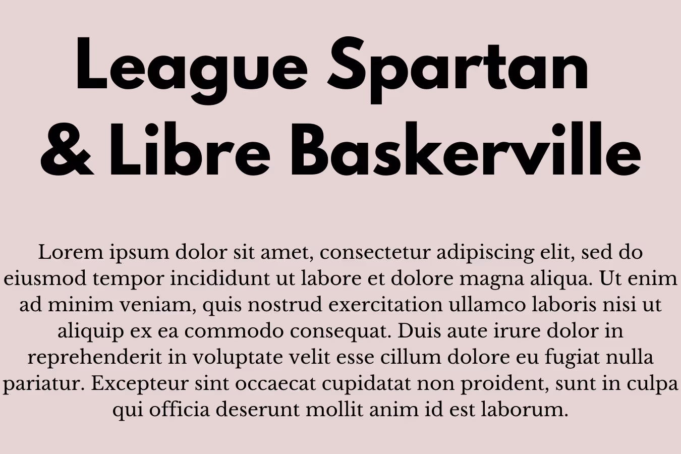
1. League Spartan & Libre Baskerville
This is a wonderful heading and body text font combination, for modern yet elegant designs. The bulky sans serif League Spartan helps catch the viewers’ attention, while the classic free font Libre Baskerville adds a touch of sophistication. Great use of this font combo could be on a modern architecture website.
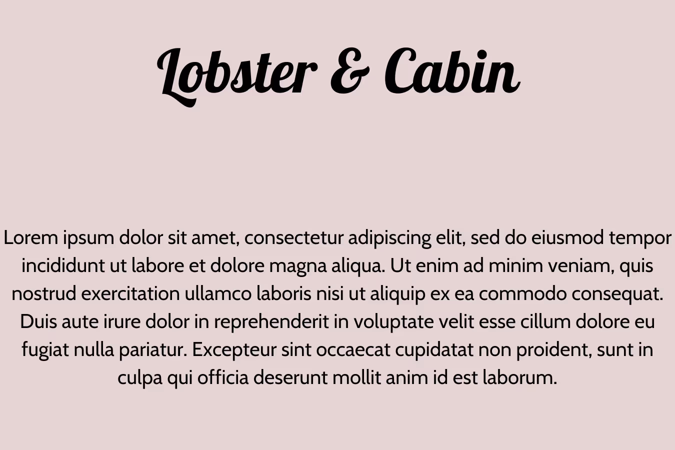
2. Lobster & Cabin
Lobster is one of the most popular script fonts, thanks to its quirky and playful look and high legibility. It would make a very good logo font and paired with the nice rounded letterforms of a sans serif font like Cabin, it would make a stunning combination for an aesthetic portfolio website or YouTube channel art.
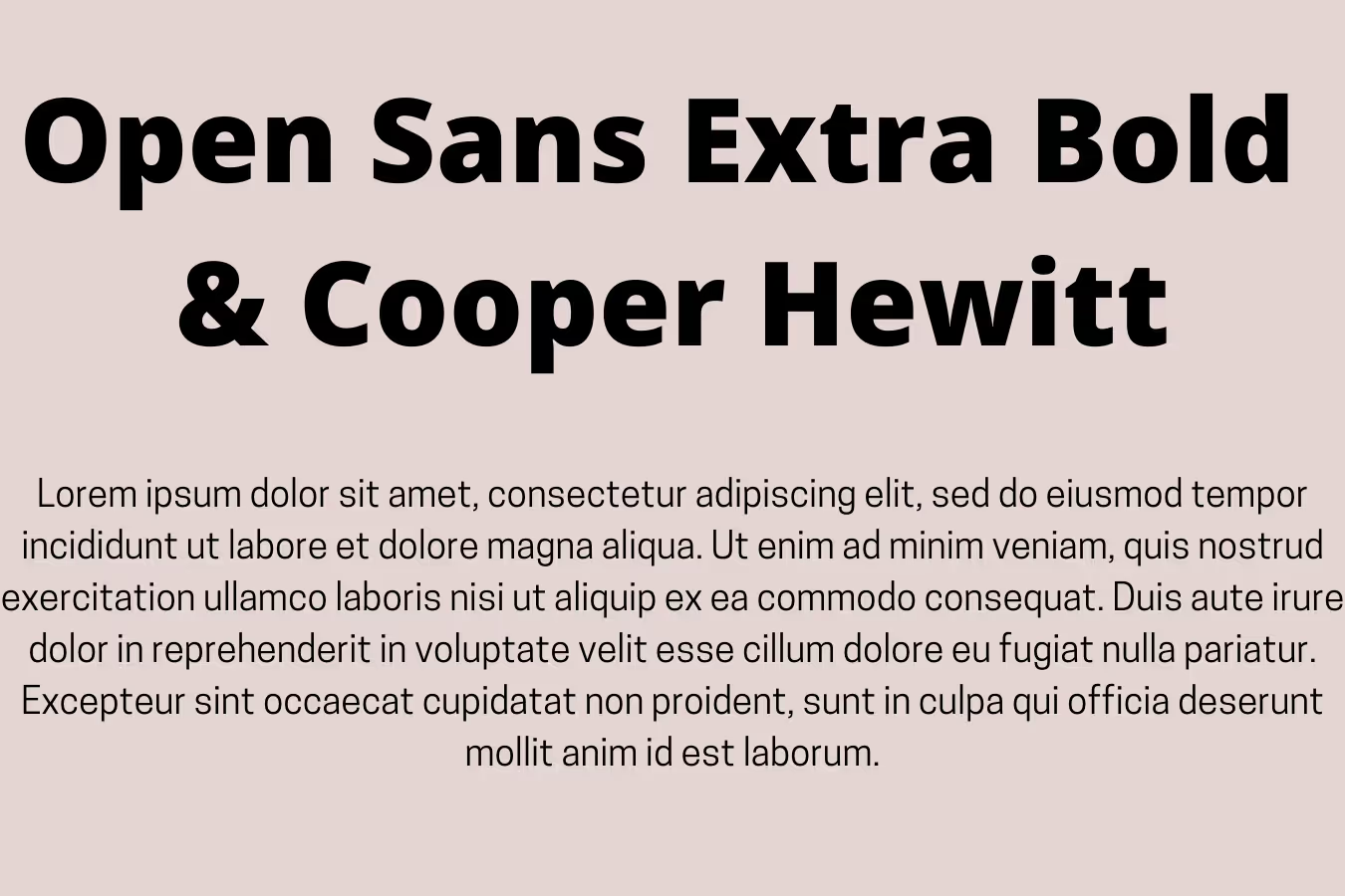
3. Open Sans Extra Bold & Cooper Hewitt
Open Sans is a big font family and one that’s often used in web design. Pairing the bulky, round lettering (especially in uppercase) with the slender forms of Cooper Hewitt will certainly deliver a dramatic effect.
The high contrast with this typeface pairing is achieved thanks to a stark difference in spacing between the letters: Open Sans has quite generous kerning, while Cooper Hewitt lettering is quite condensed.
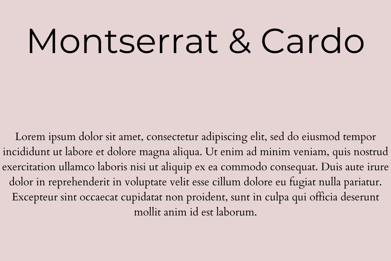
4. Montserrat & Cardo
Montserrat is a sans serif font created by designer Julieta Ulanovsky and inspired by urban typography from the first half of the twentieth century. On the other hand, Cardo is a Unicode font that was created with Biblical scholars, medievalists and linguists in mind. It’s very decorative and has a calligraphy quality to it.
Together, however, they make for a really interesting combination, and the great thing about this Google font pairing is that you can get a completely different effect by switching them round from header to body text. For example, Cardo as a heading would be perfect for fancy restaurant menu design, while Montserrat’s clean look would fit a nice spa brochure.
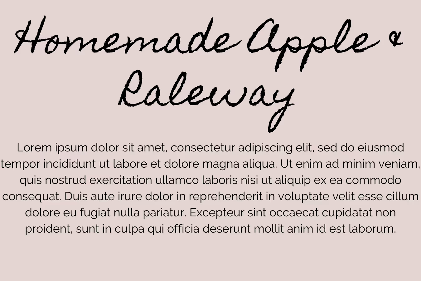
5. Homemade Apple & Raleway
Raleway is a classic sans-serif typeface that can be used for almost any professional project, so it’s no surprise that it makes a wonderfully adaptable companion to some more intricate fonts. A particularly good combo is with this cute and quirky cursive script font that looks like it could belong in a school yearbook. As a body text typeface, Raleway will let any display font shine whilst delivering all the key information.
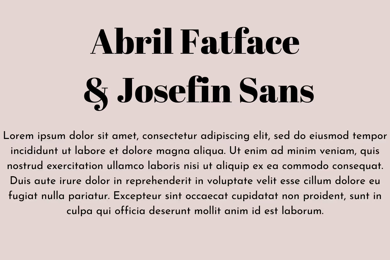
6. Abril Fatface & Josefin Sans
Although the contrast is stark, this font pairing still makes a lot of sense. T x-height on both fonts (the height between the baseline and the mean, or middle line) is slightly lower, giving uppercase letters a long and lean look. Abril Fatface is a gorgeous font with a stark contrast in the line widths, making it a lovely display font that’s still very elegant. This captivating font combination would make a lovely choice for luxury hotel branding, as it’s both classy and professional.
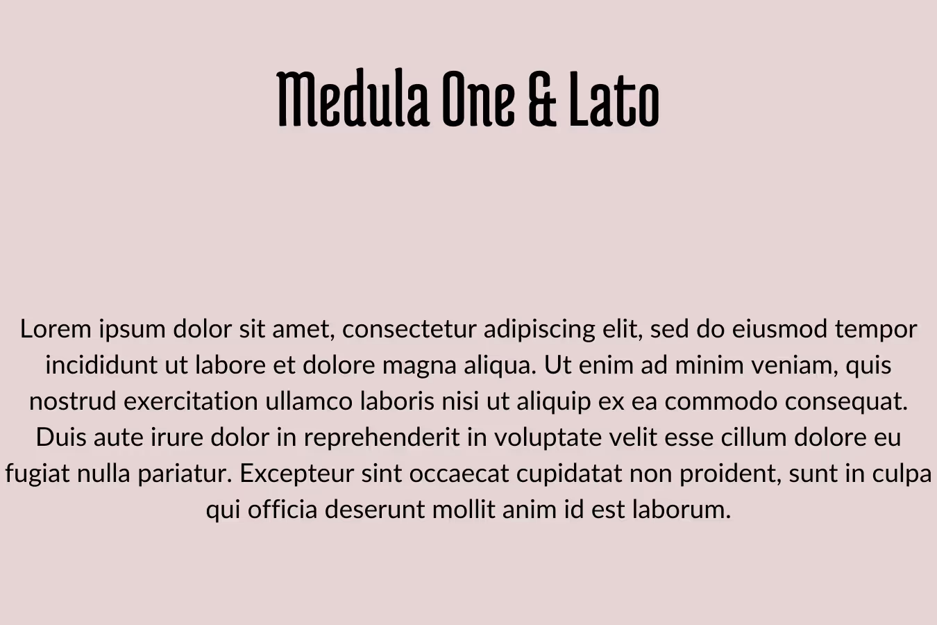
7. Medula One & Lato
Medula One looks like the perfect font for signage inside a coffee shop or a small boutique. Although it’s rather decorative, it scores high for legibility. It looks like it’s inspired by old Gothic fonts, but is definitely a more modern and updated version.
Lato was designed by Polish graphic designer Łukasz Dziedzic. Lato means “summer” in Polish, and this casual, breezy font definitely lives up to its name. There’s a certain hot and cold contrast in this pair that works really well: Medula One looks like a logo font you’d see on tea and mulled wine, while Lato would look really well in a drop shadow effect on a fizzy drink label.
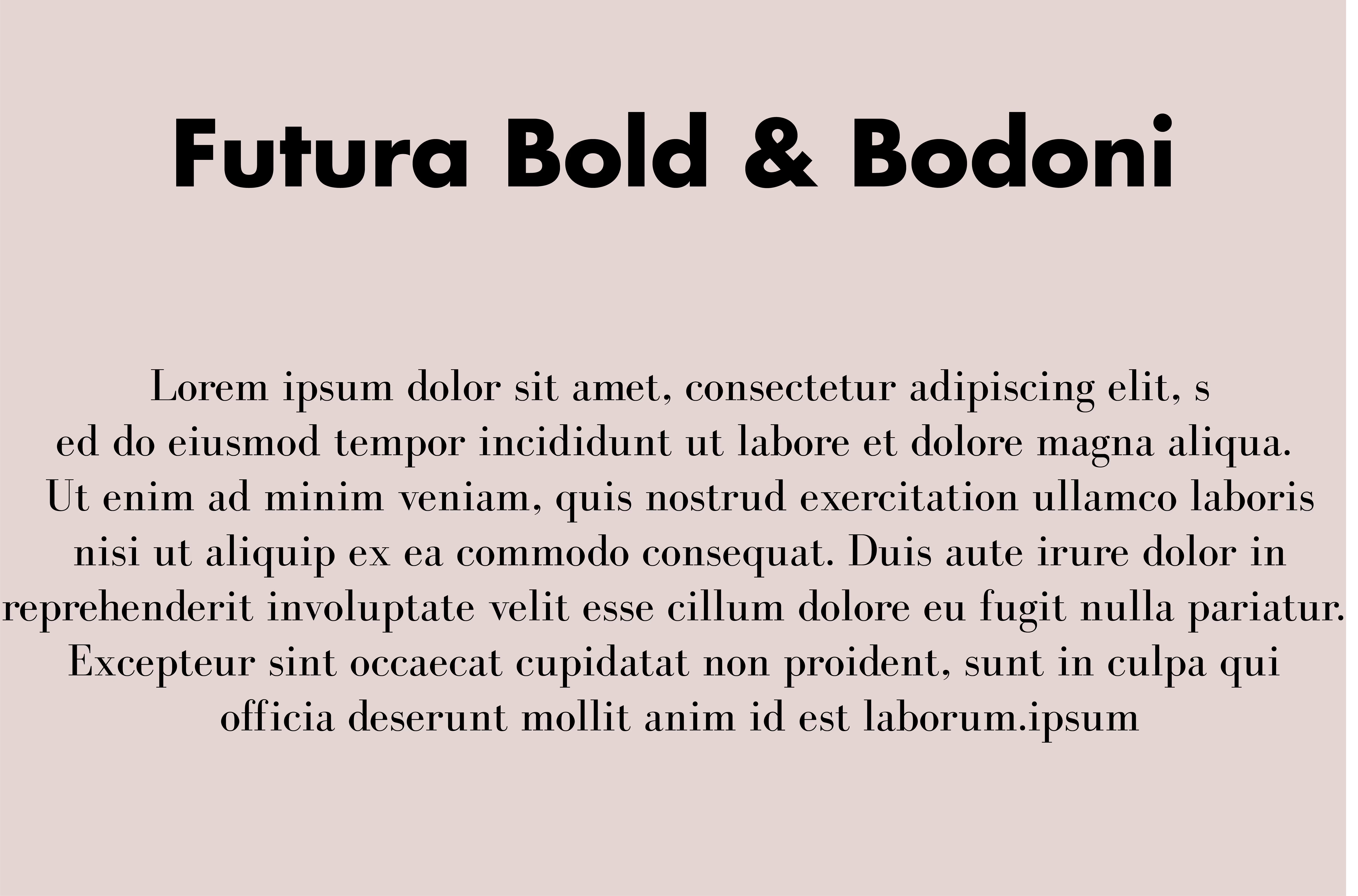
8. Futura Bold & Bodoni
This font pair is probably the textbook definition of contrast done well: using a crisp, yet chunky font for the header and a slim and elegant typeface for the main copy. The stark difference between the two typefaces really delivers a punch, so a combination like this would be great on all sorts of flyers and brochures, helping people immediately notice that text, but thanks to high legibility also take in information quickly.
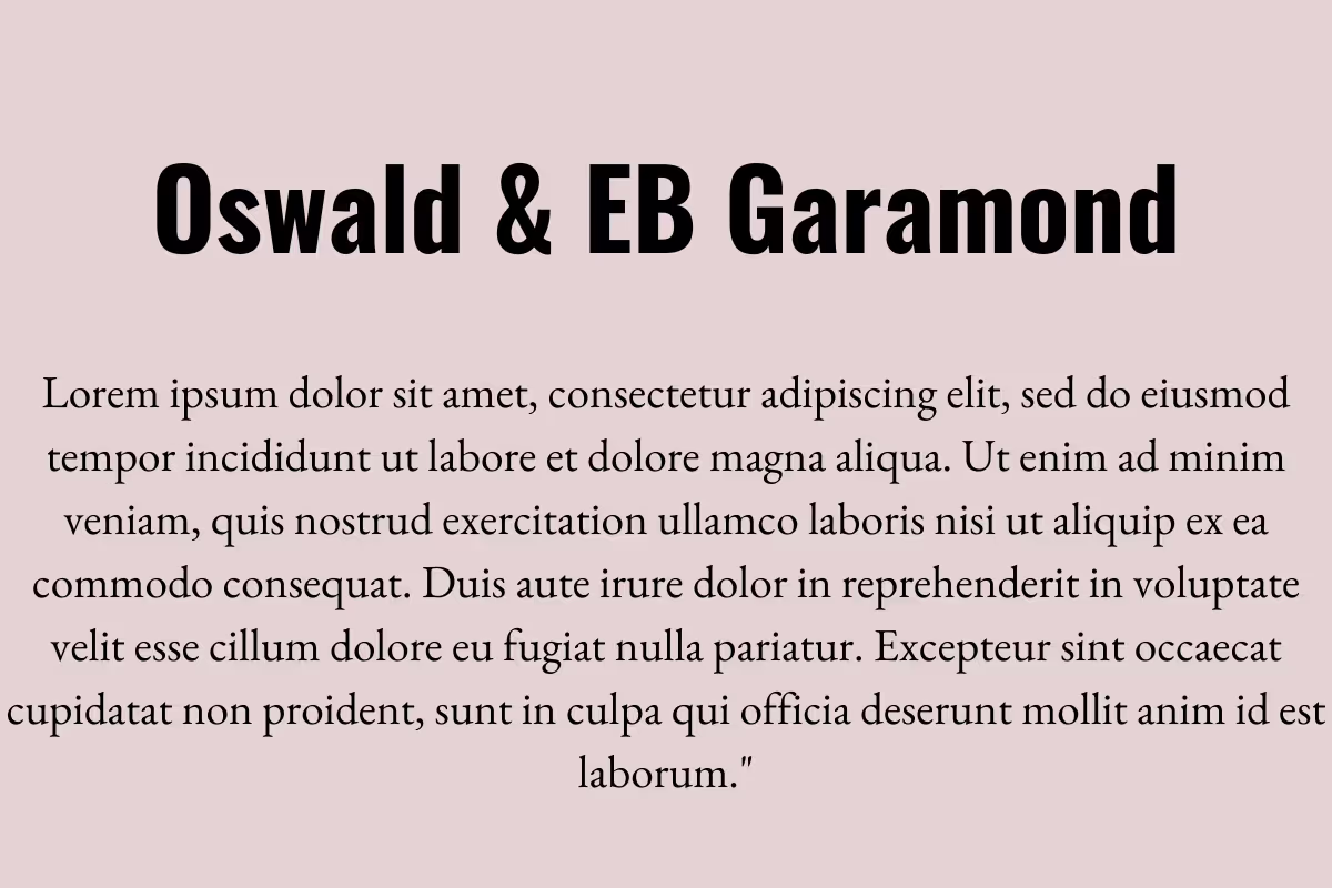
9. Oswald and Eb Garamond
You’ll often hear that sans serif is the preferred font type for body text. However, if you want to shake things up a bit, why not use a sans serif for the headings and a serif for body text?
This Google font pairing is a beautiful one to explore. Oswald is a bold and powerful sans serif that's designed to grab attention. Eb Garamond is very elegant, but much more crisp and legible than the classic Garamond font. So, it’s a perfect choice even for large chunks of text.
Complimentary font pairings
The following font combos include different fonts that still have certain similar qualities. That’s what makes these combinations perfect for rebranding projects if you want to retain a sense of brand identity while giving branding assets a more updated look.
10. Didact Gothic & Arimo
These two fonts look very much alike, but Didact Gothic has a slightly longer x-height, while Arimo is a bit more balanced. These slight differences allow the crisp sans serifs a more humanistic feel, making them a great font pair for modern websites and tech companies.

11. Playfair Display & Alice
If you’re after a gorgeous serif combo for your headings and body copy, this Google font pairing is one to remember.
Playfair Display has also got an italic version which you can use to give designs a gentler look. This stylish and romantic combo could be a great typography choice for wedding photographer websites or custom invitations. Both are available on Google Fonts!

12. Lora & Roboto
Lora is a lovely alternative to the classic Times New Roman font, and Roboto is a modern font with a very wide use (YouTube for example). You can use them both as a body copy and display font and the results will always be great. Thanks to their classic look, they’d be a great choice for more “serious” industries, and perfect for use in law firms or hospital branding.

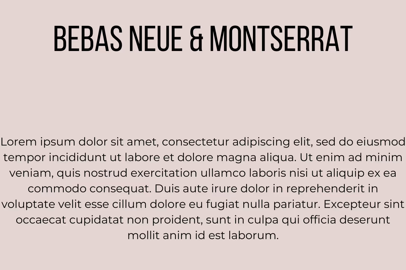
13. Bebas Neue & Montserrat
Bebas Neue is one of the most popular display fonts, found on anything from YouTube thumbnails to logo design. Since it only comes in uppercase, when it comes to design projects it requires a secondary font to accompany it. Montserrat’s crisp, geometric features make a great pair.
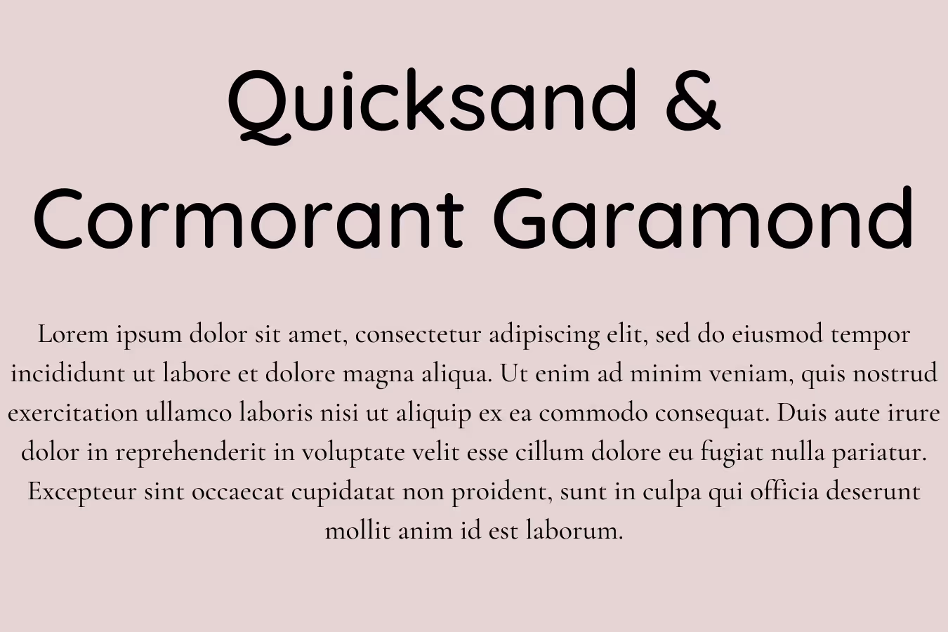
14. Quicksand & Cormorant Garamond
Quicksand is a beautiful open source sans serif font designed by Andrew Paglinawan. It’s a geometric font with rounded terminals which gives it a very nice and approachable look (very good as display or logo font in the hospitality and food industry). Pairing with a more modern alternative of the classic font Garamond gives this pair a very stylish quality.
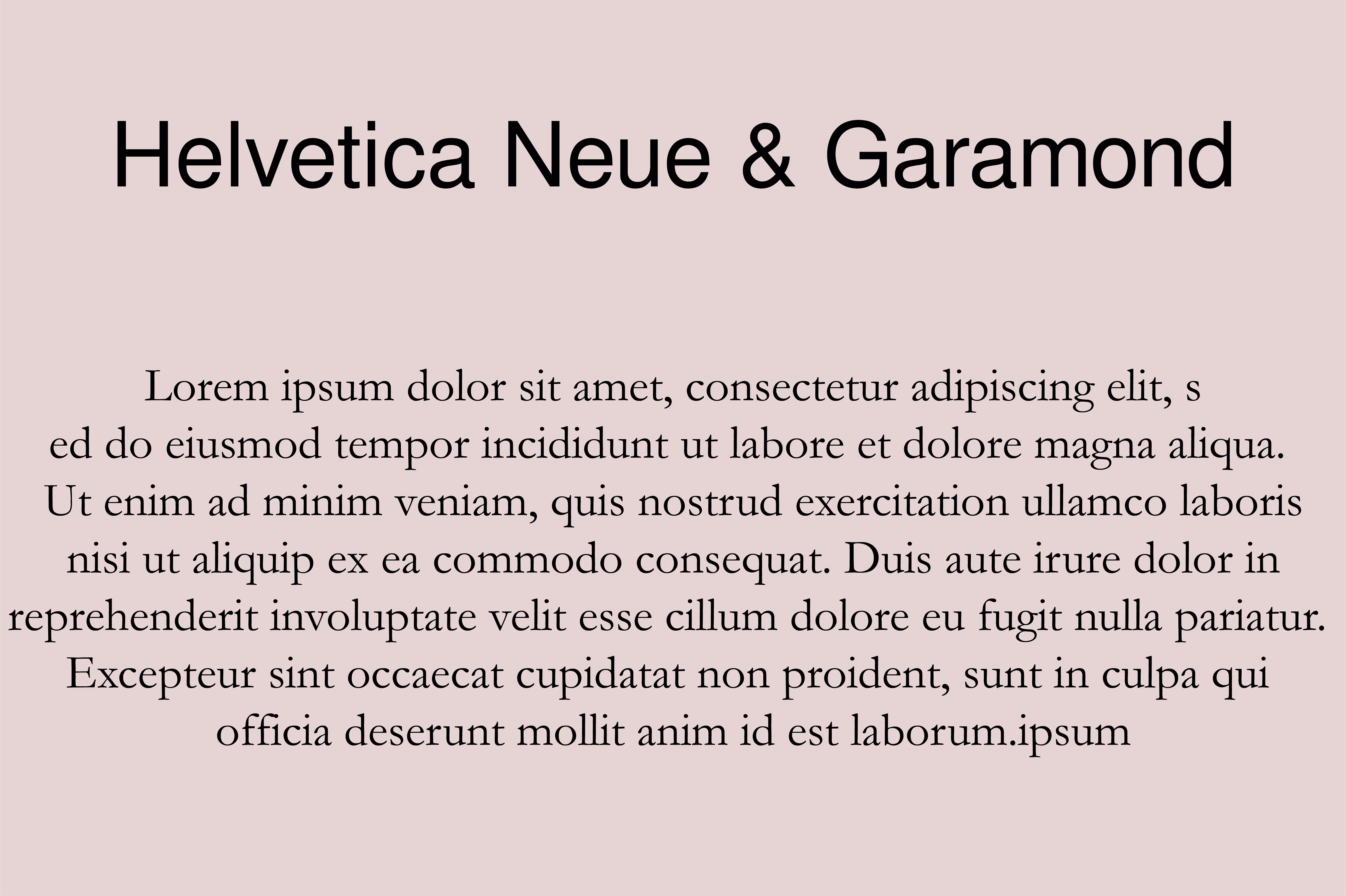
15. Helvetica Neue & Garamond
Helvetica is one of, if not the most widely used font in professional design. It’s found on numerous famous logo designs, from Nestle to Fendi and Jeep. Helvetica Neue is a more modern adaptation that has the original’s versatile and clean look and it comes in several different weights and styles, Ultra Light to Extra Black Oblique. For that reason it pairs really well with a classic serif font like Garamond, making this font pair a perfect blend of old and new.
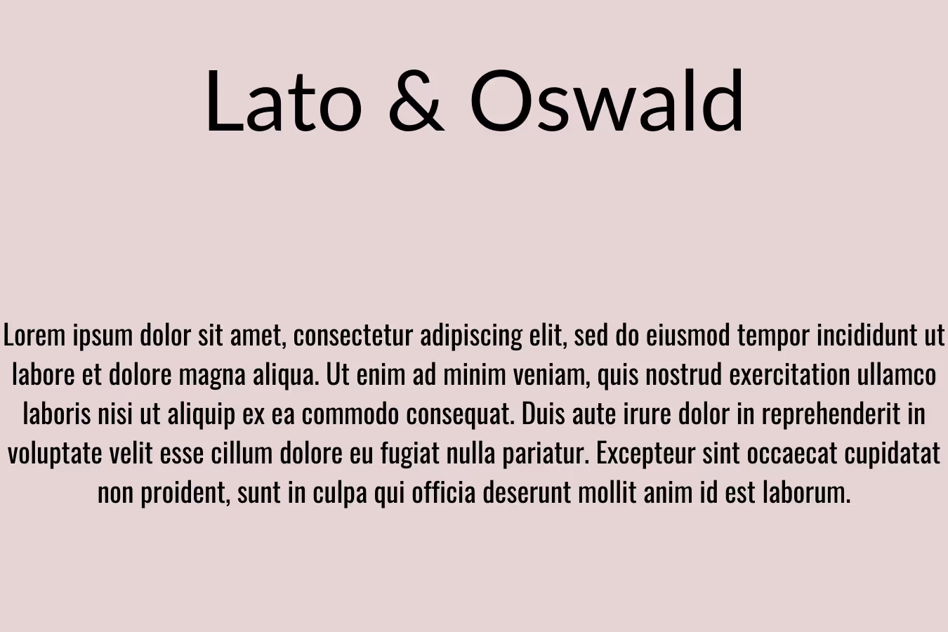
16. Lato & Oswald
If you want an exciting font combination that exudes professionalism and a crisp minimalist aesthetic, Lato and Oswald are great ones to consider. While the lettering has similar shapes, the different weights between the two typefaces add a very cool effect, still keeping the overall look of designs cohesive. They’re both great as webfonts, although you might need to adjust the kerning with the slightly heavier Oswald for more condensed body text.
Same font family pairings
Pairing two fonts from the same family can sometimes look a bit bland. However, these dynamic variations look equally sophisticated and cool, so if you want a clean and polished look for your designs definitely consider one of them!
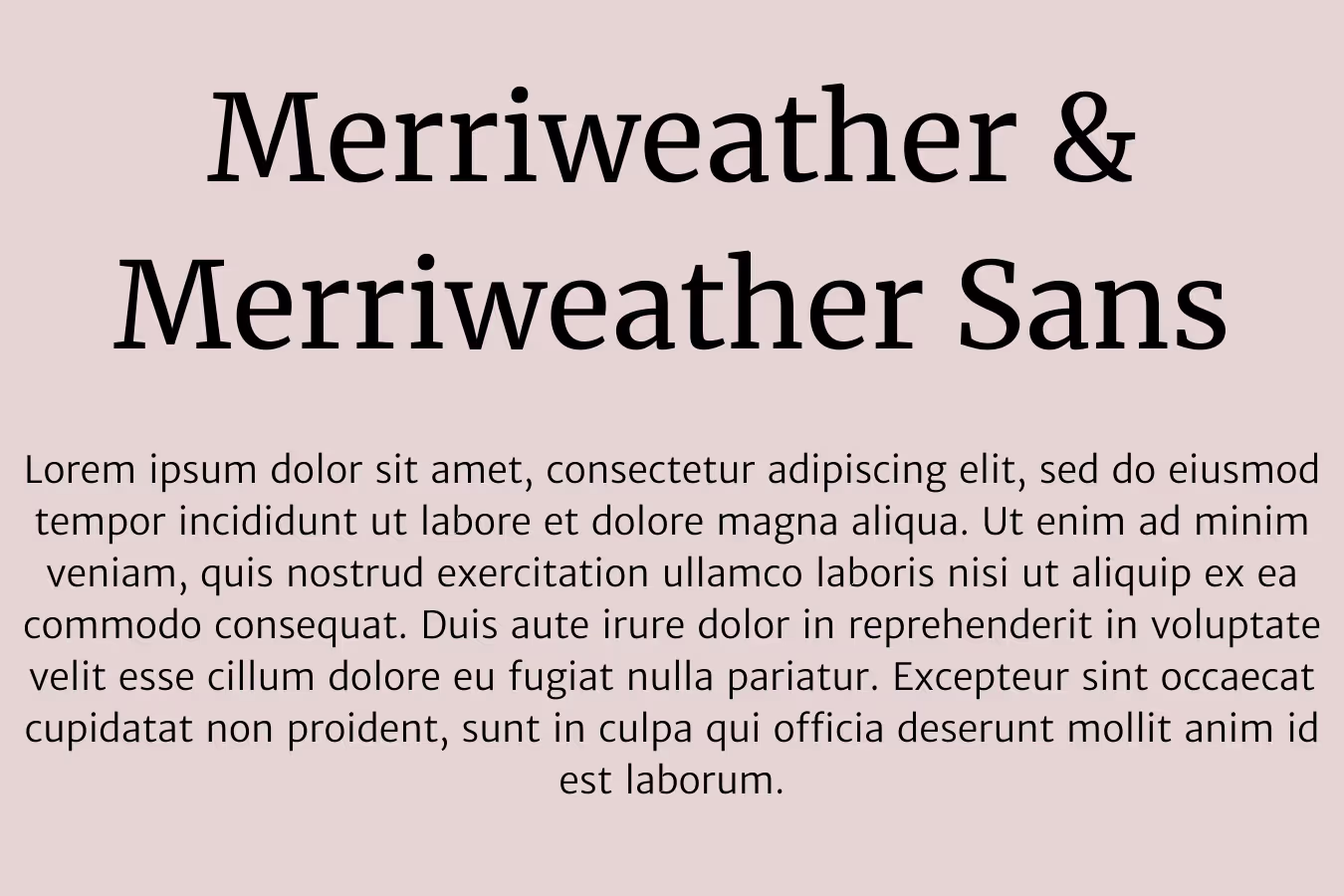
17. Merriweather & Merriweather Sans
Merriweather is a serif font with an unusually crisp look (the strokes at the end of the letters are geometric and well balanced), so it pairs well with crisp sans fonts: Merriweather and Source Sans Pro is one such killer combo).
However, for an even cleaner look pair Merriweather with the sans serif version of the font.
This combo would be wonderful for print designs, anything from book covers to business cards!
18. Space Mono & Space Mono
Nope, this is not a typo. Some fonts have a really interesting and distinct look that looks best paired with itself. Space Mono is a monospace font designed by Colophon Foundry for Google Design. Thanks to its grotesque style it bears a heavy resemblance to headings from the 1960s. For that reason, this cool and edgy font is a perfect pick for all retro designs.

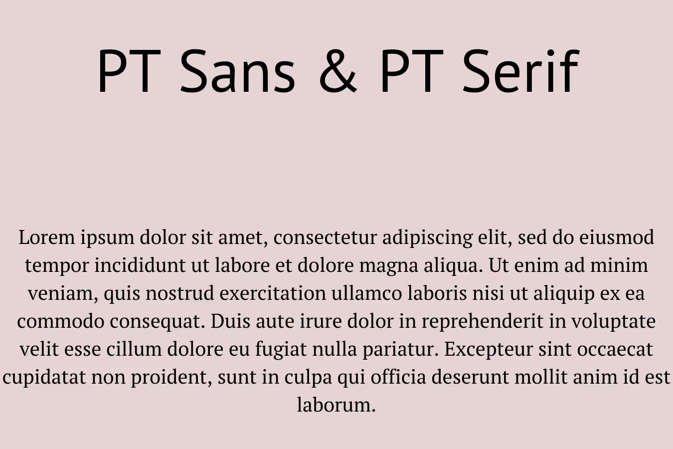
19. PT Sans & PT Serif
If you want a reliable and professional font combination, then you can’t go wrong with this one! It’s probably not going to add heaps of character to your design projects, but if you’re looking for free fonts you can use in larger publications with lots of text, then this is a good option to consider.
20. Archivo Black & Archivo Narrow
If you were unconvinced that two fonts from the same font family can make the perfect combo, then this pair will convince you otherwise! Archivo was designed for digital and print media in mind and these two variations follow suit. The different widths between the two types of letters add for a really dynamic effect, and the geometric lettering makes these fonts great to use in modern industries such as tech, data, or security.

—
We hope this gives you some ideas on how to pair fonts effectively. Although typography is one of the most vital elements of good design, it’s certainly not the only one.
Don’t waste your own precious time - our team of pro designers can create any graphic you need. Logos and branding, websites, illustrations, or indeed custom typography - we’ve got you covered!
Do you want to learn more? See how our unlimited design service compares to other design solutions. Or book a free consultation to chat with us about your design needs.

Having lived and studied in London and Berlin, I'm back in native Serbia, working remotely and writing short stories and plays in my free time. With previous experience in the nonprofit sector, I'm currently writing about the universal language of good graphic design. I make mix CDs and my playlists are almost exclusively 1960s.

Top-quality designers
A complete creative team at your fingertips: graphic and web designers, illustrators, and more.

Lightning-fast turnaround
Get start today and receive your first update on the next business day.

All-inclusive pricing
Unlimited requests and revisions. One flat monthly fee. No surprises.

Flexible & scalable model
No contract. Scale up and down as needed. Pause or cancel at anytime.
Continue reading

Explore some of our best designs
Get inspired by a curated selection of ManyPixels work. Download the portfolio to see what our team can create.


