
10 Artful Architecture Website Examples
.avif)
TABLE OF CONTENTS


Are you running an architecture firm in need of a website? Don’t go into this big task unprepared! Take a look at some of the best architecture websites from the web that will help you design your own!
Just like every other business, architecture firms need professional websites. But an architectural website is much more than basic information, such as location and a contact form.
As an architect, your site is also your portfolio website. You need to include all the best projects you’ve worked on, in an easy-to-skim and understandable manner.
Want to learn how to design an architect website? Here are 10 amazing examples with actionable tips!
{{WEB_BANNER="/dev/components"}}
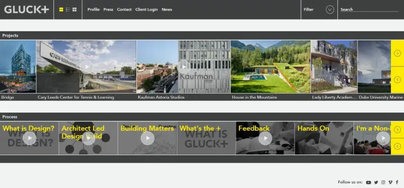
1. Gluck Plus: multi-layout homepage
This architecture studio’s homepage can be seen in a filmstrip slideshow view, list, or big thumbnail view. That makes scrolling through projects easy, no matter the layout.
The website includes a Profile, Press, Contact and News page, in which you can find the brand story, press clippings and company news, and the location of the New York office.
This information helps the clients learn about the company, but also improves SEO. Although images can also help your sites rank, the copy of your website is most important for search engine optimization.
2. Powerhouse Company: unique UI
The Powerhouse Company has one of the most engaging and unique UI designs. From the exquisite animation to the overall solution of presenting each project, the look of this website doesn’t fit any website template.
They have a unique scrolling effect, which zooms in and out rather than up and down. This makes the site look even more like an architecture portfolio.
When you click on an individual project, you are led through a detailed design process and the parameters of each building and site. You can click on each aspect of a building design and learn more about it. This helps to increase engagement rates, which is another way to improve SEO on your architecture firm website.

3. Skidmore, Owings & Merrill: video slideshow
The SOM website uses videos instead of hero images on their website. This is a great way to show off their capabilities and the quality of their architecture design.
What SOM also does well is including all their social media accounts and establishing an online presence, such as their blogging efforts from Medium, to LinkedIn.

4. El Equipo Mazzanti: extensive architecture portfolio
Although tidy and easy to navigate, the website of El Equipo Mazzanti isn’t unique because of the web design alone.
The architects behind this company share more than just their projects with the online community. This architect website boasts academic research, lectures, videos from construction projects and exhibitions.
All the educational materials attract more colleagues and architecture students, as well as competition. As all digital marketers know, every click matters and these lead magnets surely help with SEO.

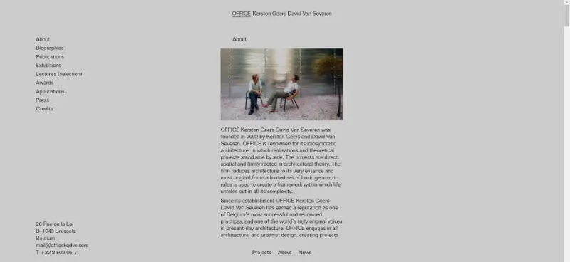
5. Office KGDVS: as simple as a sketch
Less is more, and that is a fact. The website of Office Kersten Geers David Van Severen employs that tactic, by showing finished projects in real life, and their architectural sketches side by side to show you the design process step by step.

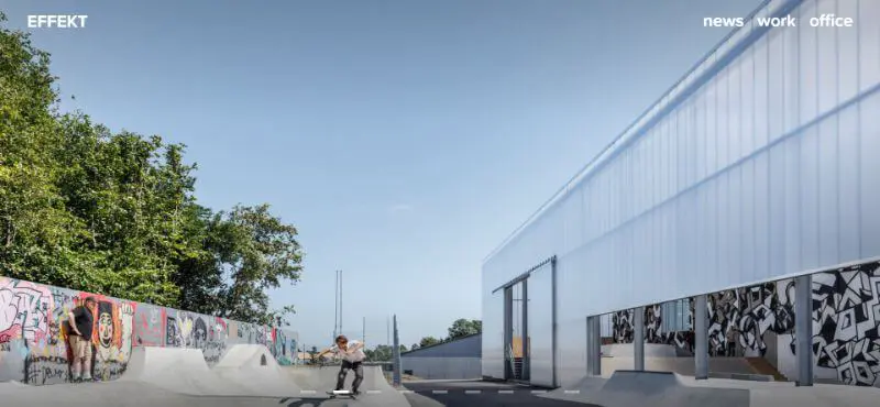
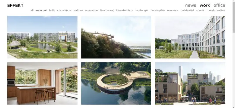
6. Effekt: the hero image is hero
Effekt architectural firm decided to trust an old and proven tactic in designing websites. Utilize an eye-catching hero image. You can see a gallery of high-quality images showcasing their impressive projects.
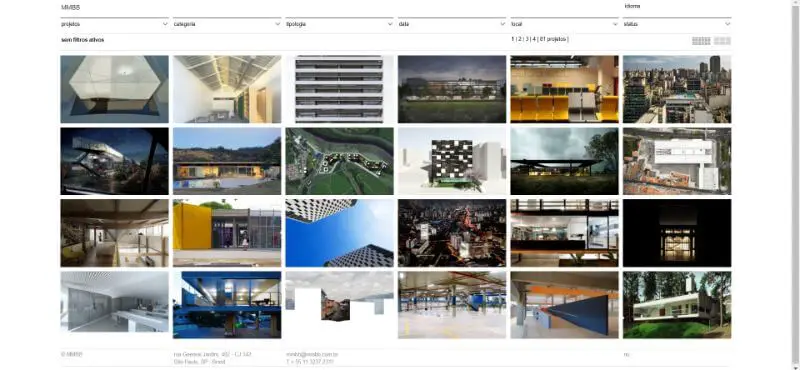
7. MMBB: quirky and retro
The website of MMBB is as minimalistic and old-school as it can afford to be, without that costing them website clicks.
The layout includes small thumbnails and digital-inspired typography. It feels almost as if it’s a website from the early 2000s, but still includes lavish photography. The great search filters help the potential clients reach whatever they need to find, and create a pleasant user experience on this unique site.
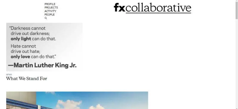
8. FXcollaborative: playful
Some of the best architecture website designs don’t follow strict rules. FXcollaborative’s site may seem all over the place at first. However, although the design seems quirky, the site is still very easy to navigate.
The content is also fun and engaging. They included quotes and inspiring maxims that perfectly describe their design philosophy and what they stand for.
9. Biasol: modern design suited to the company
Biasol is one of the most famous interior design studios, often included in websites such as Archdaily, Dezeen and Architizer.
Their expertise is not just creating unique looks and plans as interior designers, but also building high-quality furniture. From the value propositions to the typography and color palette, everything about this website builds a powerful brand image.
Finally, each image has a different call to action, which helps to make the website useful for different segments of their target audience.

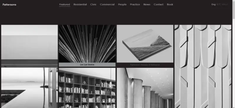
10. Pattersons: great use of templates
This fancy architecture firm website in black and gray is, actually, a WordPress template. Yes, even acclaimed architecture firms use DIY website builders and templates to create a website for their business.
The grayscale effect, simple typography and the lavish black background give Pattersons a unique and memorable look. And it has an extra ace in its sleeve: when you hover over an image, it’s in full color!
Final remarks
We hope this list gives you a few ideas on how to design an architecture website. For further tips, check out our articles on architecture logos and our detailed guide on website design.
Looking for an affordable way to get a website? Look no further than our unlimited website design service!
Get your site, landing pages, and everything else you need designed for a fixed monthly rate of just $599! Book a free consultation to see how we can help your business. Or pick your plan and get started today!

Journalist turned content writer. Based in North Macedonia, aiming to be a digital nomad. Always loved to write, and found my perfect job writing about graphic design, art and creativity. A self-proclaimed film connoisseur, cook and nerd in disguise.

Top-quality designers
A complete creative team at your fingertips: graphic and web designers, illustrators, and more.

Lightning-fast turnaround
Get start today and receive your first update on the next business day.

All-inclusive pricing
Unlimited requests and revisions. One flat monthly fee. No surprises.

Flexible & scalable model
No contract. Scale up and down as needed. Pause or cancel at anytime.
Continue reading
.jpg)
.jpg)
.jpg)
Explore some of our best designs
Get inspired by a curated selection of ManyPixels work. Download the portfolio to see what our team can create.


