
Gestalt principles in graphic design
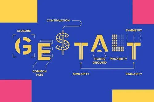
TABLE OF CONTENTS


Ask any designer about the gestalt principles, and they will know what you’re talking about. For those new to the world of design, don’t worry. Let’s break down the six principles one by one and get you up to speed.
Gestalt psychology theory was developed by Max Wertheimer, Kurt Koffka, and Wolfgang Köhler. It’s an area of psychology that studies the human mind and establishes that the whole of anything is greater than its parts.
So, since gestalt theory focuses on how we perceive things, it has a major impact on design too.
Even if you aren’t a design professional and have never heard of gestalt principles, they could still be helpful to you.
If your mind is filled with questions such as “why are the gestalt principles important?” and “what are the gestalt principles?” you’ve come to the right place. We’ll go over each principle to brush up on your design knowledge and see how these principles matter.
{{GRAPHIC_BANNER="/dev/components"}}
Why are the gestalt principles important in graphic design?
Simply put, they can significantly improve any design, whether it’s a website, an app, a business card, or anything else that requires graphic design.
That’s where the gestalt design principles come in. Gestalt principles in design are very similar to the basic principles of graphic design. So, they can help to make design visually appealing and well-balanced.
However, since Gestalt principles are also connected to our visual perception, they can also create a more powerful response with the viewer and create a lasting impression.
To understand how it works in practice, it’s best to look at the Gestalt principles in design one by one.
What are the gestalt principles?
The gestalt principles are an important set of ideas that, when implemented correctly, can significantly improve the aesthetics, user-friendliness, and functionality of a design.
Gestalt psychology is a school of thought looking at the human mind and behavior as a whole. It suggests that we don’t simply focus on every small component in the world around us but rather see it as an entirety.
In the simplest form, the theory is based on the idea that the human brain will attempt to simplify complex images by organizing multiple elements into a whole rather than a series of disparate elements.
Our brains are built to see structure and patterns to better comprehend our environment.

The principle of closure is a tool to make clever logos, but it’s also a tool to show your audience there is more if they swipe, scroll or turn over the page. You can do this by letting an image or object fade onto the next page.
You can see the principle of continuity in the above graphics created by one of ManyPixels’ designers. Rather than seeing each image as a separate entity, the white and blue elements seamlessly continuing onto the next image indicate they are grouped.
In the menu of the ManyPixels blog, you can see the principle of proximity in action. The main topics are placed in close proximity, so we instantly understand they have the same function. However, the magnifying glass and a call-to-action button are clearly placed further to the right, indicating a different functionality.
Viewing an object in its simplest form will help us recall things much quicker, since we demand fewer cognitive resources.
Even in its monochrome form, your brain will still comprehend the logo as five overlapping circles rather than curvy lines.
Monochrome logos via Olympics.com
Let’s take the call-to-action button in the design above as an example. It instantly draws your attention since it clearly stands out from the design.
1. Similarity
Grouping together similar things is human nature. We like to order things alike, whether by shape, color, or form. The gestalt principle of similarity is when we see elements sharing characteristics as more related than those that don’t.
In graphic design, this principle of similarity is used more often than you think. It works both ways: grouping things together by color to show they correlate or in contrast leaving one element out to draw attention.
A call-to-action button often differs in color so that it stands out. The same goes for a link in the text, usually colored and underlined. Then again, each link and call-to-action button is formatted similarly, allowing viewers to make that instant connection.

2. Good figure
The theory of good figure in gestalt design is when we perceive ambiguous shapes as simple as possible. It’s also known as the law of good figure, or prägnanz in German.
The Olympics logo is a classic example of gestalt design. How would you describe it? If you’d describe it as five overlapping circles, that’s the law of good figure in action. Seeing it as a combination of curvy lines would be more complicated to comprehend, so we automatically perceive it as overlapping circles instead.

3. Proximity
The principle of proximity in gestalt psychology relies on the fact that we define whether elements are related based on distance. Elements placed close to each other are deemed more related than elements set far apart.
Your audience will recognize individual elements clustered together in one area or group as one entity.

4. Continuation
The gestalt principle of continuation posits the human eye will follow the smoothest path. We see elements that are on the same line or curve as more related than those outside of the path.
This continuity perception is a valuable tool for directing your visitors through elements a certain way.
Our eyes naturally follow lines, so if you want to draw attention from one item to the next, it’s wise to quite literally put them in line. Horizontal sliders and social media carousels are both examples that take advantage of this principle.

5. Closure
Closure is the idea that your brain can automatically fill in the blanks when looking at an image or design.
We try to bring meaning and order to any meaningless chaos. Our eyes do that via reification: making sense of something by filling in missing data.
A simple example is your eyes following along with a dotted line. The World Wildlife Fund logo is a famous example of a more complex application. The outline of the panda isn’t complete; large chunks are missing. However, your brain has no problem filling those in automatically.

6. Figure/ground
Also known as the principle or law of perception, this gestalt idea posits that people instinctively perceive objects as either figure (the focal point) or ground (background). This means our brain automatically distinguishes elements in the foreground or background of an image.
Things get interesting when the foreground and background both contain distinct images, like this film poster for Peter and the Wolf.

The wolf poses in a way that the negative space creates the profile of a boy, presumably Peter. This is an excellent example of gestalt design showing how to use negative space creatively.
Newer principles
Most lists of gestalt principles of design will include the ones mentioned above. However, there are also a few newer principles which you should know about.
Common fate
More recently, the principle of common fate or synchrony was added to the gestalt principles. The principle states that we group things that are either moving or pointing in the same direction.
It often refers to a group of individual elements, but since they move seemingly as one, human perception groups them and treats them as a single stimulus. Elements don’t necessarily have to move, but they do have to give the impression of motion.
An example in our surroundings is a flock of birds. Rather than processing every bird as a distinct element, we see the flock as an entity.
Parallelism
This principle is quite similar to the one of proximity. Simply put, it suggests that elements parallel to each other are likely to be seen as related, as opposed to ones that are not.
One of the most common examples of this gestalt principle of design is in ecommerce web design. You’ll often see products in the same group appearing in parallel lines, as this helps viewers consider different options for the same/similar product.
On the other hand, a landing page explaining a single product or service in more detail, usually has a top-down layout to allow viewers to concentrate on each feature separately.
Inclusivity
So, gestalt principles of design explain how several design elements can create a single picture. Well, inclusivity is a principle that gives that idea a more pragmatic twist.
It suggests that elements enclosed in a common boundary are perceived as a single element.
This principle is often used in combination logos. This type of logo combines text and graphic elements. So, to ensure the two elements are perceived as a single entity many designers use some sort of framing or borders.
One of the most famous examples is certainly the Starbucks logo.It includes three different graphic elements (two stars and a mermaid) and two words. Yet, neatly packed together inside a circle, it’s impossible to imagine this logo without any of the elements.

Gestalt principles in graphic design
From the 1920s, designers began incorporating gestalt principles in their work. It led designers to believe that we all share specific characteristics in perceiving visual objects. Therefore, we all have a natural ability to see ‘good’ design.
After all, gestalt psychology and graphic design have a lot in common. Both rely heavily on creative problem-solving. Gestalt design is a natural forthcoming combining the two.
Embracing gestalt design can positively affect your design and how others perceive it. Similarity can create cohesiveness, leading to recognition of your brand, for example.
It allows for visual hierarchy, ensuring that the most critical element attracts attention first. Additionally, gestalt principles help take the guesswork out of design, minimizing confusion and frustration among viewers.

Final thoughts
We hope this helps you understand more about gestalt theory in graphic design and why it’s important.
These principles also give you a glimpse of what is happening behind the scenes of a design process. It goes to show how much more graphic design is than just a pretty image.
However, understanding gestalt theory in graphic design isn’t just important for designers. If you’re following gestalt principles will help you identify good design. That way you can also vet designers for hire, or provide actionable feedback on existing projects.
If you want to keep learning about the theory of graphic design, check out this list of most famous designers or check out some free design courses you can take online.

Simone is a writer, dividing her time between native Netherlands and 'home away from home' Malawi. Whenever not stringing words together, she's either on her yoga mat or exploring any off the beaten track she can find.

Top-quality designers
A complete creative team at your fingertips: graphic and web designers, illustrators, and more.

Lightning-fast turnaround
Get start today and receive your first update on the next business day.

All-inclusive pricing
Unlimited requests and revisions. One flat monthly fee. No surprises.

Flexible & scalable model
No contract. Scale up and down as needed. Pause or cancel at anytime.
Continue reading


Explore some of our best designs
Get inspired by a curated selection of ManyPixels work. Download the portfolio to see what our team can create.


