


Best Graphic Design Tips from an Expert Designer
Each person has their own graphic design process. Still, we trust our designers have much valuable knowledge to offer. Why? Because they deliver top-notch designs daily. So, we've asked one of our own, "What are some graphic design tips you can share?" Here’s what he said.

.svg)


ManyPixels is an unlimited design service with dozens of skilled designers on our team. Although they have diverse skills and experiences, our designers are used to delivering high-quality graphics fast.
Since they work with multiple clients, they have a refined graphic design creative process that allows them to design more efficiently without compromising on quality.
We've asked Bojan Budjarovski, one of our designers, "what are some of your favorite graphic design tips?" and here are some of the best insights he has shared.
{{GRAPHIC_BANNER="/dev/components"}}
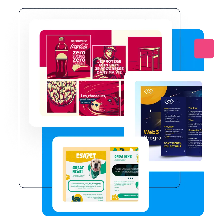
Best graphic design tips from a ManyPixels designer
There are a lot of challenges that a graphic designer faces, but with these tips, you can eliminate most of these challenges, create a seamless workflow for yourself, and deliver the best designs for your clients.
Brief proofreading

This might be the most important graphic design tips for beginners. While it's the client's job to provide a helpful design brief, the designer must identify any missing information before the start of the design process.
Bojan suggests that you ask the following questions to clients after the brief has been submitted:
- Can you provide an example of a design you like?
- Can you describe your industry in a couple of sentences?
- What do you want to achieve with this design?
- What file formats do you need?
Starting the graphic design process with a crystal-clear brief must be a part of your graphic design workflow checklist. Asking questions at this stage also helps clients define their expectations and makes the subsequent creative process much more efficient.
Decide on a style upfront

It’s common for clients to say, "I want to see options."
However, creating too many vastly different designs can backfire. It confuses both the client and the designer, losing sight of the design's purpose.
In early stages, it is crucial to decide on the brand colors (if any), color schemes, font families, layout, and more, as it influences the overall feel of the design. You don’t want to hear, “but those are not our brand colors or that’s not the font we use!” from your clients after you have spent tons of hours on the design.
If clients are unsure, offer a few options based on competitors' styles or designs from your portfolio that fit the bill. This helps narrow down choices and streamline the design process.
Choose easy-to-read fonts for readability.
The font is an essential element of your design. You must always choose easy-to-read fonts like Arial, Helvetica, and Times New Roman. This is especially important if your target audience is unfamiliar with design principles. By prioritizing readability, you ensure your message is clear and avoids confusing viewers.
Understand the difference between RGB and CMYK.

Understanding the difference between CMYK and RGB is crucial in graphic design. RGB, used for digital work, mixes red, green, and blue to create colors, resulting in white when fully combined and black when minimized.
On the other hand, CMYK, which is used for print projects, blends cyan, magenta, yellow, and black. The addition of these colors darkens the result, with black (K) fully removing light to produce true black.
Always start with the layout

The design layout is the skeleton that holds the entire design together. As designers, it's crucial to prioritize the layout from the start.
Discuss the layout with the client before you start working on the design so that they know what to expect and suggest any changes, if any before you start the work.
Get feedback on the first sketch/draft

“One of my most important tips for designers,” Bojan says, “is to get feedback on the first draft of the design.” A first draft should be as polished as possible and delivered in the least amount of time.
Effective communication is key in graphic design. If you need extra time to polish a first draft, don't hesitate to ask for more time. Similarly, if the initial draft isn't up to par, be transparent about the areas needing improvement. Seeking feedback early on ensures a smoother design process and better end results.
Apply scaling strategically

Scaling guides viewers through the design, ensuring they notice the most important information first. The size of the elements determines the hierarchy and the importance of the element in the design as a whole.
Increase/decrease the size of the graphic elements to establish a visual hierarchy. For example, make key elements like headlines larger to draw attention, while secondary elements like slogans or subheadings can be smaller.
Don’t multitask

Multitasking sounds productive, but it isn’t, trust me. Nothing harms efficiency as much as a divided focus. The only way out is to take one task at a time and not stop until it's finished.
Consider brand colors

One of the best tips for design is to stick with the brand's specific colors consistently throughout your designs. This means incorporating the colors that represent the client’s brand identity and help create a consistent visual language across all the marketing materials.
By using brand colors consistently, you reinforce brand recognition and strengthen the overall impact of your designs.
Use contrast colors to create impact.

Use contrasting colors to create an impact with your designs. Utilize contrasting colors in your palette, including backgrounds, fonts, and graphics, to enhance legibility and visual appeal.
For example, pair a bold red button with a light blue background to make it more eye-catching. However, overdoing it with too many contrasting colors can overwhelm viewers, so be mindful of that.
Remember, if the background is light, opt for a dark font, and vice versa, to ensure optimal contrast and readability. You can use a color wheel to find the right contrasting colors for your design.
Or, I suggest reading The Secret Lives of Color by Kassia St. Clair, one of the best graphic design books, to understand more about color theory.
Use white space effectively.

White space, or negative space, refers to the empty areas of your design. Allow adequate breathing room around elements to prevent overcrowding and improve readability. Negative space can also be used strategically to create balance and focus within your design.
Using white space correctly can improve readability, enhance hierarchy, and make your design more visually appealing. Imagine a crowded flyer versus one with clear sections separated by white space. The latter is easier to digest and navigate.
Use premium-quality images

Make sure your images are top-notch: high-quality, well-composed, and on point with your design's message. Clean, crisp imagery amps up your design's professionalism and impact.
Simplify complex processes with icons and illustrations

Icons and illustrations can really enhance your graphic designs if you place them smartly. Avoid cramming them in; they should be clear and have room to breathe.
You can also use logos on quotes or YouTube thumbnails to make the design more branded, while icons and illustrations can be used in tips and infographics to convey your message effectively.
Have a daily plan of tasks

When you work with multiple clients on various projects daily, you must have superb time-management skills and a precise plan of action for every working day.
One important tip Bojan has for graphic design beginners is to “start with fewer tasks.” This will enable you to create high-quality work and a solid routine. Start within your comfort zone and establish a solid workflow. With time and experience, you'll be able to create designs faster, experiment with different design styles, and perfect different skills.
Create a cohesive look with alignment.
Alignment in design refers to how elements are positioned relative to each other. Consistency in alignment gives a professional touch to your design.
While left alignment is common, you can experiment with centered or right-aligned body text for variation. The key is to maintain alignment within sections for a cohesive appearance and to tell a story through graphic design.
Use boxes or lines to organize text and images.

Organize your graphic elements effectively with boxes, lines, and shapes. You can use texts within boxed containers to highlight your focal point.
You can create negative space and keep critical information tidy using lines and shapes. Remember not to overuse them; use them sparingly and in alignment with your brand design.
Use opacity in your designs.

Adjusting the opacity of design elements is a powerful design technique. It provides contrast for readable text while allowing the background to show through partially. Striking this balance is key for a professional and polished graphic.
Provide regular ETA & report on issues

Nothing harms the graphic design process as much as miscommunication. The best way to prevent that is to update your clients regularly on the estimated completion time. Here's a foolproof way to provide daily updates:
- Say what's been worked on the previous day.
- Outline all the tasks you have planned for the day.
- Report any problems or issues (such as an unavailable font, a hung copy disrupting the layout, etc.)
- Give an ETA taking into account the issues and planned tasks.
Offer variations

Offering clients choices is crucial for a strong client-designer relationship. While too many options can be overwhelming, providing a few variations of color, font, and layout can make a big difference.
Just make sure to stay within established guidelines and style to avoid confusion. Remember, a little extra effort upfront can lead to a smoother design process overall. You can refer to various graphic design resources to get inspiration from.
Incorporate current trends in your designs.

Try to blend the current graphic design trends into your design but for that you need to stay updated on industry developments and audience preferences.
Choose trends that align with your brand and blend them with the basic principles of design. Experiment with new techniques while maintaining consistency across your work.
Set up a quality assurance checklist

Setting up a quality assurance checklist is key to delivering good graphic designs. Check for client requirements and mistakes like spelling errors or misalignment, and ensure timely delivery with organized files.
Having these standards helps ensure your designs meet expectations and serve their purpose effectively.
Ask for feedback

Asking for feedback is a smart move in the graphic design process. You don't have to bombard clients with questions, but it's helpful to inquire about their favorite aspects and areas for improvement.
Don't wait until the final draft; seek feedback with each iteration. Keeping track of previous versions helps both you and the client ensure revisions align with their requests.
Test Across Devices and Platforms

Ensure that your designs are responsive and accessible across different devices and platforms. Test your designs on various screen sizes and browsers to guarantee a seamless user experience for all viewers.
Think big

For beginners, it's crucial to think big and not get lost in the details. While details matter, obsessing over minor visual elements can slow down the process. Adding too many details can clutter the layout and dilute the message.
As a professional, trust your expertise, and don't be afraid to steer clients in the right direction. Focusing on the big picture ultimately leads to more impactful designs that resonate with the audience.
Keep it simple
One of the best tips for graphic design we can share with non-designers is to keep things simple. It’s much easier to make mistakes when you overly complicate things. Ensure that each element in your design has a purpose. Keep the number of fonts, colors, shapes, and frames to a minimum.
Use a solid frame to contain your copy and enhance the compositional structure of a design, and using contrasting tonal color combinations makes your text sharp and easy to read.
Final Thoughts
We talked with Bojan to bring you some of the best graphic design tips you can find on the internet. Now that you have the tips for design, it's time to start creating your own graphics.
Help your clients boost their online presence with website graphics, social media marketing materials, and other graphics with gorgeous designs.
You don’t even need to invest in expensive design software; you can simply get started with free digital art software like Canva or Krita.
So, what are you waiting for? Start designing now!
.avif)
Rohit is a novelist (not a NY Times Bestseller!), an avid reader, a passionate content writer, and does YouTube on the side as a hobby! When he is not researching and writing content, he loves to read books and watch movies, TV shows, and anime.
A design solution you will love
Fast & Reliable
Fixed Monthly Rate
Flexible & Scalable
Pro Designers

.avif)

