
20+ Amazing icon packs you can get online

TABLE OF CONTENTS


Looking how to get icon packs? Here are 20+ amazing icon packs in different styles.
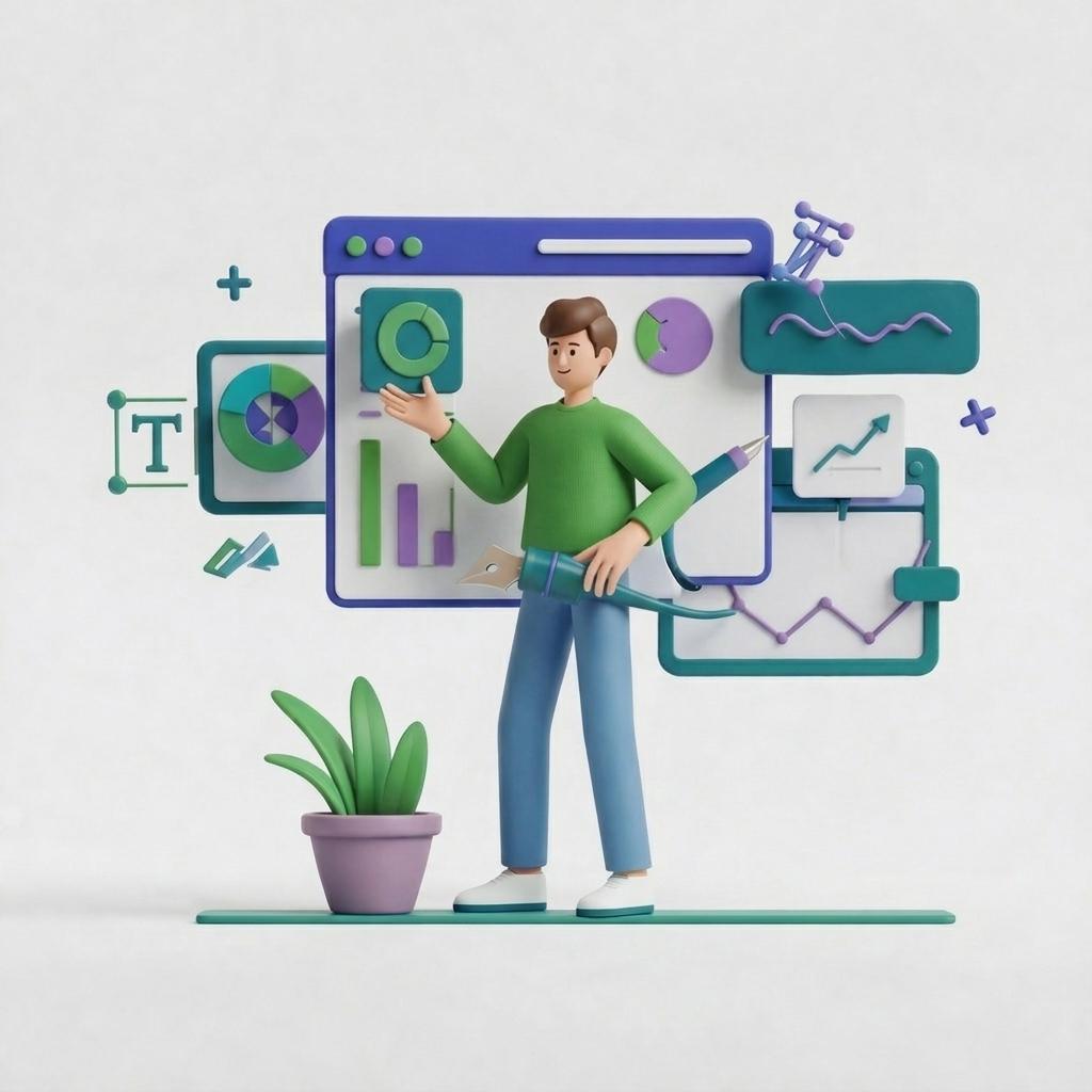
From website design to social media, these small graphic design elements are used everywhere and come in different styles. However, to keep your visuals on-brand you should consider using premade icon packs to maintain visual consistency.
Here are some amazing icon sets you can download!
{{ILLUSTRATION_BANNER="/dev/components"}}
Outline and filled icon packs
This style sports a minimalistic outline design or incorporates colors to achieve a playful and friendly look.
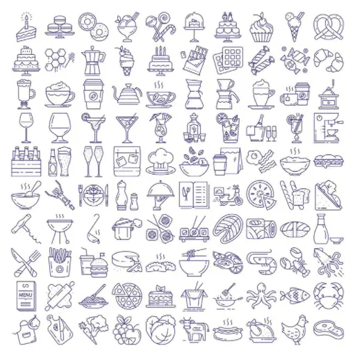
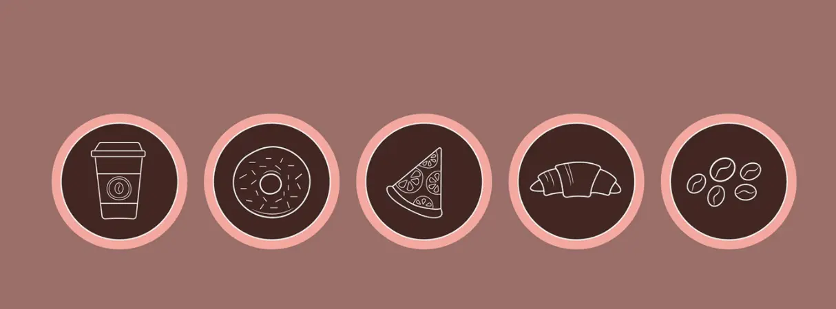
This comprehensive food icons sets for projects like bakery or coffee shop websites, as well as any type of restaurant branding.
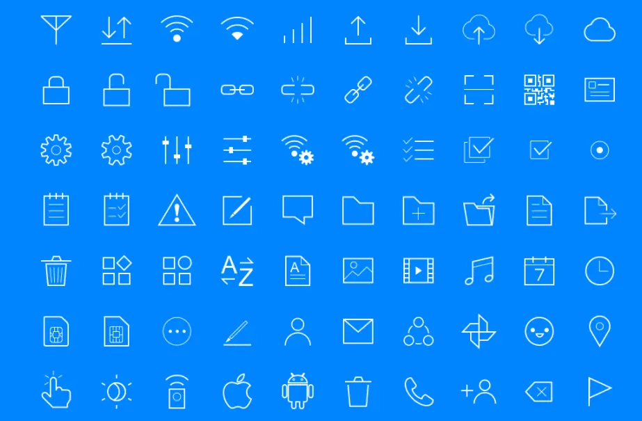
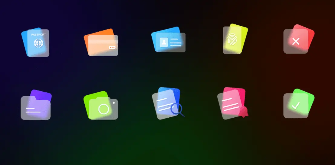
If minimalistic outline icon designs seem too simple for your brand, you can always decide to fill them with your brand’s colors. This free icon set uses just three colors, but contains virtually all the necessary icons you could need for digital design.

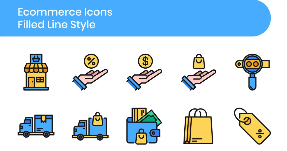
E-commerce experienced a massive expansion due to the global pandemic in recent years. Naturally, if you own or build an online business app or ecommerce website, download icon packs like this one.
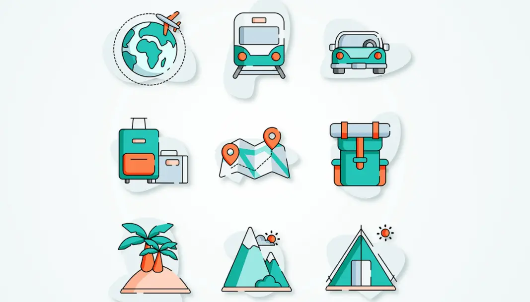
If you are an owner of a travel agency, why not include an icon set similar to this one into your web design?. After all, isn’t the point of organizing vacations to make your customers feel unburdened? These icons will provide easy navigation on your website and help you create eye-catching ads and social graphics!
Glyph and flat icon packs
We are still exploring the range of simple yet effective icon design styles. So, we must mention glyph and flat icon packs. Both types feature a simplified interface, including minimal visual effects to achieve the best results.
Glyph icons are always monochromatic, while flat icons include color combinations, textures, shadings, and highlights.

Glyph icons are always monochromatic, while flat icons include color combinations, textures, shadings, and highlights.
Glyph icon style is something that you can often see on mobile phones, since they’re simple and recognizable. Look at the message icon on your mobile device; in most cases, you will see the envelope or a speech bubble.
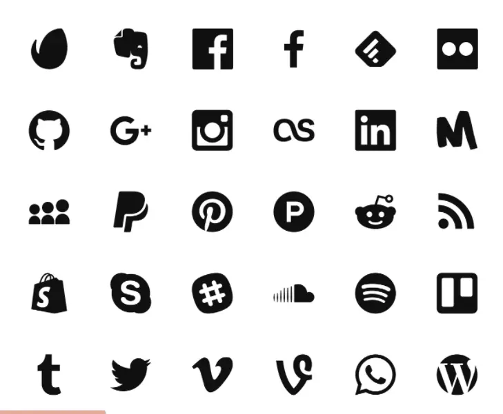
This great icon set has all the standard social media icons done in an elegant monochromatic style.
Here are some more cute flat icon packs useful for coffee shop businesses. Why not add a “pre-order” option on your site and use one of these icons to make the checkout process smoother?

Weather apps come in all shapes and sizes, but whether icons and universally recognizable. This icon set is very elegant, but conveys different weather conditions perfectly.

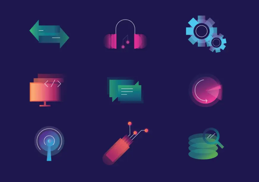
Here is one more eye-catching icon set design from the same designer so you can see the resemblance in style. The gradient style icons are a great choice for websites, apps and presentation templates.
Whether you have a medical or dental website, this icon set is worth a download! It also has a color scheme that’s commonly found in the medical industry.

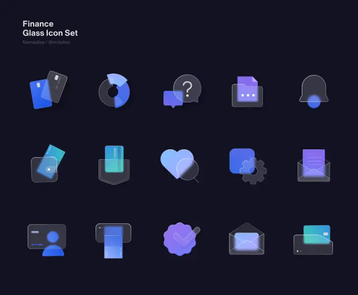
This flat type of icon can look very classy and sophisticated. Here you can see two sets of financially-related icons crafted to resemble colored glass. With some tweaks, they could even make a class finance logo!
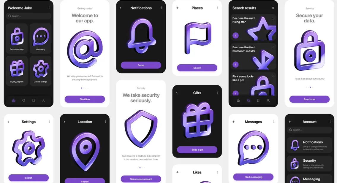
3D icon packs
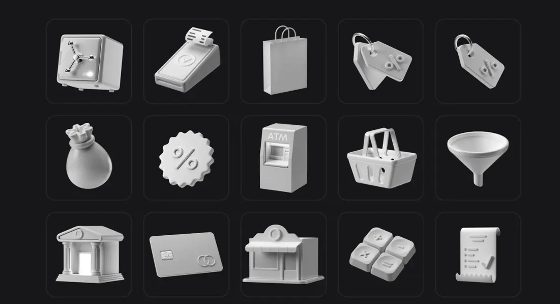
Dimensional design constantly evolves, allowing designers to express their knowledge by creating 3D objects as realistic as they desire. With icons, it's no exception, and the user interface can be significantly enhanced by including 3D icon sets into their design.
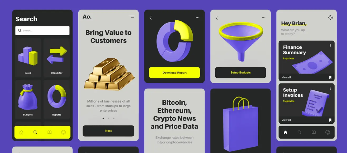
3D design always looks great in color. But for a fun twist, why not download this monochromatic set?
The following two icon packs are a great choice for any type of website. And since they come in just one or two colors you can easily adapt them to your brand identity.

Hand-drawn icon packs
Hand-drawn icons are one of the hottest icon trends right now. They have a more organic feel and make designs more memorable. However, since they require more time and effort to create, you won’t find as many free icon packs in this style.
But we did a bit of digging and found this wonderful free icon pack done in a casual doodle style. If you want to add a bit of quirk to your design projects, this is the one to download!

Not every hand-drawn icon set is detailed. This amazing icon set actually consists of simple lines. However, the level of creativity is incredible

If you are a fan of doodle art, you will love this cute e-learning icon set.With so many educational institutions exploring the possibilities of e-learning, this icon pack is worth a bookmark!

Bonus: material design icon packs
Material Design Icons are a free icon pack created and maintained by Google. They are part of the Material Design system, which is a design language developed by Google for creating visually appealing and consistent user interfaces across different platforms and devices.
As you can see it’s as simple as it gets. However, if you want to make sure your icons work on Google and WordPress websites this is a safe choice.

That’s it!
We hope this gets you closer to answering the question “how to get icon packs”. If none of the above suit you, feel free to also check out many free illustration librarires, including our free gallery, where you can download thousands of PNG or editable SVG icons.
Choosing the right icon pack for your brand shouldn’t be based on what’s trending. Instead choose a style and icon design that suits your project. Need icons for a mobile app? Opt for simpler shapes that are recognizable in a small format. For your website, pick icons that reflect your brand identity (e.g. playful, professional, quirky, etc.)
Finally, if you don’t want to use premade icons learn why custom icons can be the way to go.

Privileged to be raised in the most beautiful city in the world, Novi Sad. Studied biology and ecology at the University of Novi Sad. A creative soul, travel enthusiast, passionate writer, and crazy dog lover. Proud mama of (for now :) ) one stubborn English Bulldog.

Top-quality designers
A complete creative team at your fingertips: graphic and web designers, illustrators, and more.

Lightning-fast turnaround
Get start today and receive your first update on the next business day.

All-inclusive pricing
Unlimited requests and revisions. One flat monthly fee. No surprises.

Flexible & scalable model
No contract. Scale up and down as needed. Pause or cancel at anytime.
Continue reading
.avif)
Explore some of our best designs
Get inspired by a curated selection of ManyPixels work. Download the portfolio to see what our team can create.


