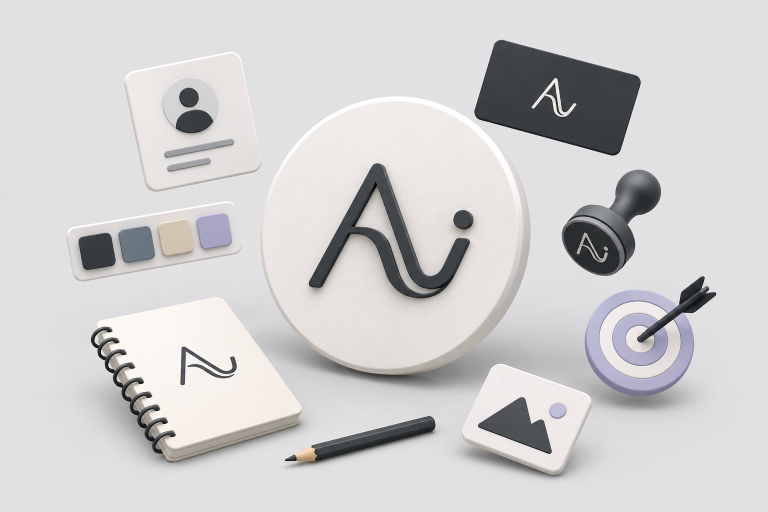
Are you looking for a new logo, or are you redesigning an existing one? Kickstart your creativity with these 20 great typographic logos!
Logos are one of the first things that your customer sees when they make contact with your business. It needs to tell them everything they need to know about your brand and what it stands for; this is your chance to create an unforgettable connection with them.
Before diving into the creation of the actual logo, let’s look and see what a typographic logo is and how to design a typography logo. Afterward, we will look at some examples that are sure to get you inspired!
What is a typographic logo?
So what is a typographic logo? Typographic logos consist only of text, and it is usually the company’s name or its initials. Sometimes they may also contain some decorative elements, a brief tagline, or a symbol. But at the end of the day, the logo should stand by itself without these additions.
Most people would think that creating a typographic logo is easy. You can just grab a typeface that you personally like, write your company’s name with it, and you are good to go. Why would it be difficult when it is just text, right? Well, when it comes to graphic design, and in our case - logo design - it is never ‘just text’.
While typographic logos are famous for their simplicity and clean design, they require as much skill and time as other types of logos. The designers need to carefully think of every detail to ensure that the logo conveys the right message to the right audience. It is a process of trial and error in order to achieve the perfect balance between the different elements of the logo.
How to design a typography logo
As we already mentioned before, creating a logo - including a typographic logo - is no walk in the park. There are several things that you should look out for when creating a logo for your company. We wish there was a sure-fire way to create a memorable typographic design that would be permanently ingrained in people’s minds. But we can try to get as close to it as possible - check out the list below to get you started!
1. Find the right typeface
Because a typographic logo is text, it needs to be in a typeface that fits your company’s personality well. Serif fonts are great if you are going for a classic, timeless vibe and are communicating to a more mature audience. Sans serif fonts are perfect for a neat, simple and modern logo. For a more unique take, you can use a script font.
Find the best fonts that will make your logo stand out
Download our guide on logo typography
Your guide was succesfully sent
Please check your inbox to download our guide.


2. Before going further, are you allowed to use that typeface?
You have found the perfect typeface for your logo, and you cannot wait to get started! But before proceeding, you must make sure that you are legally allowed to do so. Check out Font Squirrel to see which fonts are free to use commercially to avoid any potential legal issues!
3. Make it your own!
If you feel like no typeface speaks to you, you can definitely create your own. That way, you are not only saving yourself the headache of legal issues, but you will also have a one-of-a-kind logo. Look at Coca-Cola - its typography is so unique that it is recognized everywhere!
4. Choose the color palette
Once you have decided on the typeface and the text for your typographical logo, you are ready for the next step, which is choosing the color palette. Would you make the entire text in one color, every letter a different color, or perhaps a gradient? The world is your oyster!
5. Final tweaks
Your logo should look good everywhere - from billboards and newspapers to business cards and websites. No matter how small your logo must be, it must be very crisp. Experiment with the scale size of the type, and make sure that the kerning and the alignments are perfect. In such cases, a designer would need to rely on Adobe’s alignment settings and their skilled eye to find that perfect balance!
6. How about the other elements of the logo?
Does your typographical logo have a symbol, decorative elements, and/or a tagline? Make sure that it looks good both with and without them.
20 typographic logos to kickstart your creativity
Juliana Rose Photography
This typographic logo contains a perfect example of a font duo - a script typeface and a sans serif, to convey elegance, timelessness, and femininity. This style is perfect for a wedding photography business.
Twentytees
Opt for a sans serif outline font for a casual and playful logo. This is an excellent example of a typographic logo that incorporated additional elements such as the copyright symbol and the year the company was founded.
Standd
Your logo should be clear and easy to read. The Standd logo does just that by using a bold sans serif font with a twist - notice the hidden stand in the ’t’? These kinds of hidden decorations are what make a well-rounded typographic design stand out from the crowd.
Little light feet
An ethereal, pure, and delicate feeling can be achieved by using a script font together with pastel colors. This is perfect for a children’s clothing brand.
Find out how to build a strong and unique brand
Download our guide to learn all about branding and visual identity
Your guide was succesfully sent
Please check your inbox to download our guide.


Florida
Looking for a retro summer vibe for your logo? Check out a shadow script font with a vintage color palette.
Sanford
A blocky sans serif font using a mix of lowercase and uppercase letters is your go-to if you have been searching for a minimalistic retro-future font.
Fiverr Pro
The Fiverr Pro is yet another successful example of a font duo being used in a typographic logo. The bold sans serif lowercase ‘fiverr’ transmits confidence, whereas the script ‘Pro’ adds an extra touch of professionalism.
Mirror
Mirror is a clothing company with a logo using a serif art nouveau-inspired font for an elegant and feminine design. Notice the mirrored R’s in the middle?
Sachiko
This Japanese haircare brand went for a clean sans serif font with wide letters and tight kerning. This condensed design works well with delicate fonts to achieve a sense of unpretentious luxury.
Aclitec
Combine a lowercase sans serif font with a minimalistic symbol for a simple yet striking visual identity. This type of logo is suitable for companies in cryptocurrency and NFTs. When using a symbol in your typographic logo, make sure that these elements can express your brand’s mission and vision both together and alone.
StudioPaack
Serif fonts are thought to be classic and timeless - some would say even boring. If you are a fan of them but would like to make them less somber, pair them with a playful symbol.
The Kids Industry
Looking for fun typography styles for your logo? Check out this bold hand-drawn logotype with underlined words - you are sure to attract your audience’s attention!
Knock Knock
What makes this logo neat is the use of a sans serif font. But what makes it interesting is almost the non-existence of kerning and leading, the joining strokes of the N’s, and the width of the O’s and C’s.
Kyra
A stylized typographic font can be very effective! Check out this sans serif joined font with no kerning, wide letters, and no crossbars. This typographical style is suitable for a brand focused on excellence and elegance.
gsca
You do not have to stick to 2D designs for your typographic logo. How about a 3D logo using a bold sans serif that smoothly flows one letter onto the next one?
Salon du Nord
The Salon du Nord logo uses an elegant serif font with letters that almost hug each other. It is both comforting and classy at the same time. As we already mentioned, it is crucial to choose a typeface that allows your logo to look good when it is small.
Duck
The Duck logo is cleverly pairing a bold sans serif font with loose kerning with an ornate element on the letter ‘D’ to create the silhouette of a duck. Simple and effective!
Lynx
Lynx’s logo is the definition of funky! The 70s-style typeface is perfectly conveying a fun and chill vibe.
Golden
Golden’s logo is an example of an uncomplicated yet successful design. The seriousness of the bold sans serif font is balanced by the cube shape of the logo, making the design look more dynamic.
Cabana
Looking for a neat and sophisticated logo without much fuss? Check out Cabana’s logo, made with a wide serif font in a warm-colored gradient.
In love with typographic design yet?
The world of typographic designs is wide and varied. And when it comes to typographic logos, there are so many ways you can use just text to capture the essence of your brand.
We hope that the tips, tricks, and logo examples motivate you and kickstart your creativity. Now you are ready to make your logo so good that people will remember it and recognize it from afar!