
15 Construction Websites Your Company Should Learn From

TABLE OF CONTENTS


Do you need a new website for your construction company or are you looking to revamp your existing one? These stellar examples will teach how to create a construction website that will convert visitors into clients!
Although construction companies aren’t known for groundbreaking digital marketing, they do extremely serious work, which often costs a lot.
For this reason, trustworthiness is one of the key values for construction company branding, including website design. While a construction website should first and foremost be professional and user-friendly, there are a few more tips and tricks that can help boost your company’s online presence.
How to design a construction company website? Learn from successful examples. Here are 15 of the best construction websites in 2023 to inspire you!
{{WEB_BANNER="/dev/components"}}
Simple and professional industry websites
While you may be tempted to overcrowd your web design with beautiful images, remember it’s also meant to provide useful information for website visitors. On the other hand, you should also make sure that your website is search engine optimized. This means, most importantly, user-friendliness (easy access to relevant information, fast loading) and using the right keywords.
SEO can help you boost your website traffic and ultimately get more leads. So when planning the different sections of your website, it’s very good to consider what type of information will be most useful to potential customers.
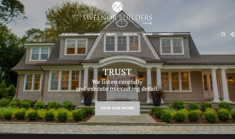
1. Sweenor Builders: Stand by your values
We mentioned that trust is a paramount value in the construction industry; and one way to make it clear to prospective customers that this is a value you uphold is to highlight it on your website.
This building company has a simple and elegant website with all the usual pages like “About us”, “Portfolio” and a “Services” page. The slider on their homepage shows some stunning home builds and highlights core values: craft, experience and trust.
This company also has a separate page dedicated to ecommerce. In their online store they sell merch like caps and mugs, so if you’re looking to make some extra money and, more importantly, build better brand recognition, creating a simple online store can be a very good idea!
2. Segale Bros: Put your main service in focus
This elegant website for cabinet making companies provides a seamless user experience, thanks to a clear visible phone number and simple CTA button. For those wanting to learn more about the business, there’s a useful hamburger menu with options like “Residential”, “Commercial”, and “Our Process”.
It also makes great use of fonts, including elegant serif fonts used in their logo and website heading, as well as reader-friendly sans serif fonts for body text.

3. Brymor Group: A well-crafted homepage
Here’s another lovely minimalistic construction website design. It features high-quality images and an effective layout. The homepage includes all the most important information, such as the services they provide and case studies.
The neutral red, blue and gray color scheme is perfect for allowing the photos of their construction projects to shine.

4. Cover: Tailor-made value proposition
This is one of the best construction websites to show you the power of simplicity. They pair different images with a fitting value proposition (i.e. projects you can “build in your backyard”.
This is a truly effective way to spark potential clients’ interest. Instead of focusing on how you work and what you do, open their eyes to possibilities when they hire your construction company.


5. Reborn Home Solutions: Web forms for more conversion
Web forms are a great addition to construction web design. As we’ve already mentioned, the cost of construction is usually quite high, but also unpredictable. So before they can hire, potential customers need to discuss their needs and budget.
This company offers a free design consultation with a simple form that takes seconds to fill out. The rest of the site is also done very well, with an elegant red, white and navy color scheme. They also have a terrific blog section, which is important for improving your SEO.

Website with videos
Video websites are a huge trend in web design nowadays. If you opt for this route, make sure your videos are optimized for web use and don’t slow down the loading speed. It’s also critical to work with an experienced web designer and developer who can ensure your videos are optimized for mobile devices.
Here are some of the best construction websites that do it well!
6. Lineslight: Corporate professionalism
A good construction website speaks to its target audience. If you’re looking for small home remodeling, this flashy corporate site might put you off.
However, Lineslight works on high-profile projects including Heathrow Airport and Museum of Modern Art (MoMa) in New York. So, the swanky video montage and their value proposition work perfectly.
The rest of the website is really well organized with a user-friendly navbar. So you wouldn’t get lost looking for information.

7. Weitz: Use genuine footage
Finding stock videos is a matter of minutes nowadays. But being genuine always pays off. Weitz has a terrific homepage video which showcases their process, from designing to the nitty gritty of construction, drilling, etc.
Adding overlay or shadow effect to your videos as is the case here, can make your site look more coherent and visually appealing.

8. Level 10 Construction: The power of perspective
Perspective is a key consideration for anyone working in the field of construction and architecture. So, what better way to send that message, than with a striking video that utilizes the power of different perspectives. In this case you can see construction projects from different angles, and the details that make them interesting.
This is obviously a huge player in the industry, as their website features social proof from none other than Mark Zuckerberg! However, they’ve managed to create a more approachable and creative image, with a vibrant yellow color scheme, instead of the overused blues and grays.

Modern construction industry websites
Motion design is a great way to give your construction company website an edge, and create a memorable website experience. Whether it’s a simple animation or a full-fledged video, this can really deliver that “wow” effect for website visitors.
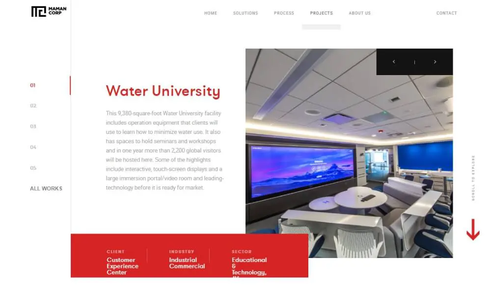
9. Maman Corporation: Awesome interactivity
If you have a skilled web developer on your side and want your company website to be a truly unique experience, then a fun interactive approach is a great solution.
Take notes from this construction management team and general contractor website. As you enter Maman’s web page, you will be overwhelmed by a sense of excitement and modernity. Blocks moving around the montage of their design-build projects have a futuristic feel.
However, the website is still fairly easy to navigate. For extra guidance, they’ve included arrows and even guide you to “scroll to discover”, so that even those who aren’t versed in super modern web design can still find what they are looking for.
The customer testimonials page is particularly impressive, as you can scroll through different projects (which move in a dynamic way) and get some key information about the project like who was the client, what industry and sector they belong to.
10. Martifer Group: Great use of parallax scrolling
Parallax is a popular website design technique that involves background images moving slower than foreground images, creating an illusion of depth and immersion.
This building company website makes terrific use of it, to add fun elements, such as illustrations or this image of a freight ship move as you scroll down.
The overall design of this website is fresh and modern, with plenty of white space that allows different design elements to shine through.

11. Cooper Design Build: Utilize lead magnets
If you know the first thing about construction projects, then you understand how gruelling and dirty a day’s work can be. However, most clients looking to hire a construction company prefer to see images of beautiful, finished interiors.
This is one of the best construction website design example that cashes in on that idea (without being overwhelming or annoying).
As you’re presented with images of gorgeous interiors, a popup appears asking to download a free remodelling guide. Lead magnets are a highly effective way to find potential clients. They might not be looking for a contractor right now, but if you get their contact details, you can stay top-of-mind with relevant content, and maybe even a few special offers.

Homepages with impressive visuals
Whether it’s a stunning photo of your latest construction project or a captivating video offering a more in-depth look at how or where you work, a strong first impression is a must for a great construction website design.
It’s always advisable to include an “Our work” or “Portfolio” page that will showcase your construction projects. However, if you want to make gorgeous photos the focal point of your website design, I suggest you take notes from one of the following examples.
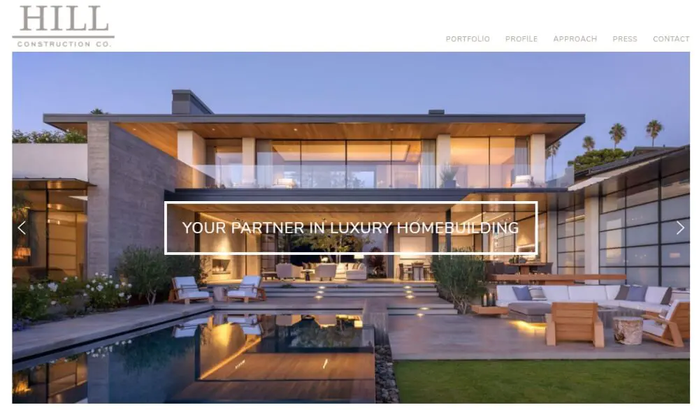
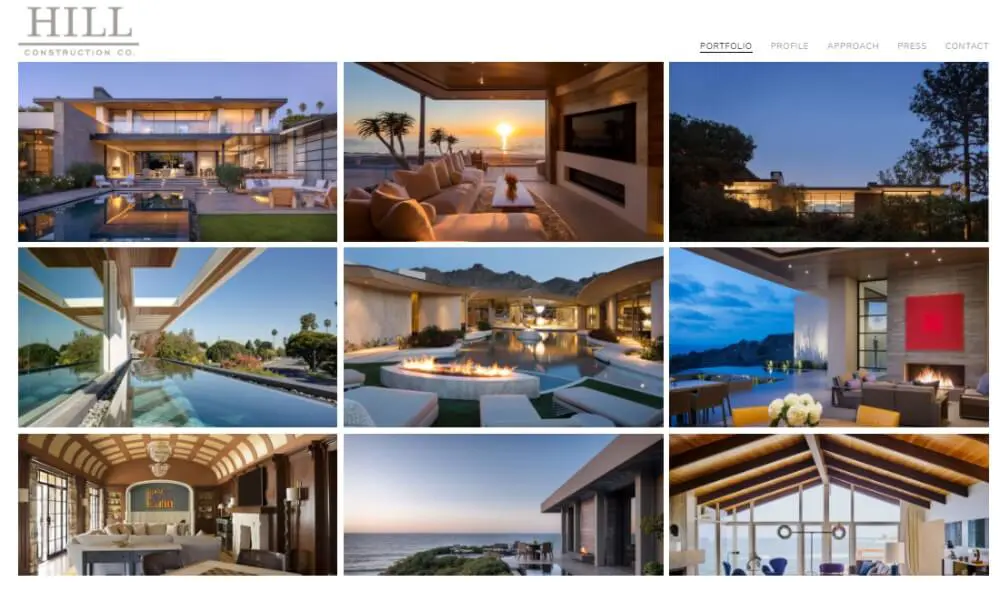
12. Hill Construction: Presenting luxury
I’m a big fan of Netflix’s Selling Sunset series - and not just because of all the drama! I also love getting a peek into all those ridiculously luxurious LA homes.
Well, this luxury construction company taps into that sentiment with a web design that relies on photos of amazing homes. Their portfolio page looks like a well-curated Instagram profile that you just want to keep browsing through.
Other than that, the website is very simple and that works really well. They have just three other pages on their website: profile (which is really the “about us” page), approach (or service page), press clippings and a contact information page. And because the stunning photos do most of the convincing, that’s really all you need to believe that this company is the right home builder for high-end clients.
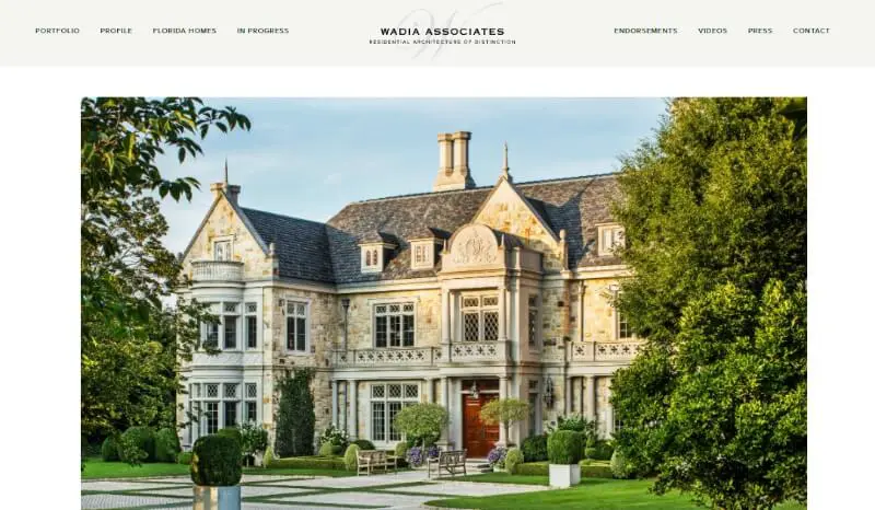
13. Wadia Associates: Use the power of social media
So, if I’m being totally honest these modern Hollywood mansions aren’t really my jam. Old-timey mansions on the other hand are a real estate dream!
This construction company site is focused on images of awe-inspiring mansions. So, naturally, you can find links to their Instagram profile at the bottom of the homepage.
And this is a very smart web design move! Although their clients are probably going to be high profile, the stunning content on their social media will attract a much wider following. And the more people know about you and visit your website and social media profiles, the better it is for your search engine ranking.
Fun and quirky construction websites
As we said, there are certain expectations from construction company websites; you usually want to give out a sense of trustworthiness and probably use high quality images that showcase your work.
However, this doesn’t mean you’re not allowed to get creative! Take a look at these fun and funky construction websites that blend professionalism and creativity.
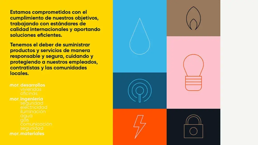
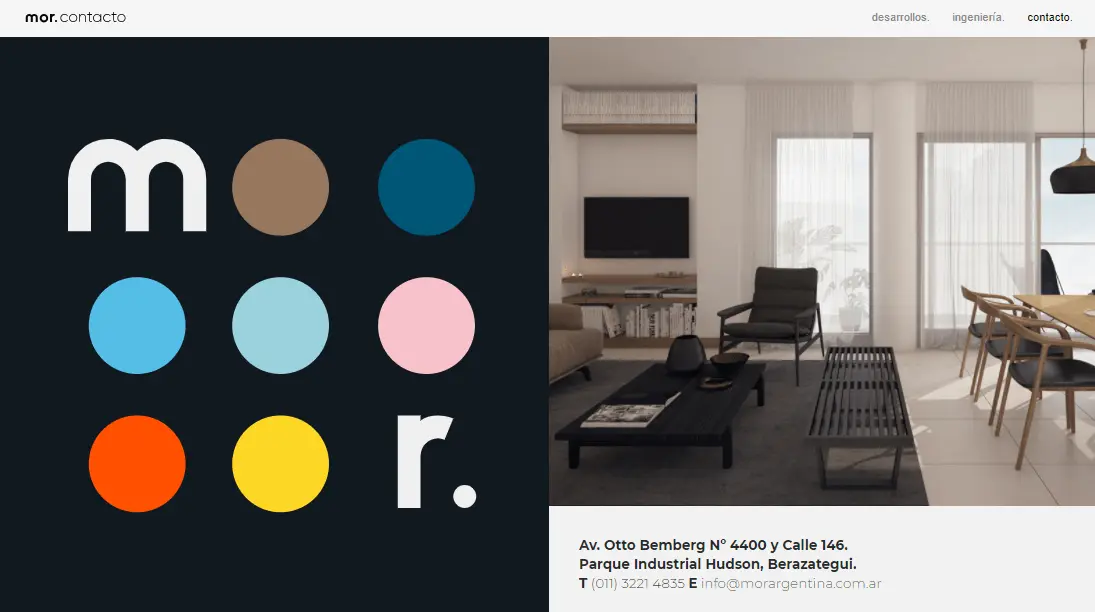
14. Mor: Create a stunning construction company brand
Another colorful and fun example is this construction company from Buenos Aires. These professionals in the fields of engineering and development have a stunning brand identity, and they use their youthful color palette to complement simple, elegant photos of the exterior and interior designs.
Even their simple contact page is beautifully done with just the basic contact information: email, address and phone number, with the brand colors helping to enforce this company’s brand image.
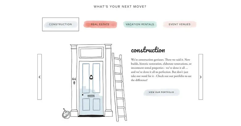
15. Luxury Simplified: Adding illustrations to web design
You’ll often hear us singing praise to the power of a simple illustration, and this fun website design is another testament to that!
Luxury Simplified has a classic and nice-looking website, that’s made a little more interesting with these playful illustrations. They deal in construction, real estate, vacation rentals and event venues, and each of these fields is represented by a different color from their brand color palette.
A sitemap and a simple contact form also help website visitors navigate easily, through the numerous sections. They also have a regularly updated blog section, which is very important for improving search engine optimization.
---
We hope this list of awesome construction company websites has given you plenty of food for thought for creating your company website design! If you need further tips on creating an awesome construction company brand, be sure to check out our articles on construction fonts and the best construction logos. If you need help with design, here's a list of the best graphic design services for construction companies that can help you out with your website.

Having lived and studied in London and Berlin, I'm back in native Serbia, working remotely and writing short stories and plays in my free time. With previous experience in the nonprofit sector, I'm currently writing about the universal language of good graphic design. I make mix CDs and my playlists are almost exclusively 1960s.

Top-quality designers
A complete creative team at your fingertips: graphic and web designers, illustrators, and more.

Lightning-fast turnaround
Get start today and receive your first update on the next business day.

All-inclusive pricing
Unlimited requests and revisions. One flat monthly fee. No surprises.

Flexible & scalable model
No contract. Scale up and down as needed. Pause or cancel at anytime.
Continue reading
.jpg)
.jpg)
.jpg)
Explore some of our best designs
Get inspired by a curated selection of ManyPixels work. Download the portfolio to see what our team can create.


