
How To Create A Kickass Lead Generation Landing Page
.avif)
TABLE OF CONTENTS


Want to learn how to create a landing page for lead generation? Discover all the vital elements for this type of page and get inspired with some of the best lead generation landing page examples.
Landing pages are often confused with website homepages since in many cases they are the same thing. However, a homepage is supposed to provide visitors with information. A landing page is supposed to make them take action.
In this article, we’ll teach you how to create a very specific type of landing page: lead generation landing page.
{{WEB_BANNER="/dev/components"}}
What is lead generation?
Lead generation or lead capturing is the process of acquiring contacts of people who might be interested in purchasing your product or services.
General Data Protection Regulation (GDPR) enacted in 2016 and in 2018 in the US, is a data protection law that, among other things, requires companies to ask people for consent before using their contact data for marketing purposes. Before that companies were basically free to “steal” your personal information and send spammy sales emails or make cold calls.
With the new legal framework, lead generation became an incredibly important and effective marketing tactic. Instead of swiping contact information of people with no interest in your business, lead generation means that leads provide their contacts to you. In return, they usually receive some sort of prize or gift, such as free content (ebooks, templates, infographics), discounts or free trials.
There are 4 main types of leads:
- Marketing qualified leads (MQL): people who’ve visited your blog or downloaded a piece of content, probably not ready to make a purchase yet.
- Sales qualified leads (SQL): people who have made it clear they’re interested in purchasing your product or service (e.g. people who abandoned their carts or signed up but have yet to complete a purchase).
- Product qualified leads (PQL): people who have expressed an interest in or have used your product (e.g. free trial sign-ups)
- Service qualified leads: people who have been in touch with your service team and expressed interest (e.g. cold call respondents who say they want to become customers).
Depending on what type of leads you’re aiming to acquire, you might need to tweak or adapt design elements of your landing page, such as the call to action button. With AI lead generation tools, you can further optimize your lead capture strategy and streamline the lead qualification process
Why do you need a lead generation campaign?
The point of digital marketing (and perhaps its advantage over traditional marketing) is that you market your business to people who are more likely to be interested in it. Lead generation is an important part of a digital marketing strategy. Here are some notable stats:
- 53% of marketers spend at least half of their budget on lead generation (Bright Talk)
- Most midsize and large companies generate at least 5000 leads per month (Hubspot)
- Companies with a mature lead generation system have a 133% larger revenue (Intellistart)
Lead generation isn’t just a way to get new customers: it’s a way to transform people who have an organic interest in your business into customers.
It’s not dissimilar to the appeal of social media marketing, which allows you to target the right audiences and advertise more effectively. As a result, social media also generates higher quality leads which have a 13% higher conversion rate than the average.
Or, you might invest time and effort into building a great content marketing strategy that will help your website get discovered organically on search engines. But if people read your blog, get valuable information and ultimately turn away, then you’re wasting a huge opportunity to convert visitors into paying customers.
So, if you’re planning to build your social media presence or boost your content strategy, lead generation is the key to transforming a booming online presence into revenue.
The UX of a good lead gen landing page
Now that we know why lead gen is important, it’s time to dive into the anatomy of a lead generation landing page.
Value proposition
As we said, the point of lead generation is to give something in exchange for people’s contacts. To get people interested or even thinking about the exchange you need to provide a clear incentive.
A value proposition generally shouldn’t use technical language (unless you really want to target experts in a certain field, on say LinkedIn), and shouldn’t be salesy. On the other hand, if you’re offering a discount or a trial, you need to make sure that your target audience understands what type of service or product it is.
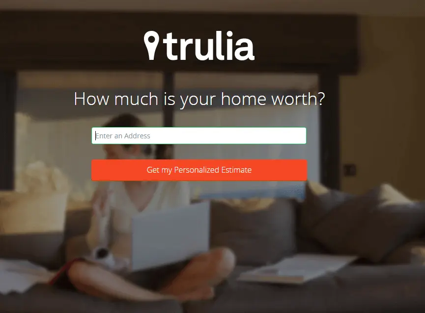
Here’s a great example from Trulia. The lead generation process starts with a simple yet powerful incentive: I want to know how much my house is worth.
In the next step, visitors are asked to complete a form. If you’re someone like me who’d just want to check the value of my home (ok, my parents’ home), this is probably the moment where I would turn away. However, this great lead generation page is also very effective as it helps to weed out the poor quality leads (like my avocado-toast eating self).
Once the form is completed, make sure that the users are instructed what to do next: whether it’s to check their inbox (including their spam), or contact you if there are any problems.
Some people might experience a lag between completing a lead gen form and accessing whatever they were promised in return. If your landing page doesn’t provide any instant feedback, they might get frustrated and forget to check their email inboxes in a few minutes (or often, their spam folder). Ziff Davis found leads are 9 times more likely to convert if businesses follow up within 5 minutes.
Provide feedback
Another great example comes from Airbnb. It offers similar upfront value, but is even more direct, so it makes sense that the call to action here is to start using their service.

Social proof
Social proof is definitely not a necessary element in lead gen landing page design, but it can increase conversion rates. Building trust in this way is very important for a lead generation page, since you’re asking people to share their personal data with you.
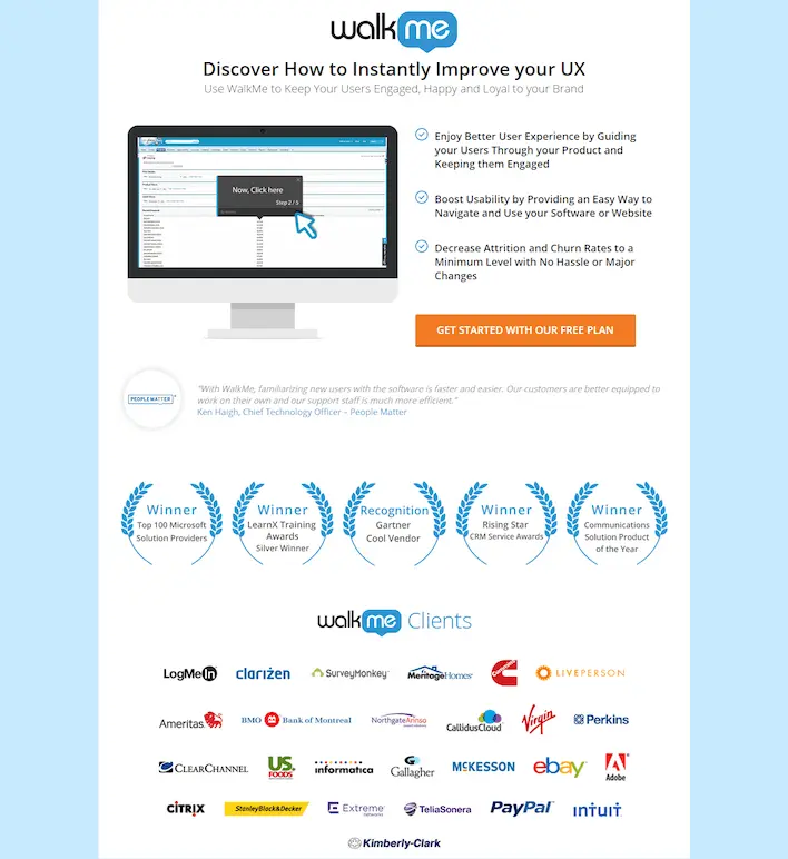
Here’s a good example from Walk Me. The overall design is pretty simple, and the value proposition is organized into bullet points for clarity. But what really stands out here are the awards badges and the big client names listed. Of course, you’ll need permission to place your clients’ logo on your page.
From a design perspective, this example also makes good use of white space, which allows the viewer to absorb the multitude of information without feeling overwhelmed.
Call to action buttons
Although sometimes it’s a simple “Submit”, “Sign up” or “Download”, a CTA button is really the pinnacle of any landing page. Essentially, it’s the one design element that makes or breaks the success of your user experience.
Make it too big and “threatening”, and people won’t feel comfortable clicking it. If it’s too understated and difficult to spot, you’ll fail to inspire a sense of urgency and FOMO which are necessary to prompt people to take action.
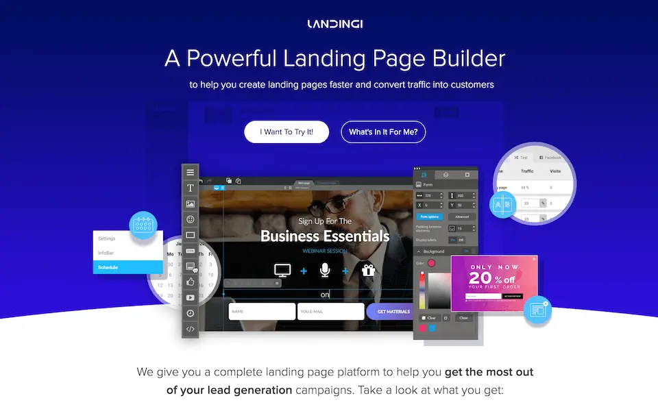
Landingi is a landing page builder and, unsurprisingly, they created this pretty great lead generation landing page. The standout element in this case are the CTAs that look great paired with the sleek, modern design. The two different calls to action work really well here, as they leave the possibility of acquiring different types of leads (product and marketing qualified leads).
Lead capture forms
This is probably the most important part of a lead generation page. Ideally, you have convinced users to provide you their contact information, and this is where they can actually do it.
A great lead gen landing page form has to follow a few UX principles to ensure that people have a smooth and seamless experience. Here are some tips.
Use autofill
Reducing cognitive load is one of the basic principles of UI/UX design. In layman’s terms, it means making things as simple as possible.
Autofill can greatly reduce the time required to fill a form, and alleviates some of the anxiety for users (have I typed my email address right?).
Minimize the number of form fields
If you’ve gotten their email address, do you really need a phone number as well? Is it absolutely necessary to provide a “website” (what if someone wants to download your resources as an individual?)
Break it down into steps
Several lead generation landing page examples we’ve mentioned before used powerful or whimsical copy to entice
However, sometimes this isn’t enough. If your lead capture form requires more than simple contact information, it’s a good idea to break it ino short, manageable steps.
Another great tactic to ensure people want to complete the steps is to opt for single- or multiple-selection. This makes it a lot easier for people to fill forms, than manual writing.
This awesome example from KlientBoost includes 4 simple steps: “what do you need”, “what are your goals”, company URL and contact info. It takes seconds to fill out, but provides this company loads of useful data on prospective customers.


Best landing pages for lead generation
Hopefully you understand how to optimize a landing page for lead generation. Of course, if you don’t have a background in design, you’ll probably want to work with an existing landing page template.
Here are some of our favorite templates to help you create a lead generation landing page for your business!.
O-Book
This great web page template available from Unbounce is a perfect landing page design for a lead magnet, such as ebook or report. It features a simple form, but provides lots of space to elaborate on why this lead magnet is useful.

Multor
Need a great lead gen landing page for an appointment booking? This Page is short and sweet and includes everything you need to entice people to share their contact details. If you don’t have a video to put on the page, simply uses the features section to describe your service.

Dropshipping Guide
This is another great template for promoting your lead magnets. The bright background works great to attract attention, although you might want to change it into a color that matches your brand identity.

Light Giveaway Page
Contests and giveaways are another great way to to acquire leads for your business. This beautiful template has everything you need to entice people. The crisp, minimalist design allows the image of the prize to shine. And the countdown adds a sense of urgency.

Free Content Audit
If you don’t have physical products to give out, a free trial of your services can work just as well. This awesome lead capture page has a big and bold value proposition and simple call-to-action button. The rest of the page includes important information, such as who are the team members, and case studies from happy customers.

Early Access
Lead generation pages aren’t just for established businesses wanting to scale. Attracting potential clients with early access benefits is a great way to kickstart your company. This awesome template available on Leadpages is perfect for virtually any app or tech business.

Newsletter Sign-Up
No list of the best landing pages for lead generation can be complete without a sign-up page example. Great content marketing requires a lot of work and effort. So, make sure you’re cashing in on that hard-work by enticing people to sign up for your newsletter and regular updates. This simple template is easily customizable, and can be a great asset for virtually any type of business.

Want even more templates for the best landing pages for lead generation? Check out our free landing page guide!
How to get custom landing pages?
You can definitely create great lead generation pages with the help of templates and easy drag-and-drop page builders. Still, to design a landing page that perfectly fits your business goals is no easy feat.
Moreover, Hubspot found that companies increased their number of leads by 55% as they went from 10 to 15 landing pages. So, if you really want to harness the power of lead generation, be prepared to create dozens of landing pages tailored to each individual campaign.
You could of course hire a freelancer every time you need to design a lead generation landing page. But this is time-consuming and expensive. If you want to get as many landing pages as you want at a fixed monthly rate, try our unlimited web design service.
For as little as $599 a month you get unlimited design requests, which includes landing pages, websites, ads, illustrations, and much more.
Sign up today, and get the first draft of your landing page back in just 1-2 business days! Or book a call with us for a chance to ask any questions!

Having lived and studied in London and Berlin, I'm back in native Serbia, working remotely and writing short stories and plays in my free time. With previous experience in the nonprofit sector, I'm currently writing about the universal language of good graphic design. I make mix CDs and my playlists are almost exclusively 1960s.

Top-quality designers
A complete creative team at your fingertips: graphic and web designers, illustrators, and more.

Lightning-fast turnaround
Get start today and receive your first update on the next business day.

All-inclusive pricing
Unlimited requests and revisions. One flat monthly fee. No surprises.

Flexible & scalable model
No contract. Scale up and down as needed. Pause or cancel at anytime.
Continue reading
.jpg)
.jpg)
.jpg)
Explore some of our best designs
Get inspired by a curated selection of ManyPixels work. Download the portfolio to see what our team can create.


