
30 Best Landing Pages You Can Learn From

TABLE OF CONTENTS


Learning how to create the best landing page takes considerable research and skill. But one of the best ways to understand why some pages work better than others, is to look at examples of the best landing pages. In this article you’ll find 30 awesome examples, with key takeaways.
A landing page can include a single web form, or all the details and sections you’d normally find on a website homepage. That’s because landing pages are essentially pages created to prompt users to take a specific action. Whether that action is completing a form, watching a video, or something else will of course affect the design of a landing page.
Complex landing pages usually have a common structure and follow some landing page best practices. However, in reality different landing page designs bring something else to the table, and can serve as a valuable lesson for anyone looking to create their own.
So, here are some of the best landing pages sorted into different categories for easy browsing.
{{WEB_BANNER="/dev/components"}}
Homepages (click-through landing pages)
These landing pages provide information about a product or service and entice visitors to click through to another page, such as a pricing page or a registration page, to complete a transaction.
Oftentimes, they are indeed the company homepage. So, here are some of the best homepage examples!
Intercom
Intercom’s landing page doesn’t follow the standard landing page structure: value proposition, features, pricing, case studies, and CTA. Instead, there are several sections that each focus on a specific feature/benefit.
The best thing about this landing page are big and bold value propositions. The main value proposition is also animated, which helps to drive the point home. But in each section, you’ll see a different convincing reason how Intercom can help.

Hubspot
Since it’s also one of the best landing page builders, it makes sense Hubspot would have a killer homepage/landing page.
As you might know, Hubspot is a powerful marketing automation software. There’s an array of tools and features (some free and others paid), which could be pretty difficult to describe in just one landing page. Nevertheless, the information architecture of this page is what helps it stand out. The most vital information is easily grouped together (different solutions, benefits and basic CTAs, demo and start for free). So, it’s pretty easy to decide where you want to go from there.

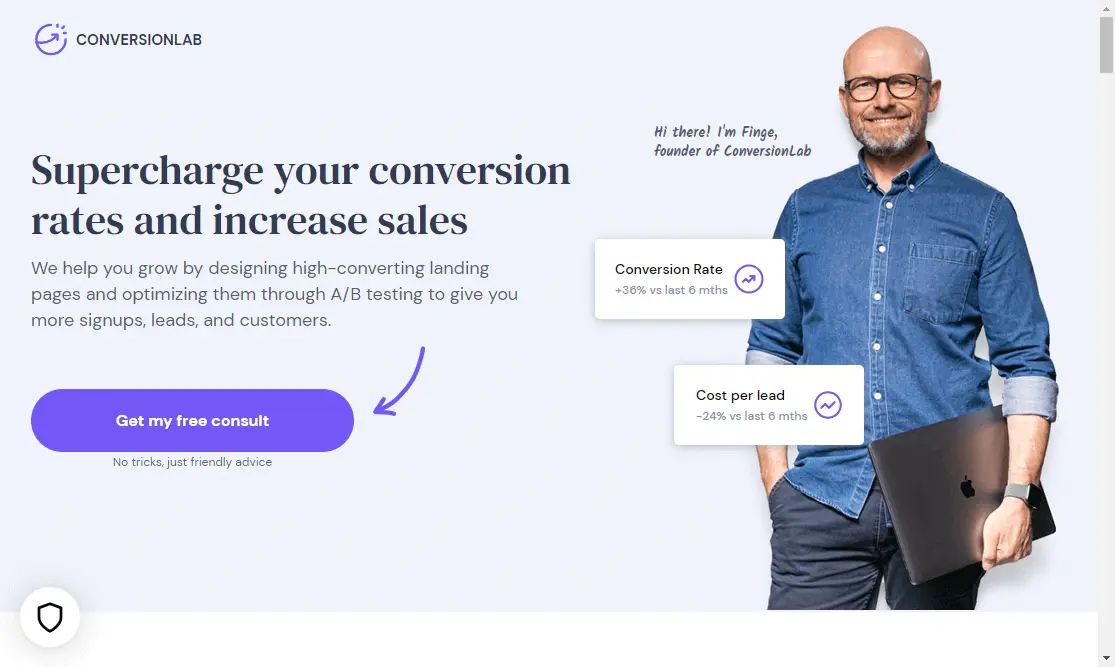
Conversion Lab
Another one of the best landing page builders, with a great landing page? No surprises here.
Whether it’s a YouTube thumbnail, or an Instagram post - people respond to brands that take a more personal approach. Using the CEO’s photo is a great way to instantly build rapport with your audience on a landing page. Remember, you don’t often have a lot of time, so it’s vital to grab your audience’s attention straight away.
Woolx
How about we give the SaaS industry a break, and take a look at what the good old clothing and apparel guys are doing? Woolx is a clothing brand that uses Australian merino wool for breathable, quality clothes.
Aside from the value proposition, this brand does a great job of promoting current offers. After all, this is what a landing page is all about! Aside from the main sale you can see, there’s also a fun popup that appears on this page. By choosing one of three sheep, you can unlock additional discounts.

Decriminalize Poverty
Here’s a wonderful example of a click-through landing page. The point of this one is to get users to scroll down to the end, and share valuable information.
This is one of the best landing pages you can find online for one very simple, yet incredibly complex factor: stunning website design. From custom illustrations, to micro animations and playful fonts, there’s nothing ordinary about this website. And ultimately, this serves the landing page’s purpose - the fun gimmicks invite people to keep scrolling through, and learn about this important social issues.

Wise
If you want to create high-converting landing pages you must provide value. Whether it’s a lead magnet, or a helpful explainer video on your homepage, there has to be something in it for the user to take action.
Wise has a really effective landing page in this respect. Aside from general information you’d typically find on a homepage, they also provide you with exact information about how their money transfer works. You can enter the amount and change the currency to see exactly how much you’ll be paying to move your money.

Sign up/login landing pages
They can be simple or quite intricate, sign up or login landing pages are present in almost every type of website or business nowadays.
Of course, the most important element for this type of page is the web form. However, a great form alone doesn’t guarantee conversion. Learn what are some landing page best practices for this type of page, with these kickass examples!
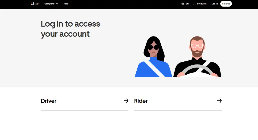
Uber
It goes without saying that the best landing pages for signing up/logging in are simple. However, that doesn’t mean boring is your only option. Just take a look at what Uber’s done!
Technically, there are two awesome aspects to this simple page. Easy segmentation of the type of user is a great way to avoid confusion, but also clutter your website design. The slinky illustrations which are perfectly on-brand add that touch of visual interest which makes for a better user experience.
Medium
Want simplicity that has the user in mind? Medium hits the nail on the head with this sign up landing page. The variety of sign in options really makes it enticing to register with yet another website.

I’m a sucker for beautiful sign up landing pages, which is why I’m happy to sign in and out of my LinkedIn account whenever needed (and not just to stalk exes).
There’s nothing I dislike about this landing page: minimal sign up form details, easy options (“sign in” or “join now”), beautiful illustration and heaps of white space that allows the landing page to breat

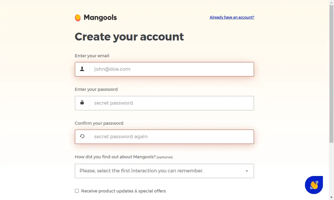
Mangools
So many sign up landing pages are dead-simple: white background and a login form. But don’t forget that even this page is meant to help you strengthen your brand identity.
Mangools has a fairly simple page, but with a couple of details that help it stand out. For one, the company logo is included at the top of the page, which is a very smart choice. They also use the same, beautiful gradient background as on other pages on their site, which helps to create a powerful brand image.
Netflix
Here comes a landing page most of us probably know well (“Hey, mum what’s your Netflix login, again?).
Jokes aside, Netflix really demonstrates one of the most essential landing page best practices. It gives people an idea of what the action will result in. In this case, it’s an array of original shows and movies you can’t find anywhere else.

Shopify
Great landing page copy is half the job done. Of course, for this you’ll need a deep understanding of your target audience.
Shopify’s free trial page is a terrific landing page example to learn from. They make things dead-simple, clearly targeted at beginner entrepreneurs and people who want to start making money online without making a huge investment. Of course, it doesn’t hurt that the web design is also nice and fits the brand image of this recognizable online platform.

Lead generation landing pages
Did you know that 91% of digital marketers say that lead generation is their most important goal? Over half of them (53%) spend at least a half of their marketing budget on these types of marketing campaigns.
Aside from an enticing offer or lead magnet it also helps to create a designated lead generation landing page that will help you gather qualified leads and increase conversions. Here are some stellar examples to learn from!
Hubspot marketing reporting template
Yes, we are mentioning Hubspot twice in this list, and for good reason. While their homepage is rather detailed and contains a lot of information, this lead generation landing page is super simple and effective. The use of contrasting colors really helps the call-to action (CTA) button stand out. Clear copy helps visitors understand what they’re getting with this free resource.
The rest of the page contains some further information. But of course, with this type of landing page it’s best not to overdo it. Instead, your lead magnets should do the work. If you’ve attracted the right target audience, there’s a good chance they’ll make a move and become a part of your marketing funnel.

Litmus 2023 State of ESP Report
This next page is another example of a good landing page form. Ordinarily, forms should contain as few fields as possible. However, if you want your lead generation campaigns to provide great results, you’ll need to separate the grain from the chaff.
An email address is mandatory, but you might want to skip the phone number in case you don’t intend to actually contact people via phone. However, if you’re a B2B company, it’s a great idea to ask for further information about the company, such as the number of employees and what role the person filling out the form has.

Nectar Book a Demo
What can you learn from this lead generation landing page? Less is often better.
If people end up on your designated book a demo page, there’s a solid chance they’re already very interested in your offer. Don’t spam them with more detailed information and salesy copy. Instead, allow users to complete their desired action as quickly as possible.

Coming soon landing pages
This might not be the first thing you search for when looking for the best landing pages, but it’s certainly a type of landing page you shouldn’t overlook. Did you know that 63% of users won’t return to a website after just one bad experience?
If your website is under construction and the only thing that pops us is a “this website cannot be reached” default page, you can’t expect prospective customers to come back once you’re (back) in business.
Moreover, a page like this can also act as a lead generation landing page. This way you can reach potential clients, even before you launch you site.
Here are some of the beautiful landing pages announcing a new website or product that will become available soon.
Arche Travel
If you think coming soon landing pages are strictly informative, this example will convince you otherwise! The gorgeous coming soon page for this travel agency really inspires wanderlust and makes you want to sign up and book that dreamy Greek vacation as soon as possible!

Lab Petite
The best landing pages for announcing a new website inspire a sense of excitement. This one does it really well using powerful copy and a countdown until the launch. The addition of social media links is also pretty useful for this type of page, as it help you stay connected with prospective customers.

SeedProd
This landing page example can teach a simple, yet vital lesson: good design matters. A page that looks good can inspire trust and show that you take your business seriously. Another takeaway from this example is that choosing the right CTA button color and copy is quite important. Instead of the usual “sign up”, the call to action “notify me’ works much better here. Also, the muted green blends well with the rest of the page, but still provides enough contrast to prompt action.

Duolingo
Not that anyone needs more notifications from Duolingo - but this kind of landing page could just get you tempted!
The best thing about this page is the progress bar which tells you what stage the new product is at. It’s a great way to get visitors excited about something, and also incentivize them to sign up for notifications.

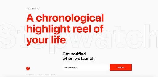
Stopwatch
Creating a great value proposition on your coming soon page is almost as important as the copy used on your homepage. This example really brings the point home, also with great use of color. Red is often used for alerts and notifications, but a slightly more muted shade like this one can help with preventing the design coming across as “aggressive”
App download landing pages
Pzizz
This really great landing page shows the power of simplicity. Although the rest of it is packed with social proof and different features, the beginning of the page works extremely well alone. Simple value proposition, great design (the logo is beautifully animated by the way), and download options - that’s literally all you need!

Slowly
This creative app gives you the opportunity to meet pen pals, and creates the experience of writing and receiving letters digitally. The download page is beautifully designed, in a bright, casual style that fits the idea of the app.

Tangerine
I’m pretty skeptical of self-care apps, but I have to say Tangerine’s landing page uses storytelling really well to illustrate how useful this page can be. Instead of the usual tired phrases like “be the best version of yourself”, Tangerine provides simple guidelines on how to use the app to improve your lifestyle. It also helps that the color scheme is beautiful and soothing.

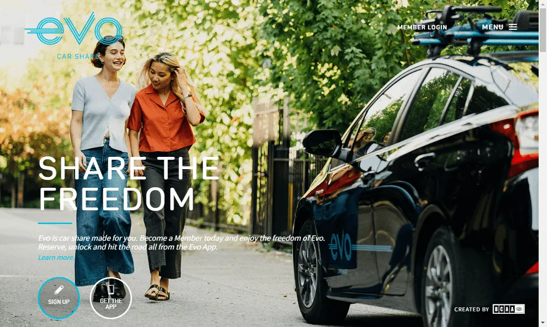
Evo Car Share
You don’t find loads of app download pages with people in them. This one does, however, and besides that it’s got a really good flow, which will keep you scrolling through the entire page. Remember, it’s great to have people download your app with just one look at your value proposition. Still, you should make sure that the landing page is giving them the full picture.
Bright Lock
What are the best landing pages for apps? I’d say minimalistic. At the end of the day, people aren’t on this page because they want to spend heaps of time learning about an app - the goal is to get them to use it.
This futuristic app that turns your phone into a set of keys has a pretty basic landing page in terms of design. However, it includes all the necessary data, such as security and privacy information that you’d want to know before downloading. Remember to consider your audience - a mindfulness app page works great with playful illustrations, but you might not want the same approach with a banking or security app.

Calm
Gamification is a popular technique in app design. It means making the app experience more like a game, with different levels, rewards, etc.
Calm employs a similar tactic on their landing page. You can select why you’d want to use the app and then proceed to the next steps, which provide different options, such as creating a free account, talking to sales, or learning more about the app.

Product landing pages
Are product landing pages only relevant to digital products? Definitely not! Here are a few awesome pages used to promote physical products.
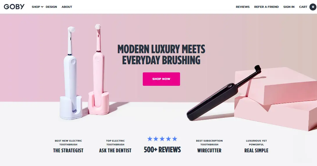
Goby
I bet you didn’t think a toothbrush could look this exciting! Creating a product page can easily be done with landing page templates. All you really need to customize these templates are high-quality product shots.
Pick your color scheme and fonts to match your brand identity and - voila! You have a gorgeous product page to help you sell your most popular product.
Dyson Corrale
One of the most important parts of a product landing page is the features sections. Whether you’re talking about the functionalities of an app, or, indeed, a hair straightener, the principle is the same.
Show prospective customers what they’re getting with this product and how it differs from other similar products on the market.

iPhone 15 Pro
You’d expect an Apple product page to be impressive, and this one doesn’t disappoint. What you can take away from it is that you can be creative when it comes to product shots. You might opt for a fun slider as you can see with this landing page. Interactive images and motion graphics are also a great way to increase engagement on your page and reduce bounce rates.

Recess
The final example on the list is yet another simple reminder that: landing page design matters. You see dozens of web pages daily, but there’s a good chance that you’ll remember something as beautiful as this one.
The pastel colors including the background are very pleasing to the eye and definitely something you don’t see on every other website you come across. It’s also a great way of building trust with your customers, as it helps to establish a memorable brand image and create brand loyalty in the long term.

Further reading
We hope this list of the best landing pages helped you find your groove and get some ideas for designing your own page.
For further tips and ideas check out our list of best websites, this handy guide on getting affordable landing pages, or grab our free landing page guide! It’s packed with tips, ideas, and templates.
Not sure if you can tackle website design all by yourself. It’s no small feat! Try our unlimited website design service today and get all the landing pages that you need for as little as $599 a month!

Having lived and studied in London and Berlin, I'm back in native Serbia, working remotely and writing short stories and plays in my free time. With previous experience in the nonprofit sector, I'm currently writing about the universal language of good graphic design. I make mix CDs and my playlists are almost exclusively 1960s.

Top-quality designers
A complete creative team at your fingertips: graphic and web designers, illustrators, and more.

Lightning-fast turnaround
Get start today and receive your first update on the next business day.

All-inclusive pricing
Unlimited requests and revisions. One flat monthly fee. No surprises.

Flexible & scalable model
No contract. Scale up and down as needed. Pause or cancel at anytime.
Continue reading
.jpg)
.jpg)
.jpg)
Explore some of our best designs
Get inspired by a curated selection of ManyPixels work. Download the portfolio to see what our team can create.


