22 Sleek and Techy App Logos
TABLE OF CONTENTS

Before you launch your new app on the app stores, you need to make sure that you have a well-designed and catchy app icon. Check out these examples to get some ideas on your own app’s logo design.
Whether you’re an Apple or Android user, you surely have dozens of mobile apps on your device. And apart from functionality, usability and great design of the app itself, more than often the thing that makes users decide on a particular app is the look of its logo or the app icon.
Every time I search for an app and I'm given a few options, I pick out one that has both a good rating and looks aesthetically pleasing. It has to fit the color scheme for my home screen after all! So, if most users are as crazy about their phone looking good and organized as I am, you should definitely pay some attention to your app icon design.
We’ve compiled some good logos in four categories to show you how important the app logo is for the overall brand identity, and help you create a concept that will make your creation an instant success.
{{BRAND_BANNER="/dev/components"}}
Lettermarks
Lettermarks or monogram logos are a graphical depiction of the initials of the company, or in this case, app. This type of logo is at the same time minimalist and practical, and especially fitting for apps, since the small sizes of icon sets on the Google Play Store and iOS App Store are restricting and need to be catchy with minimal use of space. Think of the Facebook or Goodreads app for a famous example.
1. GoTaxi
This cool icon for a taxi calling app uses a letter G and arrow, in a way that they seem like a map location bubble. It is a simple idea, but it’s incorporated throughout the app design, which helps with recognition and memorability.

2. Plome
This lovely monoline gardening logo belongs to an app that teaches users how to plant at home (plome). The custom typography and illustrations of plants coming out of the lowercase P letter show that the brand is friendly, approachable and warm, contrary to the stern and traditional looks of most design styles when it comes to logo making.
3. Pakodemy
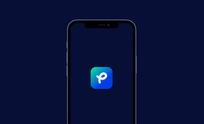
This cool and playful logo looks like an effortless scribble, but it’s in fact a very creative and minimalistic lettermark based on the letter P. The illusion of movement and the fresh color palette make it an instantly noticeable logo.
4. Feedium
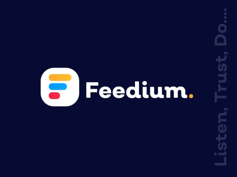
Feedium’s logo is a very trendy logo, using colors that are often used in SaaS design. The flat design rows in blue, red and yellow look like a list, while at the same time forming the shape of a letter F. The longer version of the logo is used on desktop and other branding efforts.
5. Hutch
Whereas most app logos have a gradient over them, or really blocky and bulky typography, the simplicity and elegance of the Hutch logo make it noticeable in the see of similar icons. The serif font used and the classic black and white color scheme are more than enough for this interior design app logo to be pixel perfect.
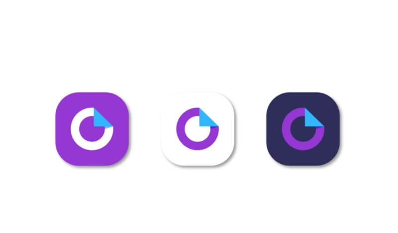
6. Ouidoc
This cool and techy logo is created in three different variants, all based on the fresh and contemporary color palette with predominantly purple tones. Creating more than one version of your logo offers some customization, and you can opt from one of the looks based on what looks best on different user interfaces.
Gradient
Ever since Instagram changed its logo to the latest version, gradients haven’t stopped being a popular choice for app logos and app icons. Even Messenger went through a makeover recently. Here are some logos that use this trendy design solution. Keep in mind that some are also lettermarks, but we decided to put them in this category cause the gradient is the first thing you notice about them.
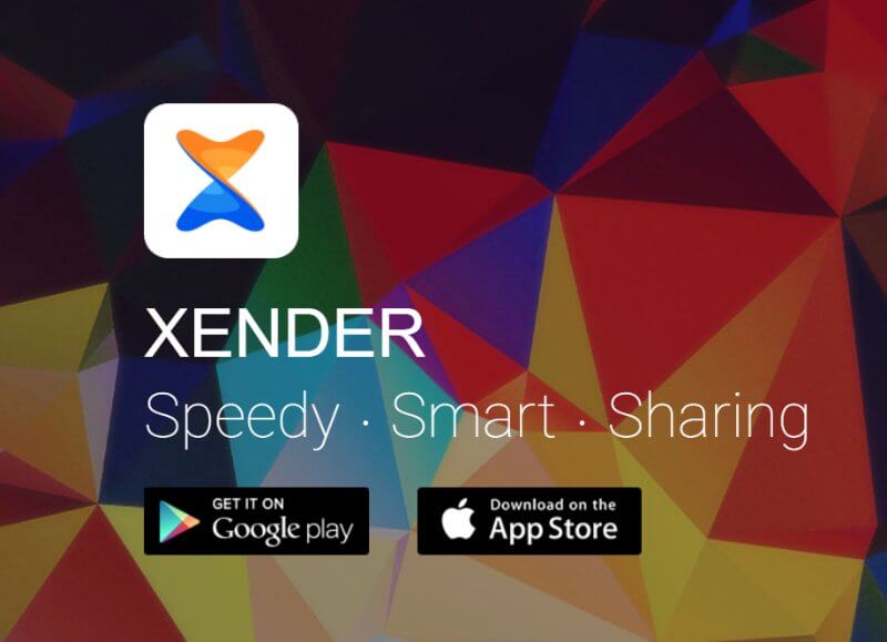
7. Xender
Xender is one of the most famous apps for file transfer and sharing, that works with different types and sizes between different Android and iOS devices, such as phones, tablets, iPads, etc. For their cool lettermark logo, they combined the letter X with an hourglass symbol, as well as a circular motion signifying the data transfer process.
8. Vacity
This app icon uses a V shape and a very popular color combination for a gradient: red, orange and pink (somewhat similar to the Instagram logo color scheme). It is a design that creates a good illusion of movement and adds dynamism to the look.

9. Rohee
This Indian-typography-inspired lettermark features two versions, both in gradient and white. The lowercase letter R, combined with the peachy and pink tones make for an elegant design, that looks contemporary and stylish.

10. Kitaly
Kitaly is an online service and mobile app used for professional networking and job marketing and application. The gradient is based on blue tones, which are usually used to express professionality, reliability and trustworthiness.

11. Helping Hand
This lovely logo shows two hands working together, which is a cute depiction of the name of the app, Helping Hand. The gradient is subtle and well-applied and in the negative space, you can see the letter H.

12. Zoom Remote
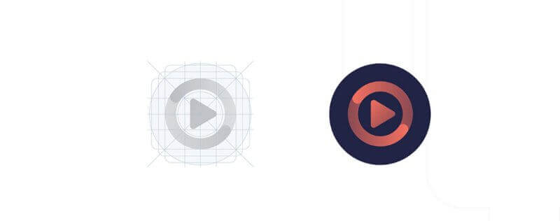
Zoom Remote might have been the app of the year since it enables users to join a Zoom meeting from any device. Its app icon is designed separately for an iPhone or Android device, according to the iOS and Google Play Store design guidelines, for best functionality. The design is based on the “Play” button shape and a circular motion, signifying two-way control.
Brand marks
Sometimes, brands go for an abstract or symbolic graphic depiction of their story and scope of work. Some examples are Twitter’s bird or TikTok’s note. Brand marks are great for creating your own visual language and basing new icons, web design and other branding efforts around it.
13. Airbnb
We have referenced the Airbnb logo plenty of times, and there is good reason for that. It is a very abstract concept, but at the same time versatile and close to the brand. Airbnb uses the belo symbol as its app icon too, and it is a combination of symbols meaning people, places, love and A for Airbnb.
14. Dribbble
Dribbble is not an app per se, but a platform where a global community of graphic designers showcase their work and find jobs and gigs. Its main logo is a typographical, script font logomark, but Dribbble’s app has a basketball as the icon. It is a symbolic way to refer to the most important activity that made Dribbble a hit among designers, which is rebouncing a design that someone else created, i.e. reworking it, similar to dribbling in basketball.

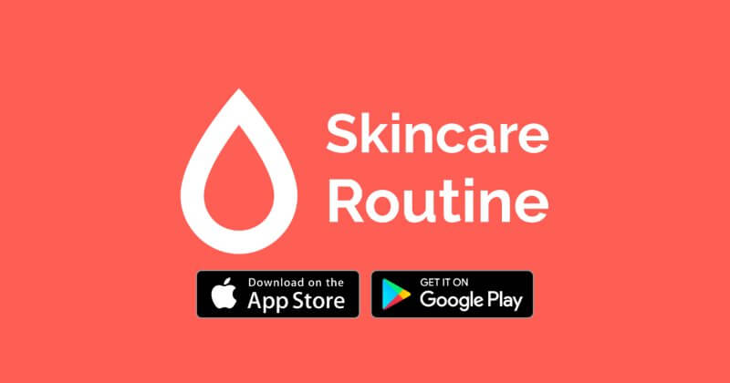
15. Skincare Routine
One thing that anyone obsessed with skincare knows, is that hydration is key. This app uses a simple one-line flat design illustration of a drop, referring to this rule that will keep your skin healthy and glowing.
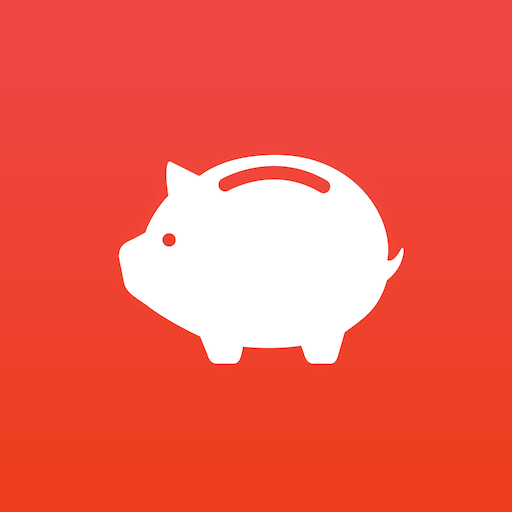
16. Money Manager
What else to use as a brand mark if you’re a saving and budget planning app? Of course, a piggy bank makes an obvious choice for this app’s icon.
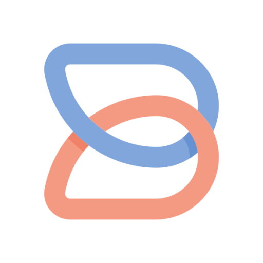
17. Boosted
This helpful app for creating video social media posts has a vast library of templates and stock footage and is a great resource for a marketer. The brand mark shows two connected links in the shape of a letter B, depicting the effect of good social media marketing: it is all linked and connected, helping you with brand recognition.
Mascot logos
The final category of logos we compiled for you is the good ol’ mascots, which have been around in graphic design for decades. They’re pretty common logos for startups and often seen in the IT and tech industry, and used by companies like Mozilla, Duolingo, Android and Mailchimp, to name a few.
18. DuckDuckGo
This online privacy and cookie-blocking app has a goofy cartoon duck as its logo and mascot. It’s a funny representation of the process of blocking popups and ads online as if they’re a physical obstacle on your way, so you must duck, duck and go.

19. Butcher Fox
This concept takes a very literal approach to translate the name into a logo. Two knives make out the shape of the fox’s face, which looks great paired with the name Butcher Fox.
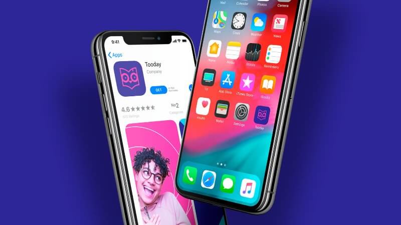
20. Tooday
Owls have been seen as a symbol for wisdom and knowledge for centuries, so it makes sense that this app for education and productivity uses one as its mascot. Fitting to modern-day design trends, this logo uses a lovely pink and purple color scheme and flat design that will surely attract the attention of users.
21. Pet Care Mobile App
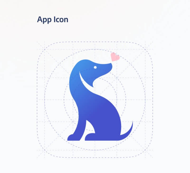
This branding and UX design project showcases far more than the logo design for this helpful app for pet owners, but the cute dog illustration used as the app logo doesn’t come second.
22. Reddit
Finally, we have a robot mascot that many will recognize, as it’s the face of the world’s most popular forum and discussion platform. Reddit’s robot Snoo is also used in the app icon, and even though it’s been designed a long time ago, it’s well-known and memorable, so the company doesn’t seem to plan on changing it.


Top-quality designers
A complete creative team at your fingertips: graphic and web designers, illustrators, and more.
Lightning-fast turnaround
Get start today and receive your first update on the next business day.
All-inclusive pricing
Unlimited requests and revisions. One flat monthly fee. No surprises.

Flexible & scalable model
No contract. Scale up and down as needed. Pause or cancel at anytime.

Continue reading
Explore some of our best designs
Get inspired by a curated selection of ManyPixels work. Download the portfolio to see what our team can create.
