
Form design: the complete guide for 2026
TABLE OF CONTENTS


TL;DR
Form design is the practice of building web forms that people actually finish. Get it right and you turn traffic into leads. Get it wrong and you lose conversions you already paid to acquire.
- ✅ The single biggest lever: cut fields. Expedia recovered $12 million a year by removing one field.
- ✅ Layout that works: one column, top to bottom, easy questions first.
- ⚠️ The trap most teams fall into: asking for information they do not need yet, which kills completion rates.
What is form design?
Form design is the process of structuring, styling, and sequencing a web form so users can complete it quickly and without friction. It covers the fields you ask for, the order they appear in, the labels and error messages, and how the whole thing behaves on mobile. Good form design is equal parts UX and visual design.
It sits inside the wider practice of UX and UI design, but forms get their own rulebook for one reason: they are where a visitor decides to commit or leave. A form is usually the last thing standing between someone and an action that moves them down your funnel. That makes it one of the highest-stakes pieces of design on your site.
You might not be building forms yourself. Even so, knowing what separates a good form from a bad one lets you judge whether the one on your site will perform before it ever goes live.
Why does form design matter for conversions?
Form design matters because small structural choices produce large swings in completion rates. Removing fields, fixing layout, and reducing friction can lift conversions by double digits, while a single unnecessary field can cost real revenue at scale.
The numbers are hard to argue with. Expedia found it was losing $12 million a year because of one extra form field. Imagescape increased conversions by 120% by cutting its form from 11 fields down to four. These are not edge cases. They are what happens when you treat a form as a design problem instead of an afterthought.
Here's the thing: you already paid to get the visitor to the form. Ad spend, SEO, content, all of it leads here. A form that leaks conversions is wasting the most expensive traffic you have.
{{LANDING_PORTFOLIO="/dev/components"}}
What are the types of web forms?
Web forms fall into a handful of common types, each with its own goal: registration, login, contact, checkout, lead generation, and surveys. The type dictates how many fields are reasonable and how much friction a user will tolerate before they abandon it.
Knowing the type you are designing for keeps you honest about length. A checkout form earns the right to ask for more because the user is motivated to buy. A newsletter signup does not.
- Registration and signup forms create a new account. Keep them short, because the user has not committed yet.
- Login forms get returning users back in fast. Social login (Google, Apple) removes most of the friction.
- Contact forms let people reach out. A few fields is plenty.
- Checkout forms collect billing, shipping, and payment. Users tolerate more length here, but every extra field still costs you.
- Lead generation forms trade user value (an ebook, a demo) for contact details. Match the ask to the offer.
- Surveys and questionnaires gather feedback. A progress bar keeps people going.
If you are building a form to capture leads, the rules shift slightly toward qualifying the right people. Our guide to lead generation UX goes deeper on that.
How to design a web form: 12 rules that convert
Good web form design comes down to reducing effort. Every rule below does one of two things: it removes friction, or it reassures the user. Follow them and you will design forms that get completed instead of abandoned.
1. Keep fields to the minimum
Every field you add is a reason to quit. Long forms consistently underperform short ones, so ask only for what you genuinely need right now. If you are not going to use a piece of data this week, it does not belong on the form. This is the rule that produced Expedia's $12 million swing and Imagescape's 120% lift, and it beats every other tactic on this list.
2. Give every form a clear title
A title tells users exactly what they are filling out and what they get in return. It removes hesitation and, for lead magnets, it carries the value proposition. Even an obvious payment form benefits from a heading that confirms the user is in the right place. Clear titles feed directly into your lead generation goals.
3. Use a single-column layout
Stick to one column, top to bottom. Multi-column forms make the eye jump around and slow people down. A CXL Institute study found single-column forms were completed 15.4 seconds faster on average than multi-column versions. Even when a single column looks longer, it reads faster. Layout choices like this are part of good website layout more broadly.
4. Order fields from easiest to hardest
Start with the simple stuff (name, email) and save the effortful fields (billing details, company size) for later. Once someone has typed their name, they have invested a little, and they are more likely to push through. Put a credit card field first and you invite people to bail before they have committed anything.
5. Mark optional and required fields consistently
Pick one convention and stick to it. Use an asterisk (*) for required fields and the word "Optional" for the rest, but never mix both systems in the same form. Asterisks keep things cleaner. Clear marking also matters for trust: nearly a third of people (29%) abandon forms over security concerns, so let them see which data is genuinely optional.
6. Make buttons stand out with color contrast
Your primary action button should be impossible to miss. A few conventions help: use blue, green, or bright brand colors for affirmative actions, and neutral tones (gray, muted shades) for secondary actions like "Back" or "Cancel." Contrast between the two guides the eye toward the action you want. The button should still fit your overall CTA and button design and brand identity.

7. Use radio buttons instead of dropdowns for short lists
When there are only a few options, show them all with radio buttons rather than hiding them in a dropdown. Users see every choice at once and tap once instead of twice. CXL ran a test and found forms with radio buttons had a 95% faster completion time. Save dropdowns for long lists like countries.

8. Show a progress bar on multi-step forms
Nobody enjoys filling out forms. A progress bar tells users how much is left, which keeps them moving through longer, multi-step flows. It sets expectations and removes the "how much more of this is there?" anxiety that drives people away.
9. Give real-time feedback and clear error messages
Users should always know where they stand. Validate fields inline so errors surface as they type, not after they hit submit. Write error messages that are specific and never blame the user: say what went wrong and how to fix it. Placeholder text helps too, especially for formatted fields like dates (MM/DD/YYYY). And before an irreversible action, tell the user what the next step will do.

10. Design mobile-first
A large share of users will meet your form on a phone, even if they finish it on desktop. That first impression has to work on a small screen: single column, tappable buttons, correct keyboard types, and no pinch-to-zoom. Enable autocomplete and autocorrect so nobody is typing full shipping details on a cramped keyboard, and test the whole flow on an actual device before you ship.
11. Build in security and reassurance
When you ask for sensitive data, show users it is safe. Use HTTPS so submissions are encrypted, add reCAPTCHA to block bots, and explain briefly why you need anything personal. Security is not just technical, it is perceived: the visible signals matter as much as the encryption behind them.
12. Do not reinvent the wheel
Forms are not the place for novelty. Users carry strong mental models for how a form should behave, and fighting those models adds friction. Lean on familiar patterns, standard field order, and conventions people already know. Save the creativity for the parts of your product where surprise is welcome.
What do great form designs actually look like?
The best real-world forms all share one trait: they make completion feel effortless. Below are seven examples worth studying, each doing something specific well, from open-ended questions to smart use of color and layout.
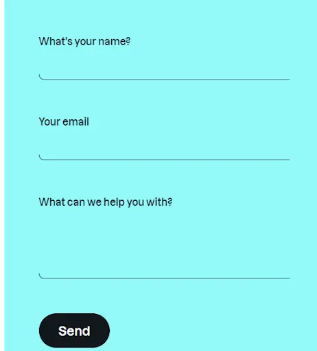
Yummygum: minimalism with one open question
This Dutch studio kept its form as simple as possible, then added a single open-ended question. Because the rest is so short, users actually answer it, and the response helps weed out low-intent leads. It is a smart move for a lead generation page.
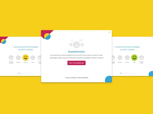
Snappet: color contrast done right
Snappet builds K-5 math software, and its satisfaction survey is playful and on-brand, with one screen per question. Unselected options sit in neutral gray while the selected one pops in vibrant color, so users never have to double-check what they picked.
Aluxion: typography and layout as the star
This product design agency pairs a minimalist palette with strong motion graphics, and its submission form matches. The typography does the heavy lifting. The form is single-column and prominent, with a short heading and description for context.

Woorise: simple value proposition
A newsletter sign-up form can only do so much. People will either be interested in reading your stuff or they won’t.
So, since you’re already shooting a long shot, avoid being overly promotional or “salesy.” Instead, a great newsletter sign-up form should convey the main value proposition. Woorise wins bonus points with the added information about email frequency. Since 59 % of users unsubscribe because they think emails are too frequent.

Chanceupon: a long form that still works
Chanceupon connects businesses with on-demand specialists, and its contact form asks a lot: service type, team size, budget. It works anyway because the design carries it. A pop of yellow directs focus, and a mix of checkboxes, text fields, and rating scales keeps it engaging instead of exhausting.

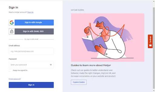
Hotjar: two forms, one clean split
Hotjar combines two calls to action, register/login and download the guide, on a single split screen. Because the two sides look completely different, neither CTA loses power. The registration side stays simple while the lead magnet side is richer and more appealing.
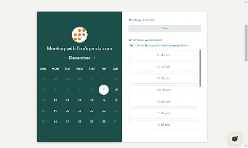
Proagenda: taming a calendar
Any form with a calendar can turn messy fast. Proagenda's demo booking form avoids that by splitting cleanly into two sections, the day and the time, with a color scheme that makes the information easy to process.
LinkedIn: context sells the form
LinkedIn's login form is clean and offers one-click Google sign-in. The accompanying image sets a tone that is fun but professional, exactly right for the platform. The lesson: the environment around a form affects whether people complete it.

How do you choose the right form design approach?
Match the form to the job and the motivation of the person filling it out. The higher the user's intent, the more you can ask. The lower it is, the shorter the form must be.
- 👉 If it is a top-of-funnel signup (newsletter, free resource): ask for the bare minimum, usually just an email.
- 👉 If it is a lead or demo request: add a few qualifying fields, but make the non-essential ones optional.
- 👉 If it is a checkout or application: you can ask for more, but break it into steps and show progress.
- 👉 If you are unsure: ship the shorter version and add fields only when you can prove you need the data.
Where ManyPixels fits
Form design looks simple and rarely is. It sits at the intersection of UX, visual design, and conversion strategy, and doing it well takes real time. If you would rather hand it off, a ManyPixels design subscription gives you unlimited web design requests, including forms, landing pages, and the graphics around them, at a flat monthly rate.
{{WEB_BANNER="/dev/components"}}
Form design FAQs
Bottom line
Form design is one of the highest-leverage design decisions on your site, and the winning move is almost always subtraction. Cut fields, use one column, ask easy questions first, and reassure users their data is safe. ✅ Do that and your forms will convert the traffic you worked hard to earn.
Got a form that is leaking conversions? Start by counting the fields and removing the ones you cannot justify. It is the fastest fix in web design.

Having lived and studied in London and Berlin, I'm back in native Serbia, working remotely and writing short stories and plays in my free time. With previous experience in the nonprofit sector, I'm currently writing about the universal language of good graphic design. I make mix CDs and my playlists are almost exclusively 1960s.

Top-quality designers
A complete creative team at your fingertips: graphic and web designers, illustrators, and more.

Lightning-fast turnaround
Get start today and receive your first update on the next business day.

All-inclusive pricing
Unlimited requests and revisions. One flat monthly fee. No surprises.

Flexible & scalable model
No contract. Scale up and down as needed. Pause or cancel at anytime.
Continue reading
.jpg)
.jpg)
Explore some of our best designs
Get inspired by a curated selection of ManyPixels work. Download the portfolio to see what our team can create.








