

20 Architect Logos for Modern Architecture Businesses

TABLE OF CONTENTS


Check out these wonderful architect logos that will inspire you to come up with a unique concept for your own!
{{LOGOS_PORTFOLIO="/dev/components"}}
Modern minimalist logos
Although minimalism is a long-standing trend, in this particular industry, a minimalist logo also serves to show a sense of style and elegance. On the other hand, a minimal logo design can be seen as a sort of blank slate, signaling to potential clients that your style and vision are adaptable to their needs.
Moreover, simple logos are easy to adapt for a variety of users: from business cards to professional architecture website design.
1. Miles Brandão
This architect logo consists of three shapes: an organic one (curved line), geometric (square), and a shape that represents a light fixture (or that “light bulb” moment of inspiration). It’s a great way to make a logo look interesting even with minimal design elements.

2. Georgia Cannon
This interior design studio logo is the epitome of impactful simplicity. Georgia Cannon’s logo reflects the designer’s style, which relies heavily on mid-century modern aesthetic and raw forms.

3. Tiago Cruz
This modern architect logo concept has two variations: the crisp wordmark and the pictogram which looks awesome on this modern business card mockup. It’s also a good reminder of how to effectively use colors to make a minimal black and white logo pop.

4. Inco Architects
This architectural firm logo is a modern wordmark that uses very minimalist lettering, inspired by geometric shapes. Since Inco Architects handle both the design and implementation of projects, it makes sense that their logo represents professionalism and trustworthiness.

5. Vyazimonova Selvinsky
The two pentagons and hexagon found on this unique architectural logo actually represent the company’s initials. The minimalism of the geometric shapes, in this case, is used very well since it resembles architectural drawing.

Creative architecture studio logos
Check out these examples that strike the perfect balance between being quirky and very professional.
6. Grein Studios
Grein Studios has a logo that’s neither minimalistic nor overly intricate, inspired by natural forms and lines. It has a very organic feel, without using any of the conventional tropes like flowers and leaves icons.

7. Roome Architects
This logo design concept takes inspiration from the timeless architecture of the city of Rome, as well as ancient Roman mythology. The logo incorporates the curves of the Pantheon’s dome and the owl which is a symbol of the Roman goddess of wisdom Minerva.

8. Astique Wood Architecture & Design
Forest animals are very popular with woodworking logos, but since this field shares similarities with interior design, this kind of imagery also lends itself well to architectural firm logos.

9. Atharv Consultancy
This modern and creative logo would make an equally good choice for a construction website or real estate logo thanks to its simplicity and recognizable imagery.

10. Cural
This great architect logo design uses simple techniques that make it distinguishable from dull templates or DIY logos made with online logo makers. Each letter differs in size slightly and instead of the A, the logo creator used a minimalistic window-like shape.

11. Kcos
The logo creator behind this concept envisioned something that resembles the process of dreaming and creation. The letter K which represents the business name actually consists of four pieces of a circle.

12. Aclinic
This creative architectural studio logo concept was created with a specific target audience in mind: hospital branding. If you serve a specific clientele, your logo should reflect that.

Professional logos for big architecture businesses
If you work for, or want to build a big architecture firm, then one of these more corporate looking examples is going to be a useful source of logo design inspiration.
13. Ipek Koray Design
This unique abstract design was created for a logo design contest and is now used by the Istanbul-based architecture and design studio. The logo designer took inspiration from the Fibonacci spiral, which is a visual representation of the numbers in the Fibonacci sequence.

14. Bauen
They say that you should always dress for the part you want, and this goes for logos and branding. If your long term goal is to build a big and successful business, then you should opt for a more serious, professional looking architecture logo design, such as this.

15. Boho Studio
Boho Studio has a simple logo that still looks unique thanks to the fresh branding color palette.

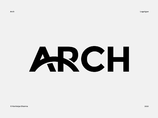
16. Arch logo
Architectural forms can make a great source of logo design inspiration. This is a wonderful example since the arch is incorporated seamlessly into the typography.
Classic wordmarks
Just like realtors, graphic designers and consultants, many architects work alone and require a refined personal brand. A wordmark or monogram can be a great logo for this reason.
17. Pedro Martins
This logo is a rather simple wordmark with very dainty sans-serif typography. On its own, it could have easily been a good boutique or fashion logo. However, paired with a vibrant, yet elegant color palette everything ties together really well to create a unique and memorable personal brand.

18. Bang
Creating an impactful wordmark takes great skill, and if you choose this route, start with a strong concept, rather than readily available architecture logo maker templates. With this logo each letter is actually written in a single stroke, showing the design skill and mastery of the architecture firm.

19. ScèneDeVie
This D and S logo takes a really creative approach to a monogram. The little monogram is perfect for use on things like business cards and social media profiles, while the complete SceneDeVie wordmark is something you would find on more official documents like letterheads or presentations.

20. Renvix Towez
Take any two letters, and a skilled logo designer can turn into a unique logo design. In this case the R and T are seamlessly integrated into one modern shape, perfect for cutting-edge architecture studios.

Conclusion
We hope this list gives you ideas for your own architecture company logo.
Most architects have design knowledge, however creating a perfect logo usually requires years of experience and practice.
If you don’t want to break the bank, but still want to hire a professional logo designer, we’ve got the right solution for you!
ManyPixels is a leading on-demand design service, where you can get a logo and complete brand identity for as little as $549!
{{BRAND_BANNER="/dev/components"}}
Our flat-rate monthly service covers unlimited requests and revisions. So no matter how demanding your keen architect’s eye to detail is, we can deliver the results you want!
Get started today or get in touch to learn more.

Having lived and studied in London and Berlin, I'm back in native Serbia, working remotely and writing short stories and plays in my free time. With previous experience in the nonprofit sector, I'm currently writing about the universal language of good graphic design. I make mix CDs and my playlists are almost exclusively 1960s.

Top-quality designers
A complete creative team at your fingertips: graphic and web designers, illustrators, and more.

Lightning-fast turnaround
Get start today and receive your first update on the next business day.

All-inclusive pricing
Unlimited requests and revisions. One flat monthly fee. No surprises.

Flexible & scalable model
No contract. Scale up and down as needed. Pause or cancel at anytime.
Continue reading


Explore some of our best designs
Get inspired by a curated selection of ManyPixels work. Download the portfolio to see what our team can create.


