
Landing Page Design 101: Tips for Creative Landing Pages

TABLE OF CONTENTS


You can have kickass content for a landing page, optimally structured for maximum conversions. And yet, you find people turning away from it. Learn how to create high-converting landing page design that will help your page perform!
There are over 200 million websites out there. This means your brand new landing page has to cut through a lot of noise to reach potential customers.
So how to design a good landing page that will help you reach your goals, whether it’s getting people’s email addresses, or selling a physical product? Keep reading to find out!
{{WEB_BANNER="/dev/components"}}
Elements of a good landing page
Before we share some actionable tips, here are some of the most important elements of any good landing page:
- Hero section: This is the top section of a landing page, which usually includes an eye-catching visual and a value proposition.
- Features section: A features section is used to provide more information about a product,service or promotion.
- Social proof: Include quotes or ratings from real customers to give your page more credibility.
- Call-to-action (CTA) button: A CTA button is the most vital component of a landing page, as it prompts users to complete an action.
- Landing page copy: A clear and succinct landing page copy is needed to provide all the necessary information in a limited space.
What makes a good landing page design + examples
Designing a landing page these days is pretty simple, as there are dozens of great landing page builders, many of which are totally free!
Using a landing page template has its benefits: it’s fast, affordable, and the landing page design looks professional. However, a good landing page is much more than purely aesthetic.
Whether you’re using a template, or going with a fully custom landing page design, here are a few tips and tricks that will help your pages perform as well as they look!
Focus attention above the fold
With a lead generation landing page, you want to hook visitors and keep them moving at a The concept above the fold is pretty simple once you know it. Essentially, it’s the content that fills your screen before you need to scroll down. The idea comes from the days before digital. Most newspapers sold on the sidewalk were usually folded in half so passersby could see the top half of the front page. If the top half didn’t excite them, they wouldn’t buy.
Before doing anything, you should think about the user experience (UX). At its essence, your content should be easy to interact with. For instance, if you’re working on the above-the-fold content with video, you need to consider whether it has captions, automatically plays silently, and ensure that it doesn’t slow down the web page speed.
But how can you also make that more enjoyable?
Here’s an incredibly clever example from Airbnb, which works on several different levels. Dividing the above the fold space into a static and moving part is awesome - it gives visitors the option to watch the video, or simply skip to the part they’re interested in (becoming a host).
This also makes the video non-obtrusive, creating a pleasant user experience. Finally, the video perfectly accompanies the copy “open your door”, creating a powerful message.
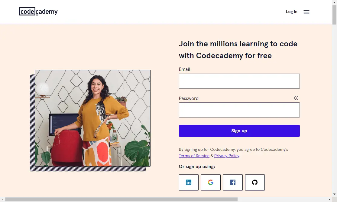
A totally different example of creating a powerful impact above the fold is Code Academy. With a powerful value proposition, and an incredibly simple sign up form, this page really hits the landing (excuse the pun). The rest of this page is also terrific, with a list of courses, a quiz to help you find the best course for you, as well as customer testimonials. However, the “above the fold” section is enough to gain anyone’s interest.
Create sensible landing page layouts
Just like with any other web design project, when it comes to landing page designing you should start with the outline of the page.
Logic is one of the most critical aspects of good landing page design. Imagine starting your page with social proof. Visitors might not know what you’re talking about, and will likely leave the page right away.
Think of it as creating steps for your visitors to take action. Start with a value proposition, move onto features, followed by social proof and a CTA button. Of course, it’s also a good idea to include a CTA button at the very top to cater to those bottom of the funnel prospects who arrive at your page ready to take action.
Come up with a big and bold value proposition
How to design a good landing page? The very first rule is ensuring users know what to expect. We’ve already discussed the importance of placing key information above the fold. In that respect, nothing is more important than your value proposition.
A value proposition should ideally include keywords that you want to rank for. However, don’t forget that the value proposition is created for users not search engines. Ensure that a person who doesn’t know much about your company, understands the value of buying your products or service.
Hubspot is probably the best known marketing automation tool, and it’s likely that most people who end up on their homepage know exactly what they’re looking for. And yet, instead of using the words “marketing automation tool”, they went with something much simpler - “Grow better with Hubspot.”

But how about design? Aside from straightforward, everyday language, use large lettering and a fitting visual. If you’re selling products, the visual should be a high-quality product shot. For services, most businesses opt for photos of people, although you can always get creative with custom illustrations.
Set things in motion with a video landing page
Did you know that landing pages with videos have 80-86% more conversions?
The reasons for this are multiple. For one, it’s in our nature to pay attention to moving faces, voices, body language, and movement. Secondly, website videos are a great remedy for our short attention span. No one will bother to read all the information on a landing page. But a 30-second video will definitely do the trick.
However, I probably wouldn’t recommend slap-dashing any video onto your carefully created custom landing page design. Before you edit your new video or grab one just off the shelf, your video needs to be optimized to create a seamless visitor experience. Otherwise, it will slow down your web page, and your bounce rate will surely increase. You can use a website speed test to review your site and make the necessary improvement to keep visitors staying longer on the page.
Best practices for creating video landing pages:
- Include social proofs in your video: Social proof is one of the most effective ways to boost lead generation. Subtly placing this in your videos can reassure your visitors of your product or service quality.
- Include a CTA - You can also embed a Call-to-Action directly into your videos to increase lead conversion.
- Make sure it’s just as effective on mobile: Many websites lose more than half their traffic due to poor mobile optimization.
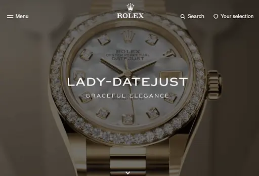
Rolex has an impressive video landing page. As the subject of the video, the demonstration of one of its masterpieces is in line with people’s perceptions of the brand: it manufactures gorgeous and high-end watches.
So whenever viewers drop by its website to check out its collection of watches, they won’t be disappointed. The refined product demonstration (360-degree and close-up views) on its video landing page is the first thing visitors see. And it’s hard not to be swept away.
Work on your call to action
The most beautiful custom landing page design is nothing without a powerful CTA. needs a powerful CTA at the end of the day. The best landing pages convince users to take action, so let your CTA button stand out. For starters, choose visually appealing colors that blend nicely. The text should also be easy to understand.
So what makes a CTA effective?
- Tailor individual CTAs to each persona: The majority is more responsive to content buttons that reflect their stage in the customer journey. Say you have a vast blog section. You should consider using different CTAs for your blog posts, depending on whether they’re simply informative, or promote your services or products.
- Grab the audience’s attention: One way you could do this is by creating urgency. Creating urgency is a psychological tactic that plays with any person’s FOMO (Fear of Missing out). “Today” and “now” are some time-oriented words that can encourage visitors to click on your page. Use a combination of font design and placement to make your CTA jump out from all your other visuals.
- Use first-person text: A whopping 90% conversion increase resulted from CTA buttons that use “I” or "me". Examples are “I want to sign up” and "Sign me up".
Just like your copy, don’t be afraid to play around with your CTA in bold or unexpected ways. If it’s in line with the audience personas, why not have a little fun with it.
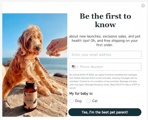
Psychology is a powerful thing in landing page design, and this example proves it. This creative call to action (notice the use of first person!) appeals to the target audience’s core values - anyone shopping for pet products wants to be the best parent to their fur baby. And if that means signing up for this newsletter - count me in!
Get creative with lead capture forms
Can you recall a time you got excited to fill out a form?
Probably not. Forms are boring, unmemorable and - one of the most important elements of landing page designing. After all, many lead generation landing pages are created with this specific purpose in mind.
But how can you make forms more exciting, and get people to actually complete them? Here are some tips:
- Incorporate brand personality into your forms: Generic forms are often dismissed by visitors as a nuisance. But if the same visitors come across a branded form, that’s a different story. If you’ve already piqued their curiosity about your brand, they may just be enticed — excited, even — to fill out your form.
- Include compelling visuals: Don’t do it, however, just for the sake of it. Consider the above example, for instance. The photo of that incredibly cute dog really brings home the message, and makes the CTA all the more powerful.
- Make your forms more fun: This may sound counterintuitive, but using non-standard UI elements such as large clickable images and toggle sliders makes the form more fun. With such an abundance of online content, the more engaging and exciting your content, the more conversions you’ll receive.
- Tease them with the benefits: Showcasing the value of registering for your service, event or download can increase the chances of them completing the form. It’s an age-old practice in marketing - don’t just give your audience your product’s features, but the benefits.
- Create interactive forms: Interacting elements can come in a manner of forms (excuse the pun). You can have quizzes, surveys, or leverage conversational marketing and design forms that are easy to fill out — just like talking to friends. Whatever it might be, make the form valuable for both you and your audience. If you have fun making it, they’ll have fun filling it out.
Ensure your pages are responsive
There’s no way you can create a landing page that will perform, without considering responsive design.
Over half the world’s website traffic comes from mobile devices, and mobile ecommerce is also getting bigger every day. So, you need to make sure your landing pages look as intended on different screen sizes.
Hiring a professional web designer can help with this. Or, there are many landing page templates you can use that are already optimized for mobile use.
Final thoughts: should you design your own landing page?
Truth be told, this is a tough one to answer. With tons of amazing landing page styles and templates readily available on the web, it’s possible to create great landing pages even with little to no design knowledge whatsoever.
The main pro of this approach is, of course, cutting on costs. With most landing pages templates being optimized for both desktop and mobile, you won’t have to worry about design or development costs.
So, what are the downsides?
- It takes a lot of time: Yes, you won’t need to pay someone else to do it. But, you’ll spend hours, if not days of your own time on adapting a template. Even the perfect landing page template will need to be tweaked to work for your needs. So, this is something you must consider in your budget as well (you’re spending time you could spend doing your job).
- Landing pages are not a one-off thing: Most businesses need landing page designs regularly. So, if you’ve managed to do it once, it doesn’t mean you will be able to do it every time.
- It can negatively affect conversion rates: We’ve explained how closely landing page design and conversions are linked. So, you should consider whether a decent, yet bland landing page is really worth it.
A custom landing page can cost hundreds of dollars. It’s probably not out of reach, but then again, do you really want to spend that kind of money every time you need a landing page?
With unlimited design services you can get custom landing page design, and virtually every other type of design project for a fixed monthly rate. Our rates at ManyPixels start at $549, which is what you could pay for a single page when hiring freelancers!
Best of all - you can try the service risk-free for 14 days!
Discover some of our work here, or book a chat with one of our representatives. We’re excited to see what we can create for you!

Having lived and studied in London and Berlin, I'm back in native Serbia, working remotely and writing short stories and plays in my free time. With previous experience in the nonprofit sector, I'm currently writing about the universal language of good graphic design. I make mix CDs and my playlists are almost exclusively 1960s.

Top-quality designers
A complete creative team at your fingertips: graphic and web designers, illustrators, and more.

Lightning-fast turnaround
Get start today and receive your first update on the next business day.

All-inclusive pricing
Unlimited requests and revisions. One flat monthly fee. No surprises.

Flexible & scalable model
No contract. Scale up and down as needed. Pause or cancel at anytime.
Continue reading
.jpg)
.jpg)
.jpg)
Explore some of our best designs
Get inspired by a curated selection of ManyPixels work. Download the portfolio to see what our team can create.


